


12 e-commerce tips for your category pages
Great ideas to A/B test on your ecommerce site's category pages
If you’re an ecommerce company looking to get more of your visitors to buy, you’re in the right place.
In this article you’ll learn 12 ecommerce tips you can A/B test on your shop category pages and the mindset you need to increase your ecommerce sales.
Remember, tips and best practices can guide us in ecommerce optimization and A/B testing, but there are no hard and fast rules. What worked for somebody else’s ecommerce store won’t necessarily work for you. You should never blindly copy case studies and competitors.
Always get ideas for optimization and A/B testing from data taken from your website and business.
And always be testing your website changes to see if you make more or less profit.
Let’s get started.
1. Make Parent Categories Selectable & Link Them To A Page
If you visitor can’t find the product they want on your store, your conversion rates are going to suffer.
At Baymard Institute they conducted an 8 month usability research study on product findability focussing on navigation and especially when using category pages.
They learned that users often try to click parent categories in mega menu's, but that most of the parent categories we’re simply labels.
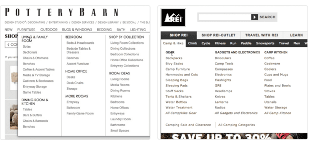
In this example of The Pottery Barn you can see Bedroom is a parent category for beds and other bedroom items. But the parent itself does not exist and is not a clickable link and simply a text label.
The study found users didn’t want to narrow themselves to a product page at this point in the research process and instead wanted an overview page of the subcategories to choose from.
2. Put The Same Subcategory Within Multiple Main Categories When Necessary
The same study also found that users struggled to find subcategories when they were only present in one parent category.
This means if your subcategories could easily be considered a subcategory of a number of your parent categories then you should include it through the hierarchy. While it is preferred to have a set of unambiguous parent categories, this isn’t always realistic.
3. Consider Having A “What’s New” Category Or Filter
If you have a lot of return visitors and customers then chances are your conversion rates could benefit from having a ‘What’s New’ section in your ecommerce website.
This is simply a category filter that allows users to see what new items have been added throughout the store since they last visited. Having this category or filter stops the users having to visit multiple pages and search using their memory for new items or products. This is especially useful in seasonal industries like fashion, where seasonal items are released throughout the year.
This can also be good for fad industries like kids toys, as they tend to want what is new and shiny.
4. Avoid category names that suck
Don’t fall into the trap of ‘creative’ category naming.
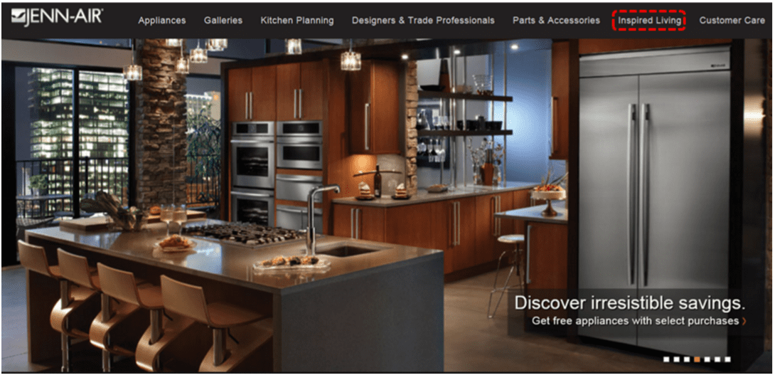
‘Inspired living’ for example seen here, communicates nothing to the user about the category.
In the same respect the categories, ‘discover’, ‘learn’ and ‘live’ are simply confusing.
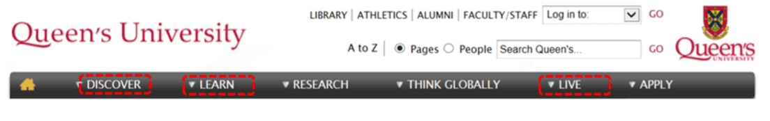
Instead descriptive categories like these guide the user towards what they are searching for.

Clever or fun category names are mostly useless and tell the user nothing about their relevance to their search. And definitely ignore the option to make up words or new phrases to name your categories.

For example ‘The Sanctuary’ here is only understood within the business or to past users. And don’t just follow your gut, as with all parts of your store design you should collect and analyse data to inform your decisions. Use card sorting and user testing processes to learn user preferences and behaviors.
Top five tips for creating your category names:
- Make them discoverable by choosing descriptive words with a strong information scent
- Avoid made up words or phrases
- Don’t make the categories too broad and undescriptive. Eg. ‘Solutions’
- Don’t use internal schemas or naming, they only make sense to you, not the users.
- Don’t rely on your gut, use card sorting and user testing
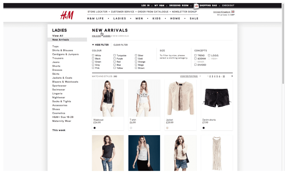
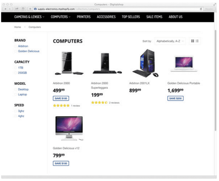
5. Optimize your product filters
Sorting is not the only way a user can find the product they want. Filtering is a great way to help users narrow down their choices and make a purchasing decision.
When considering your filters think about what attributes people would apply to your products.
For example Zappos are selling clothes, so their filters include things like size, color and so on.
This case study showed that adding filters can help increase your conversions rates, and we know if a user can’t find a product they can’t buy it, so it is worth A/B testing how adding filters or refining your existing ones affects your conversion rates.
6. Use large, high quality and contextually relevant imagery
When shopping online, visitors can’t touch or feel your products like in the real world. Therefore, it is really important to provide them with the best imagery possible to makes up for this shortcoming. The images should be high quality and large. You should be able to zoom in on products to see the details and the imagery should be contextually relevant.
Finally, the images should be consistent in their lighting, backgrounds and post production.
OVO Things does a great job of this.
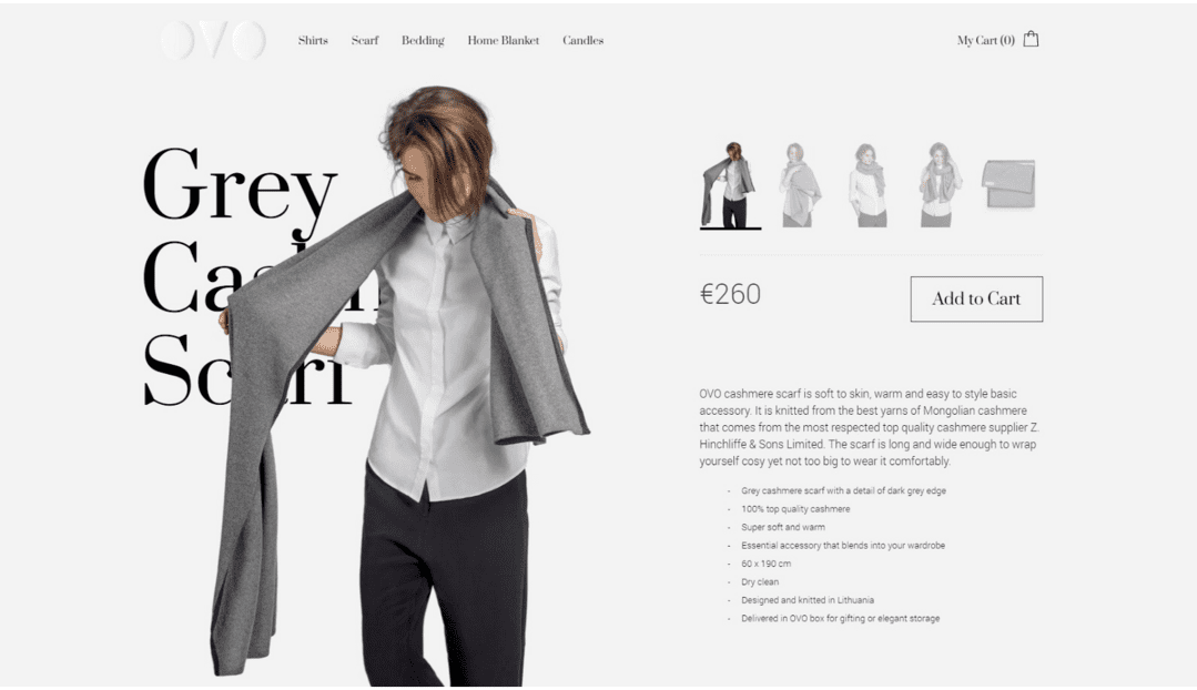
As you can see here, the images are well lit, consistently styled, high quality and contextually relevant.
As a clothing brand it is essential to show the clothes on a person, just as a furniture store should show the pieces within an interior environment.

You can also zoom the images to full screen on the OVO Things store allowing you to see the product in detail. It’s also important to show the product from different angles and perspectives.

Informing the visitor as much as possible in their buying decision. It is important however to make sure the images do not overwhelm the rest of the design and are intelligently placed in the visual hierarchy of the sales page.
As suggested by the Nielsen Norman Group:
“Large images are visually appealing, but they can harm the overall user experience if they aren't appropriately prioritized.”
Checklist for making sure your product images are looking their best:
- Use high quality imagery
- Create large images that can be zoomed
- Use consistently styled images
- Show the product in use contextually
- Display different angles and perspectives on the product
- Don’t let the image kill the value proposition or messaging of the sales page
- Use people in your photos when relevant
7. Test using consistent image sizes in your product archive
In a case study about Blue Acorn, they tested two variations of their product archive grid system.
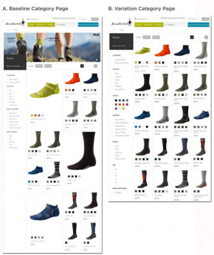
The control had varying images sizes and the variation used a uniform product image size.
They tested the two creatives with 25k visitors with a confidence of 95%. The variation, with the uniform product image size increased revenue by 17.1% against the control.
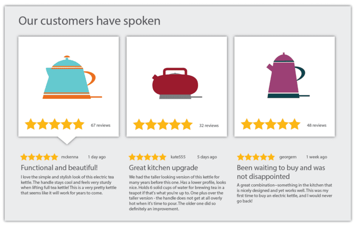
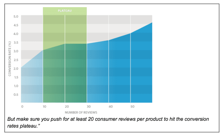
8. Test showing review ratings on your ecommerce category pages
As we know, having consumer reviews for your products can positively affect your conversion rates.
In fact, 63% of customers are more likely to make a purchase from a site which has reviews.
Try A/B testing adding review to your category page as well as inline on your product pages. There are also SEO benefits to surfacing product ratings on your category pages.
In this case study they suggested:
“Category-like pages containing Spotlights content performed four times better in search rankings and experienced a 25% increase in clicks.”
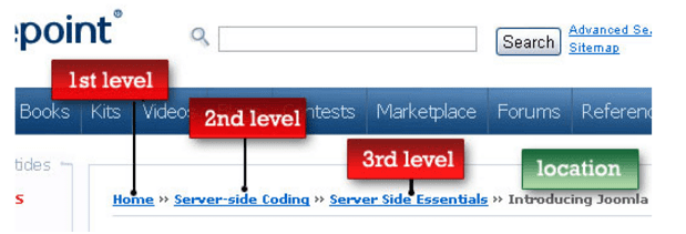
9. Follow breadcrumb use best practices
We know using breadcrumbs can increase your shop's usability and conversion rates.
But there are many do’s and don’ts and things to test when designing breadcrumbs for your store.
There are three main types of breadcrumb:
- Location-based
- Attribute-based
- Path-based
The type we are most concerned with for ecommerce stores is location-based bread crumbs.
Location-based breadcrumbs
Location based breadcrumbs are used for navigation schemes that have multiple levels (like ecommerce categories)
Breadcrumbs are great for improving user experience because they’re:
- Convenient modes of navigation for users
- Reduce clicks to return to higher-level categories
- Don’t take up a lot of screen real estate
- Reduce bounce rate by improving findability
Here are my top ecommerce tips for using breadcrumbs:
- Use ‘>’ to separate the levels in your product hierarchy
- Put crumbs at the top of the category page
- Make sure to differentiate their font styling to improve their ranking in the visual hierarchy otherwise people won’t find them
- Don’t make the last item a link as the user is already on that page and it may confuse them. Instead use a selected state
- Because of the above tip, don’t show breadcrumbs on your homepage
- Don’t use them as the primary navigation
- Don’t use breadcrumb flyout navigation, this is confusing it’s use with primary navigation also
- Always show the whole path back to the top level category
- Use full page titles where possible so the breadcrumbs correlate to the pages and reassure the user they are in the right location
10. Minimize clutter on your category pages
Even though there are countless features you can add to your category pages, more doesn’t always equal more profit.There is a point at which you confuse the user and make finding the products their desire more complicated than is necessary. The decision of what types of category page features to include really comes down to a one to one decision. If your store stock tens of thousands of products and variants then your users needs all the help they can get to find the product they want.
However if you store has a small SKU then you are better sticking to simpler categories and relevant filtering options.
Don’t fall into the trap of thinking more features equals more revenue. Just because you add more filters or a more complex sorting feature doesn’t make your users journey better. Use card sorting exercises to learn how your customer and visitors conceptualise your product ranges and learn how they divide your products into categories and subcategories and what attributes they associate with them. Then use this research to create your category page features
11. Optimize your search functionality
When it comes to creating high converting ecommerce category pages, internal search is your best friend/
Most ecommerce platforms come with some simple search as standard, but this often doesn’t suffice and leaves the user lost or confused. And as you know by now, users you can’t find the right products don’t spend money with you. With this in mind make sure you're considering advanced search features as well as just your basic out of the box search.
Your search features can make or break your store's conversion rates. Here is my top list of advanced search features to A/B test on your category pages to increase your ecommerce sales:
- Offer alternative products to empty search results
- Make sure your search has autocorrect for spelling mistakes
- Make your search dynamically show results as the user types like Google search
12. SEO optimize your category pages
To get more traffic to your category pages and more visitors into the top of your funnel it is important to SEO optimize them.
The first step here is to on page SEO your category pages.
Here is my on page SEO checklist for ecommerce category pages:
- SEO permalinks
- Keyword in your page title
- Keyword in your page description
- Keyword in the image alt and filename
- Keyword in your H1 tag
- Use LSI keywords throughout the post
When it comes to SEO optimizing your ecommerce category pages, you need to think about more than simple on page SEO. Building contextually relevant and high quality links is the best way to improve your category page search rankings and drive more visitors into the top of your ecommerce sales funnel. Use Brian Dean’s skyscraper technique to create killer blog posts and then link to your category pages with internal links, this passes the SEO juice to the category pages and shoots them up in the SEO rankings.
Optimizing your ecommerce category pages is hard
To get consistent month over month improvements in your ecommerce conversion rates and profits is hard.
And as a key step in your sales funnel, optimizing your category pages is integral to optimization success. But you must remember conversion optimization is not about copying your competitors or blindly following case studies. It is about collecting and analysing data from your website and business to inform websites changes to test on your store.
Get ideas for test from things your customers say or how they behave on your website. And don’t forget to A/B test any changes you make, otherwise your guessing what works and what doesn’t. This is what I call the publish and pray method, and it rarely see’s consistent results.
Increase your ecommerce conversion rates and sales
If you’re serious about taking your ecommerce conversions and sales to the next level I’ve got good news.
I’ve created a free, 5 part email course on ecommerce conversion rate optimization. In it I cover 51 ecommerce best practices you can test across the different pages in your online store. The best part is they’re backed by data from case studies.
 Thanks to Giles for sharing their advice and opinions in this post. Giles Thomas is an ecommerce conversion rate optimization expert, founder of AcquireConvert & ecommerce growth agency Whole Design Studios. He teaches companies how to grow as the head marketing mentor at the Google Launchpad Accelerator. Giles is also a member of the exclusive Google Experts program, a curated group of the world's leading experts in ux, product, development & marketing.
Contributer : Smart Insights


No comments:
Post a Comment