A Look at 2018’s Top Web Design Trends So Far
From minimalism to animation to low-poly graphics, web design trends are varied and always evolving. Keeping up with these shifts is important to avoid having your website look outdated or stale. Of course you should always try to maintain your own unique style, but if a redesign is in order, incorporating some of these successful design choices is just one way to excite visitors new and old.
Responsiveness
2016 and 2017 saw a huge push for responsiveness. In the era where everyone owns and shops on their phone, it’s vital to make sure that mobile users have a pleasant experience. In WordPress, responsiveness of themes and plugins became an expected default. If a site is poorly optimized for your device, mobile users aren’t going to be sticking around.
In 2018, things should begin to quiet down – but that doesn’t mean responsiveness isn’t as important. It’s just that now you’ll be expected to know better. Always design a website while fulfilling mobile needs, if not with a mobile-first mindset!

Minimalism
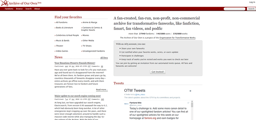
Whitespace, flat, bright colors and simple logos. If you visit ten sites, at least half will have adopted this simple design. And it’s not without reason; the fewer assets a page has, the quicker the loading times. SEO is easier to optimize and users enjoy the uncluttered experience.
Some websites even use extra-minimalistic, borderless designs where headers, footers and sidebars are all eliminated. It’s not a style that can work for all sites, but it’s gaining traction nonetheless.
Colorful and Darker Websites
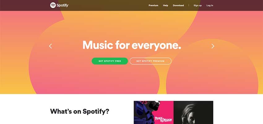
Some designers are growing tired of copious amounts of whitespace, and there’s more of a push for unique and colorful palettes. From bold pastels to showy, saturated themes, expect to see the rise of more intense and fluorescent colors.
Also look out for the return of gradients! Flat colors are still in style, but many designers prefer the dynamic but subtle look a gradient can provide.
Unique Typography
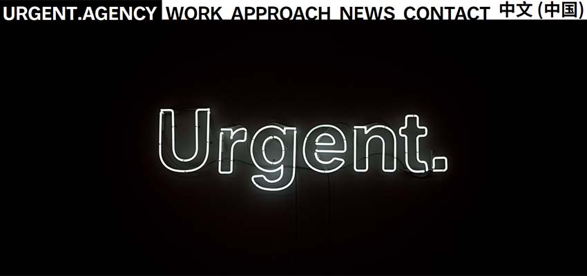
Typography is currently under a revolution. In the past, it was of little concern for many web designers; pick a good, clean, readable font and move on. Now we’re seeing more eye-grabbing, impactful headers. Hand-drawn fonts are also being incorporated into banners and logos – giving that extra personal touch.
Incorporating Art
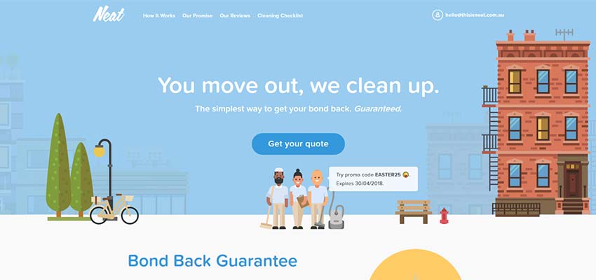
It’s a good time to be an artist in the web design industry. Art can make a website seem a bit homier and less factory-made, so it’s a popular choice for small businesses. Much of this art is in a simple and colorful style, which meshes perfectly with both a minimalistic website and one with a brighter palette.
Animation
From full-blown animated websites to simple hover effects, the web is very lively these days. Logos are becoming animated. Buttons flash and slide when you click them. Animated characters blink and wave at the screen.
Animation is a great asset and one that can give your site some extra personality. But it can also be an annoyance that causes slow loading times and distracts visitors. The trick is in knowing when to dazzle users and when to let them focus on your content.

Virtual Reality
VR has already come a long way. You may know it only as a new-fangled gaming platform, but virtual reality is establishing a foothold in the online world. Examine products in 3D. Walk through a house that is up for rent. Use a website as a visual essay. You may only see fringe websites using VR for now, but it will certainly explode in the next few years.
Looking Ahead to the Future of Design
Technologically powerful and beautifully personal: This is the direction the web is going. There’s a surge in hand-drawn art, animation, less vanilla fonts and more user engagement. In other words, a website that looks like it was designed by people and not machines. Along with this, we’ve seen the rise of VR, JavaScript and more. There’s no telling what the future will hold, but 2018 looks bright.
:) Hit link to watching video...! https://ift.tt/2wrWA2v
Contributer : 1stWebDesigner
 Reviewed by mimisabreena
on
Thursday, May 10, 2018
Rating:


No comments:
Post a Comment