10 Inspiring Examples of Branding Presentation Design
Presentations are a crucial aspect of any branding project. They allow you to present your finished designs in the best light possible, looking to make the greatest impact on the client.
It also helps them to understand the direction, as well as envisage how it would look in production. As a result, it’s crucial these branding presentations are designed with great care and fit perfectly with the project styling and direction.
In this article, we take a look at a selection of the most inspiring examples of branding presentation design.
Your Web Designer Toolbox
Unlimited Downloads: 500,000+ Web Templates, Icon Sets, Themes & Design Assets
Success Story
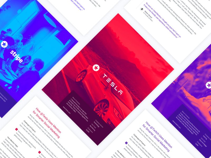
Mention’s branding presentation applies some vibrant and appealing overlay effects to the full-size imagery upon their cover designs. It allows them to maintain a consistent accent color throughout the presentation.
Rebranding B&H
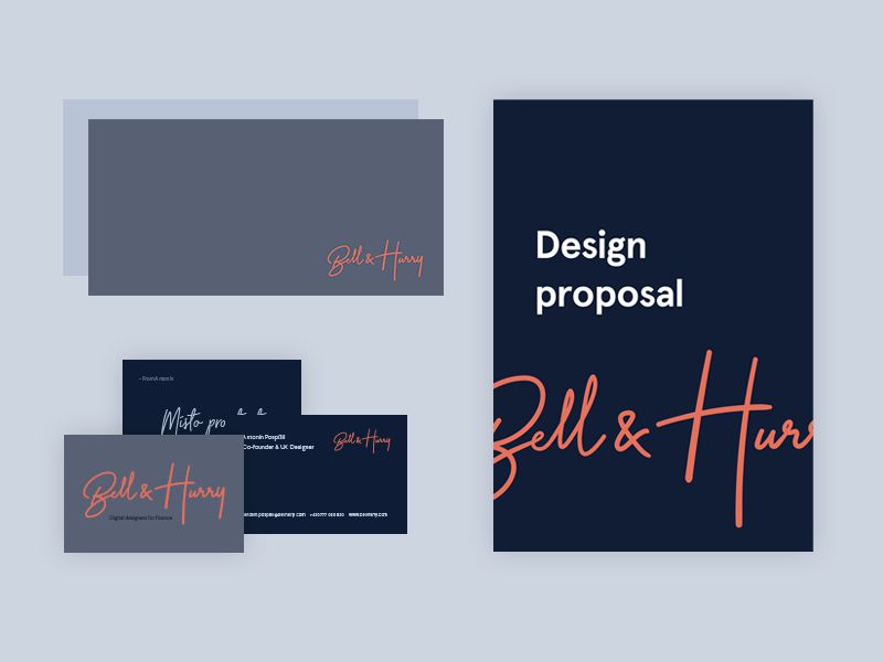
This simple but effective rebranding project is presented perfectly through the design proposal and business card mockups.
Vertical
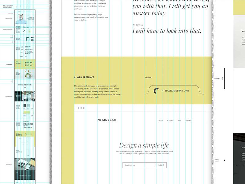
In one of the more detailed examples, this presentation is comprehensive in its detail but maintains a consistent color scheme and structure through the use of grid lines.
Branding Exploration Process
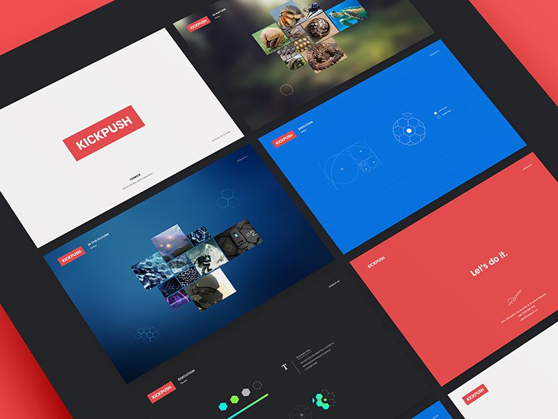
Kickpush’s highly visual presentation design uses full-color and graphical backgrounds throughout. It contrasts with the content effectively and is high impact.
Twisto Brand Book
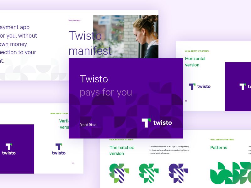
This beautiful branding project continues the use of purple and green colors throughout the presentation. The repeating background patterns are a perfect addition and provide an example of how the branding can be applied in production.
Melissa
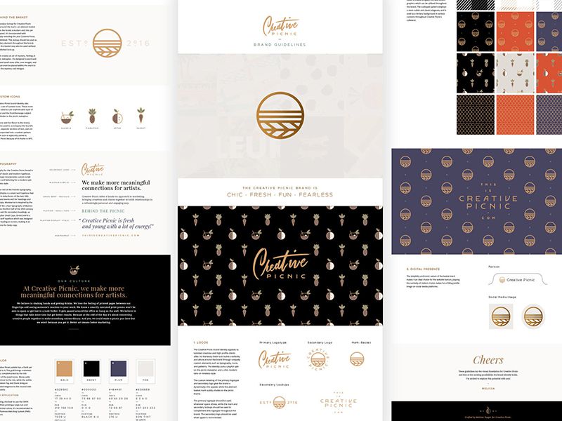
Melissa’s branding presentation is highly visual but with similarly detailed explanation throughout. It applies multiple instances of patterned imagery and related text to further expand upon her vision for the brand.
Branding Showcase Layout
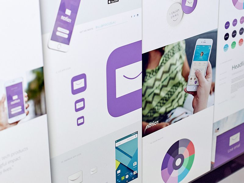
This minimal branding presentation is succinct and allows the visuals to communicate without a great deal of explanation. It makes for an easy-to-understand approach which is described through mockups and photography.
Something New for Sidecar
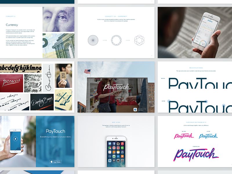
This presentation for PayTouch is inspiring in the way that it presents a unique slide for each branding concept. Each is carefully considered, and it presents a multitude of visions and approaches to the client.
One More Time
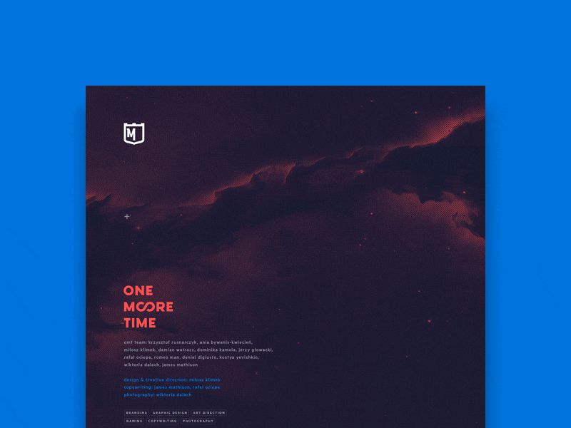
This beautiful dark theme is heavily reliant on visuals, with minimal use of typography. The red accent for the title text works perfectly against the maroon galaxy background.
uLikeIT Keynote Slides
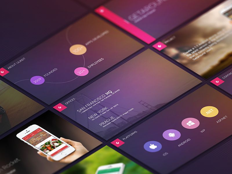
This Keynote branding presentation utilizes a master slide to apply consistent design elements across all slides. The color scheme is beautifully consistent throughout, as are the background visuals, despite differing image selections.
:) Hit link to watching video...! https://ift.tt/2ztU0Gn
Contributer : 1stWebDesigner
 Reviewed by mimisabreena
on
Friday, June 01, 2018
Rating:


No comments:
Post a Comment