


33 stunning iOS app icon designs
Apple places pride, focus and effort on great design. Its hardware is rigorously refined and tuned to improve the user experience with every iteration, and the same is true of its software.
Rather than interface elements that ape the real world, what you interact with on iOS is minimal, with icons that look more like icons rather than photorealistic art.
Since then, there’s been a slight increase in texture and form, but to add subtle depth, rather than to return to what went before.
Why icon designs matter
Apple’s obsessive attention to detail rubs off on users and designers alike. Owners of Apple kit expect great design, and if something doesn’t look right, they’ll be put off.
With icons, it’s crucial to get things right. In the App Store, a good icon can make the difference between a sale and being ignored. And on the Home screen, great icons encourage engagement, and therefore need to be compelling and easy to spot.
To help you on your way, we’ve collected a group of beautiful, innovative and stylish icons. We hope you find them a useful source of inspiration for your next iOS project.
01. Monument Valley
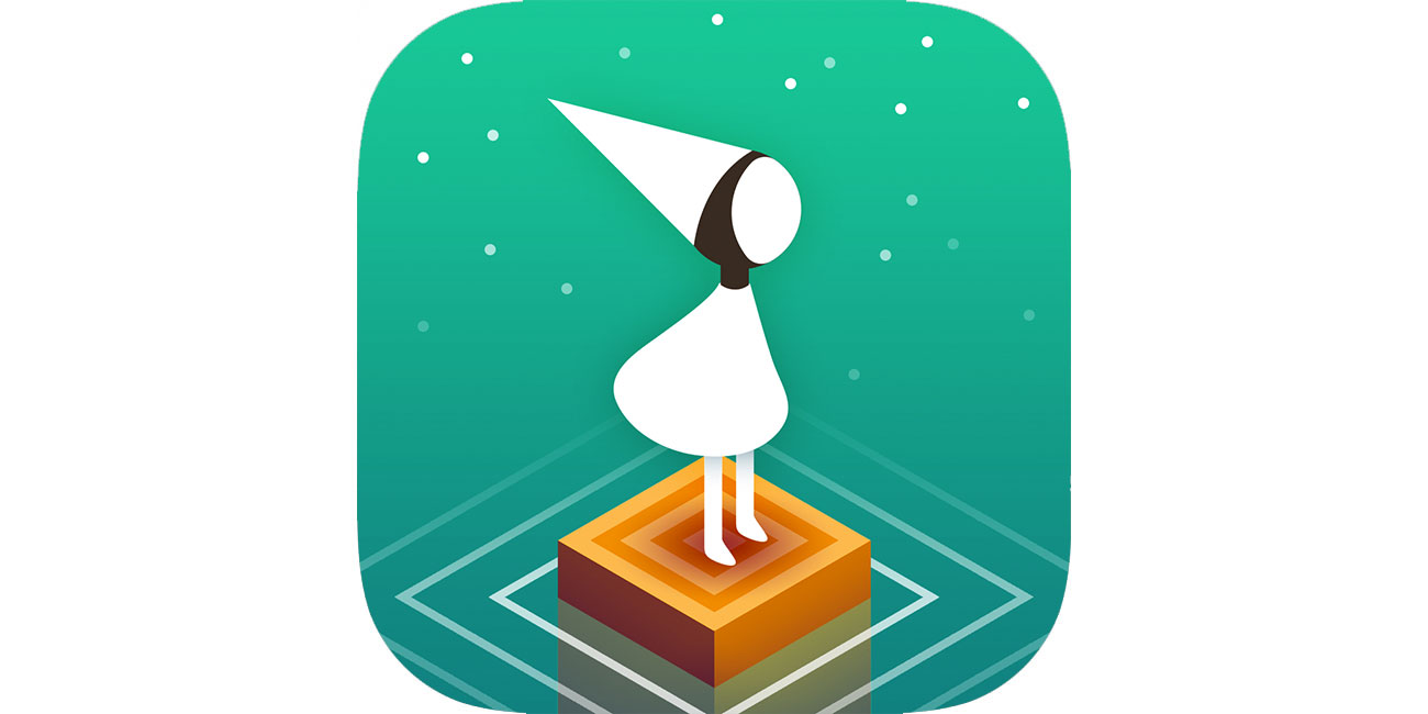
ustwo games' Monument Valley is a stone-cold iOS classic, and its icon sets you up perfectly for the peculiar adventure you're about to undertake. Straight off it introduces you to the central character, Ida, and gives you a taste of the game's minimal isometric looks, wrapping everything up in a sense of mystery that's guaranteed to draw you in.
02. Slack
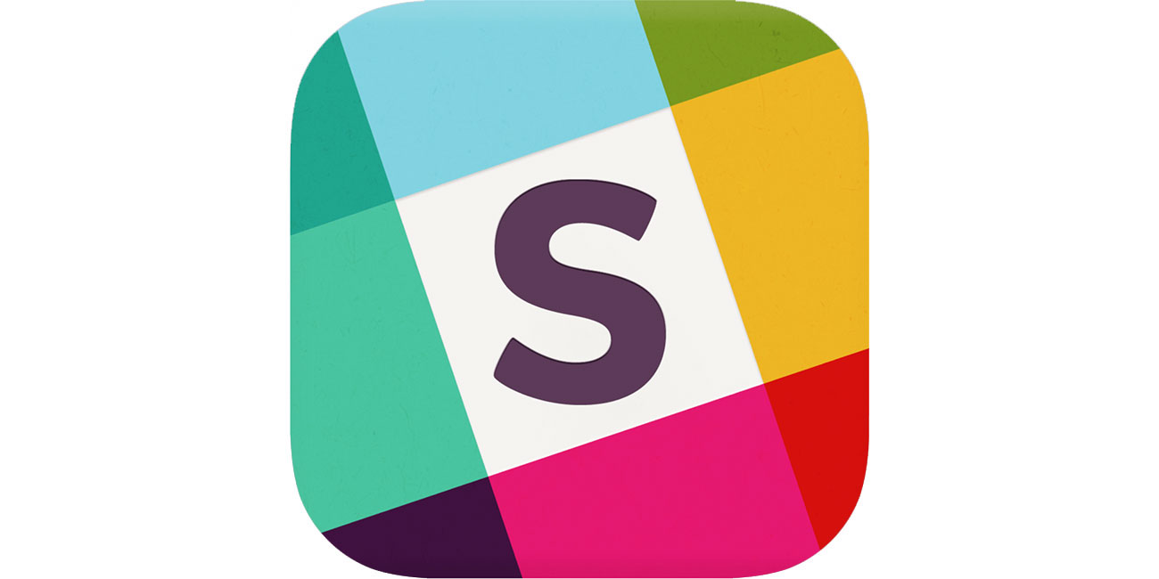
It seems that everyone's on Slack these days – at least until their channel burns through the free storage allowance and they flee to Discord instead. Until then it's easy to find the Slack icon, with its friendly 'S' and its eye-catching palette, reminiscent of coloured gels laid over strips of solid colour.
03. 1Password
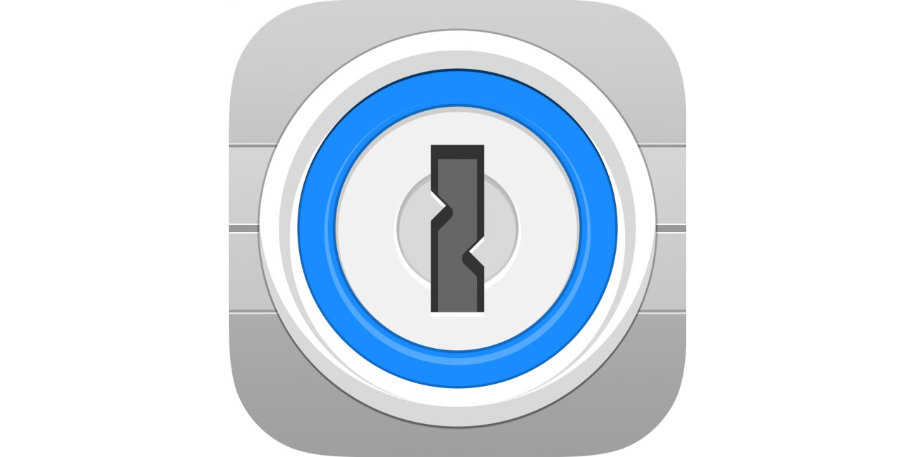
Zero marks for imagination here, going for the Captain Obvious padlock, but 1Password’s icon immediately tells you what it's about. It will be easy to find on your iPhone or iPad, and has authority in the app store. It conveys security at the heart of the app and service alike and makes users feel that whatever’s stored within will be safe.
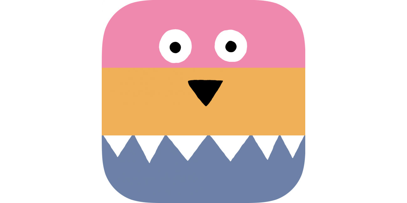
04. A Good Snowman Is Hard To Build
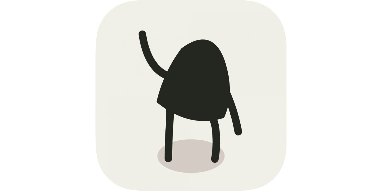
Game characters are usually too complex to be used in their entirety on an icon. Not so with A Good Snowman’s adorable monster. It stands out from other icons on your home screen and is even waving at you. It's impossible to resist, unless you’re the monster.
05. Assembly

For an app that’s the digital equivalent of felt shapes but that wants to seduce designers and kids alike, its icon needs to be fun, creative, sharp, and colourful. Job done with the Assembly icon.
06. Blek
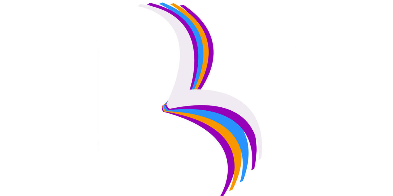
This game’s all about controlling living calligraphy, coaxing it to collide with targets. That concept’s too much for an icon, but Blek’s icon nonetheless gets across the game’s elegance and visuals with a swoosh and memorable lines.
07. Clear Todos
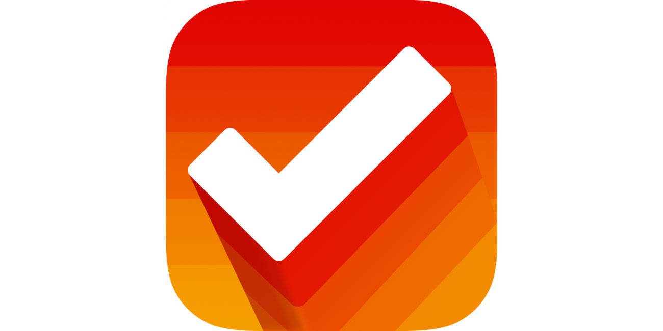
To-do app Clear Todos is one of approximately a million productivity apps using a tick. But this icon's positive, upbeat nature suggests how your life might be better when using the app, and the colours differentiate it from comparatively hum-drum, overly serious competition.
08. DEVICE 6
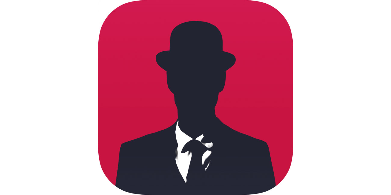
Simogo’s iOS gaming classic dumps you into a world of spies and conspiracy, leaving you to explore a mysterious world and figure everything out. The icon’s subdued menace and bold colours evoke the feel of the game perfectly.
09. djay 2
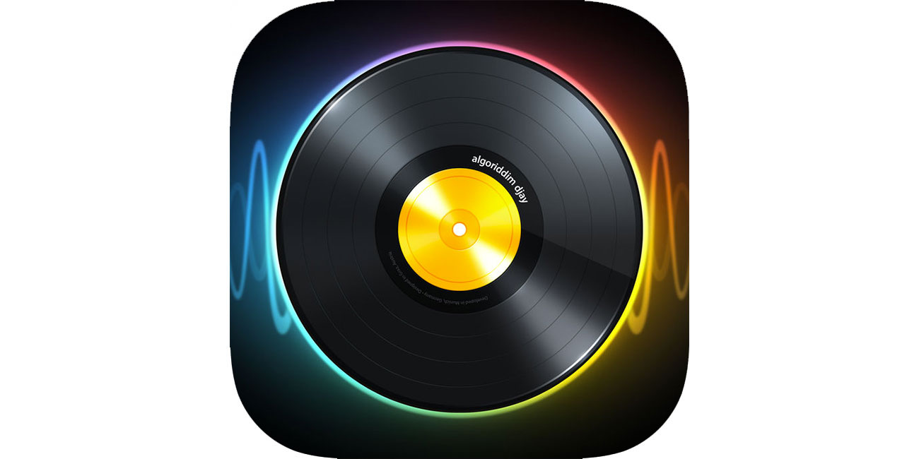
This icon showcases that a modern, minimal approach needn’t mean eradicating texture entirely. And for an app that brings to mind spinning vinyl (even if its decks are virtual), the nod to realism is appropriate, welcome and smart.
10. Doo – Get Things Done
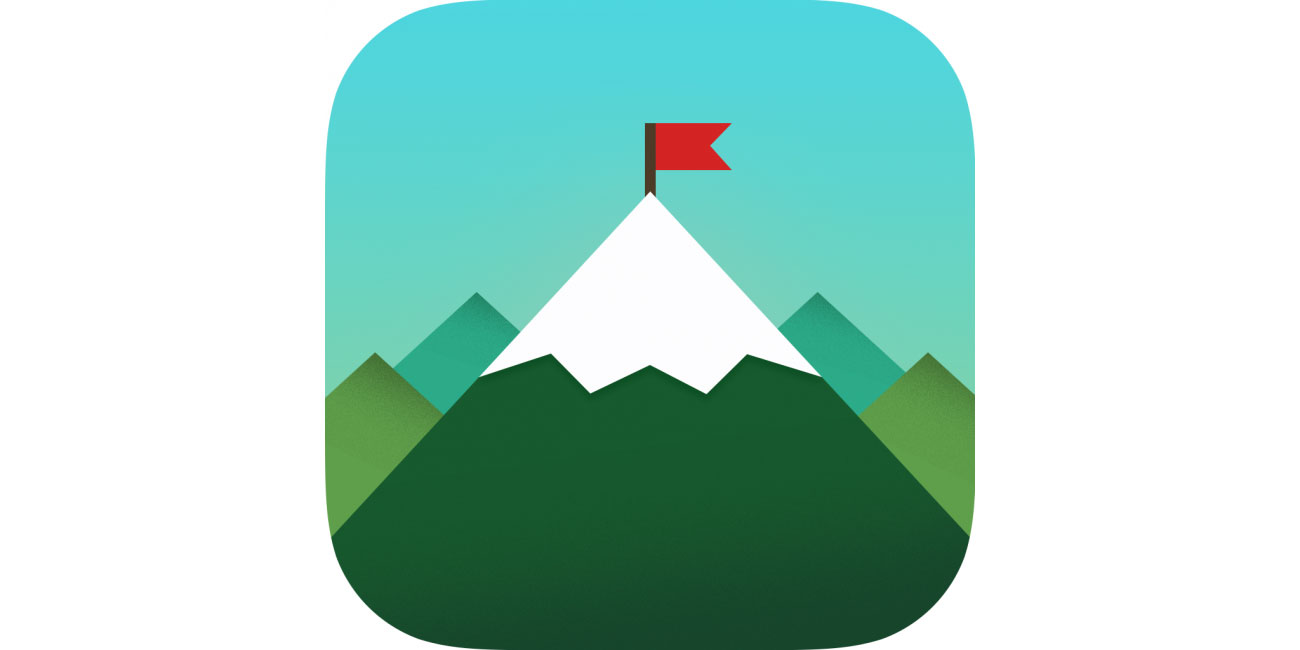
Manage to get everything done in your to-do list and you feel like you’ve just scaled a mountain, hence the inspiration for Doo’s icon. Furthermore, it’s far more imaginative and fun than yet another tick.
11. Duolingo
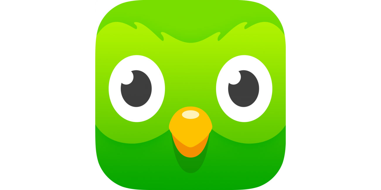
Learning a language can be daunting, and too many app icons in this space are boring flags or dry corporate icons. Duolingo bucks the trend with a friendly, cartoonish approach. Also, we suspect that this hypnotic owl (or is it Orville the duck?) has you use the app more than you realise.
12. Earth Primer
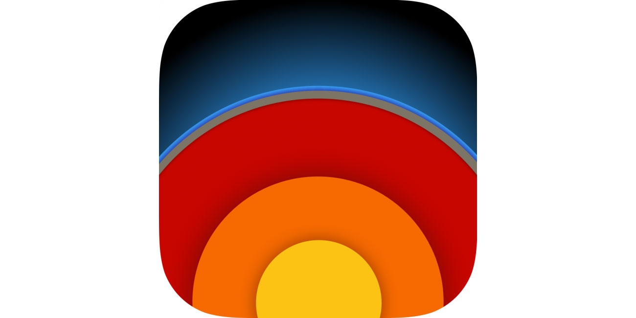
This gorgeous interactive tome about delving deep into the Earth has an icon with the book’s subject matter in microcosm. The subtle textures and drop shadows add plenty of depth.
13. Fantastical 2
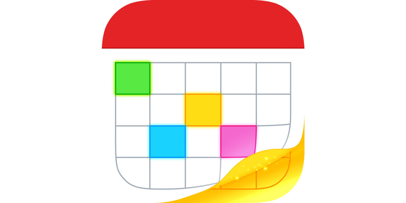
You might think it illegal these days to have icons that aren’t flat, but calendar app Fantastical’s page curl draws the eye on your Home screen, as do the vibrant colours that scream “OPEN ME!” rather than “Oh no. Work.”
14. Grayout
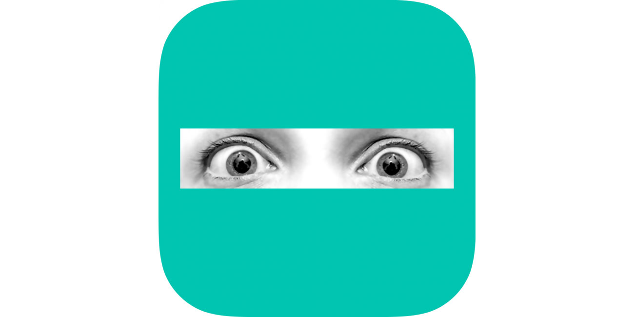
It’s rare to see photographs integrated into a modern iOS icon (at least, a good one), but Grayout’s terrified eyes ‘trapped’ behind a slab of colour perfectly symbolise the woes of the game’s protagonist, trapped in her head after an accident.
15. iA Writer
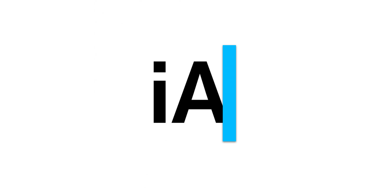
A masterclass in minimalism, iA Writer’s icon manages to convey the brand and what the writing app does, all with a couple of characters and a blue line.
16. Launch Center Pro
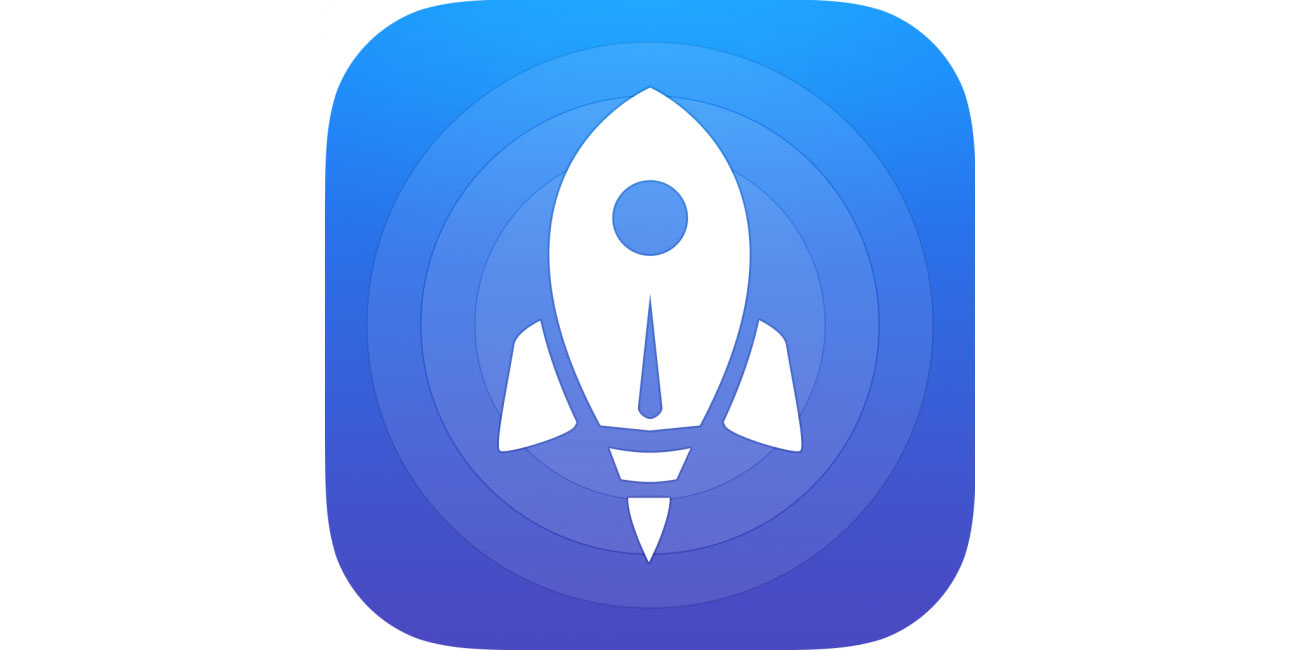
This app’s designed to speed up launching things, hence the super-speedy rocket. The icon further benefits from friendly, chunky curves and concentric circles for added depth and interest.
17. MindNode
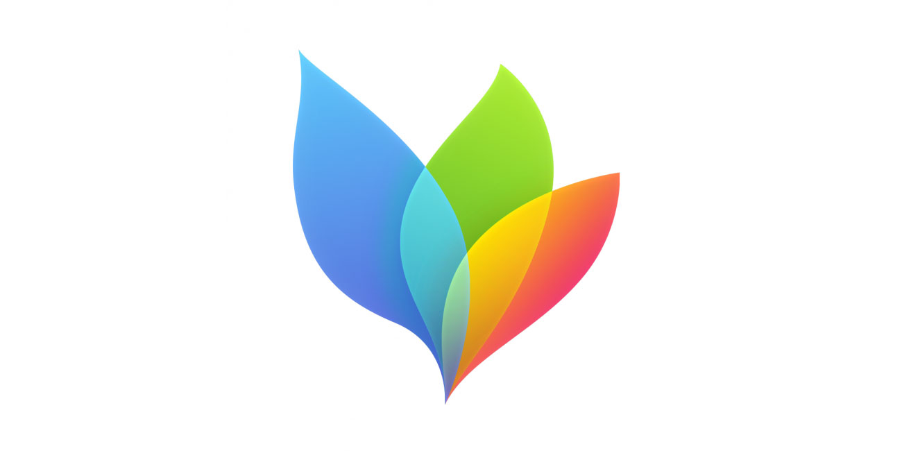
Mind-mapping apps are all about the spread of ideas, and MindNode’s interface has a kind of flowing elegance that’s rare in business-oriented apps. The icon conveys this with a memorable, bright illustration, rather than corporate greyness.
18. Miximal
Children’s app icons are often awful, but Miximal has a kind of welcoming and goofy charm. It also smartly hints at the app’s design, which allows you to slide parts of the screen to construct oddball animals.
19. Papers, Please
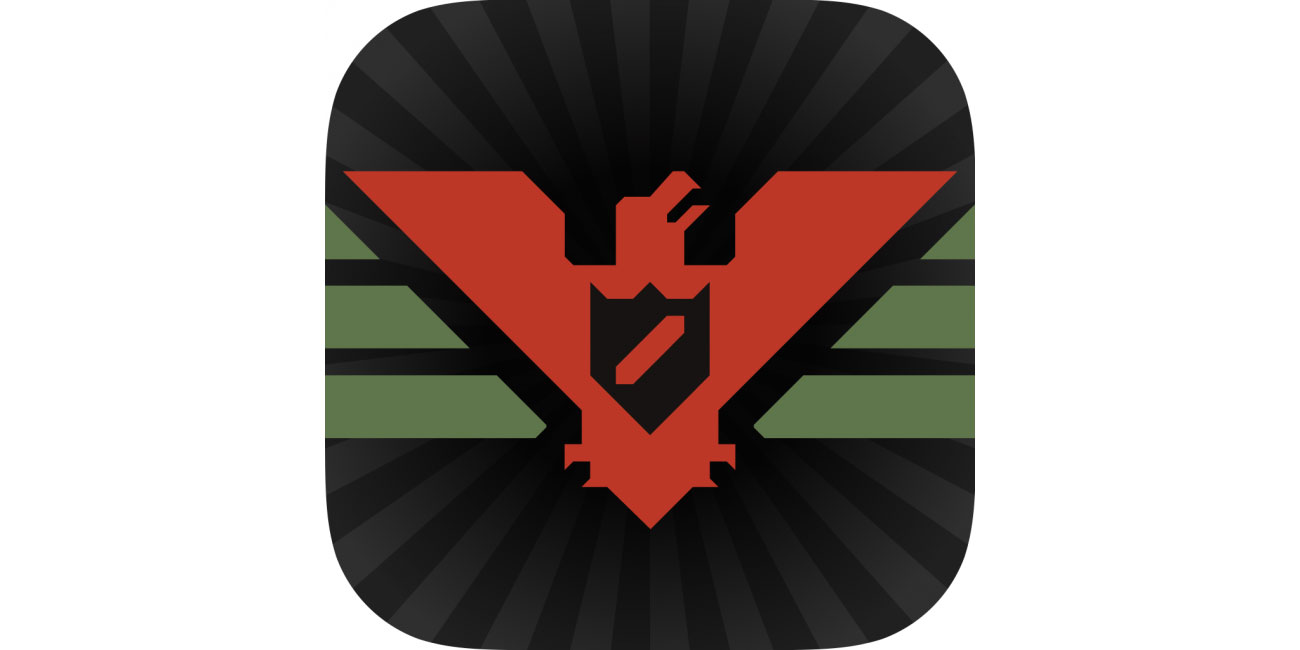
Game icons work best when evoking the feel of the game. Papers, Please is set in an oppressive communist regime, hence the stark, brutal iconography atop a subtle explosion of black and grey.
20. Pigment
Modern iOS minimalism doesn’t get across the scribbly nature of colouring in, but modern icons eschew messiness. Colouring app Pigment solves this issue by marrying sharp illustration with imperfectly coloured areas.
21. Pixelmator
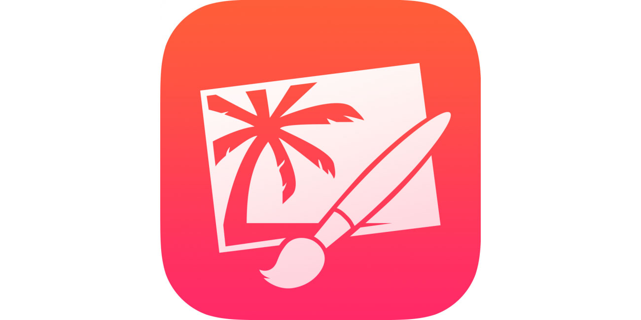
Pixelmator’s OS X icon recalls classic Adobe fare, twanging your nostalgia glands. On iOS, everything’s simplified, but the icon remains recognisable and leaves you in no question as to what the app does.
22. Procreate
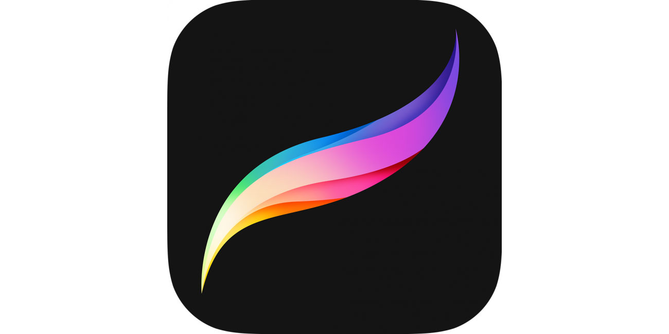
A digital tool for artists, Procreate offers a classy multicoloured brushstroke for its icon. It feels restrained but elegant – much like the app itself.
23. Prune
One of the more complex images in this round-up, Prune’s icon displays two main components from the game: fragile trees you help grow, and poisonous floating red orbs. It’s an arresting image that looks great on your Home screen.
24. Silly Sausage in Meat Land
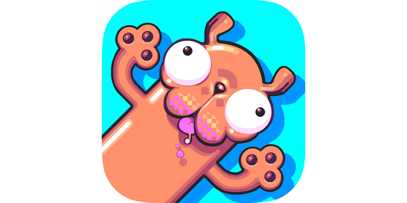
Showcasing that seriousness isn’t mandatory in icons, Silly Sausage grabs the attention with a daft cartoon dog. It fits the bonkers game perfectly, and grabs the attention while browsing the App Store.
25. SKRWT
This one’s quite clever. The SKRWT app is all about correcting angles and perspective in photos. The more vibrant shapes in the icon are perfect, but faded shadows are crooked, hinting at how the app works.
26. SPL-T
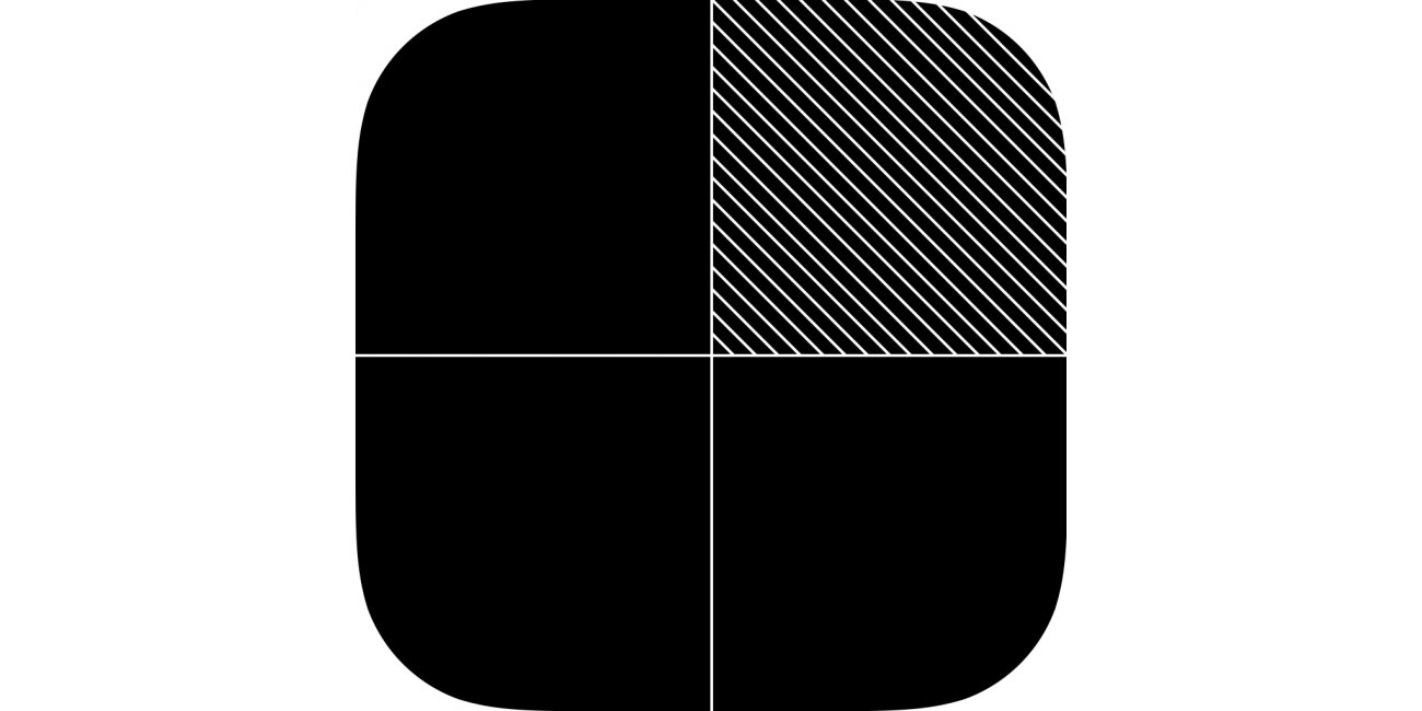
This puzzle game feels like it was sucked out of a TRS-80, and the icon is suitably old-school. Its black and white stylings are striking, not least when among more elaborate iOS game icons.
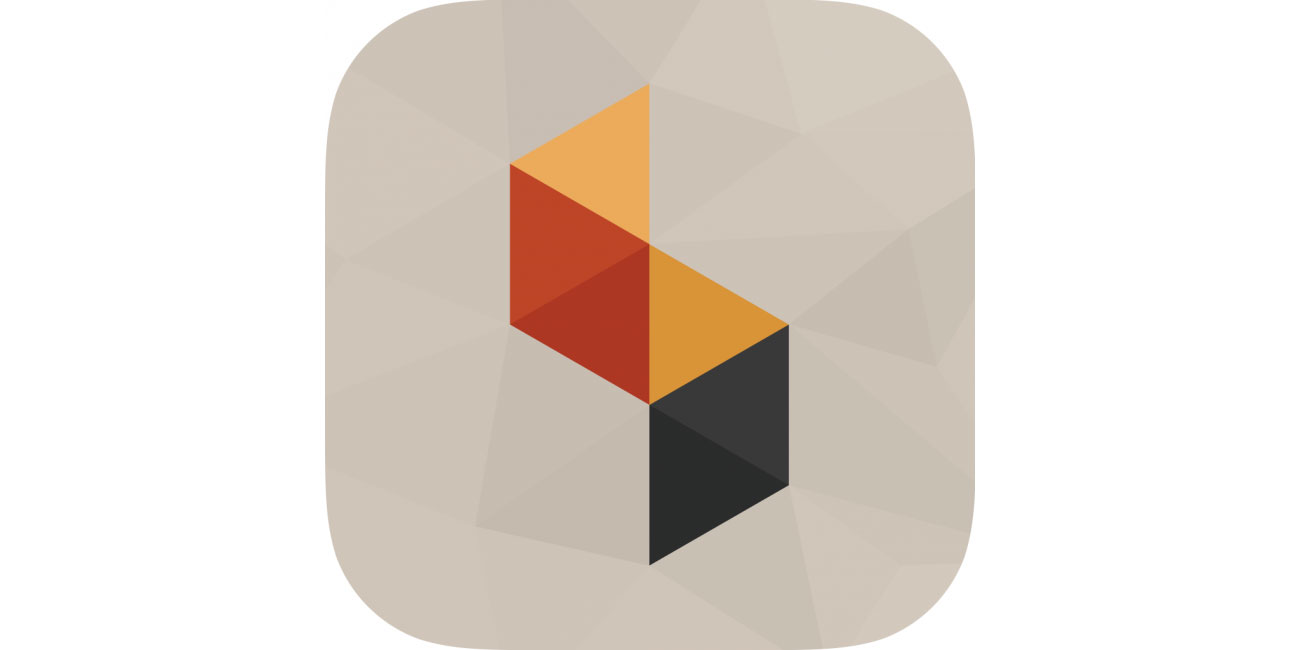
27. Strata
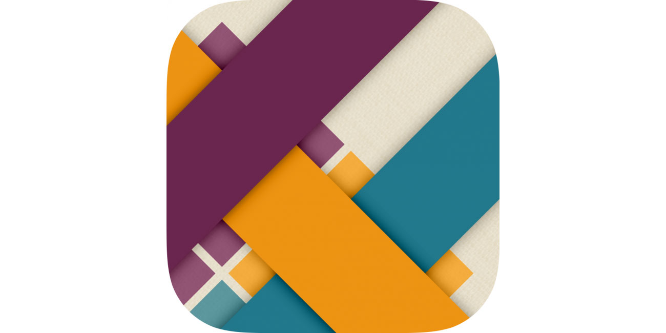
Strata is a puzzle game about weaving ribbons, and its icon’s simple pattern feels at home on iOS. Yet the details – subtle shadows; faint textures – recall real-world materials the game simulates.
28. Threes!
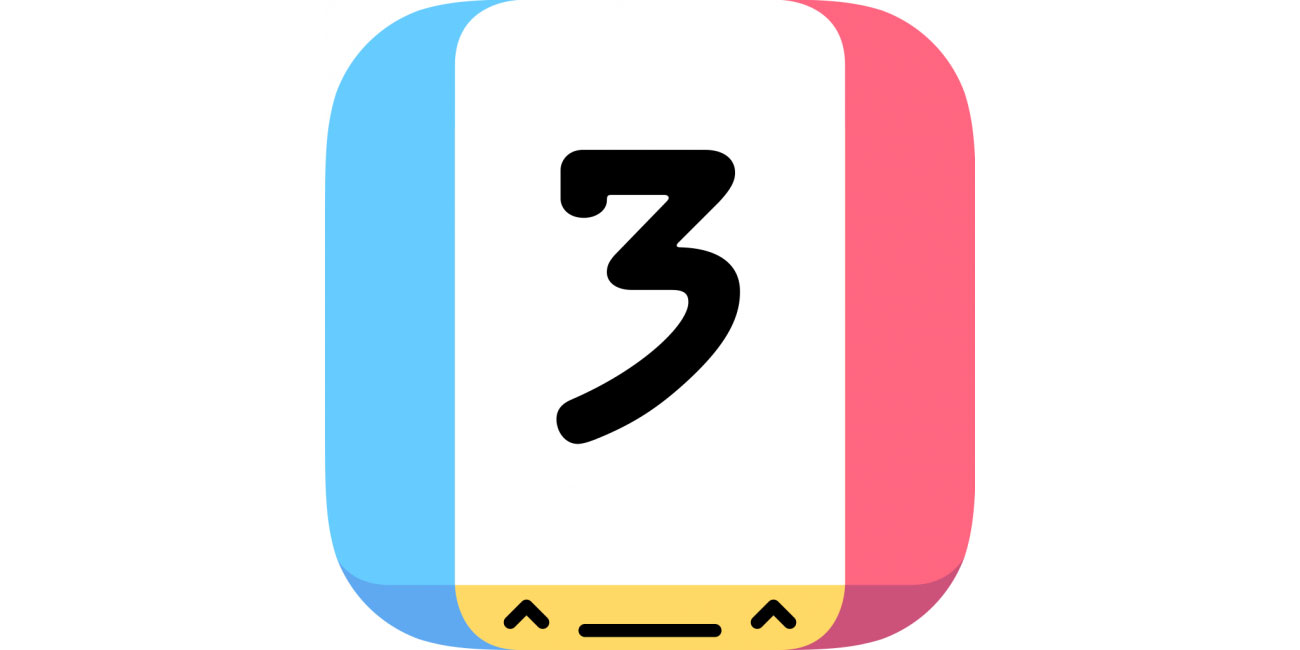
One of the smartest things about Threes! was infusing a sliding-tile puzzler with personality. This follows through to the bright, breezy icon, with its bold number and cheeky face.
29. TodoMovies 4
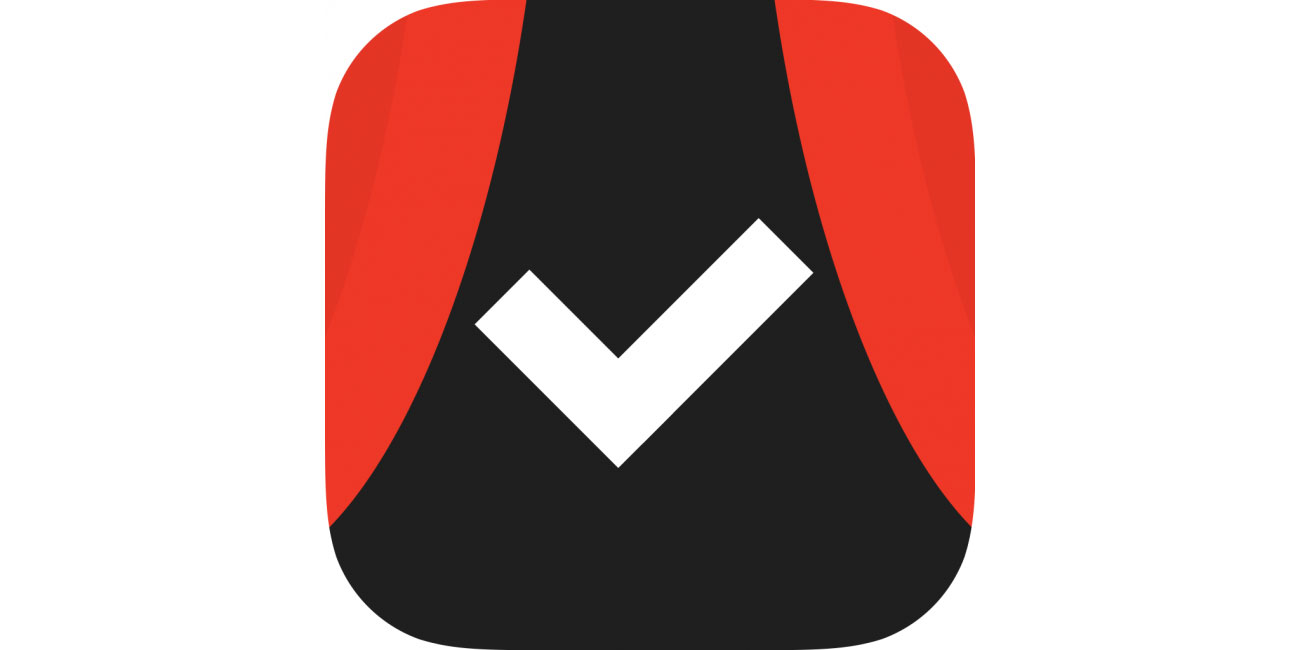
A list maker? Best use a tick, then! About the cinema? Add some red curtains! Few marks for imagination, but the result is effective and very smartly executed.
30. Transmit
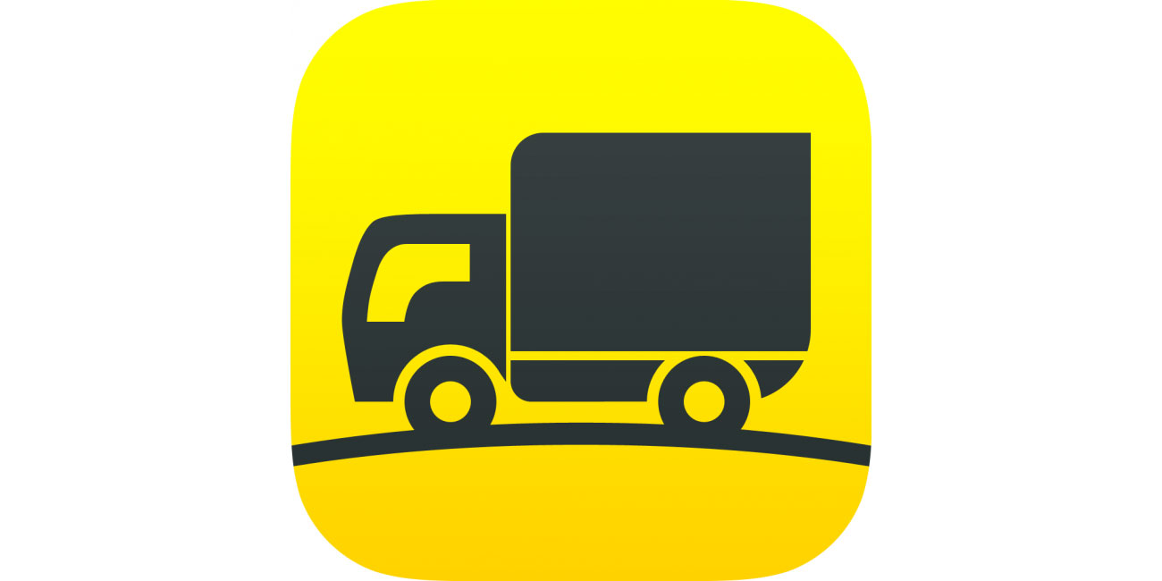
Popular OS X FTP client Transmit’s long had a 3D truck for its icon. On iOS, it’s flattened into something akin to a road sign. It’s distinct, and the colour scheme has a nicely industrial worky feel.
31. Tweetbot
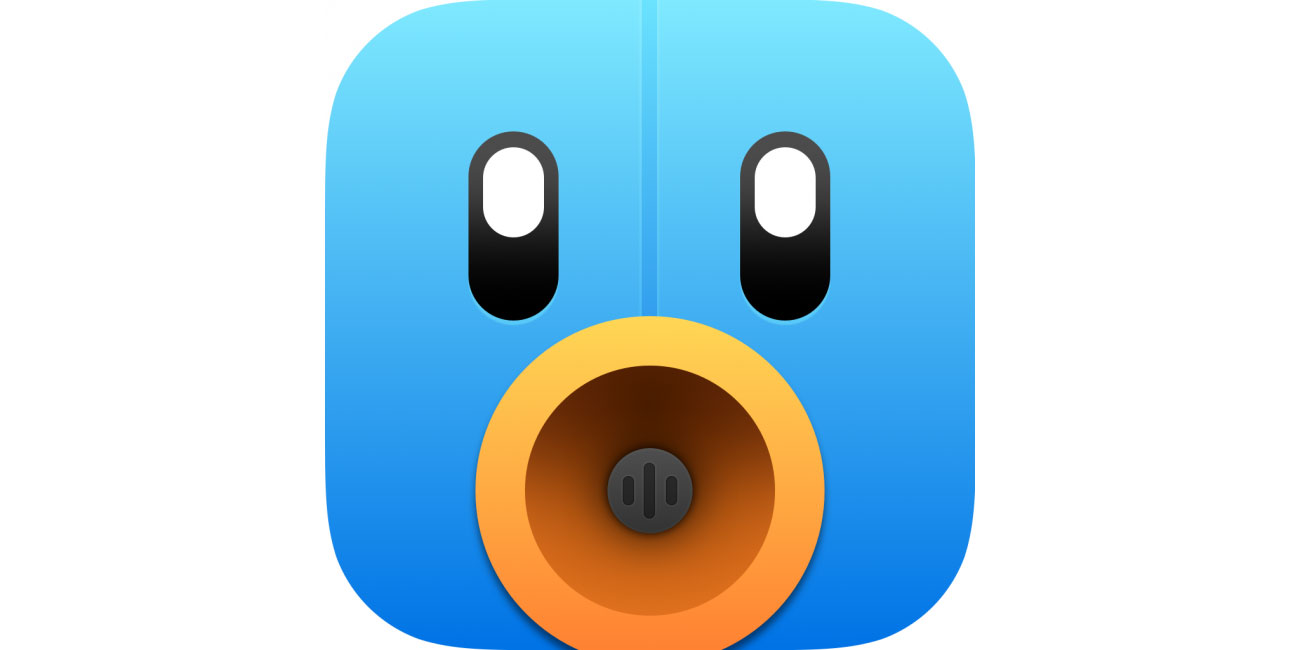
Tapbots' conceit is each of the company’s apps is a little robot. Prior to iOS 7, its icons appeared plucked from Pixar animations. Today, everything’s subtler, but Tweetbot retains a sense of character without gloss and overt 3D.
32. Wunderlist: To-Do List & Tasks
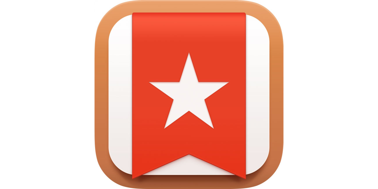
Wunderlist is an easy-to-use task management app. Its icon is slightly reminiscent of 20th century communist and nationalist imagery – not a bad thing if you want your working life to be regimented and organised!
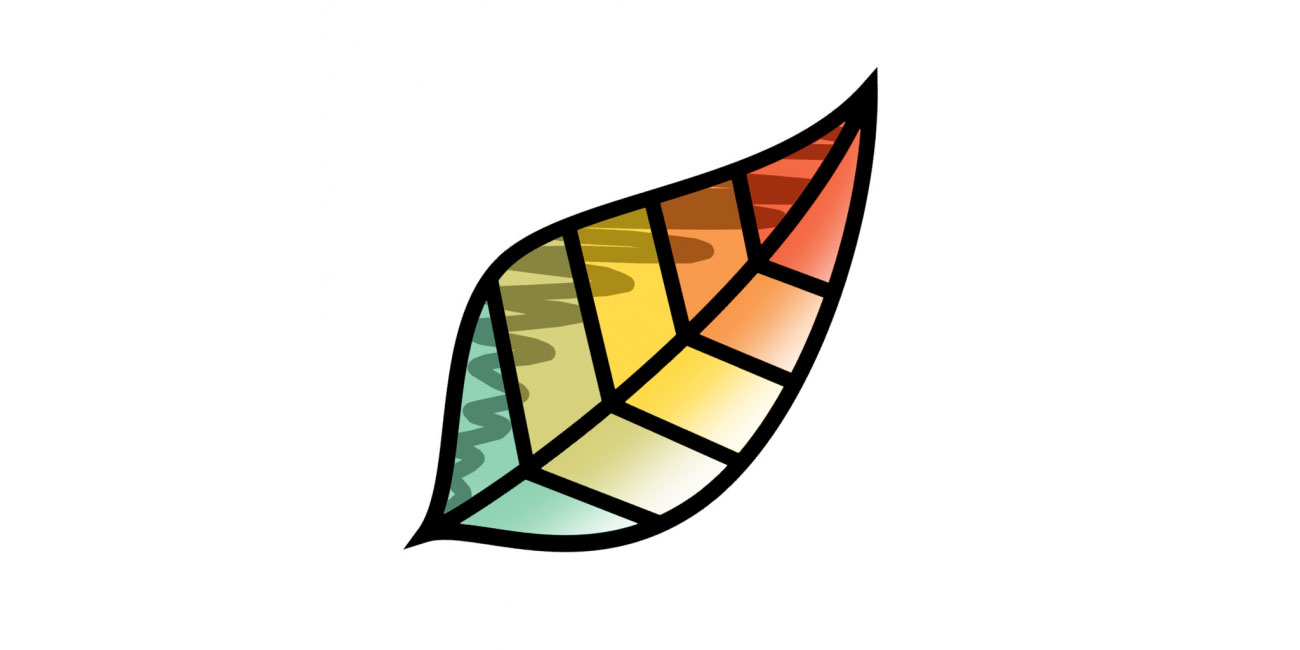
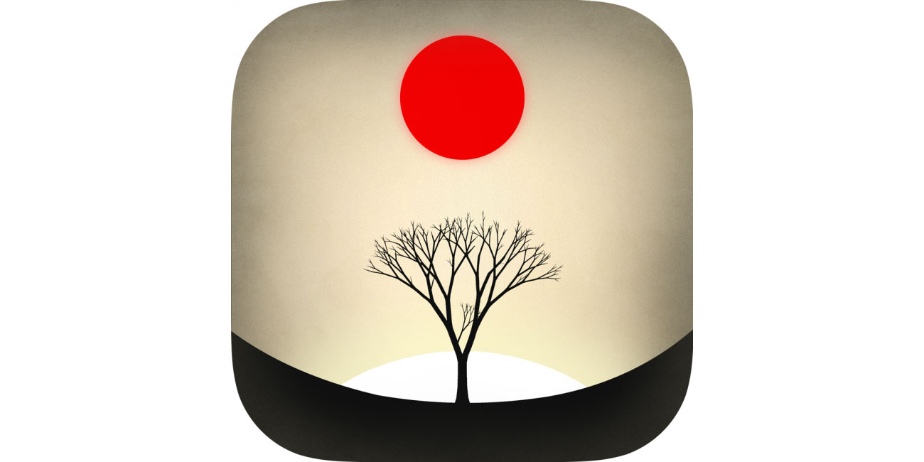
33. Year Walk
Imperfect edges make Year Walk’s icon more wood carving than polished illustration. It draws the eye in the App Store and feels like the perfect entry point into the Scandinavian horror of the game itself.
Related articles:
Contributer : Creative Bloq

 Reviewed by mimisabreena
on
Sunday, August 26, 2018
Rating:
Reviewed by mimisabreena
on
Sunday, August 26, 2018
Rating:


No comments:
Post a Comment