


5 classic fonts that are still on trend (and why)
There are thousands of typefaces out there, with more being released all the time. And with free fonts increasing in quality as well as quantity over recent years, the choice can be overwhelming for a designer.
If you can afford one, bespoke branded typefaces are also becoming increasingly popular. They help give brands a unique and distinctive personality that cuts through the noise, and conveys just the right tone of voice. If not, with the right amount of research and due diligence, you'll be able to find a typeface that suits your needs.
Despite the proliferation of typefaces on the market, however, a noble few have stood the test of time for decades, even centuries, to remain in-demand and relevant amid a sea of young pretenders.
So read on for our guide to five classic fonts that are still not showing their age, and why they could be right for your next project...
01. Futura

Designed by Paul Renner and released in 1927, Futura can be seen as the grandfather of geometric sans-serifs – a flavour that is very much of the moment, following a wave of minimalist rebrands for the likes of Google, Mastercard and Spotify over the last decade. Futura itself has been used by a dizzying array of brands, including Alfa Romeo, Cisco, Domino's Pizza, Gillette and more.
Futura may have passed the grand old age of 90, but the iconic typeface's popularity has shown little sign of waning. With the spirit of the Bauhaus at heart, its design is based on simple geometric shapes – circles in particular – and exudes efficiency, purity and modernity to this day.
Its strokes are smooth, even and low-contrast, and the typeface as a whole – despite being progressive at the time, flying in the face of its grotesque counterparts – is timeless enough to be as relevant and usable in 2018 as it was in 1927.
02. Caslon
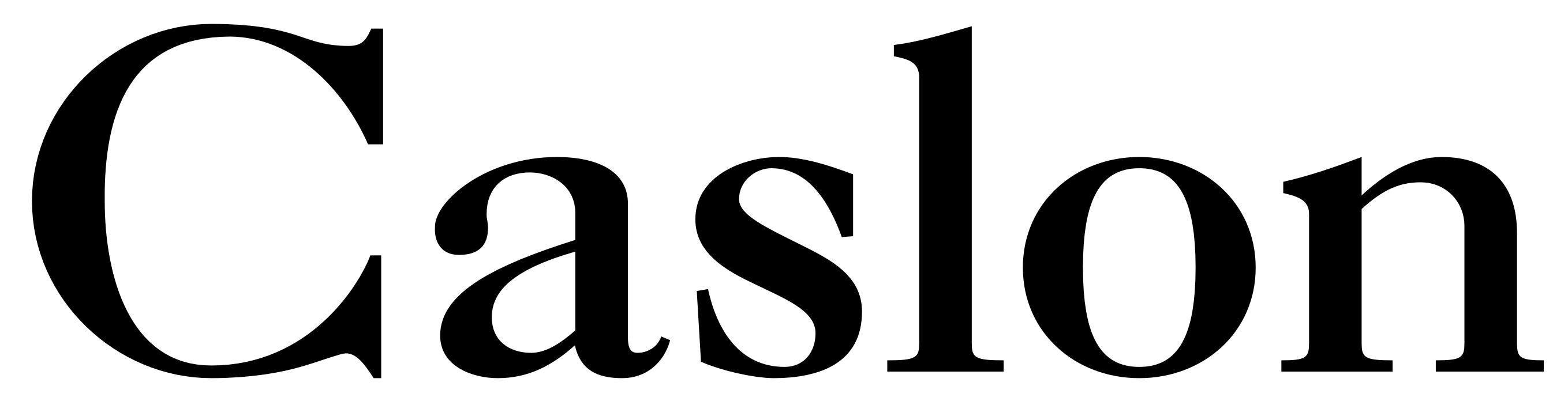
Caslon makes the 91-year-old Futura look like a scrappy upstart. The name references William Caslon, an engraver of 'punches' – or master templates used to create the moulds for metal type – who lived from 1692–1766.
Although it comes in several different varieties and modern revivals, the typeface known as Caslon retains the organic, Old Style look and feel that he established in the 18th century. Like Futura, Caslon was ahead of its time – in London, at least – drawing on imported Dutch Baroque typefaces for inspiration.
Known for timeless elegance and effortless readability across large passages of text, the Caslon typeface family briefly fell out of popularity during the early 19th century, but recovered and now lends 300 years of gravitas to books, journal articles, encyclopedias and more.
03. Garamond
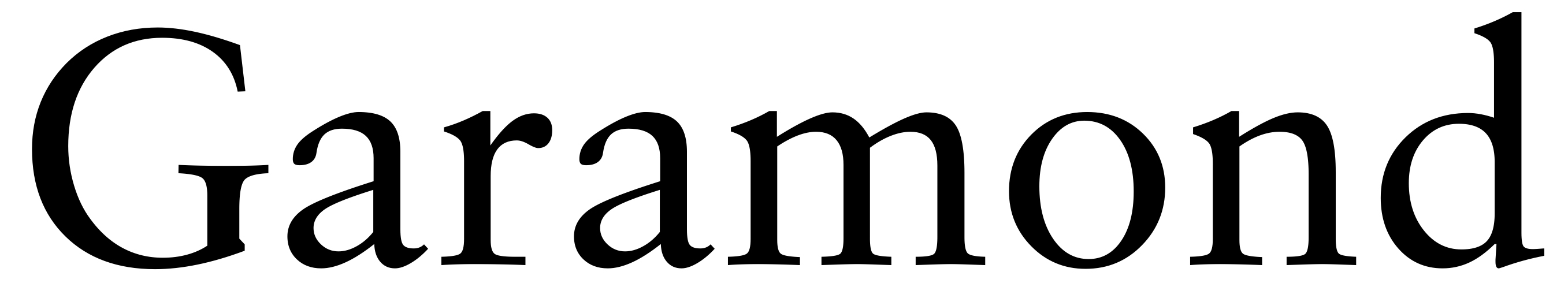
Another popular typeface for setting large passages of text in books, Garamond's heritage makes even the three-century-old Caslon look like a young whippersnapper. Like William Caslon, Parisian engraver Claude Garamond created punches for metal type, and first crafted the typeface that bears his name in the 16th century.
Its history can be traced back even further to 1495: the design follows the Old Style serif model originally established by Venetian printer Aldus Manutius, and designed by punchcutter Francesco Griffo. Both Garamond and Caslon maintain a natural, almost handwritten look and feel, but with a strong and timeless structure.
Many modern revivals of the typeface are inspired by the work of Garamond and his contemporaries in the early-modern French typography scene, such as Jean Jannon – and the family remains a viable choice for setting long-form text.
04. Clarendon
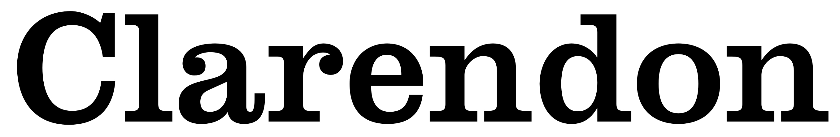
Slab serifs became particularly popular in British lettering, printing and signage during the early 19th century, so Clarendon was riding the wave of this trend on its release in 1845. Its original design was engraved by punch-cutter Benjamin Fox and credited to Robert Besley, a partner in the type foundry Thorowgood and Co.
Clarendon's popularity was such that its look and feel was widely imitated by other foundries – both at the time, and in the latter half of the 20th century – effectively spawning a sub-genre of type design in its own right.
Although the many different varieties of Clarendon have their own idiosyncrasies, the common factors are bold, solid letterforms with a relatively uniform stroke weight and bracketed, slightly tapered slab serifs. The typeface is popular to this day for display use, particularly for letterpress and woodblock printing work.
05. Akzidenz Grotesk
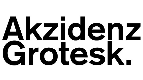
Love it or hate it, Helvetica has become the typeface that defined an entire generation of graphic designers that embraced mid-20th century Swiss design principles, otherwise known as the International Typographic Style. But Helvetica follows in the footsteps of Akzidenz Grotesk, the sans-serif family originally released by the Berlin-based Berthold Type Foundry.
Released in 1898, almost 50 years before Helvetica, Akzidenz Grotesk was part of a wave of overtly 'commercial' typefaces, intended for use in advertising and promotional materials to communicate, persuade and ultimately sell, rather than to decorate, or make reading easier.
Following the grotesque sans-serif tradition that Futura bucked against with its geometric approach, Akzidenz Grotesk became one of the leading exponents of late-19th century German typography. Simple, bold and neutral, and yet clearly distinct from its more widespread descendent Helvetica in characters such as 'Q', 'R' and 'J', it remains a classic sans-serif option 120 years on.
Related articles:
- 5 types of font and what to use them for
- 5 ways to pick the perfect app font
- Pick the right font for your social campaigns
Contributer : Creative Bloq

 Reviewed by mimisabreena
on
Friday, August 24, 2018
Rating:
Reviewed by mimisabreena
on
Friday, August 24, 2018
Rating:


No comments:
Post a Comment