


Improve your line work with these pro drawing tips
What I love about drawing is how you can capture the imagination. It’s the thing that keeps me fascinated. My speciality is hand-drawn illustration, and in particular, the creation of line work with dip pen and black Indian ink. In this workshop I’ll show how I create my own interpretation of Mephisto, the demonic antagonist in the German legend of Faust.
I start with an underdrawing, on to which the line work is inked. Through this process I emphasise anything that conveys the fantasy noir atmosphere of the tale, in particular the hard lighting.
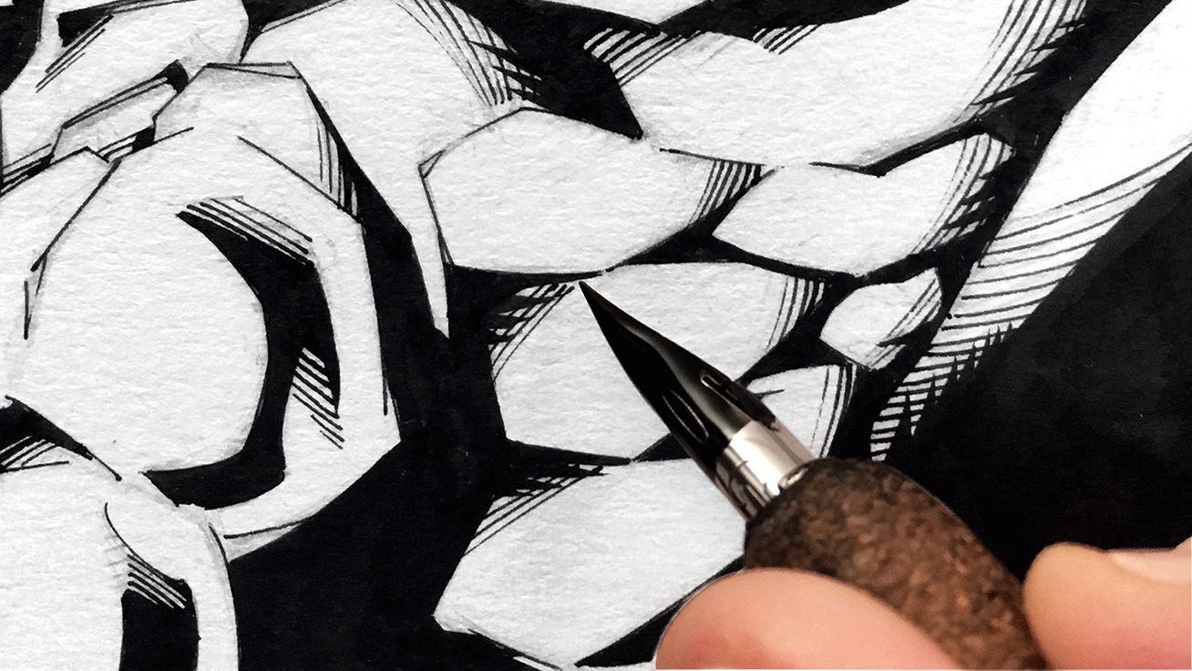
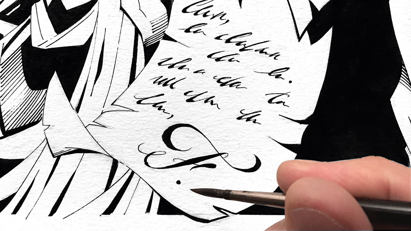
Unlike digital drawing, inking with a traditional dip pen only allows the draughtsman to push forward. It’s a live take with every mark of the pen. Every nib gives a different stroke, each responding differently to pressure and speed. With practise the range of lines that can be made with a single nib is enough to create compelling line work.
Materials
- Paper: Daler Rowney 160gsm fine grain cartridge paper (A3 size)
- Mark Making: Derwent Graphic pencils, F to 2H lead Cork tip penholder Steel G nib Winsor & Newton Series 7 brush, no. 2 Winsor & Newton Black Indian Ink
- Miscellanous: Soft putty eraser Raised edge ruler Inkwell Small dish of water to clean nib Lint-free cloth to wipe and dry nib Lightweight rolling paper to soak up blots Scalpel to scratch up unwanted ink marks
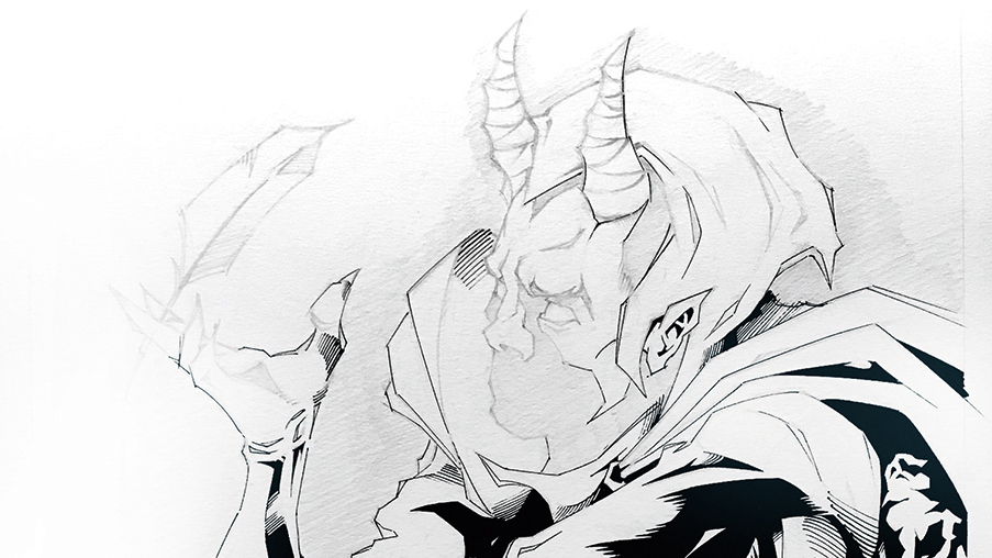
01. Pencilling the structure
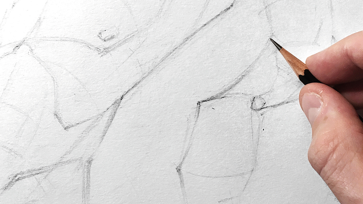
Marking lightly with an overhand grip, I map where the major elements fall on the page: gestural lines, blocks, cylinders, spheres, wedges, and in this case a few anatomical landmarks. Any compositional changes are made at this stage before moving forward. If any pencil lines need to be lifted, then I use a soft eraser to ensure that the paper isn’t distressed.
02. Lay in the figure
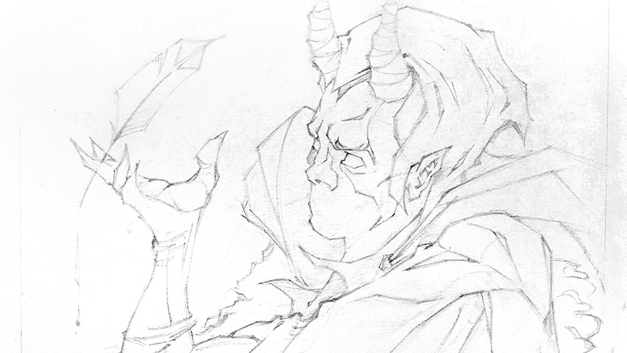
The blocks offer visual cues to lay in the drawing. Although good body language, anatomy and musculature are central in this piece, it’s more important to capture the main idea than perfect every single detail. To keep the paper intact I continue to work lightly with the pencil, especially when using a hard lead.
03. Light and shadow
I refine parts of the drawing, and with the light source in mind the shadow shapes can be mapped. This is an underdrawing, so the pencil values don’t matter. What does matter is deciding where to ink in full black, and how halftones and plane changes might be inked.
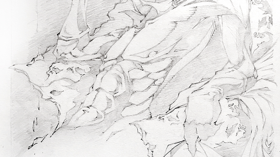
04. Ease in the ink
Inking with a dip pen requires precision and sensitivity. To warm up I begin on areas of the picture that aren’t critical. That means no facial details until I get into my stride. There are no golden rules with inking, but it’s always visible when an inker has found their rhythm.
05. Between the lines
Rather than following the pencil work, I interpret the underdrawing, as tracing often makes a picture lose vitality. For this reason I explore ways to improve on the original pencils, so the line work moves the image along.
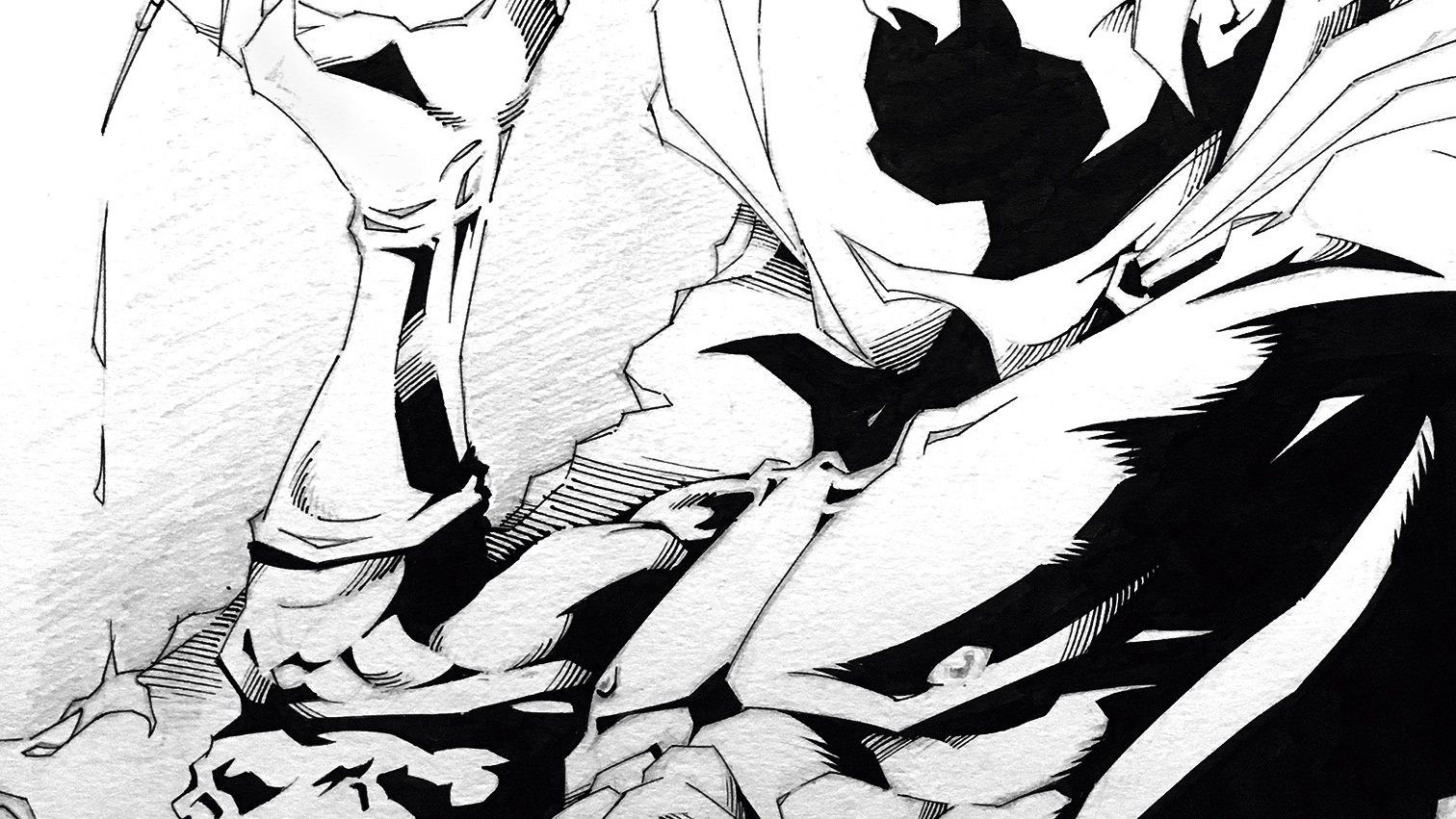
06. Balance is key
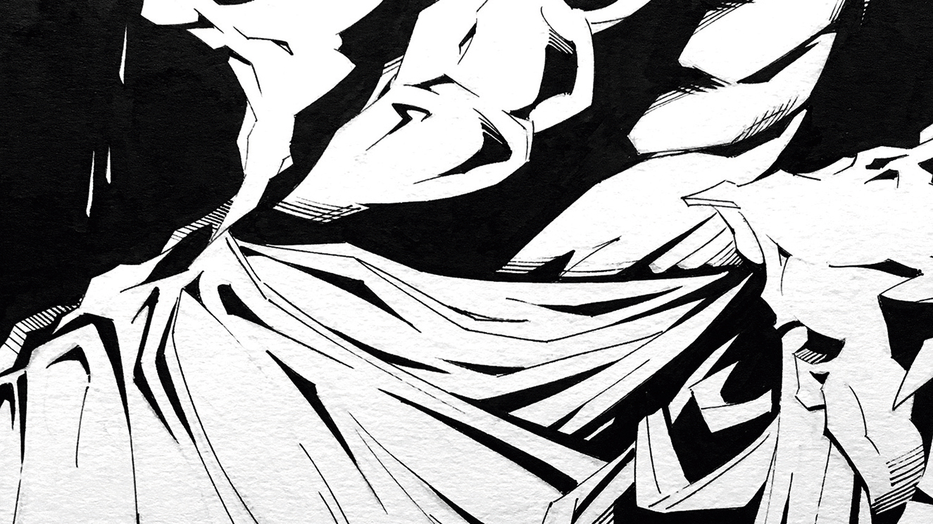
As the drawing finds its shape my attention shifts to balancing the image. When solid blacks and halftone hatching are evenly measured throughout, it brings cohesion to the picture as a whole. The same goes for different line weights and textures. These are all techniques that I use to pull the image together.
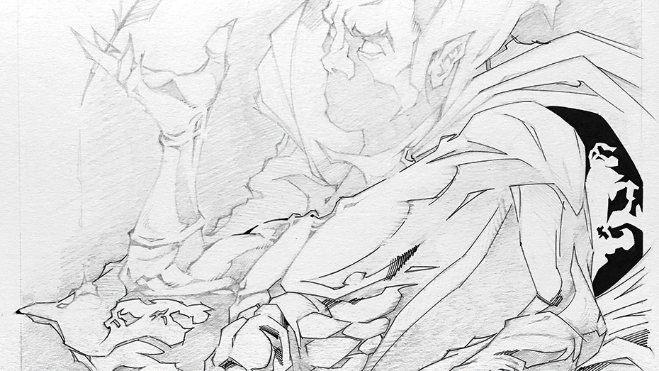
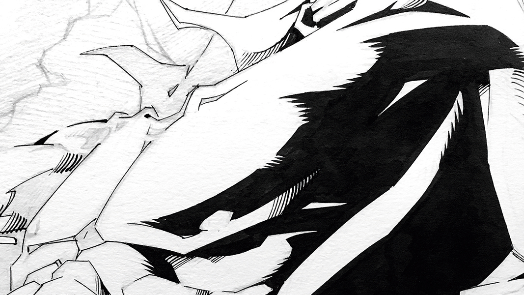
07. Filling areas with black
I spot any black areas by brush, planning the route to avoid tide marks. Many inkers prefer to leave all the black fills to the end. My own preference is to add them as I work through the drawing, so I can respond to the illustration as it emerges.
08. Adjustments on the fly
With the inks in place it becomes easier to assess what might benefit the artwork. The inking usually becomes more improvised beyond this stage, so it’s good to keep in mind what the aim is, and to keep the artwork legible.
09. It’s a grey area
Good hatching that flexes around the forms can help lead the eye through a picture. As a rule of thumb, if I want to cross-hatch I avoid intersecting at 90 degrees because this can look like a wire mesh. Overlaying lines of different weights is also preferable for the same reason.
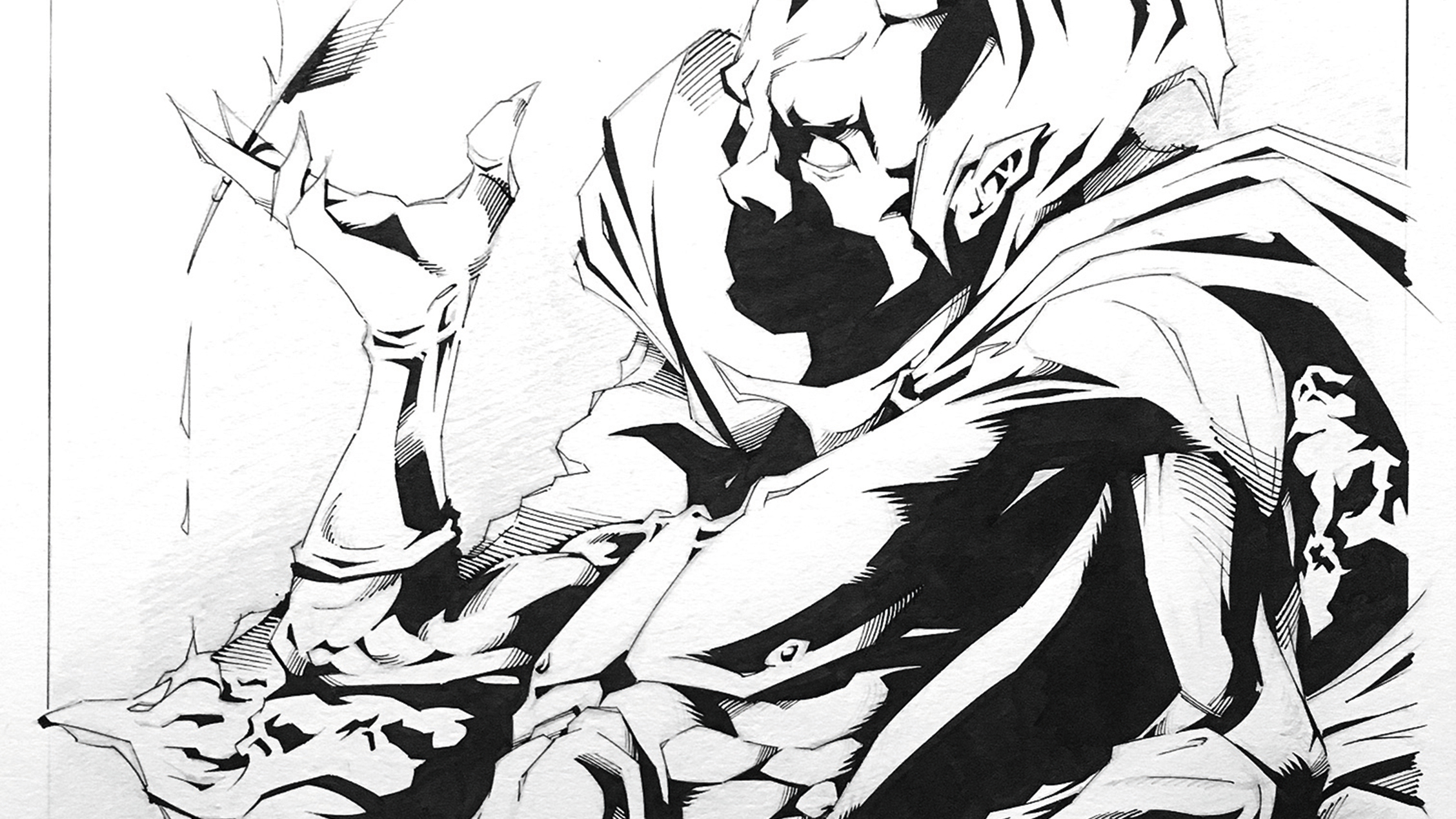
10. Taking one final pass
Before signing off the artwork, I like to take a look with fresh eyes. With so many details it’s easy to lose sight of the big picture, even when it’s right under your nose. Now I see that leaving the lower left of the picture clear doesn’t create the effect I’d hoped for. The solution doesn’t take long to appear.
11. Embrace the unexpected
As I mentioned before, visual balance is key, so when I realise that an area needs working up I let the ink dry and plan the next move. Using light pencil marks as in step one, I develop the area that needs attention. When I’m confident with the layout I go back in with ink, ensuring the line work remains consistent.
This article was originally published in issue 156 of ImagineFX, the world's best-selling magazine for digital artists. Buy issue 156 here or subscribe to ImagineFX here.
Related articles:
- How to draw: 95 tutorials for drawing animals, people, landscapes and more
- How to draw a dragon: 16 pro tips
- How to curate a creative portfolio
Contributer : Creative Bloq

 Reviewed by mimisabreena
on
Sunday, March 18, 2018
Rating:
Reviewed by mimisabreena
on
Sunday, March 18, 2018
Rating:


No comments:
Post a Comment