


The Top 10 Principles to Optimize Your Web Design for Mobile Users
It’s time for you to adapt to the latest marketing trends. Your company can no longer afford to ignore mobile users.
Your website must be optimized for mobile devices. Why?
Well, for starters, 80% of the top websites according to the Alexa rankings were optimized for mobile users. Plus, 80% of all Internet users have smartphones.
It’s easy for people to browse the Internet from their mobile devices. Doesn’t it seem like everyone is glued to their smartphones all the time?
Even those who aren’t holding their phones right now, I’m sure, have them within arm’s reach, either in their pockets, purses, or on nearby tables.
This is great news for your company and your website. Our love for mobile devices makes it easier for your current and prospective customers to access your site.
According to Statista, more than half of the global web traffic comes from mobile devices:
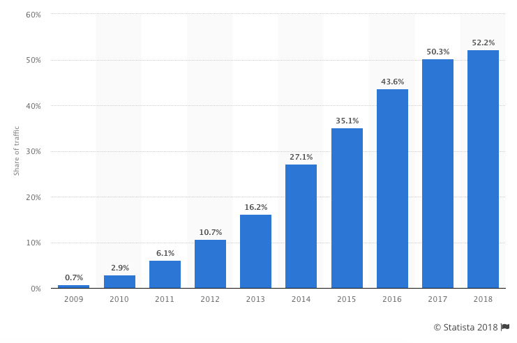
As you can see from this graph, this number continues to grow each year. I expect this trend to continue in the years to come.
This percentage is even higher in some areas of the world. For example, more than 65% of web traffic in Asia comes from mobile devices.
No matter what industry you’re in or where you’re located, your site needs to accommodate mobile users. How can you do this?
I’m here to explain the top principles of an effective mobile web design. If you can apply these concepts to your mobile site, you’ll benefit from an increase in traffic and more engaged users.
Ultimately, this will lead to higher conversion rates. Here are the top 10 tips you need to know.
1. Simplify your menus
Obviously, mobile screens are significantly smaller than laptop or desktop screens. Keep this in mind when designing your menu options.
The menu of your desktop site can be more extensive and have lots of options. But this complicates things on a smaller screen.
You don’t want visitors to have to scroll or zoom in and out to see all the navigation choices. Everything needs to be concise and fit on one screen.
Here’s a great example of this concept applied by Domino’s Pizza:
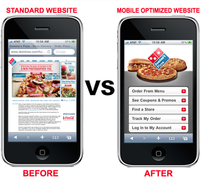
Take a look at what their standard website looked like on a mobile device before it was optimized. Navigation was nearly impossible.
Users had to zoom in to see the menu to find out how to proceed. If your mobile site is the same, it will crush your conversions.
But look at how simple this menu is on a mobile-optimized site. Dominos was able to simplify its entire website into five menu options.
Each option fits on the screen and has a clear destination. Evaluate your current website, and try to simplify the menu options for mobile users.
2. Keep forms as short as possible
Think about all the different forms you have on your website. If you’re asking the visitor for a lot of information, it’s not an effective approach.
Instead, you should change the design to keep your forms short.
Again, if someone is filling out a form on their computer, it’s not as big of an issue because it’s easier to type and navigate on a larger screen. But this isn’t the case with smartphones and tablets.
Evaluate your forms, and ask yourself whether you need each line.
For example, if you’re trying to get users to subscribe to your email list, you don’t need their home addresses and phone numbers.
Forms designed for buying conversions shouldn’t ask the user what their favorite color is. Get their billing and shipping info, and end it.
In fact, a long and complicated checkout process is one of the top reasons for shopping cart abandonment:
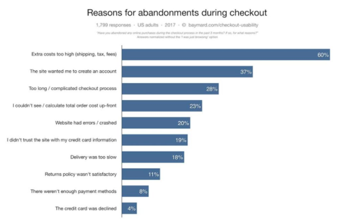
If you want to reduce shopping cart abandonment rates from mobile devices, you’ll need to change the design of your mobile website forms.
3. Clearly display your CTAs
Let’s continue talking about conversions. To have an effective mobile web design, your call-to-action buttons need to be obvious.
Since we’re dealing with a smaller screen here, you don’t want to overwhelm the user by trying to squeeze more than one CTA on the screen.
Think about your goal for each landing page. Are you trying to get downloads? New subscribers? Increase social media presence? Get visitors to buy something?
Your CTA needs to focus on that primary goal.
Focusing your attention on your CTA buttons will give you an edge over your competitors. That’s because 53% of websites have call-to-action buttons that take users more than three seconds to identify.
That’s far too long. Your CTA should be easy to spot in just one or maximum two seconds.
4. Include a search function
This design principle relates back to what I previously said about your menu options. Right now, some of you may have a menu with 20 or 30 different options.
It may seem impossible to try to simplify those options to fit on just one page. Well, it can be done, especially if you add a search bar to your mobile site.
Encouraging users to search for what they want reduces the need for you to rely on a large and complex menu. Too many options will confuse the visitor and kill your conversions.
This feature for sure needs to be incorporated into the web design of ecommerce sites. Let’s take a look at the home screen of an industry giant Amazon:
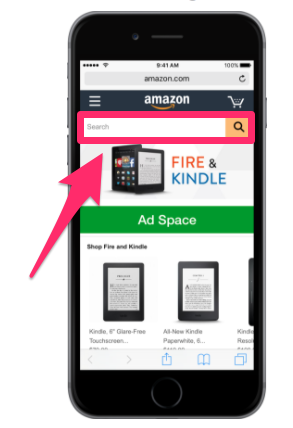
Amazon sells over 12 million products. Take a minute to let that number sink in. I’m willing to bet your website doesn’t sell nearly as many products.
I’m not saying this to make you feel bad. But I want you to realize that if Amazon can use a search bar to help mobile users browse through millions of items, your company shouldn’t have any issues applying the same concept for hundreds or thousands of products.
Implement a search bar to simplify your design and make it easy for mobile users to find exactly what they’re looking for.
5. Make customer service easily accessible
No matter how much time and effort you put into simplifying your mobile web design, people will still have issues.
Don’t worry, it’s all part of running a successful business and website. But the key here is being able to quickly and effectively help your mobile site visitors work through their problems.
Make sure you’ve got obvious customer support information on your mobile site.
Provide your phone number, email address, and social media profiles. Display anything that gives the user an option to contact a representative from your company as fast as possible.
Put yourself in the shoes of a frustrated mobile user who has a question or problem. If they can’t get help from your customer service team, it’ll leave them with a bad impression of your company.
Adding obvious customer support information to your mobile web design is something that can’t go overlooked.
6. Size matters
Navigating a website from a desktop or laptop computer is simple. It’s easy to control a cursor from a mouse or keypad.
But browsing with your thumbs on a 4-inch screen isn’t as easy. Keep this in mind when laying out different elements of your mobile site.
Buttons need to be large enough to be tapped with a finger. Make sure you keep enough space between buttons so someone doesn’t accidentally click the wrong one.
Having to tap the same button several times to make it work will frustrate mobile users visiting your website.
You also need to keep in mind the placement of clickable items on the screen:
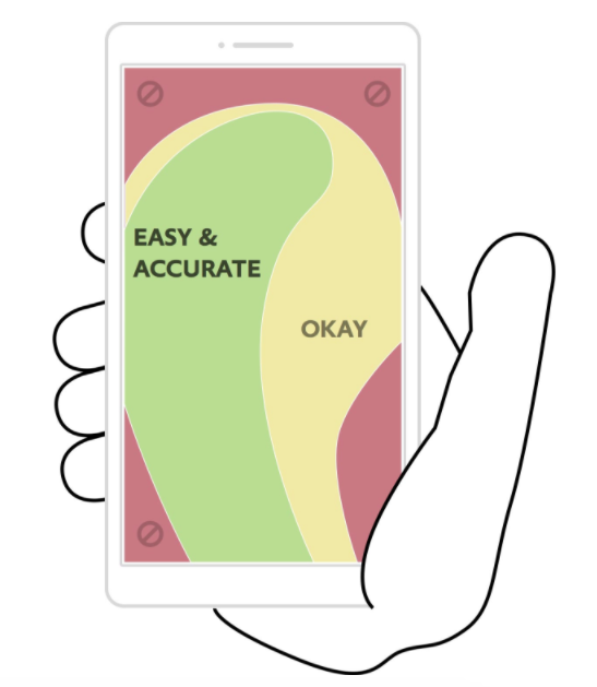
Keep in mind 75% of smartphone users use their thumbs to tap on the screen.
This image shows you the best location on the screen to place buttons. Avoid the corners: it’s hard for a person to reach those places with their thumb while holding a mobile device.
The reach decreases further as the screen size becomes larger. It’s in your best interest to place the most important elements and clickable buttons toward the middle of the screen.
7. Eliminate pop-ups
Get rid of pop-ups on your mobile site. For the most part, people don’t like pop-ups as it is. They are annoying and hinder the user experience.
The problem with pop-ups on mobile devices is they become even more of a nuisance because they are so difficult to close.
Recall that people use their thumbs to tap on small screens. The small “X” button to close a pop-up will be so small on a mobile device that users won’t be able to close the window.
They might even accidentally click on the ad while trying to close it. They’ll get brought to a new landing page, which will ruin their experience.
Sometimes users will try to zoom in on the close button to make it easier to tap, but then the dimensions of the screen get messed up as well.
It’s best to remove these pop-ups altogether. Come up with other ways to promote whatever your pop-up is advertising.
8. Avoid large blocks of text
Reduce the amount of text on the screen of your mobile website. Obviously, you’ll need to use some words to communicate with your visitors, but keep sentences and paragraphs as short as possible.
Large blocks of text are overwhelming and difficult to read. Remember, if a paragraph is two lines long on your desktop site, it might be six lines long on a smartphone.
Take a look at how typography affects conversions:
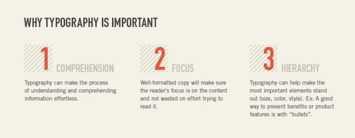
Keep these three elements in mind whenever you’re adding text to your mobile site.
Can the visitor comprehend your message? Where is their point of focus? What is the visual hierarchy?
Eliminating large blocks of text makes this possible.
9. Choose the right font
Let’s continue talking about the text on your mobile site. Picking the right font is a crucial design principle as well.
Fonts need to be clear and easy to read. But you can also use fonts to set two lines of text apart.
You don’t want the text of one line to run into the text of another.
For example, you could use all capital letters and bold font for the headline of a section. Then use regular capitalization rules and non-bold font for the line underneath to show a clear separation.
You’ve got a small space to work with, so you can’t rely on a page break or image every time you want to separate text.
10. Prioritize speed
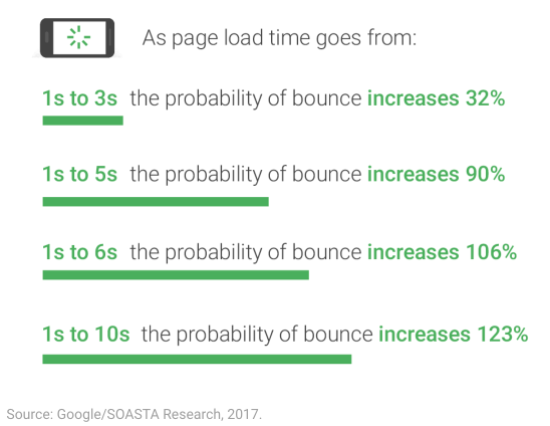
No matter what changes you implement on your mobile website, you need to keep its speed in mind.
Research shows that 53% of people will abandon a mobile website that takes more than three seconds to load. Take a look at how these bounce rates increase with increasing page loading times:
The best way to keep your page loading time as low as possible is by simplifying your design.
Fortunately, if you follow all the other principles I’ve outlined so far, this shouldn’t be an issue.
Eliminate unnecessary heavy images and flashing lights. Simple websites load faster and have higher conversion rates.
Conclusion
Your website needs to be optimized for mobile users. To do this effectively, you need to understand some important design principles.
Simplify your menu choices, and keep forms short. Make sure your CTAs are clearly displayed, and stick to one CTA per page.
Add a search bar to help improve navigation while clearing up space on the screen. You should make it easy for mobile users to contact your customer service team.
Realize that people are using their thumbs to tap on the screen, so buttons need to be sized accordingly. Get rid of pop-ups as well.
Carefully select an appropriate font that’s easy to read. Eliminate large blocks of text on the screen.
No matter what, make sure your mobile site loads as fast as possible.
Follow these top 10 mobile design principles to maximize conversions on your mobile website.
What design elements need to be changed on your mobile website?
COntributer : Quick Sprout https://ift.tt/2EdVtlB

 Reviewed by mimisabreena
on
Monday, April 02, 2018
Rating:
Reviewed by mimisabreena
on
Monday, April 02, 2018
Rating:


No comments:
Post a Comment