


36 perfect font pairings
Finding font pairings that set each other off, don't fight the eye for attention, and harmonise without becoming homogenous and dull is an art. The age-old rule goes: concord or contrast, but don't conflict.
But with so many professional typefaces and free fonts to choose from, how do you find two that work in harmony? Read on for our pick of the best font pairings – or jump to the end of page 2 for some top tips on finding your own. If you need to brush up on your typography knowledge, take a look at our guide to the different font types you should know.
01. Calvert and Acumin
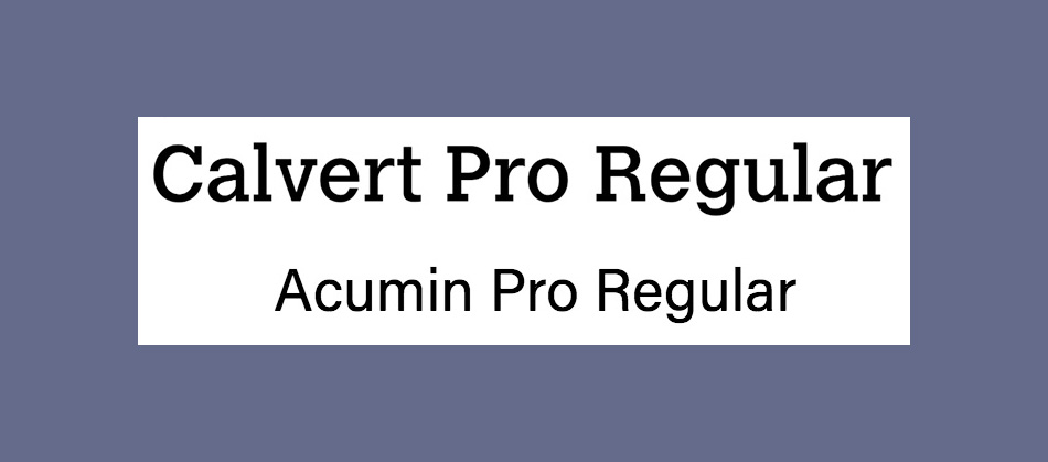
Calvert is a punchy slab serif from Monotype, named after its creator Margaret Calvert. It comes in six styles: Calvert Pro and Standard, each with Light, Regular and Bold variants. For an ideal font pairing, try sans-serif Acumin. This typeface comprises a massive 90 different fonts (still confused about the difference? See our explanation of font vs typeface). It has been designed by Robert Slimbach as part of the Adobe Originals initiative, and to access it you'll need a Creative Cloud subscription.
02. Montserrat and Courier New
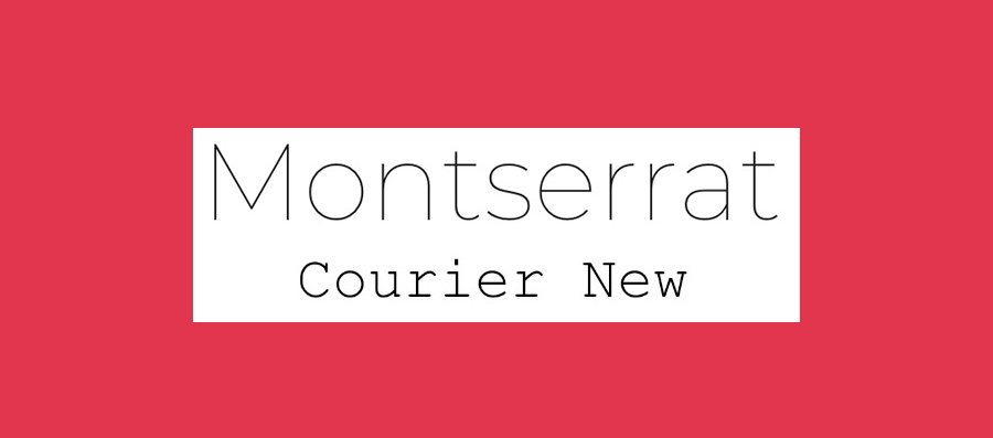
Google Font Montserrat was designed specifically for use online, while Courier New is a classic typewriter font. On paper (metaphorically), you might not think they'd make the ideal font pairing, but you'd be wrong. Montserrat's light, modern sans-serif letterforms offset Courier New's heavier, retro vibe perfectly.
03. Skolar Latin and Proxima Nova
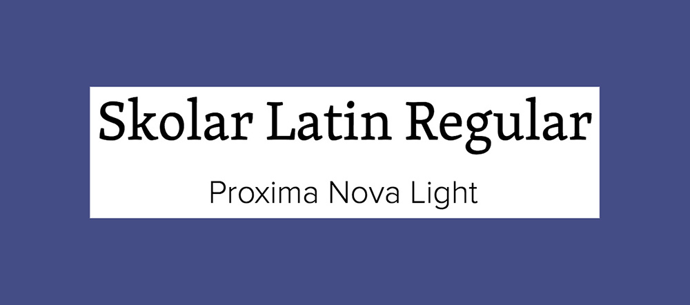
Skolar's type foundry, Rosetta, describes it as "a typeface for complex typography". To back that up, it boasts a vast character set, and comes in Latin, Cyrillic, Greek, Devangari and Gujarati scripts. The typface itself sports low contrast, a relatively large x-height and robust serifs, which means it remains legible even when used at small sizes. Our font pairing is popular web font Proxima Nova. This was designed, by Mark Simonson, to mix modern proportions with a geometric appearance.
04. Alegreya Sans SC and Source Sans Pro
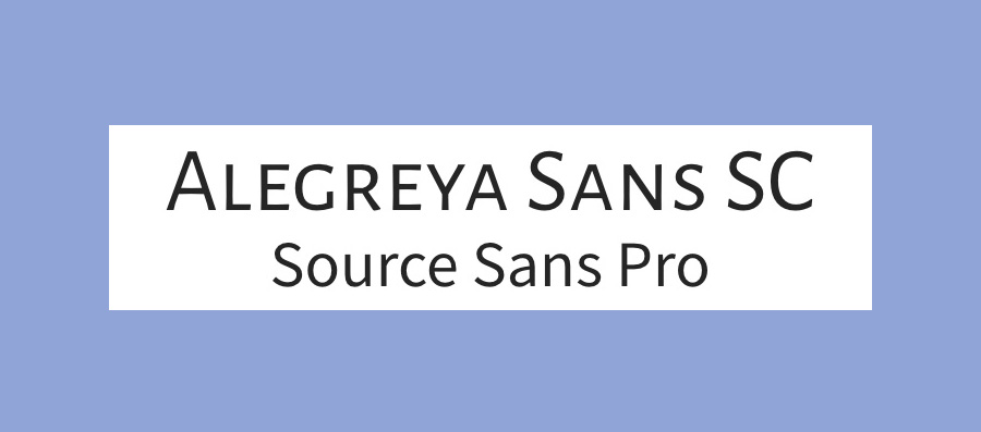
Alegreya is a super-family that includes sans and serif sister families alongside this small caps version, designed by Juan Pablo del Peral for Huerta Tipográfica. The family has a slightly calligraphic edge, and is designed to be suitable for long blocks of text. However, the small caps variant is best suited to headers. We suggest pairing it with Source Sans Pro, Adobe's first open source typeface family, designed by Paul D. Hunt.
05. Pacifico and Quicksand
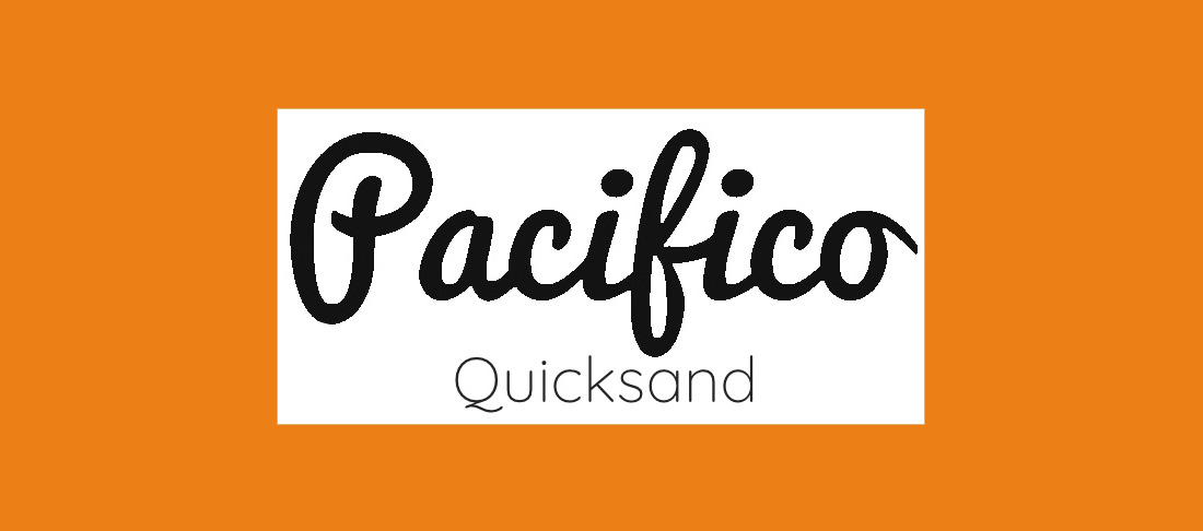
For a delightful font pairing with an unintentionally tropical theme, try Pacifico and Quicksand. The former is a pleasingly free and flamboyant brush font that's ideal for use in headings. The latter is a sans-serif with rounded terminals and some quirky touches – including that distinctive descender on the uppercase 'Q'. Quicksand was actually also designed as a display typeface, but it's clear enough to work well at small sizes, too.
06. Julius Sans One and Archive Narrow
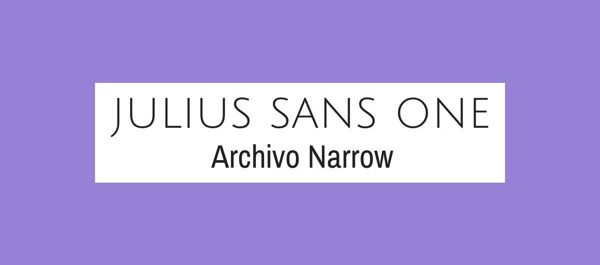
If you're aiming for a professional look, this is a great font pairing to try. Julius Sans One works only comes in one weight and is an all-caps font, but it's a top choice for a display font, with its fine stroke and broader baseline. The more geometric Archivo Narrow is a perfect match. It has been designed to work equally well in print and digital.
07. Playfair Display and Raleway
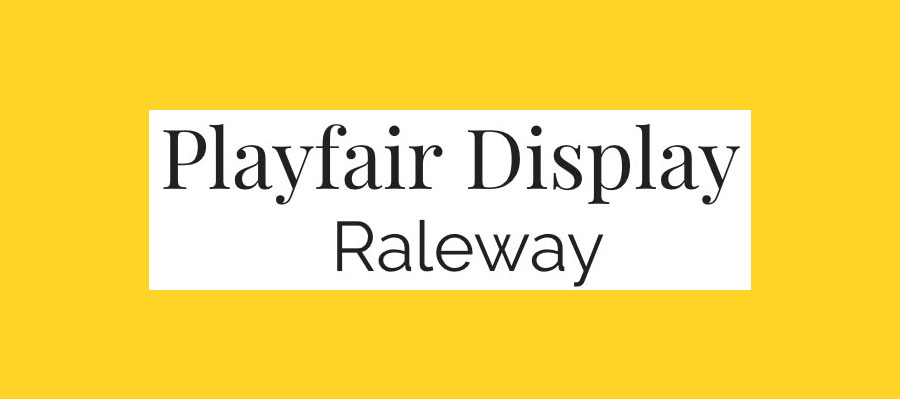
Display font Playfair draws inspiration from the period in the 18th century when quills were being replaced by pointed steel pens. This, alongside printing developments, led to high-contrast letterforms with delicate hairlines becoming popular. Elegant sans serif Raleway makes a perfect font pairing.
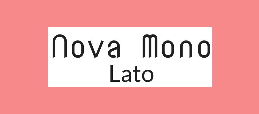
08. Oswald and Lato
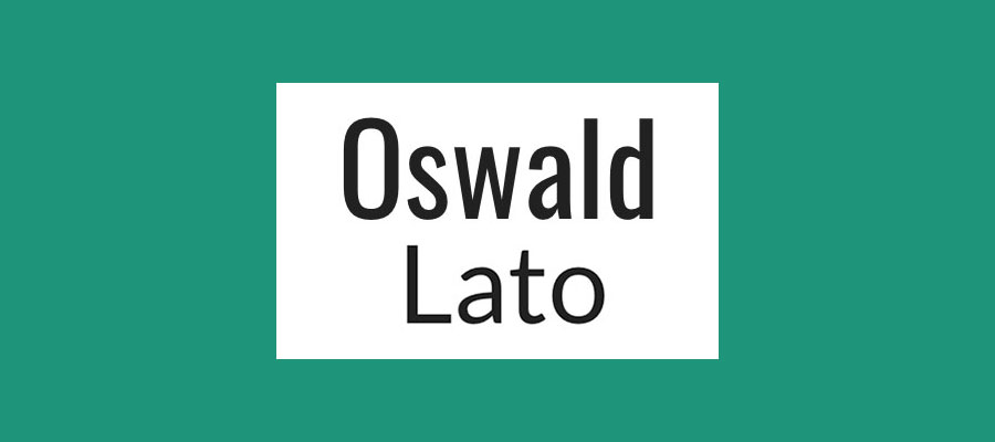
Oswald was launched in 2011 as a reworking of the 'Alternate Gothic' sans-serif type style. It makes a great pairing with Lato (which translates as 'summer' in Polish), a warm yet stable sans serif. Both are available in a range of different weights and variants, making this font pairing nice and versatile.
09. Super Grotesk and Minion Pro
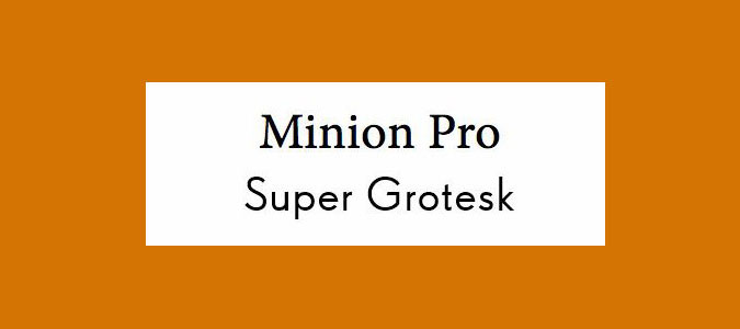
The ever-popular serifed Minion Pro works perfectly as a headline font when coupled with the nimble sans-serif Super Grotesk for body copy. Together, these fonts create a modern sense of effortless elegance.
10. Libre Franklin and Libre Baskerville
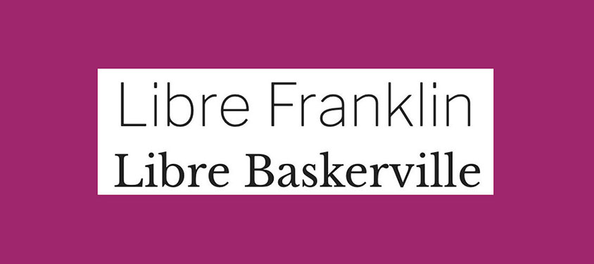
These two libre typefaces make a great font pairing if you're after a traditional feel. Both Libre Baskerville and Libre Franklin have been optimised for use on screen. The former is nice and readable, so ideal for use as body text, while the latter is better suited to headlines. Nine different weight options make it nice and versatile.
11. Freight Sans and Freight Text
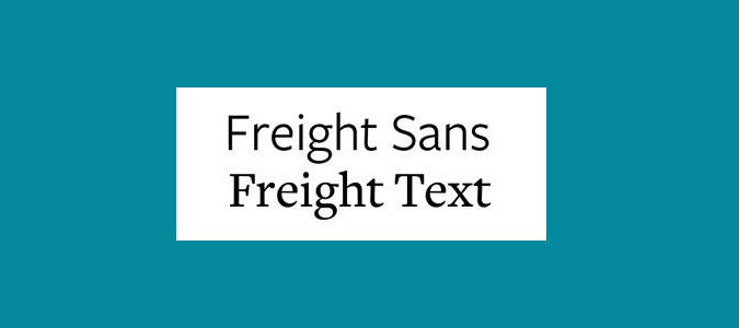
Working within superfamilies makes it easy to find harmonious font pairings. GarageFonts' Freight is a great example. It's available in a large range of weights and styles, including Sans, Text, Display and Micro versions – giving you a versatile typographic toolkit to work with.
12. Kaufmann and NeutraDemi
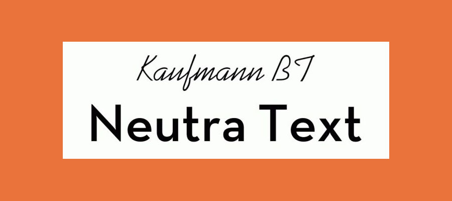
If you're after something more unexpected, how about this duo? The flowing stylings of Kaufmann add a touch of handwritten flair to this odd couple, and offset the straight and angular sans-serifed NeutraDemi perfectly. This font pairing might not be the most obvious match, but that doesn't stop them playing off one another beautifully.
13. Brandon Grotesque and Minion Pro
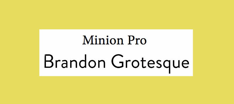
Due to its versatility, the reliable Minion Pro appears a few times in this list. This time it's playing second fiddle to the bold and attention-grabbing Brandon Grotesque. This is a classic serif and sans-serif font pairing, with both typefaces remaining crisp and easy to scan in any page layout.
14. Josefin Slab and Patrick Hand
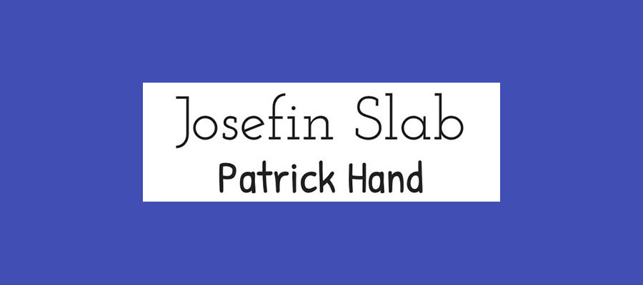
When creating Josefin Slab, designer Santiago Orozco wanted something between Kabel and Memphis, but with modern details. The final typeface has distinctive, typewriter-style details, and is ideal for use in headlines. Combine it with body copy in Patrick Hand for a font pairing packed with character. The latter, based on the designer's own handwriting, has a neat, friendly vibe.
15. Helvetica Neue and Garamond
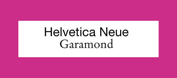
This is a famously harmonious duo, combining ubiquitous Neo-Grotesque sans serif Helvetica Neue for headlines with the classic Old Style serif Garamond for text. Mix up different weights and sizes between the two neutral families to establish hierarchy within your designs.
16. Caslon and Myriad
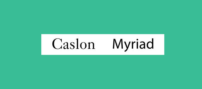
Another classic font pairing, this time between an 18th century Old Style serif and a late-20th century Humanist sans serif. Myriad is famously used in Apple's corporate communication, as well as in the Rolls Royce logo.
17. Nova Mono and Lato
Nova Mono is only available in one style, but that style is ideal for making a statement. Pair it with versatile sans serif Lato to stop things getting too crazy. Lato designer Łukasz Dziedzic wanted something that was nice and clear at small sizes (as we'd suggest using it within in this font pairing), but revealed some stylised effects when used larger.
18. Fontin and Fontin Sans
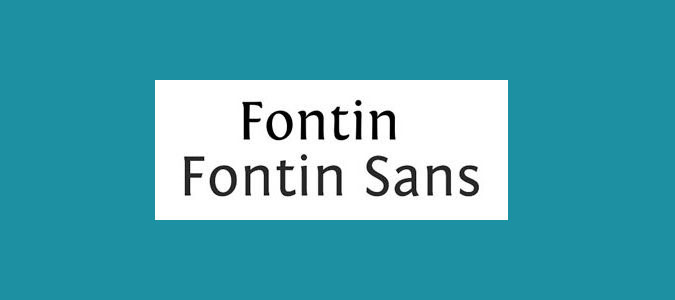
Time for another superfamily, this time from Dutch foundry exljbris. Fontin has been designed specifically for use at small sizes, and features loose spacing and a tall x-height. Fontin Sans makes an ideal partner for it.
19. Minion and Poppl-Laudatio
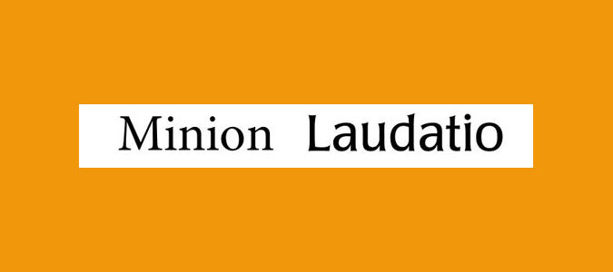
Two typefaces both have plenty of personality, but bond perfectly. An Old Style serif typeface, Minion was designed in 1990 but inspired by late Renaissance-era type. Although technically a sans-serif, Poppl-Laudatio's subtle flared details give it a quirky edge.
20. Liberation Serif and Liberation Sans
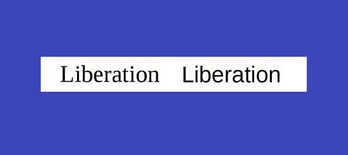
Superfamily Liberation was intended as an open-source substitute for many commonly used Windows fonts, such as Arial, Times New Roman and Courier New. The Serif and Sans versions make a smart font pairing, but there are also other variations to play around with, including Sans Narrow and Mono.
21. Trade Gothic Bold and Sabon

This pairing is particularly effective when Trade Gothic is used in its Bold weight for headlines, to set off Jan Tschichold's classic Old Style serif face for text. Both typefaces are highly readable, with a tall x-height, and combine well together to give a pleasing effect.
Next page: More perfect font pairings to explore
22. Gilroy and Jura
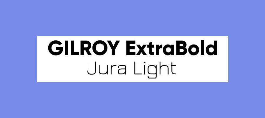
This pair of sans serifs pair nicely to create a trendy, industrial look. Gilroy's geometric style in ExtraBold weight is ideal for headers, while Jura Light has a wiry, structured shape that offsets it nicely. The combination is ideal for adding a strong, technical feel to your creative projects.
23. Orpheus Pro and Twentieth Century
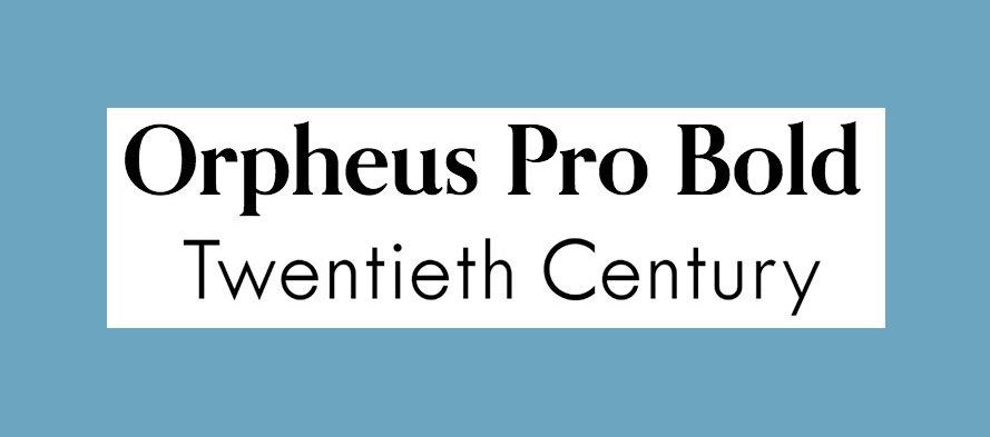
As we enter another '20s, how about looking back at the 1920s with this typeface from designer Sol Hess for Monotype? The typeface has an eye-catching Art Deco vibe (it's subtle here, but the glamour really gets amped up in the Twentieth Century Std Poster MT variant). Our pick for a perfect type pairing is Orpheus Pro from Canada Type. This typeface was planned as a new version of Walter Tiemann's Orpheus and its italic companion font Euphorion, but ended up being much more elaborate – if you're using it for display purposes, there are plenty of extensions, alternates, swashes, and ligatures to explore.
24. Playfair Display and Source Sans Pro
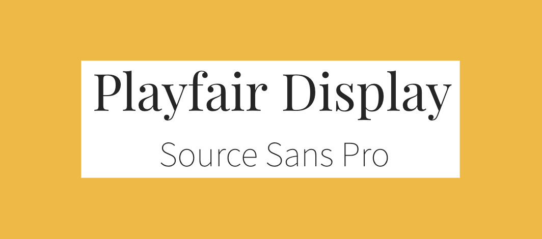
Dedicated display typeface Playfair Display sports high-contrast that exude old-fashioned charm. Source Sans Pro is a modern sans-serif designed specifically for use in user interfaces. Together, they make a perfect pairing of old and new, with the understated Source Sans Pro letting Playfair Display really shine.
25. Scala and Scala Sans
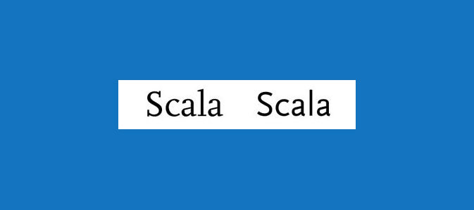
FontFont's superfamily Scala started with a serif version in 1990, followed in 92 by its sans serif companion. With small caps, various ligatures and old-style figures, this family is hugely versatile and widely used in publishing.
26. Bebas Neue and Montserrat Light
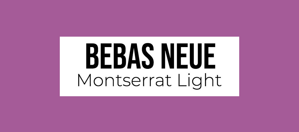
Its clean, condensed letterforms make Bebas Neue an excellent choice for headlines. It's free to download and open source – so you can edit it to your own particular needs through the GitHub repo, if you have the desire and skills to do so. Montserrat offers a nice contrast; especially the Light version.
27. Rockwell Bold and Bembo
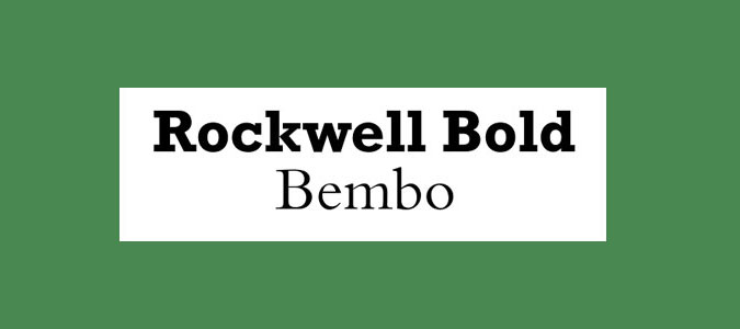
One of the classic slab serifs, Rockwell was designed in the 1930s and has a huge amount of personality and attention-grabbing potential when used bold. The much more conservative serif Bembo is neutral but versatile, making for a perfectly contrasting font pairing.
28. Myriad Black and Minion

Myriad and Minion have already cropped up in different font pairings elsewhere in this list, but this combination is definitely worth a look. The shouty, ultra-bold Black version of the former and the text weight of the latter can help you create a clear hierarchy in your designs.
29. Souvenir and Futura Bold
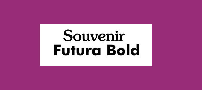
Mixing two strong typographic personalities rarely works, as they end up fighting. However, this is an exception. Souvenir is softer and more playful than many of its Old Style serif counterparts, while Futura Bold is quirky without being too dominant.
30. Dax Bold and Caslon
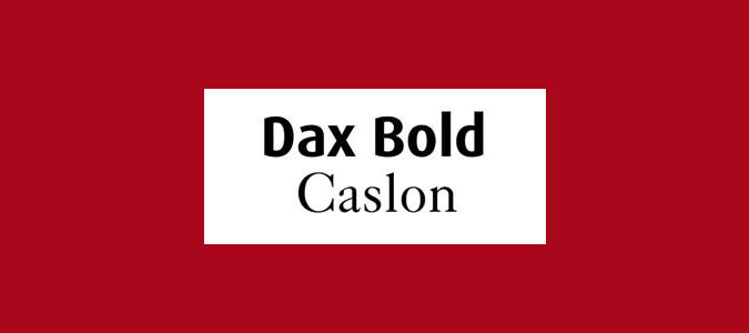
One of the most versatile Old Style serifs, Caslon has also appeared elsewhere on this list. Its neutrality plays off against the informal, modern Dax Bold, enabling the latter to deliver its strong personality. Dax Bold is a great choice for a headline, and the understated Caslon won't compete for attention.
31. Roboto and Montserrat

These two simple sans-serif typefaces make for a clean and modern font pairing. Roboto combines geometric forms with friendly, open curves, and has been designed to offer a natural reading rhythm. Montserrat – named after designer Julieta Ulanovsky's neighbourhood in Buenos Aires – is currently being developed into an extended family, which will give you more type pairing options to play around with.
32. Antique Olive Bold and Chaparral
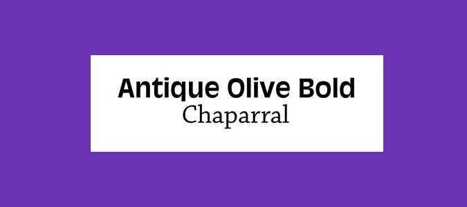
Initially designed as an alternative to Helvetica and Univers, Antique Olive has a very tall x-height with short ascenders and descenders, which make it highly distinctive in display form. Chaparral has a modern feeling but is a much more neutral slab serif. The two together work in perfect harmony.
33. Aviano and Aviano Sans
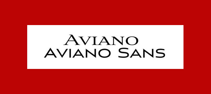
Only available in all-caps varieties, Aviano has sharp, edgy serifs that give it a distinctive personality. Its sans-serif variant is smoother. Combine these two tilting typefaces together to create create hierarchy in your designs.
34. TheSerif and TheSans
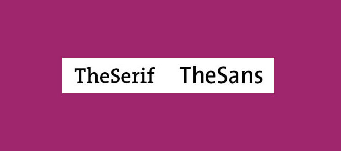
The rather straightforward naming strategy within LucasFonts’ Thesis typeface superfamily makes the foundry's intentions pretty clear. These two variants are totally complementary, and each comes with its own sub-varieties.
35. Renault Light and Apex-New

An ideal font pairing for formal or corporate use. Both Renault and Apex-New have a very similar ratio of x-height to body height for an effortless partnership between contemporary sans serif and authoritative serif.
36. Calluna and Calluna Sans
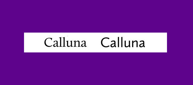
An exljbris creation, Calluna was born out of an experiment in adding slab serifs to Museo, giving designer Jos Buivenga the idea of 'serifs with direction'. The result is a highly distinctive text face that later spawned a sans-serif companion.
Top tips for perfect font pairs
Tip 1: Use font superfamilies
The easiest way to find perfect font pairings is by using different fonts within the same overarching typeface family. Find a so-called 'superfamily' and you'll have a ready-made range of weights, styles and classifications that are specifically designed to work together.
A good superfamily will include serif and a sans-serif version of the same typeface: famous examples include Lucida/Lucida Sans and Meta/Meta Sans.
Tip 2: Pair contrasting typefaces
Contrast, as the name implies, is about finding totally different – but still complementary – typefaces that are each fit for their intended application. Traditionally, this involves pairing a serif with a sans serif.
Typefaces will generally conflict if they are too similar: two ever-so-slightly different serifs or sans serifs rarely create nice font pairings.
As a designer, the important thing is to establish a clear hierarchy. This could be as simple as varying the size and weight of the same typeface – but where the typeface varies, careful font pairing is crucial. If you have a display face packed with unique personality, you'll need something more neutral to do the hard work.
Tip 3: Pair type sub-categories
Of course, 'serif' and 'sans serif' are themselves broad classifications – each split into several sub-categories. Generally speaking, Old Style serifs such as Bembo, Caslon and Garamond will combine well with Humanist sans serifs, such as Gill Sans and Lucida Grande.
Meanwhile, Transitional serifs have a stronger contrast between thick and thin strokes – examples include Bookman, Mrs. Eaves, Perpetua and Times. These pair with Geometric sans serifs such as Avant Garde, Avenir, Century Gothic, Eurostile, Futura and Univers.
Finally, Modern serifs have an often very dramatic contrast between thick and thin for a more pronounced, stylised effect, as well as a larger x-height. Included in this third sub-category are Bodoni, Didot, New Century Schoolbook and Walbaum. Again, Geometric sans serifs marry best with these.
So what does all this actually look like in practice? Here's our reference list of tried-and-testing font pairings that are guaranteed to avoid conflict.
Related articles:
- The fonts every graphic designer should own
- How to create your own font
- 5 fonts we love to hate (but maybe shouldn't)
Contributer : Creative Bloq

 Reviewed by mimisabreena
on
Monday, January 13, 2020
Rating:
Reviewed by mimisabreena
on
Monday, January 13, 2020
Rating:


No comments:
Post a Comment