Design a playable avatar for a video game
For this Photoshop tutorial, I’ll be creating a playable human, female video game character for a fighting, action genre. I love video game heroes, because there’s such variety in what the player can be. There’s often a huge range in styles and personalities that the player may adopt, once they’ve got the game up and running.
When they choose a character, they’re surrendering themselves to the quest of the hero. When I say hero, I don’t mean the player’s a protagonist or antagonist. I’m referring to the avatar the player experiences the rest of the game through. This is one of the most fascinating parts of video games: placing the player in an unfamiliar situation and seeing how they react.
Designing player avatars is a unique process that’s different from designing other non-playing characters, simply because the avatar’s personality, actions and appearance affect their ability to make the player interested in taking on their role. In a sense you’re creating the boundaries that the player must adopt, ultimately embracing these limits by the end of the game.
01. Setting boundaries
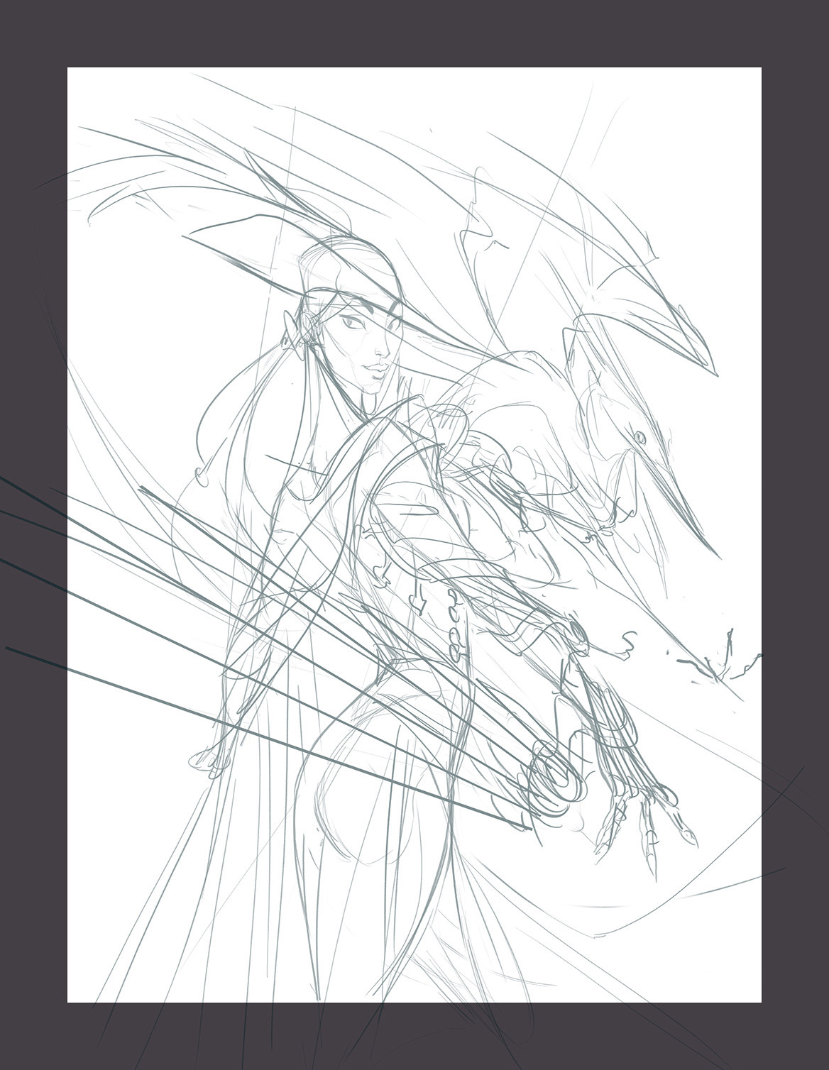
This is often the hardest step for me. Without the rest of the game to show anyone, a single character provides a lot of information about the world I’m trying to create, so first impressions are key. Some boundaries from the assignment are that she be a young, female character with a fantasy-steampunk edge, and she has a pet.
02. Creating a theme
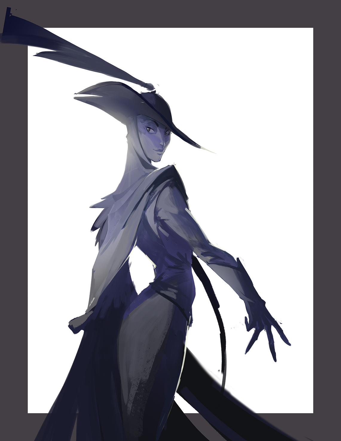
I end up with a dark character wearing a wide-brim hat, and a pet that looks like a bird. Now that I have a loose idea of the pet, I want to design the costume to reflect the animal. A lot of this idea comes from theming around her weapon, which I need to start drawing!
03. Setting the tone of the figure
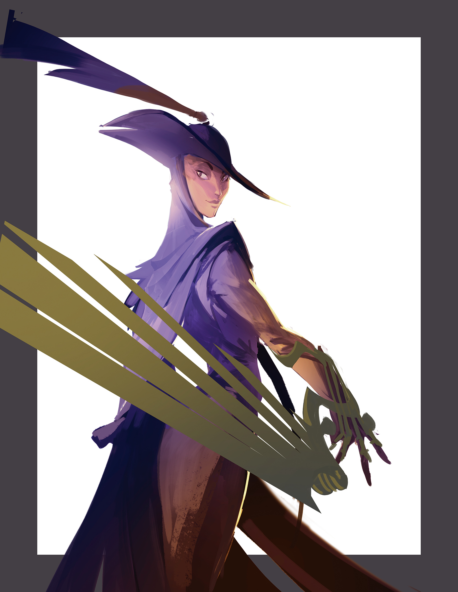
I want the character to be dark and mysterious, with a sense of flair. Having the wing in the foreground will be important for my composition to show it off. At first I approach it with her back turned towards the viewer, looking nonchalant and confident, and maybe a little guarded with that wing in front of her. I also block in some colours that could fit her character.
Pro tip: A lot of my drawings start with a strong gesture or clear line of action. If I create any more lines of action, I want to make sure they work in concert with one another, and don’t overpower each other. I want a sense of movement in my work: keeping my gestures simple and strong is how I try to achieve this.
04. Designing her companion
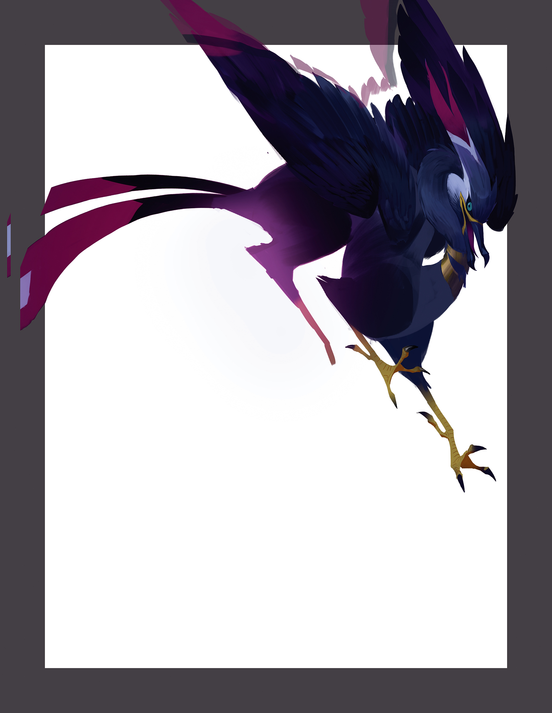
The character is like a superhero who bases their costume on an animal, so what does that animal look like? I imagine something fantastical and pretty, but also predatory. Since I want the character to be something like an airship pirate, I try to design a pet that could fly but also looks like it would be comfortable in water.
05. Playing around with the composition
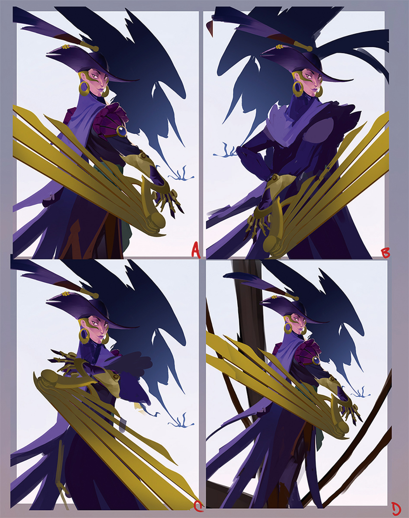
I give exploring the composition a shot. Since the image is mostly about showcasing the design, I don’t want her to be in an intense action pose. It’ll also be cropped so I can only show parts of the character. Because the weapon is the most important, I try to make sure it’s prominent in every composition. You can also see that I’m starting to explore the cultural aspects of the costume.
06. Ensure the player connects with the character
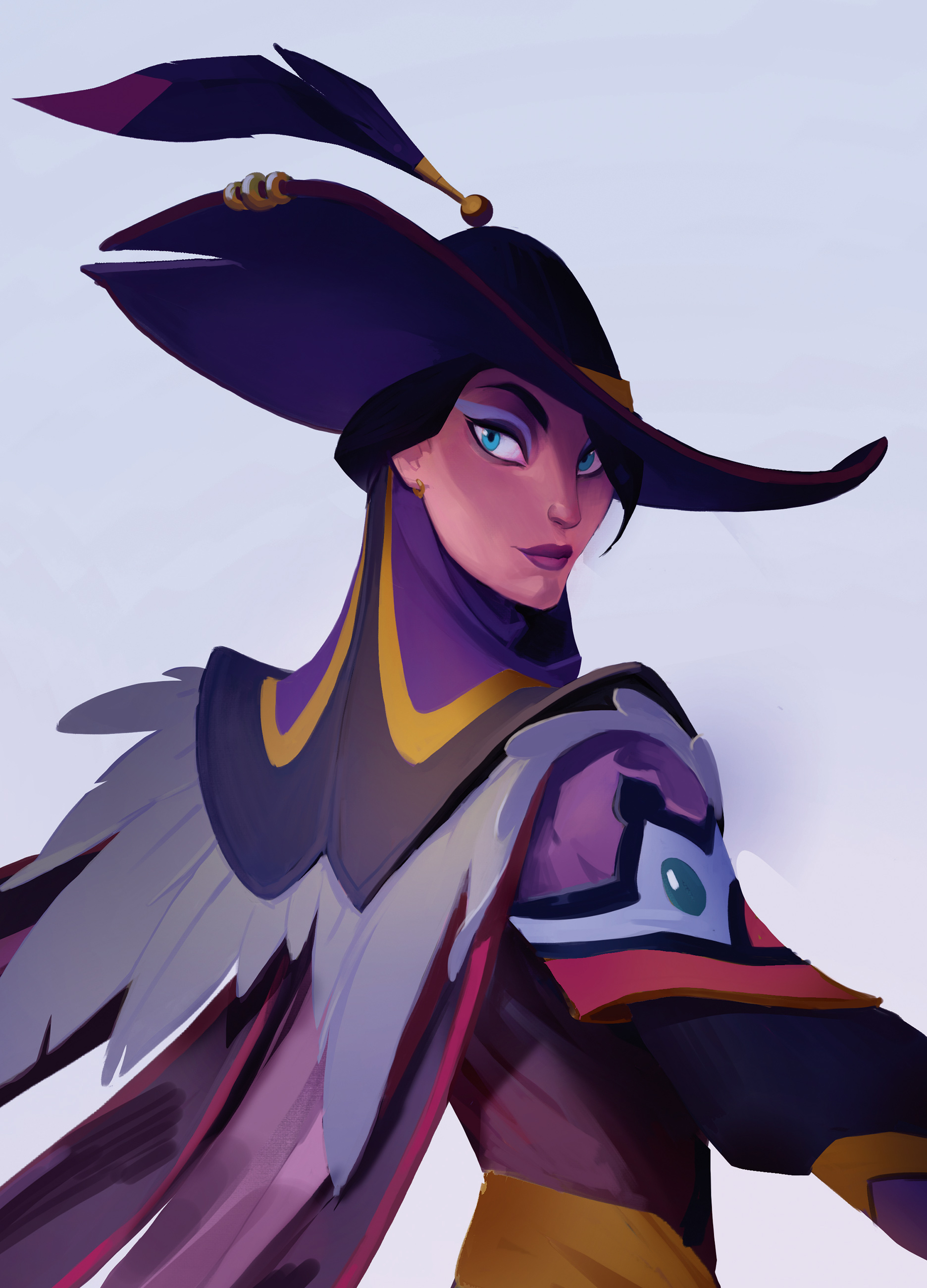
I end up staying with the original composition! I start to hash out details, especially in rendering the face. Her attitude is conveyed in her posture and costume choice, but the face is where the viewer really connects with the character before they play her. I want her to feel like she borrows some attitude from her fancy pet, too.
07. Dress to slay
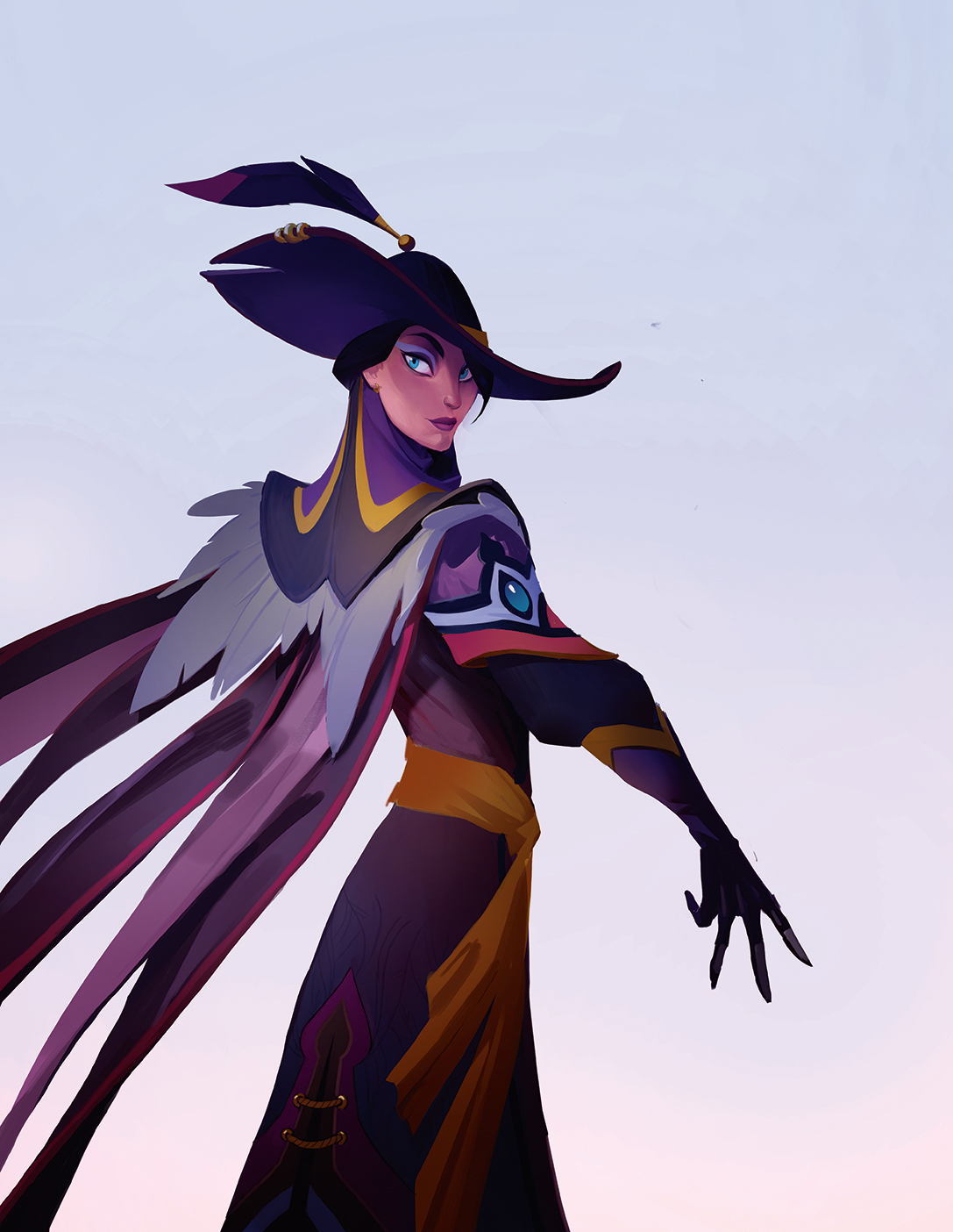
Now that I have my pose I can really start to highlight the costume details. Despite the European ‘musketeer’ influence present in the previous images, I begin to lean towards some Asian costume design. I can’t help but think of Mongolian Eagle Hunters, and that starts to inform her look. I even start to incorporate what might be her pet’s feathers into the costume.
08. Winged and dangerous

I’m feeling more confident about the costuming so I move on to the mechanical wing. I want it to look like she could use it for fighting, but maybe it has other functionality, too. She could use it to glide from ship to ship perhaps? Cutting ropes and sails to sabotage them? Especially for a video game, props can become a huge part of the character’s identity and could make them fun to play!
09. Together again at last
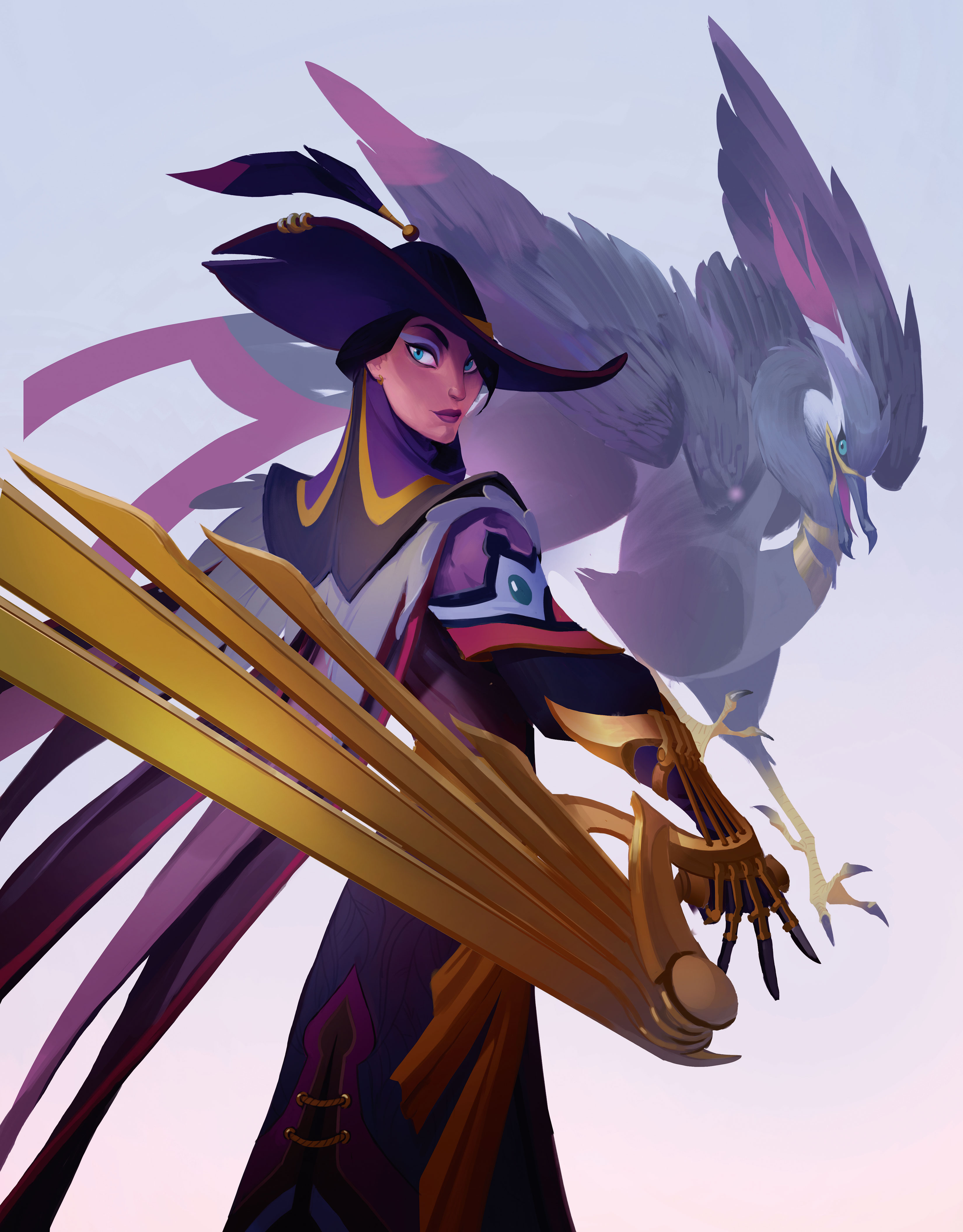
Seeing them in the same composition, it looks like I need to make some edits to make sure they’re both framed clearly. I want to highlight both of their designs, but it’s a tight space! I’ll need to redraw the bird in a better position that flows with the same shapes and rhythms of the main character. A lot of this will be repositioning the wings and claws, which have very long, clear vectors.
10. Bird is the word
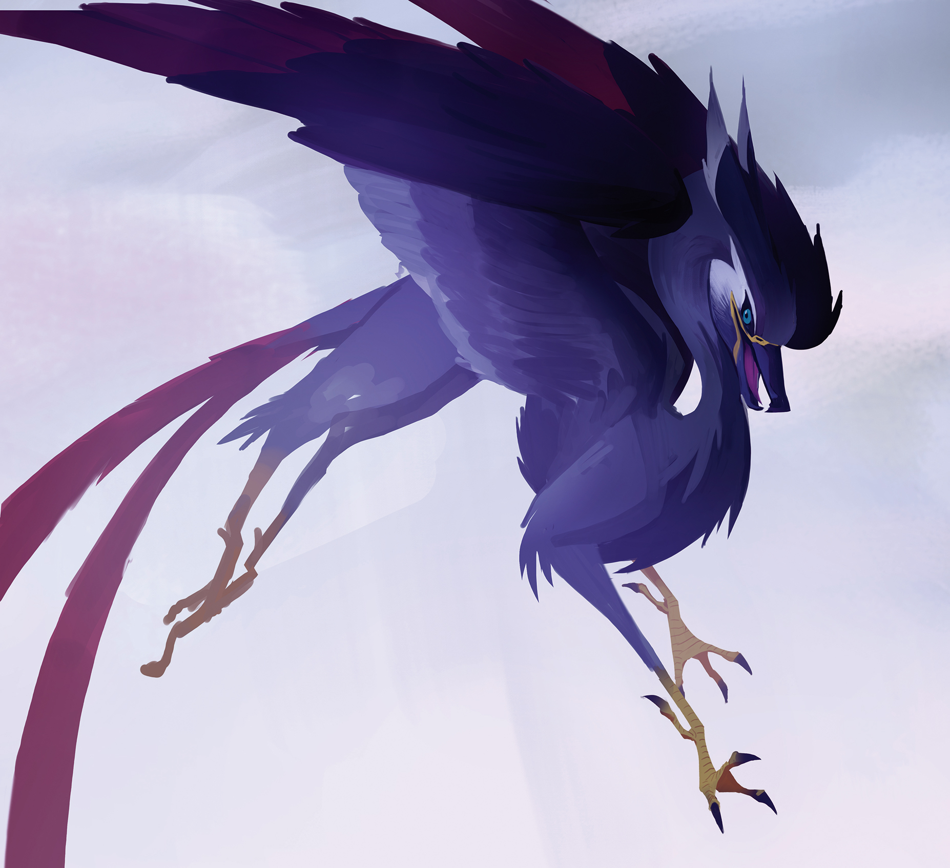
I study how the characters frame each other and determine their relationship. From the design of the creature, I could see it being a swift, agile helper that assists its companion in fights and tasks. Maybe the hero could hang on to her pet’s feet and use them to glide-travel across gaps, or steal things from her opponents like a terrible seagull!
11. Framed up
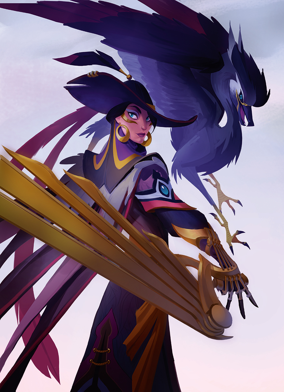
I feel like I’ve succeeded in allowing their individual silhouettes to be visible, with less overlap. I can start working on the overall lighting and atmosphere of the composition. Maybe an overcast day near the sea can work. All the bounce light will start to take on the neutral grey sky colour, which I’ve intentionally left at a low saturation so as not to compete with the vivid colours of the characters. Dramatic lighting or a detailed background scene aren’t necessary in this case.
12. Reinforcing the bond
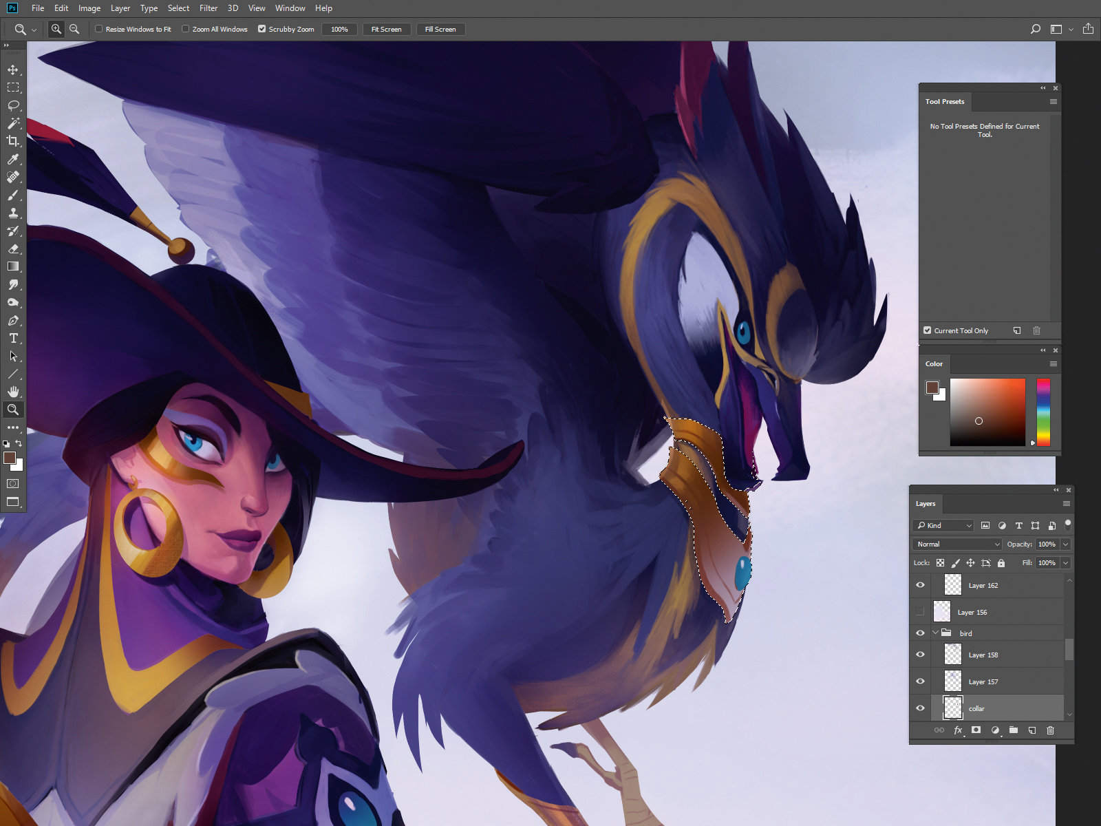
Now that I’ve resolved their compositional relationship, I want to start adding some storytelling elements to their appearance. The hero should look like they clearly got inspiration from this agile predator, and the pet should look like they have a relationship with its owner. An easy way to do this is with costume elements, such as a collar that resembles the same shape language as the hero.
13. Light the way
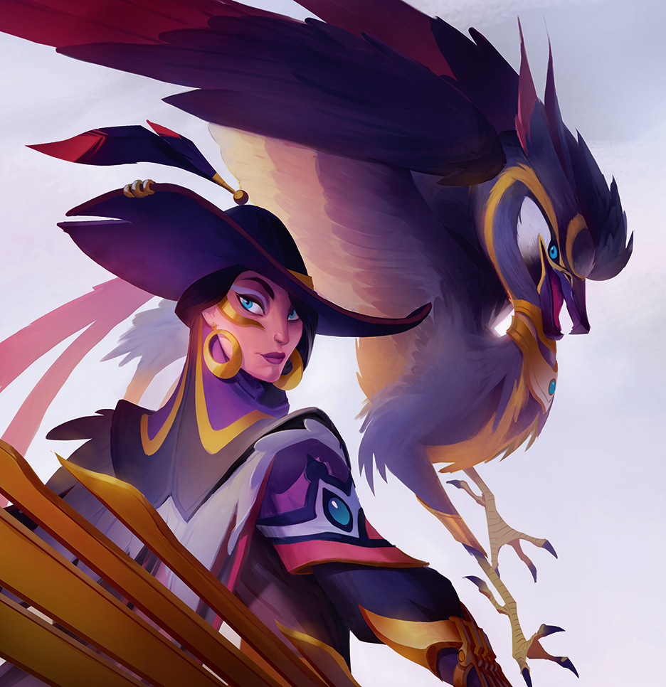
I start to separate my forms with light and make the image even clearer using Overlay, Hard Light and Multiply layer modes. With all the high-contrast costume elements, it can be difficult for shapes to read together and I want to control that as best as I can. I make sure that the hero and pet start to have some visual language shared between them, but I also don’t want her to look like she’s wearing a bird costume.
Pro tip: Keep it simple. One pet peeve of mine while using Photoshop is starting to paint on a layer and then realising it’s the wrong one! The way I fight this is by merging down and committing to my changes as soon as I can. I’ll also group my layers and label them by layer mode, so I know what they do without selecting them.
14. Final fight
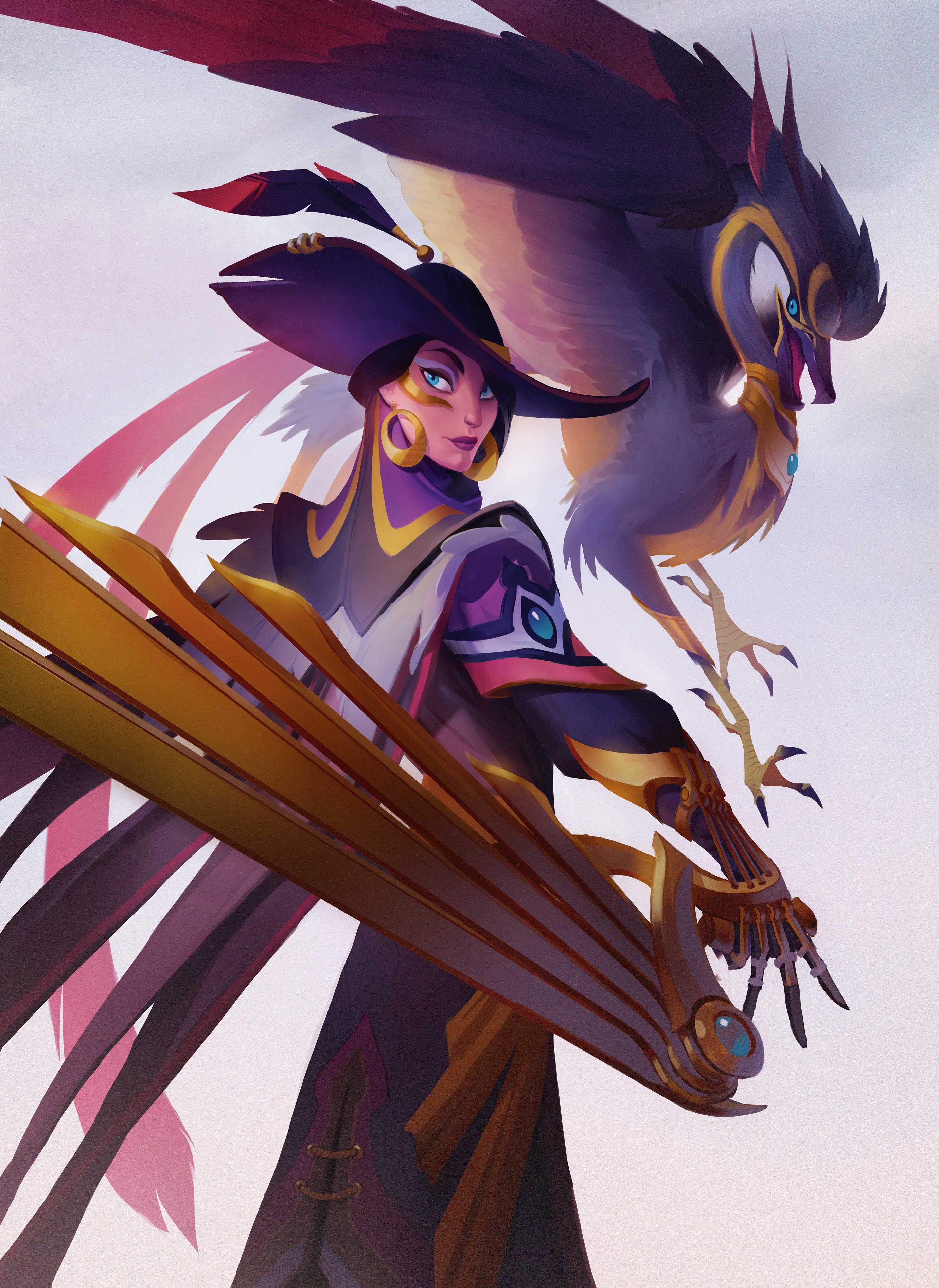
In the end, I really want the silhouette of her hat to stand out, so I make the bird creature’s wings a lighter value to pop it. I use some last-minute lighting changes to try and bring all the attention to the hero’s face despite there being so much costume and weird animal themes going on. Player One is ready to enter the game!
Contributer : Creative Bloq
 Reviewed by mimisabreena
on
Tuesday, May 01, 2018
Rating:


No comments:
Post a Comment