Exploring Dark and Gothic Trends in Web Design
In today’s web design world we see waves of minimalist, modern designs that often stick to light colors, standard fonts and lots of space. However, many industries and brands require an alternative approach.
For example, a gaming website might have a better effect with dark tones and gothic-style text. Dark web design can represent class, ruggedness or mystery. You can even see it used when someone is trying to communicate a sense of power. Both masculine and feminine designs use dark and gothic elements. While one website might want to show the strong side of being a man, another might want to display the elegance of being a woman. That’s not always going to be the case, but it works when implemented properly.
It’s important for designers to avoid getting stuck in the rut of only developing the same, “modern” white websites and apps. Because eventually, you’ll run into a client who craves something more sinister, elegant or strong. In that case dark, gothic web design comes in handy.
Therefore, we put together some examples of this type of design. This way, you can reference back to these excellent designs when you’re looking for some inspiration.
Gjezarian
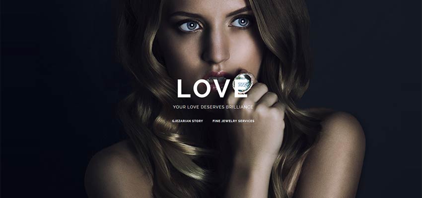
Here’s a great example of how darker designs often work for female-centric websites. Jewelry and clothing often make people feel richer or more elegant. Therefore, the darkness in a design like this mimics that of a classy, dark restaurant or club. It almost makes the user feel like they’re going to end up hanging out with celebrities if they buy the product.
Olly Moss
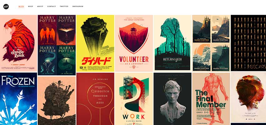
A gothic design doesn’t always mean that you have to make everything black. For instance, this portfolio-style website features a mainly white background. Combine that with the black font and logo and it lets off a feeling of robustness. Not only that, but the gallery pieces have their own gothic appearances.
Black Dog Films
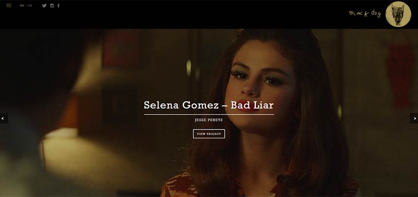
Black Dog Films takes its name and uses it to its advantage. The majority of the website has a black header, with shadows placed on the majority of images. You’ll also notice that the logo appears to be rigidly drawn, presenting a rugged, yet powerful, appearance.
Immortal Night
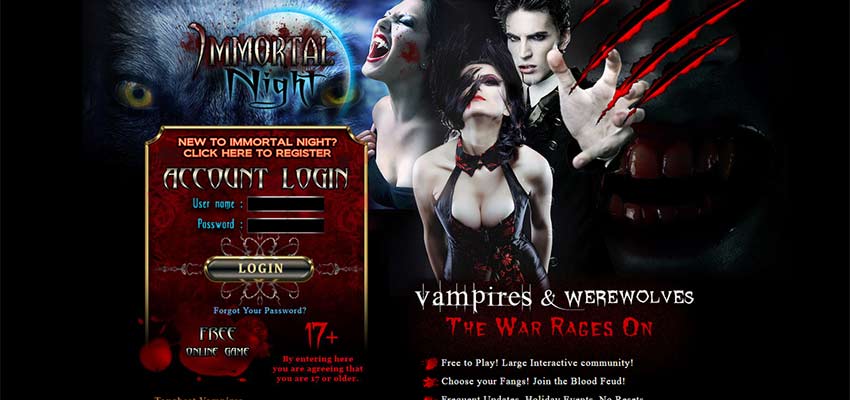
It’s rather common to see a dark, gothic design on a video game website. It’s especially common when that video game relates to something mythical like vampires or zombies. Notice how the bright red colors create contrast with the black background. This is essential for using darker colors effectively.
Department Creatif
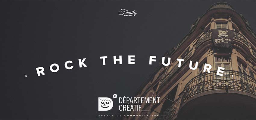
Here’s a website that merges the trend of retro typography and darkened themes. This is actually a very common way to create header images, where the background is dimmed quite a bit so the text placed on top of it can be viewed properly.
Tender to Art
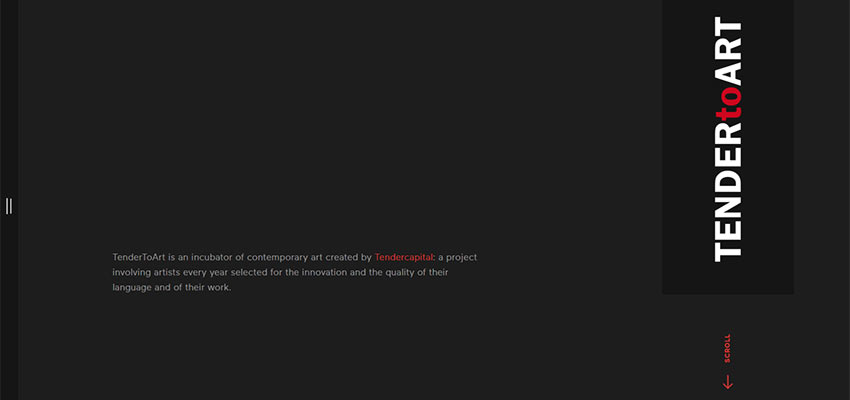
A dark design doesn’t have to be complicated. This incubator of contemporary art sticks to the modern layout, with bold typography, minimal content and interesting animations as you click through the website.
Ever and Ever

One of the great things about this design is the contrast we see with the white human figures. It almost looks as if the figures are statues from a long time ago, going along with the gothic theme and drawing the eye to those individuals as it sits right on top of the darkness.
Nerisson
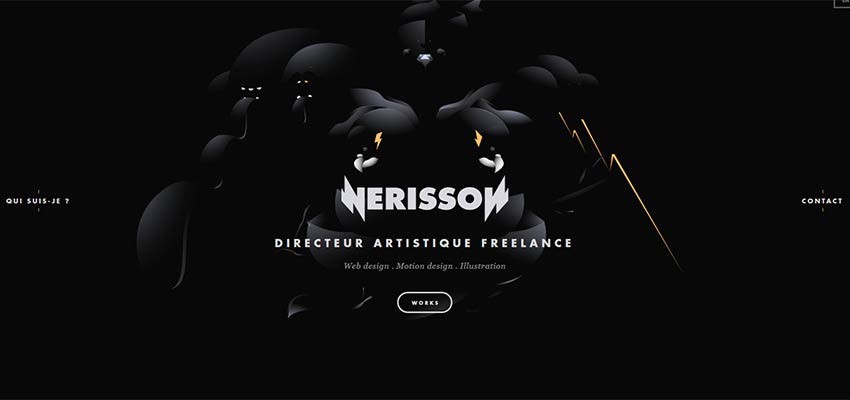
Working with darker designs means that you have the opportunity to create an ominous feeling with even more dark elements. The “Ever and Ever” example we saw above is the exact opposite of this one. Instead, we see minimal contrast, where the user has to almost squint to see what’s going on.
These are just a few examples of a darker, gothic web design style. We hope you’ve enjoyed them. And if you have any other examples you’d like to suggest, feel free to leave them in the comments below.
:) Hit link to watching video...! https://ift.tt/2xkWjz1
Contributer : 1stWebDesigner
 Reviewed by mimisabreena
on
Tuesday, May 29, 2018
Rating:


No comments:
Post a Comment