The Subtle Typography Trend Changes in Mobile App Design
Apple and Google have presented designers with fonts that are arguably hard to beat. They both have excellent legibility, form, and are both compact – helping make better use of the limited screen size on mobile devices.
As such, we’re seeing a shift towards more consistency and better readability in mobile app design, benefiting not just the cohesiveness of the ecosystem, but the end user too.
Despite this shift to the two default fonts, typography is still being implemented in exciting and unique ways, through font size, weight, spacing, alignment, and layout.
Below, we’re going to look at some subtle examples of typography on mobile that have been implemented highly effectively.
Emphatic, Bold Screen Titles
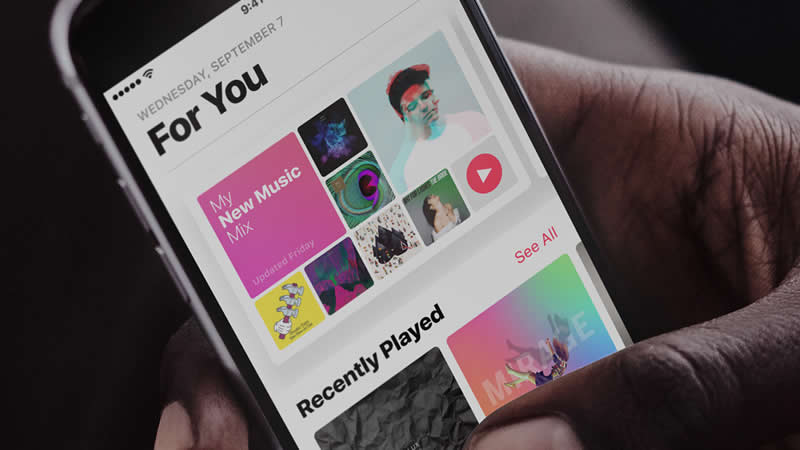
Apple Music uses an interesting implementation of San Francisco with emphatic, bold titles for screens and section headings. The left alignment is also a unique way of presenting typography on iOS. The type is loud and adds personality to the app.

It’s easy to read and aligned in a way which breaks up the content effectively. It uses a clear hierarchy of title and subheading styles, differentiating between them with caps and title caps, dark and light color, font size, and font weight.
Small, Light, Minimal
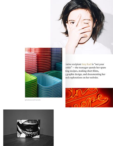
VSCO implements type sparsely. In the instances where type is incorporated, it is done so in a visually appealing and spacious manner. Font sizes are smaller than usual to allow for maximum focus on the imagery. It applies color to text only for important links, and relies more heavily on iconography.

It uses black and bold weight for titles and grey and light weight for almost every other aspect, creating a clean and minimal interface.
Text descriptions and posts use an attractive serif font which is both bold and unique in its form, contrasting well with the clean lines of the default typography.
Font Weights to Communicate
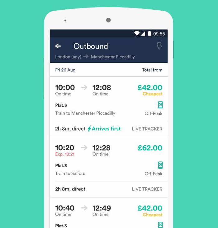
The Trainline app is a fine example of typography being used to improve the communication of data. It utilises the latest trends by making effective use of color and using a custom but compact and modern font family.

The color, size hierarchy, and bold font weights bring attention to the critical data for each train journey, and adds simple tips in yellow and red to alert the user of special offers and delays respectively. The typography is well-spaced allowing for optimum readability and is overall an excellent example of typography in mobile app design.
Finished
As 2017 gets well underway, it will be interesting to see if we continue to undergo a shift away from type labels and links to make way for more iconography.
We are also likely to continue to see more large and bold type used in mobile designs, as well as an abundance of serif fonts for written content. Larger companies are also beginning to develop their own fonts to develop their brand uniqueness. It really is going to be interesting.
What trends do you see developing through 2017? Share your thoughts below.
:) Hit link to watching video...! http://ift.tt/2ooi5IB
Contributer : 1stWebDesigner
 Reviewed by mimisabreena
on
Monday, January 22, 2018
Rating:


No comments:
Post a Comment