How to Rock a Tired Email Design
Tired of sending the same old email design?
You want to mix things up. But kicking out the jams risks confusing your email contacts when they just recognize your brand.
Instead, follow the beat of the hottest rock acts to keep your email design fresh while retaining your brand essence.
What is the rock star approach to email design?
Think about your favorite musical artist for a moment.
Do you remember their last album and tour? How about the one before that?
You’ll notice something about each release: same artist, but the supporting artwork and design are all geared to that particular release. There’s something that allows fans to recognize the artist and something that makes the promotional materials unique.
Let’s take a look at some rocking email design examples
Here’s an email from one of my favorite bands, U2.
Notice the simple design format: Picture, paragraph, call to action.
Also, take note of the logo treatment and colors used.
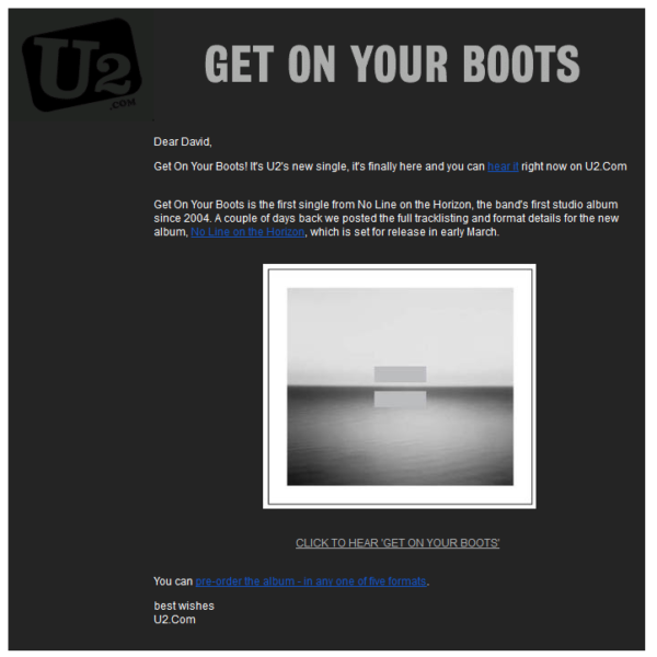
Although the content of the email mentions new music, the design style and imagery support the previous album How to Dismantle an Atomic Bomb and represent the email design during that period.
Here’s how the email design changes in support of the next album:
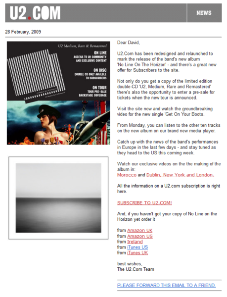
This email design follows the same principles of picture, paragraph, call to action — but the imagery, colors, and logo treatment change to mark the release of the band’s next album No Line on the Horizon.
Same band. Different imagery.
Easy for a rock band, but what about me?
Let’s take a look at some examples from nonprofit theater company, Astoria Performing Arts Center.
This first email supports the organization’s annual gala and contains their usual branding.
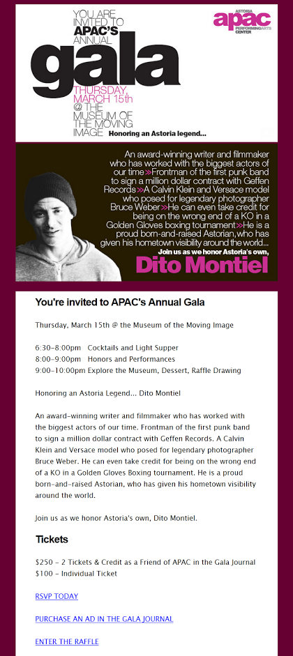
This next email changes to reflect the imagery and design of a production.
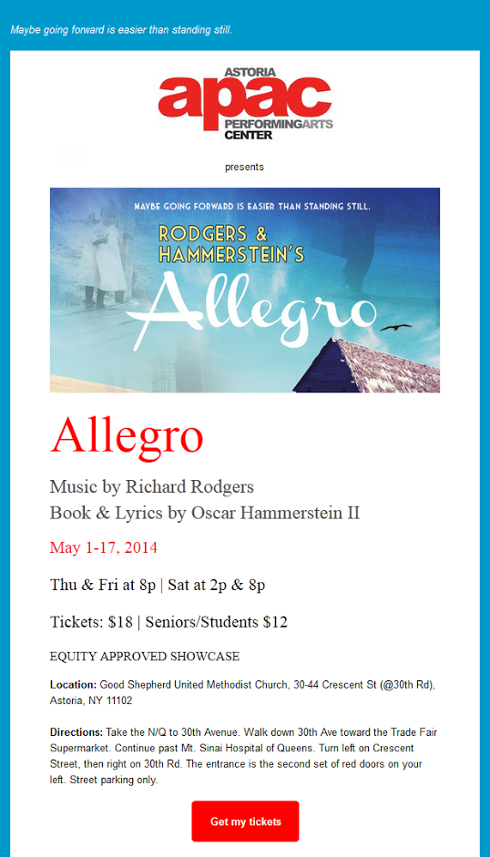
Here you can see that the logo treatment, the background colors, and the headlines have all changed to reflect the show, while still retaining the essence of the brand.
Same organization. Different imagery.
It doesn’t take much to wake up a tired email design
You don’t need to change much because the essential elements of email design are typically the same. All you need to focus on to wake things up is a theme, pictures, and colors.
Also, remember that it’s important to think about mobile. If you’re not already using a mobile-responsive email design, now’s a good time to start.
A word of caution
You may get bored with your email designs. But you are not your customer. Unlike you, your customer is just learning to recognize your brand. You could be hurting yourself if you change up your look too much.
Depending on your sending frequency, you’ll want to think in terms of many months to years in between design refreshes. You don’t want to change from email to email. All that does is confuse your email contacts because there’s no consistency.
Rock your email designs with this simple approach
You don’t need to do anything drastic to get results. It can be as simple as using images and colors in a smart way to refresh the feel of your emails.
Remember:
- Keep the essence of your brand at all times
- It’s okay to change things up, but not too frequently
- Think in terms of themes, images, and colors
- Update to a mobile-responsive email design if you haven’t already
Take a look at some of these email designs for inspiration. Here are 14 Templates to Spark New Interest in Your Email Design.
The post How to Rock a Tired Email Design appeared first on Constant Contact Blogs.
Contributers : Constant Contact Blogs http://ift.tt/2pnN5eV


No comments:
Post a Comment