Ready, Set, Convert – 5 Conversion Rate Optimization Trends for 2018
Whether you’re running an eCommerce site or a standard online business page, your aim will be to convert as many visitors into paying customers as possible. Conversion is the name of the game for any company, and it can happen all over your website, from your homepage to a product page, landing page, or even your blog.
CRO or “Conversion Rate Optimization” is about finding out where your leads turn into customers and working to streamline the process. The better your website is at generating sales, the more sustainable and profitable your organization becomes.
The question is, how do you enhance conversions in a competitive era where customers are more cynical than ever? The following conversion rate optimization trends for 2018 could help.
1. Create a Personalized Experience
The “one-size-fits-all” approach to sales is a thing of the past. In a time when companies are struggling to stand out in an ever-more-saturated space, you can’t afford to deliver a generic online experience. Fortunately, all you need to do to set yourself apart is get to know your customers. According to Accenture, 65% of consumers are more likely to purchase from a retailer who knows their buying history. What’s more, the same percentage feel more compelled to spend money when promotions are tailored to their interests.
Now that your customers have their pick of dozens of different brands to work with, it’s up to you to show them what makes your company different. A great price and a compelling product or service can be a good start, but 96% of marketers today say that personalization helps to build stronger, more lucrative customer relationships.
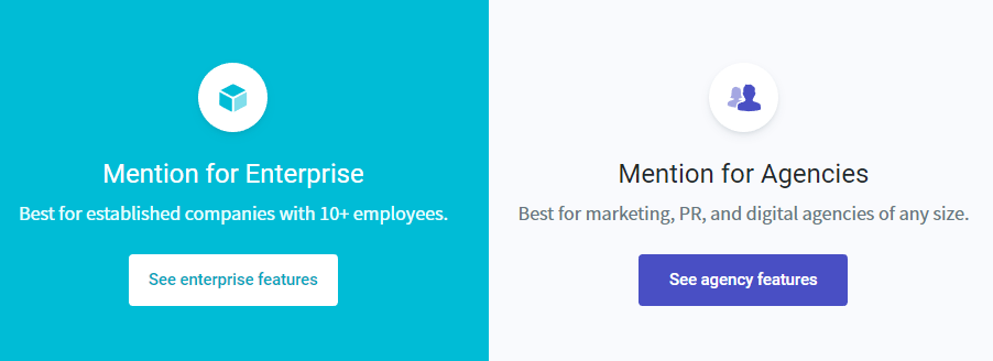
You can personalize visitor experiences by segmenting customers based on their needs, such as in the Mention.com landing page example below. On the other hand, you can use dynamic advertisements to deliver personalized ads based on previous purchases.

2. Help Shoppers Get the Answers They Need
More options in the marketplace empower today’s customers to select the brand that appeals most to their interests. However, the more choice someone has, the more complex their buyer journey becomes. Because of this, many of today’s customers will instantly go for the experience that’s as simple, and straightforward as possible.
The quicker you can show your customers why they should buy from you, and what they need to do to tap into the value you have to offer, the better their experience will be. Leads want to be able to find the answers to their problems with very little hassle. For instance, Pew Research indicates that 83% of US adults want to have their questions answered about products or services, but they don’t want to call someone to discuss their query.
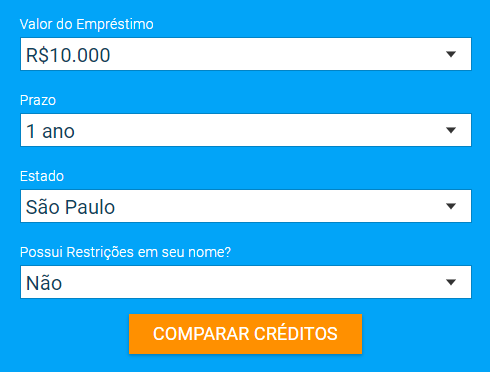
The easiest way to make sure that your customers have the information they need to make a quick purchase is to provide everything they need to know right there on your landing page. The simple and effective form on the Emprestimo Online landing page allows customers to choose the specific information they need about creditors, and get answers instantly with the click of a button.

3. Use Plenty of Social Proof
Today’s customers are more empowered and informed than ever before. They know they have a world of information at their fingertips, and they’re willing to use it to make sure that they’re getting the best deal. This means that if you want to convince someone to buy from you, you need to prove that they can trust you to deliver an exceptional experience first.
While you can always optimize your landing pages to include statements about your values or benefits, people are far more likely to trust the opinions of other customers, than the words of a brand. This means that you need to generate social proof in the form of testimonials and reviews you can include on your website.
82% of adults in the modern marketplace will read reviews and ratings from other clients before they purchase something online. The great news for companies is that you can streamline their search by demonstrating your best reviews on your landing pages, in the form of quotes, 5-star ratings and more. Some companies even showcase video reviews. The PipeDrive website highlights both customer quotes and links to other review websites to turbo-charge its social proof score.

4. Use Video to Hook Customers and Explain Your Values
In 2018, video is more popular than ever. Over the years, this marketing tactic has been gaining weight as a strategy for engaging and captivating customers. Today, countless companies are already using videos and animations to communicate the complexities of their brand story, explain their values, and develop stronger relationships with possible customers.
While you might still need written content to help you rank higher on Google, and appeal to people with different preferences, video is a fast and simple way to earn viewer attention. After all, watching a video requires minimal input from your customer, so they’re less likely to give up and click the back button when they can’t figure out what you have to offer.
The key to success with video is making sure it’s exciting, interesting, and short. Beyond that, it’s up to you to be as creative as you like. Brands have done everything from creating hand-drawn animations to behind-the-scenes videos of their companies. Whatever method you choose, research shows that a video on your landing page can increase conversion rates by 80%.
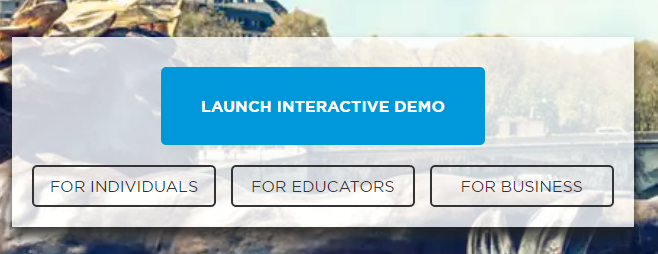
The Rosetta Stone website includes videos on the landing page, links to interactive demos for different customers, and more. Remember, your videos don’t have to be limited to just one page on your website, they can spread throughout your entire online content portfolio.

5. Create a Simple and Effective Checkout Page
It’s always been important to give your customers a straightforward checkout experience, but in a world where cyber security attacks are running rampant, a good checkout process can be the difference between a sale, or another abandoned cart. In fact, studies have found that most eCommerce retailers experience an average abandonment rate of 70%.
While there are plenty of reasons why a person might leave your website at the last moment, from a distraction to the promise of a better price elsewhere, a lack of optimization on checkout pages can be a common problem. Interestingly, one of the biggest reasons that people will give up on a purchase when they hit the checkout page is that the “extra” costs like postage and packing are too high.
If you can’t do much about the price of your shipping fees, then you should make sure that your customers know exactly what they’re going to pay before they get to the checkout. For instance, if you have a flat shipping charge, show it next to your product prices. On the other hand, if you have a minimum fee for free shipping, display it as a banner on your product pages.
Amazon.com displays whether an item has free shipping or not on each product page, so you can judge whether you want to pay the extra fees or look for a different seller.

Are You Ready for Better Conversions?
The online world has never been more competitive, with new companies joining the fray on an almost constant basis. The good news is that if you’re willing to do some research and stay ahead of the trends, then you should have everything you need to outshine the competition and earn those all-important conversions.
:) Hit link to watching video...! https://ift.tt/2GnNFTp
Contributer : 1stWebDesigner
 Reviewed by mimisabreena
on
Monday, March 26, 2018
Rating:


No comments:
Post a Comment