Effective Examples of Mobile App Login Screens
Mobile app login screens are an integral aspect of any app handling user accounts. They are often the first point of contact with a new user and therefore as well as handling existing user logins, they also have to serve as a conversion point to push new users to sign up and create an account.
The key to designing an effective mobile app login screen is to do so with the optimum conversion rate by making the process as quick, easy, and user-friendly as possible.
In this article we are going to look at some prime examples of mobile app login screens and what makes them so effective.
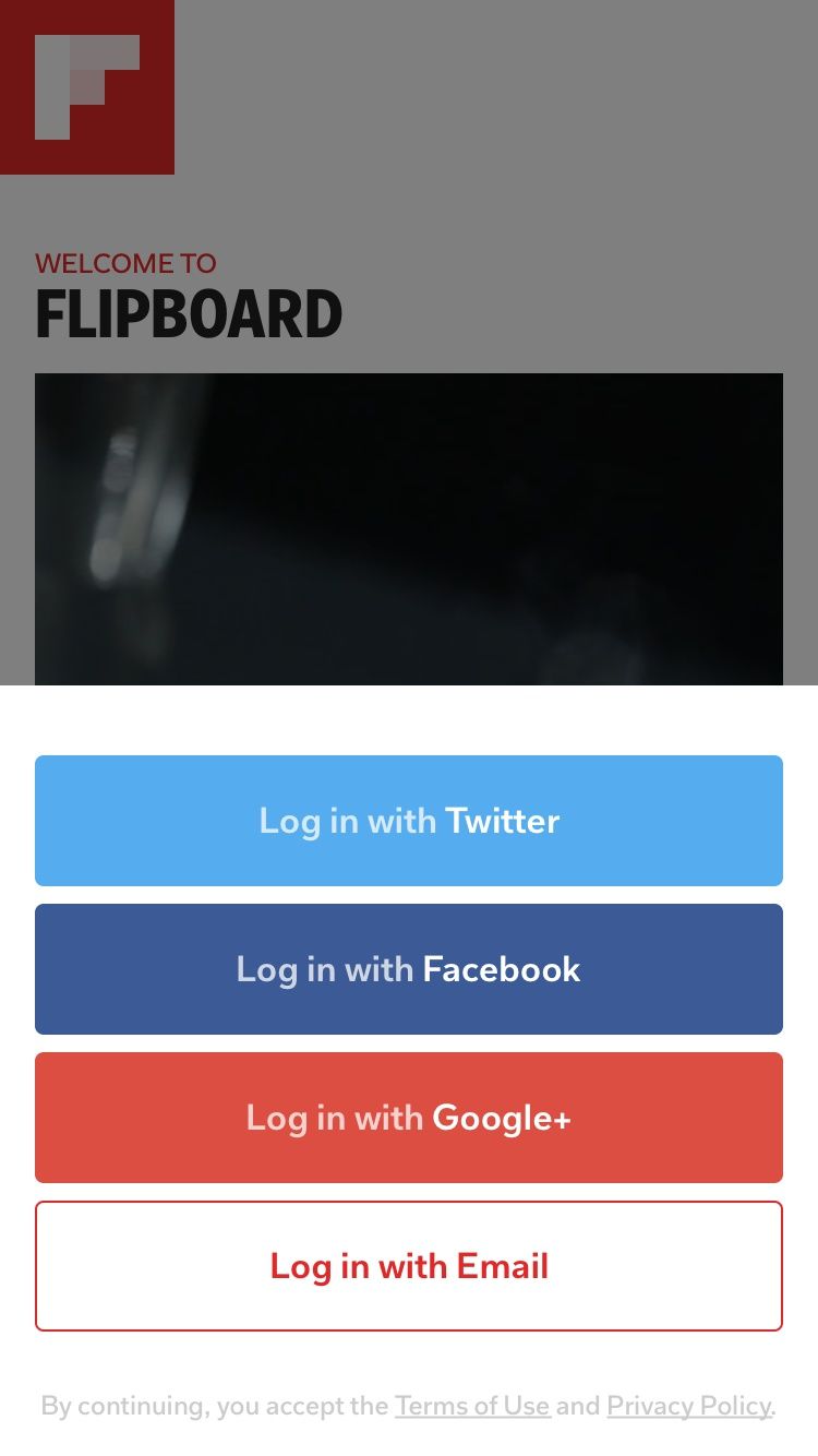
Flipboard allows for a much-simplified and quicker sign up process by enabling integration with popular networks such as Twitter, Facebook, and Google+. However, the multitude of options can be overwhelming to a new user, and as such, the designers have opted to position the login options behind a slide-up card which remains hidden until the user taps the primary login button.
Through use of color and fill, the primary emphasis is placed upon social logins which have a speedier log in process, while they also allow for the option to log in with email.

Lake
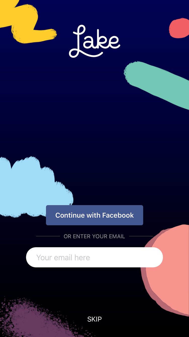
A beautifully designed app, Lake combines some stunning login screen visuals with an incredibly simple and refined user experience. Rather than forcing a full sign up process, the app designers have opted for a simple one-tap Facebook login, or email entry.
Despite the simplicity of this, they have gone even further in implementing a ‘SKIP’ button, allowing the user to delve straight into the app and sign up at a later date. This eliminates the bounce rate of users who want to try the app before handing over any personal details such as an email address.

VSCO
Another wonderfully simple example is VSCO. Combined with some on-brand visuals and clear continuation of their monochrome color scheme, VSCO has opted for a single button which serves as a sign in and sign up.
On top of this, they have also opted for a ‘Skip for now’ button. Like Lake app, this allows users to try the app before committing to signing up with their details. This tends to be implemented in apps where the featureset does not strictly require an account from the outset and portrays a real sense of belief by the company in their product where they are confident the user will enjoy the app and sign up at a later opportunity.

Airbnb
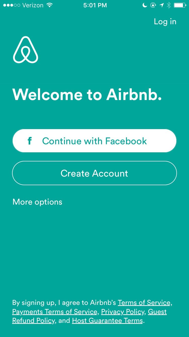
While slightly less refined than the above designs, Airbnb is still an excellent example of a mobile login screen. The login button is de-emphasized in place of large social and standard sign up options. The brand and logo are clearly conveyed, and the necessary legal information is displayed in a way which does not affect the usability or simplicity of the options at hand.
The sign-up buttons are easy to reach, large, and place emphasis on signing up with Facebook, due to the simplified sign up process it accompanies.

Which are your favorite examples of effective mobile app login screens? How much do you value being able to sign up with a social account? Share your thoughts in the comments below!
:) Hit link to watching video...! https://ift.tt/2shWtn2
Contributer : 1stWebDesigner
 Reviewed by mimisabreena
on
Thursday, April 05, 2018
Rating:


No comments:
Post a Comment