How to Use Visual Elements to Enhance Your Blog Post’s Engagement
A picture is worth a thousand words.
This is a ageless English idiom that I’m sure you’ve heard countless times throughout your life. It’s a simple concept. In short, it means that it’s easier to show someone something than it is to tell them about it.
But are you applying this strategy to your blog posts? Blogging is a science.
There are lots of tips and tricks you can learn to engage with your audience, such as mastering the art of storytelling. However, words alone won’t drive engagement.
You’ll need to learn how to incorporate visual elements into your blog posts as well. If you’ve been reading my blogs for a while, you know that I practice what I preach.
I love using visuals to help improve my content. For those of you who aren’t used to this, it can sound intimidating.
Where do you start? How many visuals should I include? What visuals are acceptable?
These are all valid questions that I can answer for you. Use this guide as a reference for adding visual content to your blog posts. Here’s what you need to know.
Understand how people read your blog
You can be the best writer in the world, but the reality is that people aren’t going to read your content word for word. It’s a fact that you need to accept right now.
According to a recent study, people only read 20% of your content on a page.
Let that sink in for a moment. Research shows that the optimal blog post will take someone about seven minutes to read.
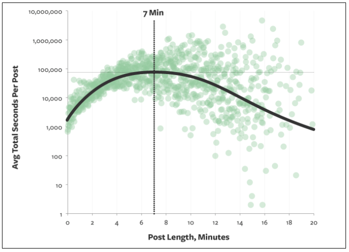
Typically, seven minutes translates to about 1,600 words, assuming that each word is read (which we already know isn’t the case).
So if your blog post is 1,600 words and only 20% of it gets read, that means visitors are only digesting about 320 words of your content.
What does this information tell you? Simply put, people are scanning your blogs.
So that means that your writing style needs to be adjusted accordingly if you want to increase engagement. Get rid of lengthy paragraphs and large blocks of text. That’s difficult for people to scan.
Instead, use short sentences and stick to paragraphs that are just a few lines long at most.
Add visuals to break up the content.
Visual elements jump off the page at a reader. So if someone is scanning through your blog post, they’ll likely stop at the images. They’ll skim the first few lines before and after the picture to digest your points of emphasis.
You’ve got to be consistent and establish a pattern with your visuals.
For example, let’s say you’ve got a blog post that’s 3,000 words long. You’ve got an image every 300 words or so for the first 1,000 words of the post.
But then you don’t include any more images until the final few paragraphs. That’s a mistake. Refer back to what we just discussed about how people scan.
They’re going to stop at your images. So if they get into a rhythm of scrolling until they see a picture, they’re going to scroll through the majority of your content without stopping if you have such a large gap between each visual element.
Take a look at elements that are included in a typical blog post.
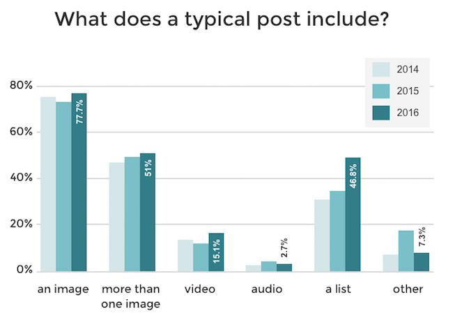
As you can see, the majority of blogs include an image. But that percentage drops down significantly in terms of blog posts with more than one image.
So you can really separate yourself from the crowd by adding lots of visuals to your blog. As you continue reading through this guide, I’ll explain which types of visual content create the most engagement.
Create infographics
As you can see from the images I’ve used so far in this blog post, graphs are a great way to help emphasize a point. There are a few reasons for this.
For starters, it helps validate the message that you’re trying to convey. Graphs also help make your blog posts more legitimate.
This shows your audience that you’re not just making up facts out of thin air. You’ve done the research and used data from high-quality sources of information.
But another reason why you should use graphs is because it helps people retain information. Studies suggest that people only remember 10% of information three days after they hear it.
However, if there is an image associated with that information, three days later people were able to retain 65% of the information.
You want people to remember what you’re telling them. This will definitely boost your engagement.
Instead of just using graphs and statistical data from sources on the web, you can create original infographics for your blog posts.
Try using free online resources, such as Canva, to design your infographics.
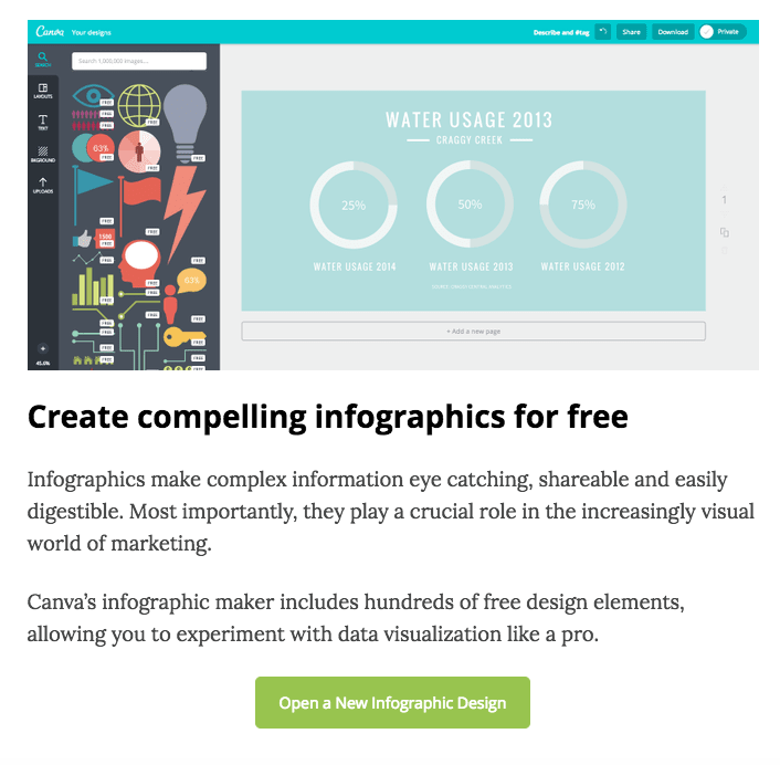
Their platform is very simple and easy to use. You don’t need to have any design skills to get this accomplished.
Infographics are great if your blog posts are focusing on some kind of research that you conducted. The best part about customizing original infographics is that it can ultimately drive more traffic to your website.
Think back to what I talked about earlier in terms of sourcing quality research from the Internet. Well, you’re not the only person that’s trying to do this.
Other bloggers also want to add high-quality resources and visual elements to back up their statements. When they are researching a particular topic, they might find your infographics.
Then they’ll cite your website as the source whenever they use your infographics in their content.
Those reference links will drive more traffic to your website. Plus, having more inbound links also helps improve your SEO ranking.
Use original photos
You want your content to be unique as possible. Obviously, this isn’t something that’s always 100% possible in today’s digital era. Chances are, someone else has blogged about a similar topic.
If you’re using a chart or infographic that you didn’t create on your own, then other bloggers have used it too. That’s OK.
However, if you want to be creative, you can add original photographs to your content as well. This will help separate your blog from your competition too.
Original content is like a breath of fresh air. Readers will feel the same way. If you’re into photography, you can pair that skill with your blogging platform.
Here’s a great example from the Sets in the West blog.
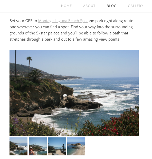
These blog posts are written for people who want to explore California. The author talks about her personal experiences in different areas and adds original photos as well.
Sure, you could just browse through Google images for professional photos of different places. But that’s not as genuine as taking the pictures yourself.
Again, this also relates to validation. It’s authentic. Your audience will know that you’ve actually done something and you’re not talking about a topic that you haven’t experienced.
For the same reason as your infographics, these original photos can also end up driving more traffic to your website. If other people use them, you’ll get credit as the reference link.
But what if you don’t have a fancy camera and don’t have any photography experience?
No problem. You can still learn how to take and edit photos without hiring a professional.
I’m sure your smartphone has a decent camera. Then you’ll just need to educate yourself on some basic photography principles and you’re good to go.
So get out there and start snapping some photos. This will help you get more engagement on your blog.
Mark up screenshots
Another way to help improve engagement on your blog posts is by showing people how to do something. Think about how people are searching for topics on the Internet.
If your blogs include “how to” guides or things of that nature, you’ll definitely want to include visual elements to show people what you’re talking about.
It’s not easy to explain how to do something. But taking screenshots on your computer and marking them up with arrows, boxes, circles, or words can really guide your readers in the right direction.
For example, take a look at this recent blog post I wrote about generating leads on Twitter.
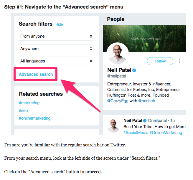
In this section of the post, I’m explaining how people can use the Twitter advanced search query as a tool to generate leads.
Rather than just saying, “Click on the advanced search button,” I show my audience exactly where the button is located.
I continue to use some short text to explain where the button is on the page as well. Here’s another example from that same blog post.
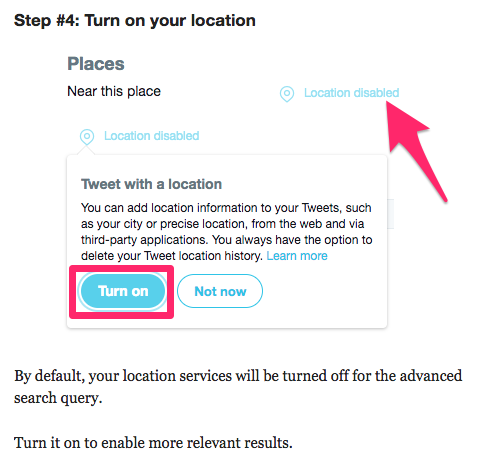
I’m using the same approach for this step as well. Instead of just saying, “Turn on your location,” I markup the screenshot, so it’s obvious what needs to be done.
By default, I’m sure your computer has some screenshot editing software.
Personally, I like to use Skitch to markup my content. It’s free to download and use, so give it a try if you’re looking for something new.
Add videos
For the most part, we’ve been talking about different types of pictures as visual elements to enhance your blogs. But that’s not the only type of visuals that can be used.
You can add videos to your blog posts as well.
Take a look at your analytics to see how long website visitors are staying on a page before leaving. If you want to improve that time, videos can be the solution.
In fact, research shows that videos can increase the time spent on your page by more than 100%.

The great thing about adding videos to your blog is that it’s really easy to do. You won’t necessarily have to create new video content for this.
Instead, just repurpose some of your old videos.
Here’s what I mean. Hopefully, you have a YouTube channel. I’m sure you’ve got lots of informative video content on this platform.
So anytime you’re discussing something in a blog post that’s relevant to one of your videos, just embed the YouTube link within the blog.
That’s it. This doesn’t require any extra effort on your part.
Plus, videos also help break up your content the same way your images do. Here’s an example from a blog post I wrote about Facebook cover photos.

As you can see, I embedded a link from my YouTube channel that was relevant to the topic.
Here’s another quick tip about how to use videos in your blog.
Add captions. Captions increase views by 40%. Furthermore, there is an 80% increase that viewers will watch an entire video if captions are available.
Conclusion
If you want to increase engagement on your blog posts, start by adding more visual elements to the page.
It’s important for you to understand how your audience is consuming your content. They aren’t reading each word on the page. Instead, they’re skimming through it.
Visuals give your readers a chance to stop and digest your points.
Mix it up. There are plenty of different types of visuals that you can use in the same post to drive engagement.
Add graphs, charts, and custom infographics. Take original photographs. Markup screenshots. Include relevant videos.
All of these will help bring your blog to the next level.
What types of visual elements are you using to increase engagement on your blog posts?
COntributer : Quick Sprout https://ift.tt/2qaliPg
 Reviewed by mimisabreena
on
Saturday, April 07, 2018
Rating:


No comments:
Post a Comment