How to Use These 8 Visual Elements to Improve Your Marketing Strategy
Did you know that 65% of people are visual learners?
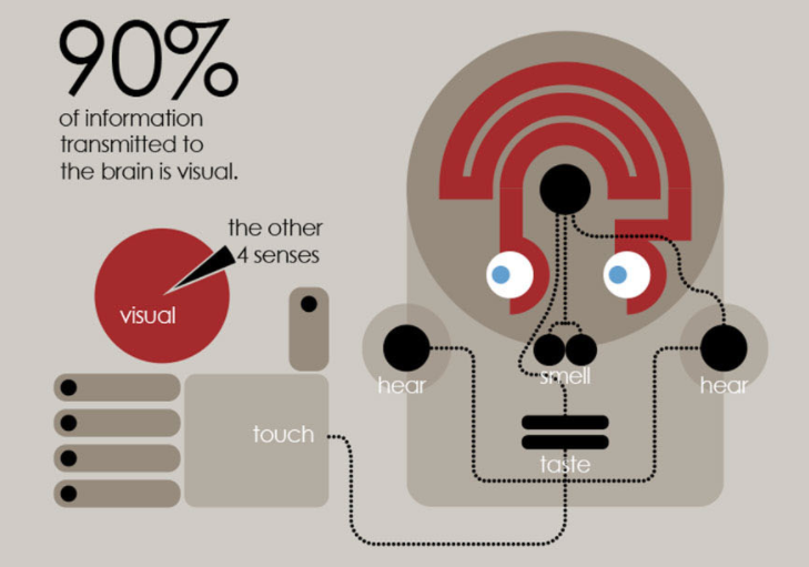
Furthermore, 90% of information that gets transmitted to the human brain is visual.
But if you thought that was crazy, consider this. We process images 60,000 times faster than we process text.
Let that sink in for a moment.
As you’re reading this, you may believe you’re processing the information I’m sharing with you, and that very well might be the case. But if I show you an image, like this one, it will increase the chances of you remembering it:
As a marketer, you need to use this knowledge to your advantage. You always have to come up with new ways to reach and engage with your target market and current customers.
If your most recent marketing campaigns didn’t succeed, I want you to reevaluate those strategies.
Did you use any visual elements?
If you answered no, you have a significant room for improvement as you move forward. But some of you may be using visuals and still not having the success you’re looking for. That’s okay.
It’s possible you’re using the wrong visuals. Or maybe you’re just not positioning them properly within the campaign. You might need to make slight adjustments.
Regardless of your scenario, this guide will help you.
I’ve narrowed down the top 8 visual elements you can use to improve your marketing campaigns. I’ll tell you what they are and explain how to implement them.
1. Images
I’m sure you’ve heard the age-old saying that a picture is worth a thousand words.
In fact, articles with images get 94% more views than those without them.
To me, that’s a pretty significant number. What’s that worth to you?
It’s especially important to anyone who uses blogging to scale lead generation.
That’s why I use images in all my blog posts. They are a great way to break up the content and make my posts easier to read.
People don’t read your posts word for word. Things are going to get easier for you as soon as you accept it.
Your readers skim through your content. But if all they see is large blocks of text, they’ll find it difficult to stay engaged, get through it, and retain any information.
That’s why an increasing number of bloggers use more than one image per post to enhance their posts:
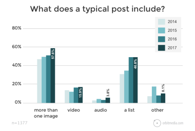
Images give people a reason to stop while they’re scrolling. As I explained earlier, the human brain is programmed to process and retain visual information.
With images, you can still get your point across even if each word isn’t being read.
In addition to blogging, images should be used for your other marketing campaigns as well.
For example, let’s say you’re sending an email to your customers offering them a 25% discount. If you just put that in the message written as text, it won’t be very effective.
But by turning that message into a visual coupon, you will make the message much more appealing. As a result, the recipient will be more likely to use the discount, which will translate to more sales for your company.
2. Original photos
Where should you get your images?
Obviously, in today’s digital age, the Internet is saturated with photos. You can definitely use those to enhance your content. I do this all the time. Just use someone else’s photo, and give them credit for it.
While there is nothing wrong with this strategy, it’s not the only option.
If you really want to bring your visual marketing strategy to the next level, take original photos. You should consider doing this for a few reasons.
First of all, it makes your content more unique. There’s less of a chance that your audience has seen the picture if you took it yourself.
Sure, if you were taking a picture of a famous landmark, there will be similar ones out there. But yours will still be unique. Plus, you won’t have to give anyone else credit for the image.
Once you start taking original photos, you can use them for much more than just a single marketing campaign.
It gives you something to post on social media, which is part of your general marketing strategy as a whole. Check out these pictures on the Muscle Milk Instagram page:

Yes, they could have found photos of people hiking, camping, and running on the Internet. But those would not have been as authentic as these.
Instagram is the perfect platform for you to post original photos. It gives your audience a reason to follow you, which will improve your brand awareness and benefit your company.
If your social media followers find out you’re posting random images from the web, they will be less inclined to follow you and your promotions.
You don’t need to hire a professional photographer to take and edit photos like a pro.
Once you publish original content, other people may end up using those photos as well. As a result, they’ll have to give you credit as the source, which will drive more traffic to your website.
3. GIFs
GIF stands for the graphics interchange format, but nobody calls it that.
It’s basically a hybrid between a picture and a video. GIFs have many different uses. They are more elaborate than a picture but not as long as a video.
For example, if you add a video to your content, you have to rely on someone clicking to view it. But that’s not the case with a GIF. When it appears on the screen, it will start moving.
You can use a GIF to demonstrate something quickly, like an action.
Put GIFs in your marketing emails. GIFs can be very funny, and they are extremely versatile. Look for online resources to find relevant GIFs for your brand.
While they may be simple, they can stand out and capture the attention of your audience, which will ultimately increase their engagement.
4. Memes
Memes have seemingly taken over the Internet.
They’re all over social media, and it seems like a day can’t go by without someone sending a meme to my phone via a text message.
Often, they’re meant to be funny, but they can also be downright stupid. You can still use them to enhance your marketing efforts. Here’s an example of a silly meme I could use about content marketing:

That’s what some of these old-school business owners tell me when I first meet them for a business consultation.
A meme is basically just an image with the caption written directly on it.
Come up with clever ways to turn a recognizable picture, actor, fictional character, image, or cartoon into something related to your brand.
If you search for memes online, you’ll come across plenty that are pretty inappropriate. I do not suggest using these with your marketing strategy, unless that kind of humor is part of your brand image.
It’s better to be on the safe side and stick to memes that are corny but relatable, as opposed to really funny but possibly inappropriate.
There are also plenty of online tools, such as the Meme Generator from Imgflip, you can use to create your own meme.
Just make sure you know your target market. For example, if you’re marketing to a Millennial audience, it wouldn’t make sense to use an image of a rock star from the 1960s.
Use pop culture references your audience will recognize, or it defeats the purpose. You can also build a meme with industry jokes, like the one I used above.
5. Slideshows
Slideshows aren’t just for school presentations.
You can use them to enhance your digital content as well. You can embed your slideshows into your website pages and blog posts.
These are great tools for communication.
Consider creating and sharing your slideshows on SlideShare, for example:
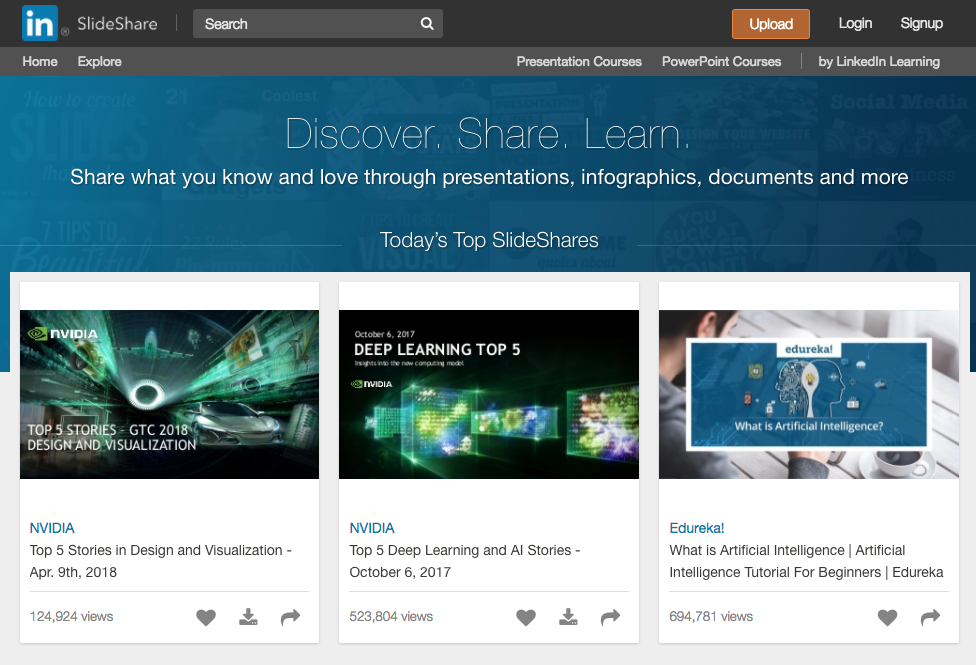
Here’s a great strategy for those of you who have previously published lots of long blog posts, articles, or case studies.
Turn those into slideshow presentations.
Simplify them, and give your audience a chance to retain that information. You don’t need to eliminate the text completely. Just republish those old posts with a slideshow at the beginning.
This is a great way to breathe fresh life into your old content with the help of visual aids.
6. Videos
No marketing strategy is complete without video content. That’s what consumers want to see today. So give them what they want.
You should find a way to use videos in nearly every aspect of your marketing campaigns.
Here are some examples of the types of videos you can create and ways to implement them:
- embed videos on your website
- send emails with videos
- upload videos to social media
- share product demonstrations
- give tutorials
The list goes on and on.
Here’s what I recommend. Set up a YouTube account if you don’t already have one. From there, it’s easy to distribute your content on other marketing channels since YouTube is compatible with them.
It’s easy to make videos. Plus, look at some of the benefits of video marketing:
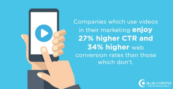
That’s why 83% of marketers say they would create more video content if they had unlimited time, budget, and resources.
Want to take your video strategy to the next level? Consider starting a video blog.
Stream live video on your social media channels as well.
7. Whiteboard presentations
I’m sure you’ve seen these before.
Yes, a whiteboard presentation is technically a video. But it’s a mix between a regular video and a slideshow presentation.
Rather than showing content slide-by-slide, it’s displayed as a video.
Lots of times, these are shot with just a hand that’s writing on a whiteboard.
Consider using a platform like Animaker to create your whiteboard presentation.

This method may be more professional and presentable than just filming yourself writing on a board in a dark room.
Basically, you want to create them as if you were a teacher, trying to present information to a class.
It’s a great visual tool to help you explain how to do things.
8. Screenshots
I use screenshots all the time when I’m blogging. This tool helps me get my point across in a way that’s easy for my readers to understand.
Use the same approach if you’re trying to explain how to do something online.
Sure, you’ll need some text to support the picture. But screenshots show the reader exactly what to do.
Skitch is my favorite software for taking screenshots and marking them up. You know all those pink boxes and arrows you see in my blog post images? Those are from Skitch.
Just telling your audience to click on something isn’t as effective as drawing an arrow directly to the button.
To show you what I’m talking about, here’s an example from a blog post I wrote about Facebook cover photos:
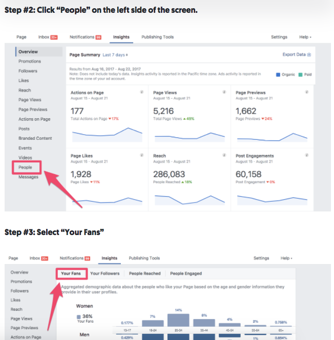
In these step-by-step instructions, I use text to tell people where to click.
That said, look how many clickable buttons there are on these screens. There are dozens of choices.
By using Skitch to mark up these screenshots, I show the reader where to look, which improves their experience.
Conclusion
Visuals are more powerful than text alone.
You need to be incorporating visual elements into your marketing strategy.
Use images to break up your content. Take original photos to make your brand seem more unique.
Memes and GIFs are fun ways to spice up your advertisements.
Use slideshows and whiteboard presentations if you want to explain things to your audience.
Videos can be used for nearly any campaign.
Take screenshots and mark them up with arrows, boxes, and text to highlight what you’re talking about.
If you follow tips on this list, you won’t have a problem improving your marketing strategy with visual elements.
What types of visual elements does your brand use in your marketing campaigns?
COntributer : Quick Sprout https://ift.tt/2NzWA4Z
 Reviewed by mimisabreena
on
Tuesday, July 10, 2018
Rating:


No comments:
Post a Comment