Instapage Review: An Inside Look At How To Create A Landing Page Fast
Last updated: 6th July 2018.
Building a well-optimized landing page is hard, right? You have to go back-and-forth with a designer and, oh yeah, pay a bunch of money…is that the gist?
Maybe five years ago.
Now, design is mainstream and you have all types of tools that can help you build a feature-rich landing page without needing to know a lick of code.
One of those tools is Instapage. It’s a high-powered landing page builder with tons of helpful integrations and optimization features.
In my Instapage review below, I’ll give you a hands-on look at exactly how Instapage works and delve into the question of whether or not it’s the right tool for you.
What does Instapage do? A general look at the feature list
Don’t worry – I’m going to show you how this all actually works in the next section. But I think it’s helpful to frame the more hands-on part of my Instapage review with a quick look at the feature list so you know what to expect.
You already know that Instapage is a landing page builder. But here’s what that actually means:
- Drag and drop page builder – It’s not grid-based like WordPress page builders. You’re free to drag and drop each element exactly where you want it. This is super cool – keep reading to see it in action.
- Widgets – Widgets let you insert elements like CTA buttons, countdown timers, and more.
- 200+ customizable templates – These help if you don’t want to start from a blank slate.
- Direct access to 33 million Bigstock images – It’s easy to insert professional stock images, though you have to purchase each image separately.
- Detailed form builder and asset delivery – Easily create all types of forms, including multi-step forms. Then, connect to a huge number of integrations. Instapage can even handle automatically delivering assets like lead magnets.
- Helpful analytics – Heatmaps, A/B testing, Google Tag Manager, and more.
- Collaboration tools – Instapage brands itself as a platform for “marketing teams & agencies”, which results in a number of helpful tools for collaboration. For example, you can leave comments on specific parts of a landing page design draft.
- Instablocks – Save specific landing page sections to reuse across designs, or choose from Instapage’s pre-built sections.
- AMP Support – Design Google AMP landing pages using the same drag and drop interface.
- Detailed attribution data – Beyond analytics, Instapage can connect to Google AdWords and other services to integrate attribution data like AdWords campaigns or price data.
That’s by no means a full feature list – but it’s a solid look at the highlights.
Why not just use a WordPress page builder?
Ok, as you read the feature list above, you might be wondering this:
Why use Instapage over a conversion-focused WordPress page builder like Thrive Architect?
I hear you – it’s definitely a valid question.
Skipping the obvious answer that some of you might not actually be using the world’s most popular content management system (WordPress!), Instapage still has a few things going for it over a page builder.
First, it’s 100% dedicated to landing pages. Many WordPress page builders include some landing page templates, but it’s not their sole focus. Instapage has over 200 templates, and all of the widgets are geared towards landing pages.
Second, Instapage is much more focused on analytics and optimization. You get A/B testing, heatmaps, analytics, easy Google Tag Manager inclusion, and lots more. Most page builders don’t offer any of those features.
So if you’re analytically-focused, you might appreciate those extra options (though you’ll pay more for them).
Third, you can manage landing pages for multiple websites from one Instapage account, which is helpful if you run a number of sites.
Finally, Instapage can handle hosting both your landing pages and any digital assets (like lead magnets) that you want to deliver. While you can do that with WordPress, it’s definitely not as easy.
A hands-on look at Instapage: Creating a new landing page
Now that I’ve hit you with the theory, I want to take this Instapage review a bit more hands-on and actually show you the process of creating a landing page.
When you first head to the Instapage interface, you’ll get a broad overview of your account. And you can also create two things:
- A page – This is an actual landing page
- A group – This is sort of like a folder. Groups help you organize different pages.
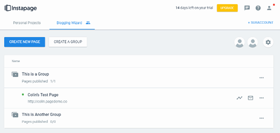
When you go to create a new page, most of the time you’ll be doing it from a template, though you can also import page designs.
Instapage has a lot of templates (200+), all divided up into different categories at the top:
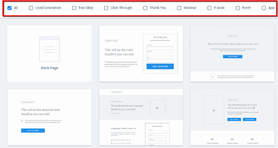
They range from basic frameworks (like the ones in the screenshot) to more detailed designs with more defined aesthetics. You can also always choose to start from a blank page.
Once you choose a template, Instapage will drop you straight into the Instapage Builder.
How to use the Instapage Builder (and why I love it)
Ok, I’m actually going to start this section with a GIF of a WordPress page builder. I think it’s important because it shows how powerful the Instapage Builder is.
If you’ve ever used a page builder, you know that, while they bill themselves as drag and drop, you can only drop things into pre-defined areas. Watch this:

You can’t drag an element anywhere – it has to fit in the existing row/column framework.
With Instapage, you have true drag and drop. You can position a widget literally anywhere you want (even in areas that don’t make sense!):
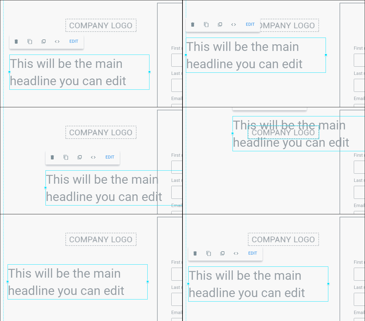
It’s like you’re dragging layers around on Photoshop. I love how flexible this is.
With that being said, Instapage should generally feel pretty familiar to a WordPress page builder.
You have your set of widgets at the top:
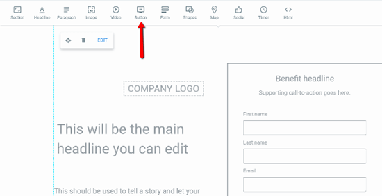
And you can edit individual widgets by clicking on them in the page:
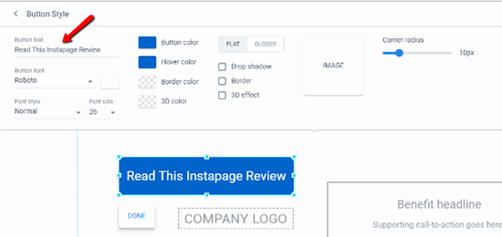
You can also use a similar interface to edit page sections to add, say, a background to your design.
Working with forms in Instapage
Forms are obviously the lifeblood of most landing pages, so I want to show you specifically how Instapage lets you work with them.
To get started, all you need to do is add the form widget.
Then, you’ll get five different options at the top of the page:
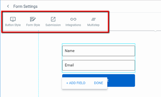
The first two just deal with the style of your form, which is similar to what I’ve shown you already.
It’s the final three options that are the most interesting.
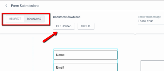
In Submission, you can choose to:
- Redirect users to a specific URL
- Deliver a digital asset that Instapage can host for you
This makes creating lead magnets an absolute cinch:
In Integrations, you can sync your form up to most popular email marketing services. Or, for more flexibility, you can set up webhooks or connect to Zapier.
Instapage is missing dedicated integrations for some smaller services like Drip or MailerLite – but the webhooks should still let you connect to them.
Finally, the Multistep option lets you set up a, you guessed it, multi-step form, though you’ll need to use a separate interface.
Not only is the form builder pretty powerful, it’s also simple to use, even for things like lead magnets.
Creating a mobile version of your landing page
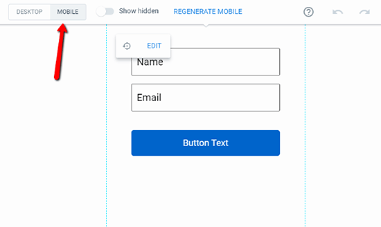
Another thing I like about Instapage is that it lets you use the same drag and drop builder to create the mobile version for your page.
All you need to do is click the Mobile toggle at the top to switch views.
Instapage will automatically generate a mobile version from your desktop page (so you don’t need to restart from scratch), but this interface is helpful to go in and tweak things further:
Creating an A/B/n test to optimize your landing page
Ok, at this point you should have a fully functioning landing page. You could just publish your page and call it a day.
But if you want to make sure you’re publishing the best page possible, Instapage makes it easy to create an A/B/n test right from the Builder interface.
Rather than split testing specific elements, you’re technically testing completely different page versions against one another.
But…
You can still test specific elements by simply cloning a page and only changing one element.
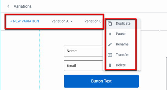
And you can even pause specific variations as needed if you want to stop a specific test:
Other helpful analytics integrations
Beyond split testing, Instapage also makes it easy to track visitors’ actions on your landing page. You can do this in a couple of ways.
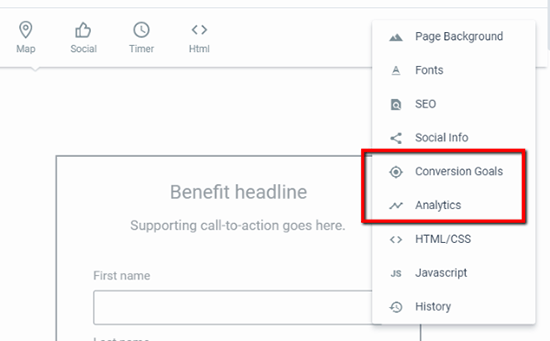
First, you can define Conversion Goals right from the Builder that you can track through Instapage’s analytics.
Second, you can easily add Google Analytics, Tag Manager, Facebook Pixel, and more right from the Analytics option:
Publishing your landing page
Once you’ve designed your page and set up all of your (optional) split testing variations, you’re ready to publish your page and start driving traffic to it.
When you click the Publish button, Instapage gives you 5 choices:

While you can pick whichever you want, I’ll dive a bit more into the WordPress option for this review.
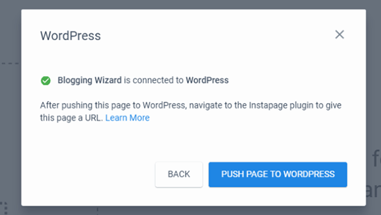
Instapage offers a dedicated WordPress plugin that makes the process absolutely painless. To configure the plugin, all you need to do is log in to your Instapage account from inside your WordPress dashboard.
Then, you can push pages to your WordPress site with a single click:
And as soon as you do that, you can publish the page right from your WordPress dashboard:
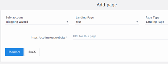
And just like that, your landing page is live on your own domain name at the URL that you specify:
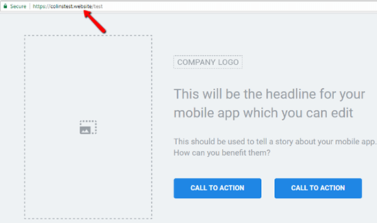
Overall, I was impressed with how seamless the WordPress integration is.
A quick look at Instapage’s analytics section
Before I finish up my Instapage review, I want to give you a quick look at the in-dashboard analytics that Instapage offers.
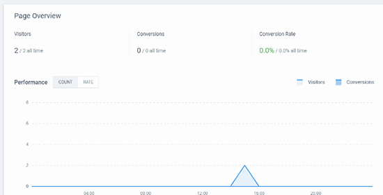
At the top of the analytics page, you can view basic information about your page’s conversion rate (measured based on the conversion goals you set when building your page):
If you’re running split tests, you’ll also be able to view data for each variation in your test:
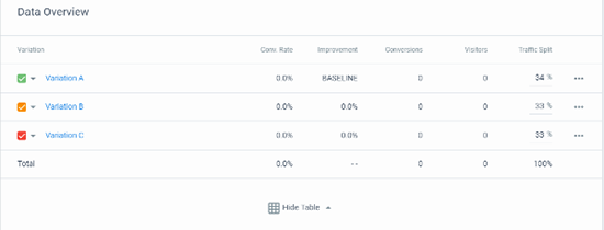
If needed, you can also adjust the Traffic Split between each variation. It’s a little odd for that feature to be tucked away here – but it’s nice to have.
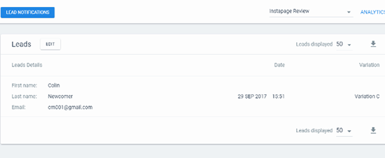
In a separate analytics area, you can also get a look at all of the leads that you’ve collected via that landing page. You can even see which variation generated a specific lead:
Six other Instapage features to help you work more effectively
Above, you learned how to use Instapage to create and analyze a landing page at a high level. But what makes Instapage so powerful is that there are also a number of deeper features that you can harness to boost your productivity and the effectiveness of your landing pages.
1. Easy visual collaboration (great for teams)
If you’re part of a team or agency, you’ll love Instapage’s built-in collaboration tools. It’s kind of like InVision, but built right into your landing page creation tool.
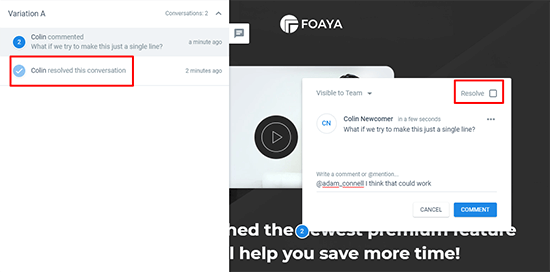
Using Comment Mode, you, or any member of your team, can click on specific parts of your design to leave a comment right there:

Then, other team members can either:
- Respond with their own comment, including @mentions
- Resolve the issue once it’s completed to help keep track of which changes have been made
2. Instablocks to save you time when working with common elements
You already saw Instapage’s full landing page templates, but Instapage also includes a smaller template option called Instablocks.
Instablocks are essentially templates for a specific section of a landing page. For example, you might have an Instablock for a header section or a CTA section:
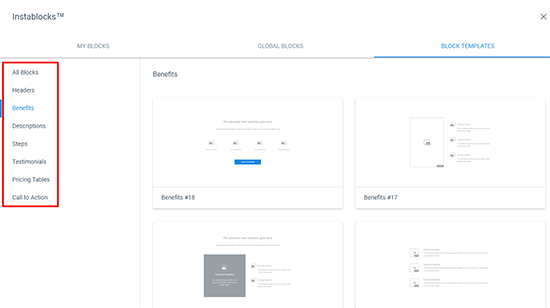
They help you speed up your development process without requiring you to use a fully pre-built template.
And beyond the pre-built Instablocks that Instapage includes, you can also save your own sections as Instablocks, which is a big time-saver if you need to reuse similar elements across multiple landing pages.
3. Google AMP support for quick-loading mobile landing pages
AMP helps your landing pages load lightning-fast for mobile visitors. But the problem with most AMP pages is that they’re ugly.
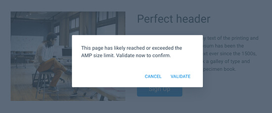
Instapage helps you use AMP without sacrificing design and conversion optimization. You will have some limitations on size and technology that are inherent to the AMP platform (e.g. you lose the timer widget) – but you’re still able to build validated AMP pages using the familiar Instapage builder:
4. Easy AdWords integration to track ROI and effectiveness
If you’re using AdWords to send traffic to your landing page, Instapage helps you connect your landing page to Google AdWords with just a few clicks:
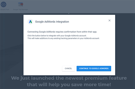
The benefit is that you can view cost and AdWords campaign information inside your Instapage dashboard, which makes it easy to see your ROI.
5. More options for attribution data beyond AdWords
Beyond its dedicated integrations with Google AdWords and Google Analytics, Instapage also lets you pass custom lead metadata (like referral source or IP address) for even more detailed attribution tracking.
6. Built-in heatmaps to find hotspots
Heatmaps help you analyze where users are interacting with your pages the most. Normally, you’d need an external tool like Hotjar to track heatmaps for your landing page. But Instapage can automatically track heatmap analytics and let you view them right from your Instapage dashboard:

Put before How much does Instapage cost? section
How much does Instapage cost?
Now it’s time for the moment of truth…how much are all of these cool features going to actually cost you?
Well, more than a WordPress page builder, that’s for sure.
The cheapest plan costs $69 per month (billed annually). But – that plan doesn’t include A/B testing or heatmaps.
If you want A/B testing, the cheapest plan for that costs $99 per month (billed annually).
So…is Instapage worth the money?
If you’re a casual blogger who only uses one or two landing pages, probably not.
But if you’re a high-powered blogger who’s always running different promotions, or if you’re running a business or marketing team, then I think Instapage is definitely worth a look.
Yes – it’s a hefty cost. But it is legitimately better than many of the cheaper alternatives…if you actually take advantage of the more advanced features.
Final thoughts on Instapage
Instapage is a powerful tool. It’s definitely a cut above the WordPress page builders that many bloggers are used to.
While it is powerful, the Builder is still easy to use and accessible to beginners. And I loved how free-form the Builder is. You truly have the power to put things anywhere.
I also liked how things like A/B testing and conversion goals were built right into the Builder. It feels like they’re part of the actual design process, rather than an afterthought that you tack on to a finished page.
Finally, the publishing options make it simple to use the landing pages that you create, no matter what type of website you’re running.
It’s definitely not the cheapest tool. But if you want a high-powered, optimization-oriented landing page builder, I don’t think you’ll be disappointed.
And if you’ve wondered how Instapage compares to a tool like Leadpages, check out my comparison between the two.
The post Instapage Review: An Inside Look At How To Create A Landing Page Fast appeared first on Blogging Wizard.
Contributer : Blogging Wizard https://ift.tt/2xmWy7a

 Reviewed by mimisabreena
on
Saturday, July 07, 2018
Rating:


No comments:
Post a Comment