Newsletter Examples: How to Craft Irresistible Newsletter Content

What makes the best email newsletters?
What are the best email newsletters made of? Captivating copy, engaging visuals, and a clear call-to-action, right? Well, yes, but there’s more to it than that. The number of emails flooding inboxes these days is staggering. According to DMR, the average person will get 121 emails per day (which is roughly 44,000 emails per year). That’s a lot to read. Due to the sheer volume of emails people receive daily, it’s crucial to cater to your target audience. So how do you ensure your emails are the brightest in the inbox?1. Give readers what they didn’t know they needed
The inbox is a sacred space. It’s a direct line into the lives of your audience and potential customers—so whatever you send should be of the highest quality. Yes, creating an email newsletter free of grammatical errors and broken links is important. But providing actionable, helpful information to readers is also important. Bonus points if you provide knowledge or insight on something they didn’t know they needed. For example: If you’re a business development coach looking to expand your newsletter readership, including extra content that your audience cares about (like a template or eBook or one of these 22 Brilliant Lead Magnets) is a good idea.2. Keep readers reading with great copy and even better design
You can have the best written copy, but if it’s hard to read, it can be tough to get readers to stick around. We’re not suggesting that bad design mutes stellar copy, but striking a balance between the two is key when creating a quality email newsletter. Related: How to Create Amazing Photos for Your Emails on Zero Budget Take photo company Artifact Uprising for example. They're a visual company, which is clearly communicated across all marketing materials. In the example below, they stick with large, eye-catching images and bold, monochromatic colors.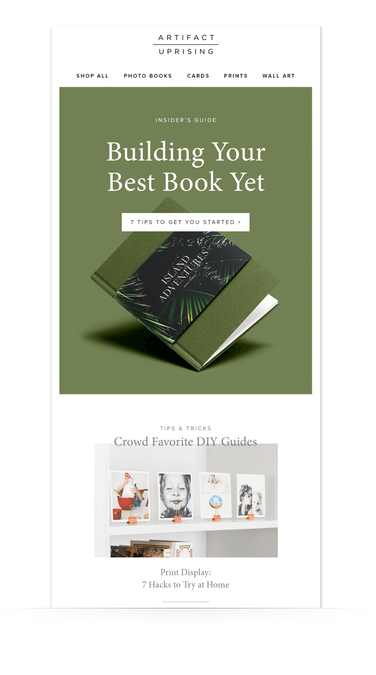 But they don’t rely solely on bold, featured images. The copy, although simple, packs a punch — and it’s hard to resist clicking on the single CTA button to learn how to create your own beautiful photo book. The copy and images in this example work together to tell a story. This is not a long email newsletter, but it didn’t need to be. It's chock full of value (an "insider's guide" and "tips and tricks"), and that’s what resonates with readers the most.
3. An email that reads well will be well read
Design doesn’t just mean pretty pictures. This is where readability comes into play. If you want readers to digest your content, make it easy to do so. The Daily Carnage is a great example of strong layout and organization when it comes to email. It’s text-heavy, but in the best way. Bullet points, subheadings, and colorful call-to-actions make this email newsletter easy (and enjoyable) to read.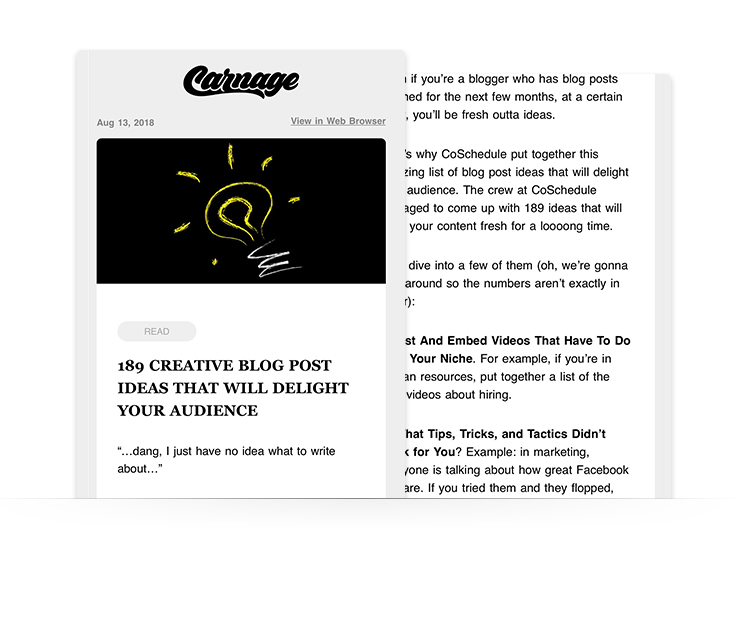 As with any writing, when it comes to the layout of your email newsletter, place the most important information at the top. Dwindling attention spans mean it’s critical to include important information first. The secondary details and other non-essential information come next. If you see a block of text in the body of an email newsletter, what’s your first reaction? Delete? Scroll past? Chances are if you wouldn’t read it, neither would your subscribers. Breaking the copy up into digestible paragraphs or bullet points will help your readers understand the message while saving them eye strain. The goal is to make the copy scannable, which is tough to do with large blocks of text. Not sure what to write in your emails? We created a free course — What to Write in Your Emails — that comes with 45+ email writing templates!
4. Leverage your lists correctly
Segmentation is an excellent way to make your email newsletters more effective and to grow your customer base. According to the DMA, segmented and targeted emails generate 58% of all revenue. With email segmentation, you can create lists of customers based on specific parameters you set and then customize campaigns for each. For example, let’s say you want to target customers who have bought from you once but have not been back since that purchase. You can create a list of these customers and deploy an email campaign that works toward a sale conversion goal. Rewarding customers for past purchases, sharing sale information, or encouraging customers to tell their friends about your brand are a few of the things you can do with a segmented list. Or you can categorize customers based on their email behavior (who opened/didn't open an email). Then, you can target each list differently, either educating them further on your business, or incentivizing them to buy with a unique offer. Understanding what makes your lists unique is the key to using them effectively and seeing the ROI of your email newsletters over time. Related: The Beginner's Guide to Making Money with Email MarketingWhen it comes to design vs. content, both matter
When creating an email newsletter, it’s easy to focus on either design or content. But the truth is: Both design and content are equally as important to the success of the campaign. In fact, if an email includes too many images and not enough text, it can become problematic:- Emails marked “image-only” may end up in the spam folder due to email service providers like Gmail filtering and blocking them.
- Subscribers may have disabled image viewing/downloading in their email settings.
- Depending on the internet connection and browser version, images can take longer than text to load. Subscribers may delete the email before the images have time to load.
Design & Layout in Email Newsletters
1. Use the template that matches your goal
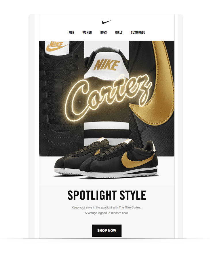
Are you sending out a discount code to new customers? Launching a new product? Announcing a huge end-of-the-season sale? There are many email templates to choose from, which can feel overwhelming at first. (AWeber has more than 700 mobile-responsive templates that you can use. Create your account today!) The question is: Which one will be the best for the job? For example, if you’re an AWeber user who wants to send a new discount code to new subscribers to show your appreciation and to get them to try a product, you might want to select a template that clearly indicates your message. Here's our "announcement" layout that you can customize for your business and brand.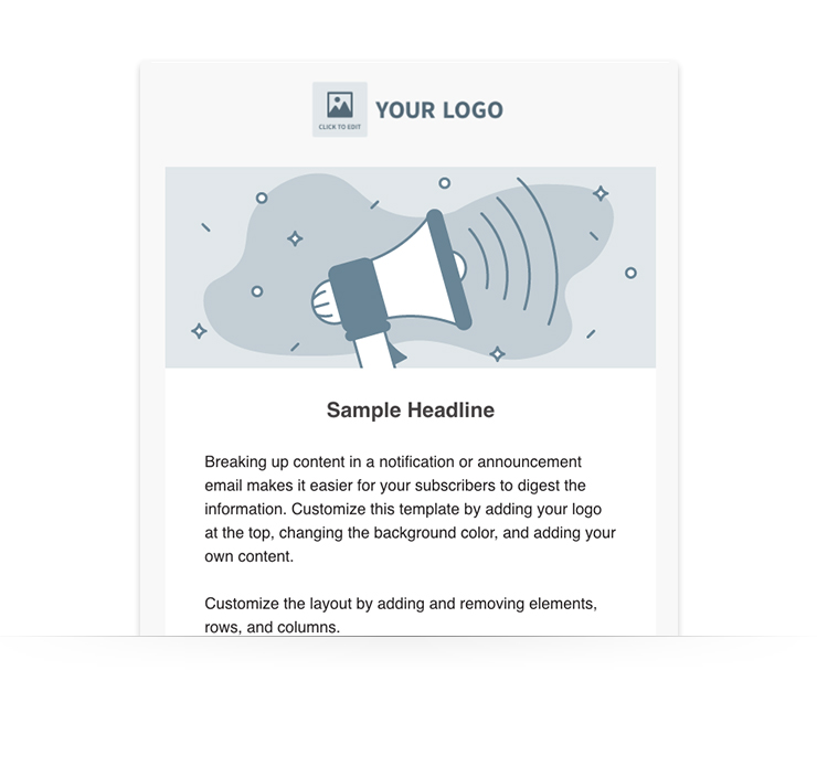 This Nike email does an excellent job of showing readers the detail of a product through visuals and copy:
2. Be bold in your image selection
Images do more than get your brand noticed, they elicit emotion. With images, you are able to set the mood and tone of your email before subscribers even begin reading. This email from The North Face is a perfect example of stunning imagery at work. Not only does the image showcase the products (waterproof rain gear), but the striking contextual image captures attention immediately: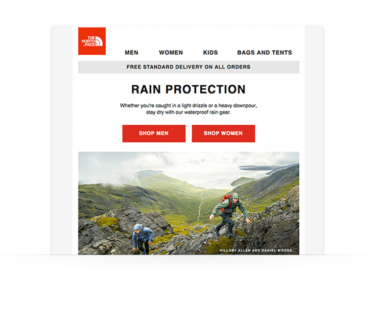
3. Leverage contrast and whitespace
When designing your email, be sure to consider contrast and whitespace. Images that contrast in color are not only impactful and interesting to look at, but they help ensure readers can see the images, too. Including a healthy balance of whitespace is also a design best practice that can make reading your email easier for subscribers. Take these newsletter examples from Peloton, Flock, and Headspace. All three newsletter examples use contrasting images and include enough whitespace to make for easy reading.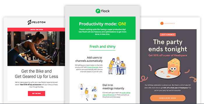
Comments on Content in Email Newsletters
1. Make it personalized
Customizing your email newsletters per your target audience is the secret to success. Thanks to email segmentation, we can categorize subscribers with specific parameters and organize them into lists. Every email created should have the audience’s interests and needs at top of mind. Customizing emails go a long way when done correctly. AWeber user and personality test company Truity has seen increased open rates as a result of their personalization efforts, including personality type-specific messages, like the one below aimed at its a specific personality type — ENFP subscribers. Truity uses the "digest" layout in AWeber's Drag and Drop Email Builder for its newsletters, giving it a streamlined, cohesive look every time it hits your inbox.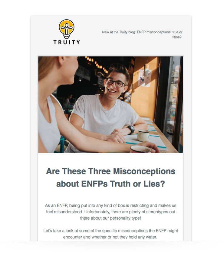 Related: Steer Clear of These Personalization Mistakes When Building Your Email
2. Short vs. long-form content
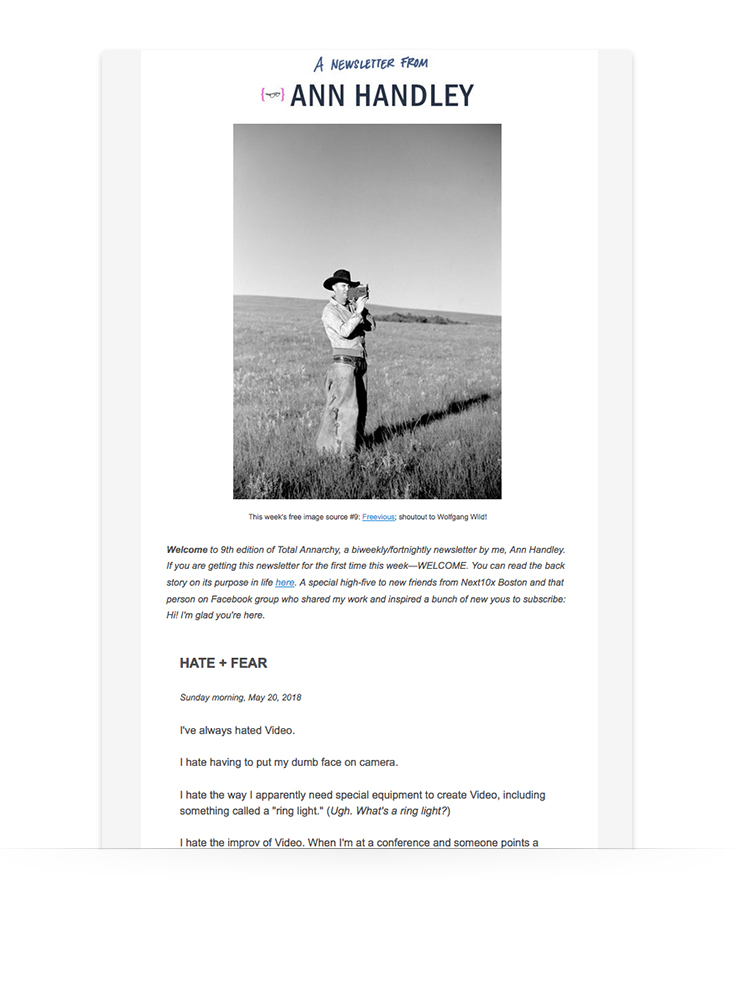
One question that marketers hear often is “how long should my email be?” The answer is, there is no right answer. Both can help you accomplish your goal and communicate your message. The InVision Weekly Digest is concise writing done right. Punchline copy delivered in an easy-to-read format.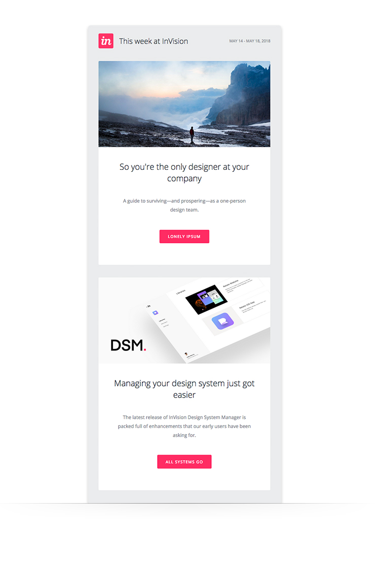 Whether you choose to create an email that’s short and sweet or something long-form, one thing stands true for both: Make it easy to read. This rings especially true for long-form content. As we mentioned above, having a large block of text in the body of your email doesn’t do anyone any good. Break things up into short 2-3 sentence paragraphs or use a bullet point format to convey your message. Related: 8 Powerful Email Copywriting Techniques Ann Handley — AWeber customer, author, and founder of Marketing-Profs, sends a bi-weekly email newsletter, Total Annarchy. It always begins with a long story. However, Handley does an excellent job of taking a ton of valuable information and presenting it in a digestible way.
3. Make your emails count
Trust is hard to gain (and easy to lose) when it comes to engaging with your customers. If someone has given you permission to his/her inbox and has opened your newsletter, it’s your time to shine. Providing value-packed content to your subscribers is a key component in seeing a positive ROI on your email campaigns besides to growing your customer base. WouldYouRather (WYR), another AWeber customer, does this well by making every email engaging and interactive: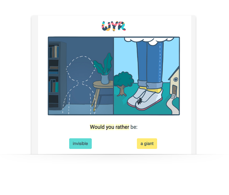 What’s more: WYR follows up with the results every week so subscribers can see what other people on their list chose (who won: compliment or a $100 bill) and why. They ask for the reasoning behind the choices made to share some insight into the human decision-making process. Bottom line: If your content is not providing subscribers information worth their attention, leave it out of the email.
4. Special offers can lead to purchases, if done correctly
Promotional content can yield successful results, too. This is an integral part of business for those in the eCommerce world, as well as for those promoting events and selling tickets. We see this executed well in this simple, to-the-point email from AWeber user and the band Phish: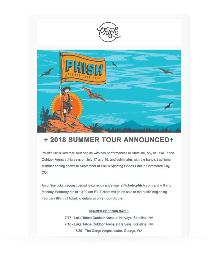
5. Be a stickler for grammar (if you aren’t already)
Mistakes happen, but if grammatical errors are consistently popping up in your email newsletters (or any of your marketing materials for that matter), you run the risk of losing your credibility, customer trust, and money. Have an editor or a coworker with a trained eye look at the copy before adding it to your campaign. Be sure to have them check it again after you finish building the email. If you’re an AWeber customer, it’s easy to edit copy even after you’ve entered it into your template.More inspiration: newsletter examples
The examples below are grouped by category so you can find what’s most relevant to you.Newsletter Example: Blogs
Leading with a strong image and captivating copy is a sure-fire way to keep your subscribers reading. The example (hey, that’s us!) below does just that: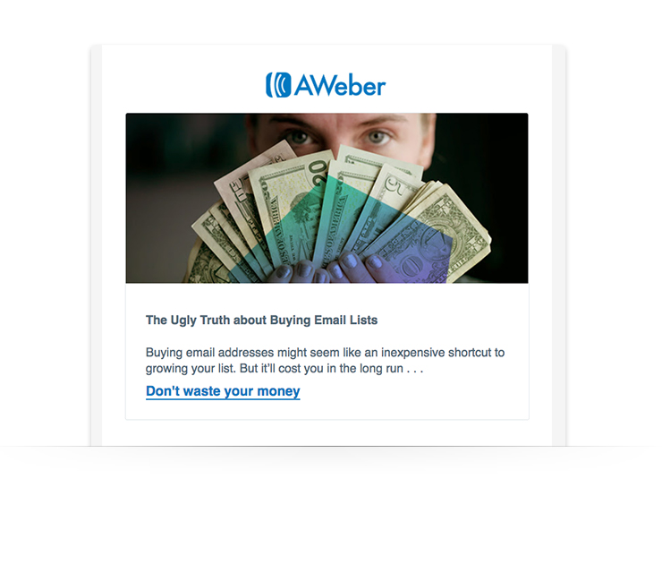 (Gain a competitive edge: Subscribe to AWeber's newsletter. Get essential tips and news about email marketing sent weekly to your inbox.)
Newsletter Example: Local and small businesses
Showcase your products or services with an email template that is visual and text-friendly. This email from Moo does a great job of highlighting a product sale in a colorful way that is not only on-brand but also eye-catching.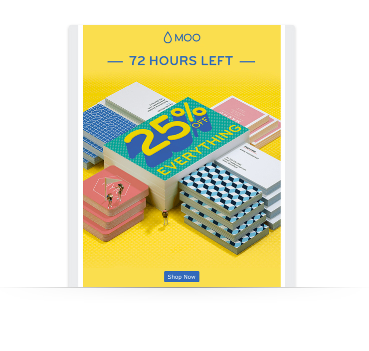
Newsletter Example: Podcasts
Podcasts tend to cover a lot of information during each episode. What better way to create a centralized place where listeners can do further research, learn more, or read up on guests than with a summary email?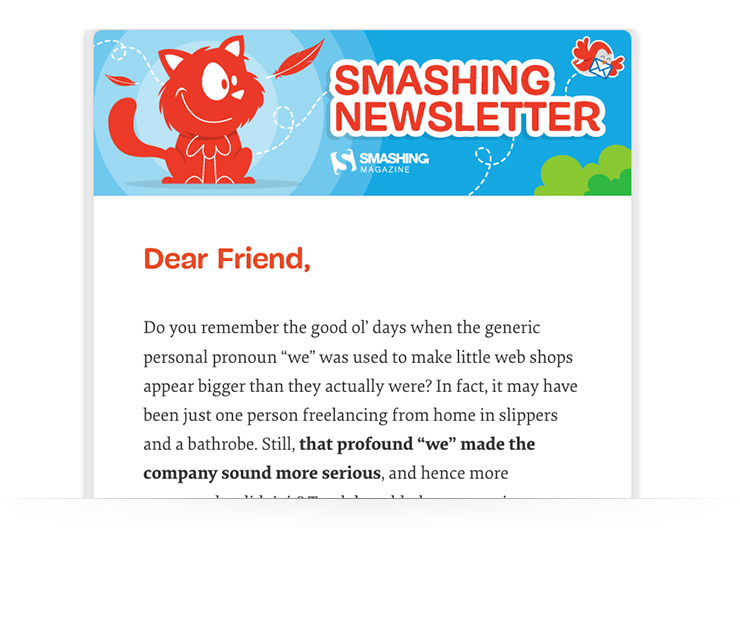 This email from Smashing Magazine includes a table of contents that make jumping sections a breeze. With an organized layout and plenty of space for a recap, this format is perfect for podcasts.
Newsletter Example: SaaS and Software Companies
Providing value to your subscribers, in whatever capacity that may be, is crucial to keeping them interested. Including helpful content like this “How to Use Instagram Stories Templates” guide from Later is a great way to provide value. This also shows subscribers you know what you’re talking about.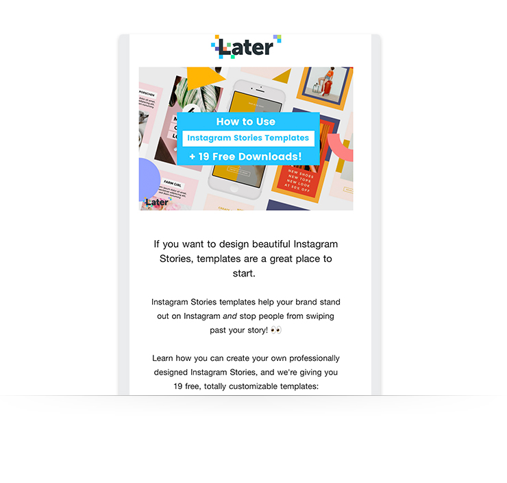
Newsletter Example: Non-Profit Organizations
The Human Rights Campaign knows how to welcome new supporters. This email not only includes a thank you note, but it also outlines how supporters can take further steps to help the campaign.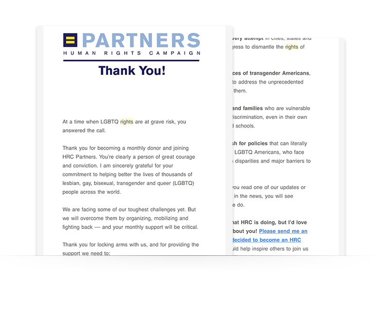
Newsletter Example: Product and eCommerce
Like the SaaS example above, product and eCommerce companies can provide value with actionable content, all while keeping things fun and interesting: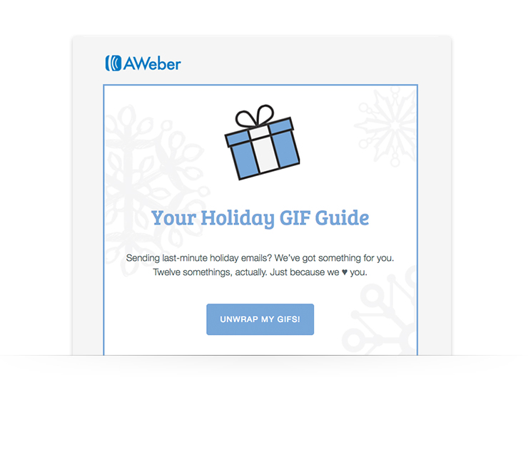
Now it’s your turn
With all this good information, now you’re ready to knock out your next email newsletter. Maybe you’ve selected your template, but aren’t quite sure what to include in each section. No problem. We’ve broken down what the layout of your email newsletter could look like.- Title - [Your Brand Name]’s [Weekly | Monthly | etc.] Newsletter
- Paragraph 1 - This is a great place to summarize your company and explain why you’re great. Be sure to include the most important information in this section. If you’re sending a welcome note to new subscribers, add details on how often they can expect to receive your newsletter.
- Paragraph 2 - Leverage your template by selecting bold imagery that is not only on par with the content of your email but also with your brand.
- Paragraph 3 - Time to let your writing chops shine. The goal of your email will most likely determine the length of your copy. It’s important that your email reads the same as the rest of your marketing materials, so keeping your brand style guide close is a good idea.
Building Your Email Newsletters
Your email newsletter is your opportunity to inform, educate, and connect with potential customers. Your subscribers have granted you permission to show up in their inboxes whenever you please — so now it’s time to get to work. Let’s recap what we just learned:- Providing value-packed content to readers is essential when it comes to the success of your campaign. Formatting your email for readability will make or break your click-through rates. Leveraging your segmented email lists correctly through customization will increase your ROI. Creating an email design that is eye-catching and functional will keep subscribers reading. Writing attention-grabbing copy that communicates your message goes a long way.
The post Newsletter Examples: How to Craft Irresistible Newsletter Content appeared first on Email Marketing Tips.
Contributer : Email Marketing Tips
Newsletter Examples: How to Craft Irresistible Newsletter Content
![Newsletter Examples: How to Craft Irresistible Newsletter Content]() Reviewed by mimisabreena
on
Thursday, August 30, 2018
Rating:
Reviewed by mimisabreena
on
Thursday, August 30, 2018
Rating:


No comments:
Post a Comment