Web Design Don’ts (And How to Fix Them)
Now more than ever, a website is the first point of connection between product/content creators and potential users. Because a face-to-face interaction is out of the picture, credibility and connection must be established in other ways. Whether you’re using a web builder, or building things from scratch,.
The best sites or app designs provide users with straightforward navigation, a personal connection and pleasing visuals, but all too many websites fall short. These are some of the most common web design flaws and some ways to avoid them.
Your Web Designer Toolbox
Unlimited Downloads: 500,000+ Web Templates, Icon Sets, Themes & Design Assets
Cluttered Fonts
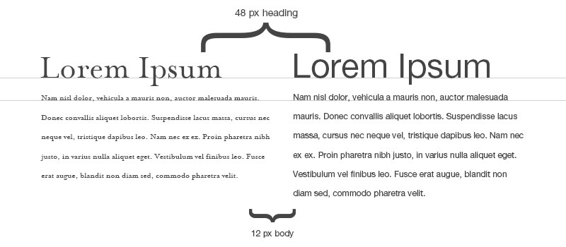
Some websites seem to operate under the assumption that they might run out of space. All information is packed in using a small font size. This overwhelms users and causes them to check out.

Image Source
Large chunks of text create a phenomenon called “TL; DR”, or “Too Long; Didn’t Read”. Web users have endless choices of what content to consume and want to engage with it efficiently. Here are some tips for avoiding “TL;DR”
- Instead of crowding all possible information on your front page. Think about what different users might be looking for and separate it into individual pages linked by an easy to navigate menu.
- When possible, use bulleted lists instead of paragraphs to create an easily scanned page.
- Use a larger font size. Users are willing to scroll indefinitely if they are engaged, so feel free to take up space.
Photo Faux Pas
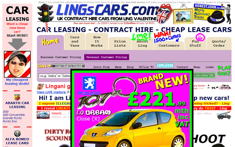
There are several ways your website’s images can damage credibility. Corny “clip-art” animations and graphics tell users that you designed your site in the late nineties (this is especially true of any image with a big white square behind it).
The same goes for badly Photoshopped images, low resolution photos and unconvincing stock photos.
- Use real, high quality images whenever possible. DSLR cameras are easy to find and even smartphones often can take beautiful high resolution images.
- Use images purposefully and sparingly. Cluttered photos are just as bad as cluttered text. And one meaningful and appealing photo is always better than a big pile of uninspired images.
- DIY! Personalized hand-drawn illustrations can create a connection with users and make them feel at home. If you are someone that has the skills and access to a drawing tablet, this can be a great personal touch.

Un-scalable
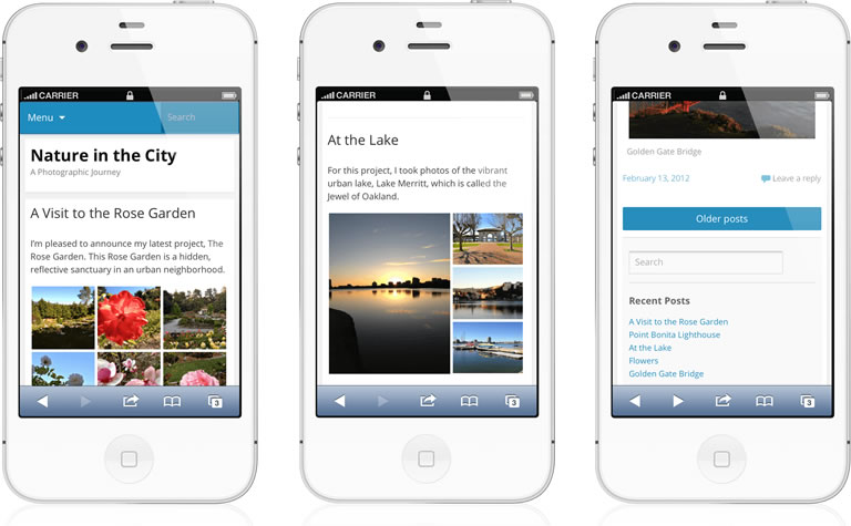
In established markets like the United States and Canada, mobile devices are the primary web browsing tool for between 60 and 70 percent of users. In emerging markets like Indonesia it is upwards of 90 percent.
Yet, many websites are still almost impossible to navigate using a mobile device. If upwards of 60 percent of your users can’t easily move through your site, you will lose them to the next listed site on Google. Even if your site is technically usable but difficult to manage, you risk losing visitors.

But there is an easy fix! Website templates for WordPress are cheap and easy to use. Not only do these templates automatically adjust your site for different screen sizes. They have the added benefit of providing access to a whole world of apps and backgrounds that can be plugged right into your site.
Confusing Layout
A good website is a user-focused website. If your users are required to poke through 10 different pages to find what they are looking for they won’t be returning to your site.

All too many websites bury important information at the very bottom of a page or in an area of the site that takes multiple steps to access. Your content should be as easy to reach as possible.
- Go menu crazy. Great sites often have three menus, one across the top, one down the side, and another that users can open by tapping open. Do whatever it takes to organize as much relevant information on the homepage as you can.
- New stuff first. A dynamic website is always adding and improving content and that stuff should take center stage. A blog style homepage is a great way to get the most up to date and innovative content in front of users before they start clicking around.
Keeping in mind mobile users, creating a clean and navigable layout and avoiding unnecessary media applications are all ways to create a great website. By maintaining a user-friendly site, you will be able to keep current users happy while building your base. And don’t be worried – if you need a redesign, there’s still time.
:) Hit link to watching video...! https://ift.tt/2uoJFgi
Contributer : 1stWebDesigner
 Reviewed by mimisabreena
on
Thursday, November 01, 2018
Rating:


No comments:
Post a Comment