Web Design Trend: Big and Bold Typography
Have you been paying attention to the latest web design trends? Typography is getting bigger and bolder! Good typography is essential to a great website. And, what makes a more prominent statement than huge text that gets right in your face and tells you what you need to know?
If you’re considering a redesign for 2019, you’ll want to keep track of the latest trends in web design so that you can see what’s speaking to internet users (and what’s out). These websites have got the right idea – take a look and see how this trend is affecting web design!
Frana FX
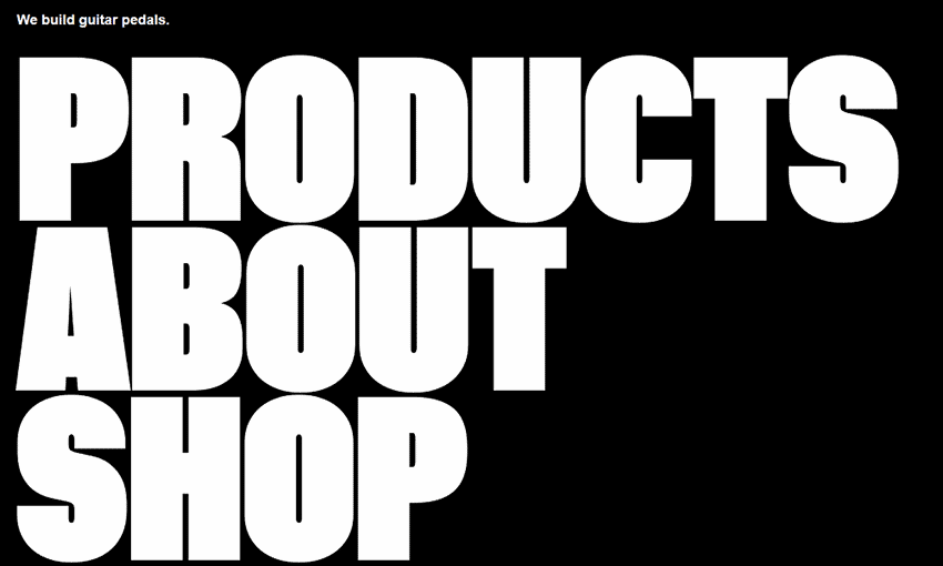
When we say big text, we mean it! The homepage is made up of nothing but a directory of large text. It gets straight to the point with just a one-sentence blurb about what the company does, before immediately directing you where you want to go.
Dragon Rouge
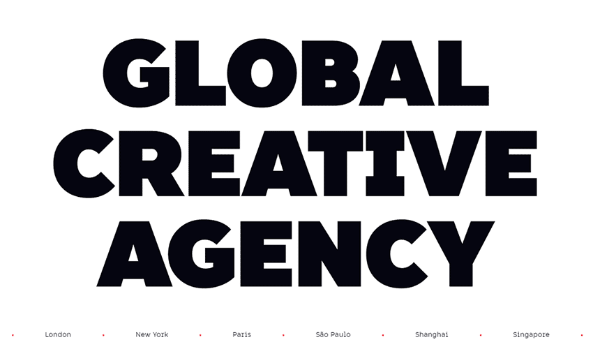
Dragon Rouge gets super creative with its typography. It opens with a list of countries it operates in, scrolling by as the gigantic title fades in. Various screen and hover effects involving the distinctive typography present themselves as you explore the site. Make sure you look around to find all the cool text effects!
Huge Inc
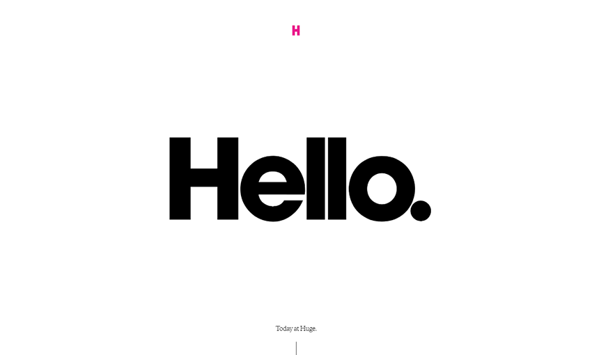
When you open this site, you’re instantly greeted with a big “hello”! The rest of the site’s headers uses the same eye-grabbing font, establishing consistency and always drawing you in to the important info. The more readable serif body font pairs well with it, too.
The Black Sheep Agency
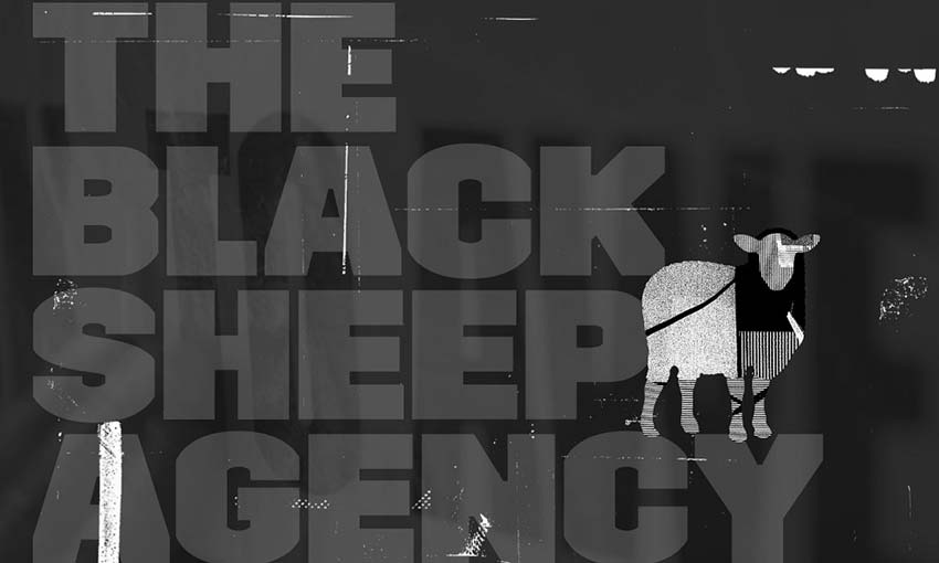
Black Sheep combines big, blocky text with interesting visuals to create a really cool effect. This type of typography suits the dark, grungy aesthetic well.
Nurture Digital
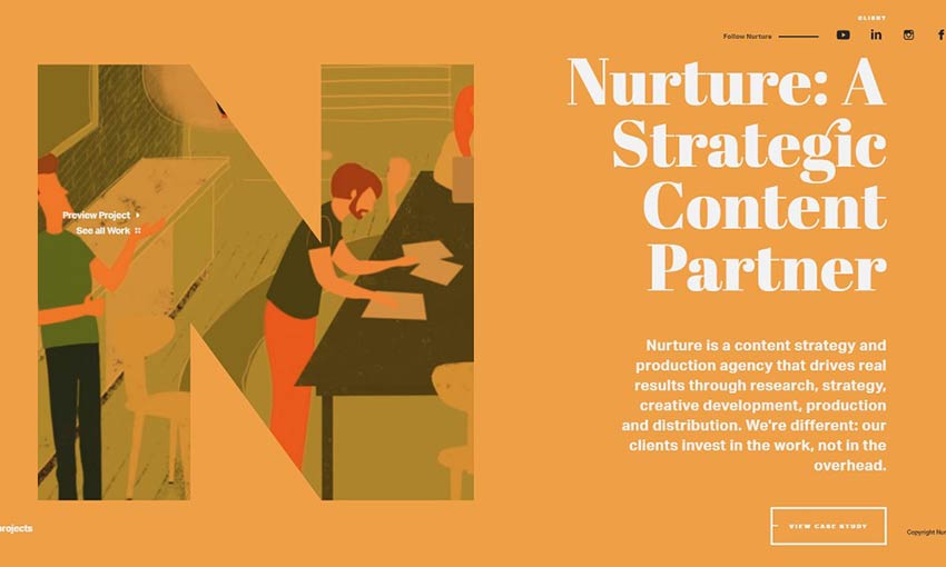
A lot of bold typography tends to look similar: Sans-serif, flat and clearly defined. Nurture Digital uses a more stylized font, and it works really well with the creative, cartoon-like animations. You’ll also find videos with a large letter overlay as you scroll through recent projects, creating a distinct effect.
Florent Biffi
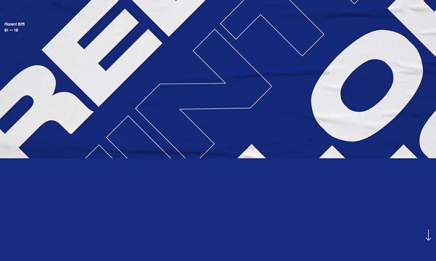
Besides the awesome animated typography banner, the site uses large, sans-serif headers to draw your eyes towards the most important areas. For a designer, that would be their past work, awards and contact links. This is how you design a modern portfolio!
M&C Saatchi Worldwide
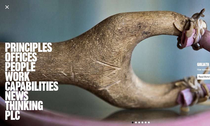
Your homepage doesn’t need to follow the same tired formula. Sometimes all you need is a little typography. The only place to go is the menu, and here you’ll find more big text directing you to learn more about the company. Inside, you’ll find even more unique text-based page design.
Basic Culture
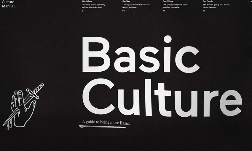
This full-screen website is primarily designed with text and effects, using only occasional images to draw you in. The little effects and additions like the subtle static animation and occasional scribbles tie this presentation together.
Built By Built
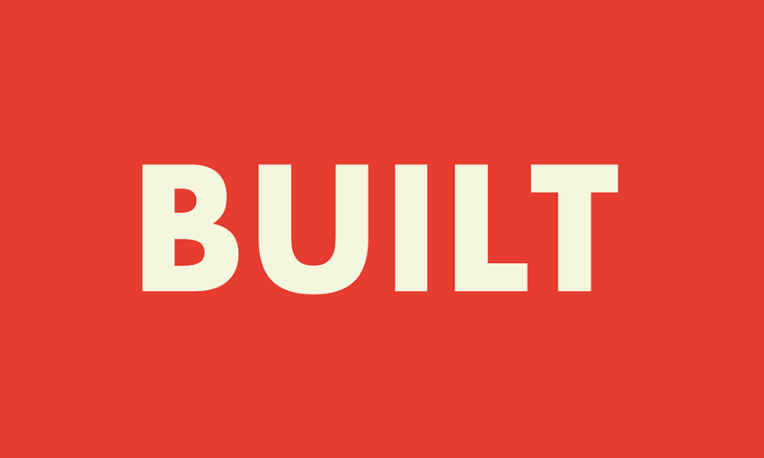
A flat, colorful text banner greets you here. As you scroll, the site transitions from carefully crafted paragraphs to elegant images. This site makes expert use of colors and content to create an experience that draws your eye exactly where they want you to look.
Color Lisa
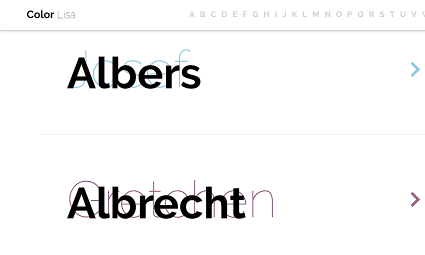
This is a neat trick. Overlaying a thin font and a thick one of different colors keeps both words readable. It’s a pretty cool reminder to experiment with your web design. The simple, sans serif header fonts work well with the flat, clean design of the website as well.
Peter Van Alphen
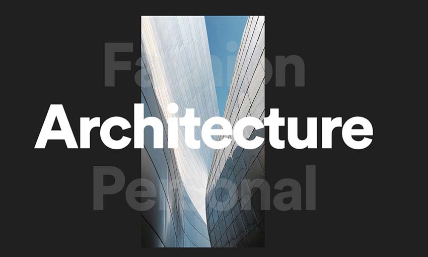
Besides the simple text-based homepage navigation, one cool feature of this website is the background. As you browse, the name of the category you’re on will appear there. It’s a cool way to decorate your background using just text.
Almanac
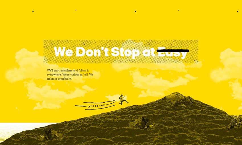
It’s often best to stick to two or three fonts for a website, but rules are made to be broken. Almanac uses a variety of striking fonts and styling. This works perfectly with the colorful, animated design of the website.
Make a Big Statement
People are getting tired of overly simplistic designs, white websites and elegant subtlety. Right now, the trends are turning towards boldly designed sites that grab your attention. That means colorful design, eye-catching animations – and bold typography!
If you liked the aesthetics of the websites above, take a risk with your design and include some impactful typography in your next website.
:) Hit link to watching video...! http://bit.ly/2DaLjVA
Contributer : 1stWebDesigner
 Reviewed by mimisabreena
on
Wednesday, January 16, 2019
Rating:


No comments:
Post a Comment