Design Elements That Make Your Product Pages Stand Out

I remember walking into this small boutique store a few years back on holiday, exploring the local scene.
As I walked in, there was this beautiful white shirt right in front of me. I had one of those “Confessions of a Shopaholic” moments, where I thought that shirt spoke to me, asking me to buy it. I indulged, and I still love showing that shirt off.
When I think about it now, I don’t know what clicked. Was it the perfect lighting that brought the shirt to life, or was it placed in a way that made it impossible to miss? Or was I drawn to how the shirt seemed to have a personality of its own? Maybe it was all this, or maybe the boutique owner just knew how to design the whole store perfectly for browsing customers like me.
Product pages on ecommerce websites can have that same effect on people. It’s all about the design. Recreate the experience of an online boutique store, with a design that is compelling, calls out to customers, and makes products stand out.
How do we do that? Here are seven essential design elements to design product pages that have an impact on your customers.
Learn more with award-winning designer and online educator Pamela Wilson in a free webinar to learn “How to Use Visual Marketing to Get Attention.”
Get started with these seven essential design elements
1. Product images
The first focus must be on the product images you put up on the product pages. Collect multiple images, showing different angles, and even the product in action. Consider creating a story around the images to make them more appealing, instead of a simple, drab list of images. For example, if the product is a beach bag, you could fill it with beach essentials and shoot the pictures at a real beach. Additionally, using high quality, and high-resolution pictures is an absolute must to represent the real product as closely as possible.
2. Description
Once the quality images have caught the customer’s attention they need a description to better understand the product. The description needs to be short, and crisp, but also convey the value the product brings to the table. For example, for the beach bag, the description must include the size, material, color, and price. Additional information can be placed lower on the page, as the customer scrolls down.
3. Call-to-action button
Your aim is to convert potential customers into paying ones. Adding a clear call-to-action button, like, “Buy now,” or “Add to cart” helps browsers make a decision to purchase the product. This clickable button must take them to an easy checkout process, or allow them to continue shopping before they buy all the products they have added to their shopping cart.
4. White space
The amount of white space on a product page greatly influences how well the product stands out. Cluttered product pages with heavy text, and cramped up blocks only creates confusion. Every block – images, descriptions, call-to-action buttons, or additional information – must be well divided within the white space. You want each piece of information, and image to be impossible to miss.
5. Brand colors
You may be following your brand colors across all your marketing campaigns, but it’s equally important to incorporate the same colors on your product pages. Using uniform brand colors across all channels and mediums makes it easier for customers to recognize you. The call-to-action button, borders, colored product titles, and all other additional blocks must be aligned with your brand colors.
6. Fonts
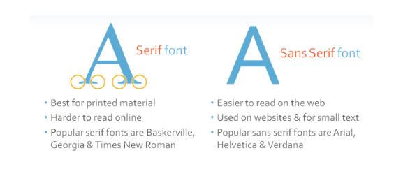
Using more than three different fonts across a product page only makes it look messy. Stick to the same fonts you use for other communication channels, make sure it’s clear and easy to read, and keep the sizes standard. You don’t want an extra large product title to be followed by an impossibly small description font, and then a call-to-action text that looks like worms instead of words! Keep it easy, simple, and clear.

7. Additional information
Once you have made an impact with attractive images, relevant information, and a call-to-action, add some additional information to help your customers make the buying decision. This goes at the bottom of the page. Add shipping and returns information, care instructions, customer reviews, styling tips, or other product recommendations to complete the whole package.
These seven design elements can persuade a customer to go ahead and buy your products. Give out all the necessary information, make it easy on the eyes to make your products stand out, and help customers know how to take the next action.
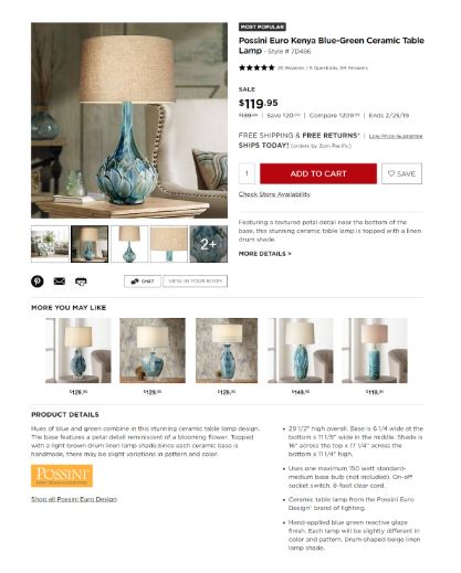
Here’s an example of a product page that includes all the necessary elements:

Integrate eCommerce with email marketing
If you’re an ecommerce business owner, it’s time to focus on the visual appeal of your product pages to catch the attention of your customers – and sell more.
That’s not all. Using the perfect brand colors, design elements, and integrating it with email marketing for ecommerce can create an even bigger impact.
Here’s what you need to do:
- Add a pop-up on your website, asking people to sign-up for your newsletters and emails.
- Keep the colors, fonts, and visuals in your emails aligned with those used on the product pages.
- Using an email marketing platform, connect your ecommerce store with your email marketing to send out personalized emails.
- Send out abandoned cart emails to cut down on missed opportunities.
- Use the browser, or purchase, history to send curated content, recommendations, and product suggestions.
Ecommerce email marketing campaigns allow you to boost your returns on investment, get more traffic to your product pages, and boost conversion.
Start designing so your product pages can start selling for you
You’re now ready to start designing your product pages with these design elements. Draw attention to your products, give your customers all the information they need, and compel them to go ahead and buy it.
It’s all about keeping it simple so customers can pay attention to what’s in store for them. Put on your creativity hat and start designing, to start selling.
Learn more with award-winning designer and online educator Pamela Wilson in a free webinar to learn “How to Use Visual Marketing to Get Attention.”
The post Design Elements That Make Your Product Pages Stand Out appeared first on Constant Contact Blogs.
Contributers : Constant Contact Blogs https://ift.tt/2GyDtIh


No comments:
Post a Comment