Logo Design Tips for Fitness and Wellness Businesses

It’s amazing how our brain stores and processes numerous visuals, every single day.
You may not even realize a visual is permanently stored in your mind, until you see it pop up somewhere. In fact, our brain processes visuals 60,000 times faster than text.
A purple door with a vintage yellow frame around the peephole immediately reminds me of my favorite TV show, Friends. In the same way, I could be traveling in any part of the world, not know the local language at all, but as soon as I see that round green and white logo, with a woman’s face, I know I can get my cup of Starbucks coffee.
As a small business owner, you can create that instant click with your customers with a well thought out, relevant, and catchy logo. Whether they spot your physical store, your ad that pops up on a social media feed, or your poster at an event, they’ll know it’s you. You can even create branded email templates for your email marketing campaigns.
Logos and visuals have the power to create that instant association between a brand and its customers. Just as signs on the road lead us to the right place; logos can lead customers to the products and services they seek.
For the fitness and wellness industry, logos can not just draw customers in, but also have the power to inspire confidence, reflect a sense of well-being, and project the brand’s vision.
Let’s say, you’re looking for a spa near you. Two options pop up: the logo for one is a soothing blue hibiscus flower, and the other one displays a fiery red dragon. Just looking at the logo, which one are you more drawn toward? If you’re looking for a spa which logo inspires calm and peace?
You get the picture, right? Now, let’s get into the details of how your fitness and wellness business can do just that – draw the attention of your customers, and compel them to connect with your business.
Looking for fitness and wellness email campaign ideas? Create and send powerful emails with Constant Contact when you sign up today.
Tips to design the perfect fitness and wellness business logo
When you start thinking about the logo for your fitness and wellness business, you need to look at the bigger picture. You want to make sure that your business logo looks great, but is also recognizable, no matter where it is.
The first step to designing your logo is to remember that a logo is placed on different platforms, so it should retain its identity no matter its size or placement. For example, on your business letterhead the logo can be big and bold, but the same logo also appears as a tiny circle on Instagram.
Keeping this in mind, here are the five key elements to consider when designing your logo:
1. Brand vision
What is your brand’s vision? Are you selling a specific type of fitness, or are you considering overall health as your vision? Are the products the central focus, or the customers? What do you want to achieve and how do you want your customers to perceive your brand? Your business logo is like a sales pitch, so what impression do you want to make with it?
The idea is to be able to convey who you are, what you stand for, and what you deliver. Look at this logo that beautifully conveys the brand vision of offering 360-degree health and fitness:

2. Concept-based ideas
Don’t just think of images or icons, shift your focus to concepts. The concept could be as simple as fitness equipment to reflect the equipment you use for fitness training, or a symbol associated with deeper meanings, which are still relevant to your business.
Here’s a logo for an outdoor fitness business. The concept here is depicted by the arrows portraying directions, leading to the outdoors, and the circle reflects a complete outdoor fitness experience:

3. Effect of colors
The use of the right colors can boost brand recognition by up to 80%. The colors of your logo can influence potential customers, and have a big impact on how they perceive your brand. Every color is associated with certain traits, and knowing these can help you understand what works best for you. Additionally, as a small business owner, it’s also important to understand that logos with less than two colors have a much lower printing cost, as compared to multi-colored logos. As a business within the fitness and business industry, the best colors to use are:
- Yellow – optimistic and happy
- Orange – confident and friendly
- Blue – dependable and trustworthy
- Green – health and peace
Here’s a logo for a Yoga center that uses the right colors to inspire a sense of trust, optimism, and happiness:

4. Legible fonts
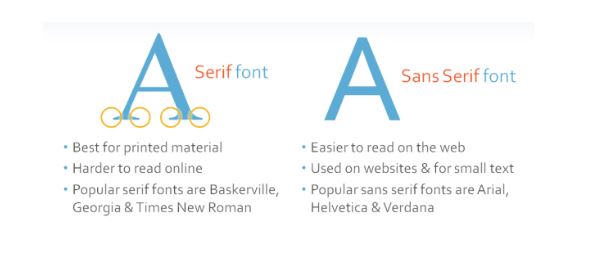
Simple, easy-to-read, and clear – these are the three most important things to look at when choosing the font for your business logo. Some fonts may look beautiful and artistic, but they’re not always practical. You want to make sure that customers can read what’s written on the logo at a glance. It’s often better to choose from the Sans Serif font category like Arial, Helvetica, and Roboto. If you want a more artistic font, opt for Slab Serif font categories, like Rockwell and Clarendon. However, steer away from using the script font category like Brush Script, and Comic Sans is a definite no-no for a logo.

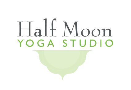
Here’s a good example of a logo that uses two different fonts. Both are easy to read, simple, and clear:

5. Simple but catchy
The best logos are simple, yet hard-to-miss. The simpler the logo, the easier it is for people to pay attention to it, understand the idea behind it, and be drawn to it. Think of some of the biggest brands, Apple, HP, Pepsi – all of their logos are based on simple ideas. The idea is not to show how artistic you can be, but how creative you are at conveying ideas simply. If you have a story behind the logo, or the business, incorporate that.
Here’s one logo that defines simplicity, relevance, and a touch of the remarkable:

Bridge your business and customers together with the right logo
The right logo helps you build a bridge between your business and your customers. Be it a social media post, a branded email marketing campaign, a lead generation ad, or a banner at an event location – your logo is what people remember, and think of when they’re doing business with you.
From the right font, to the color, the idea, and your vision, everything works together to make your logo stand out. Design a logo that’s simple, but powerful.
Looking for fitness and wellness email campaign ideas? Create and send powerful emails with Constant Contact when you sign up today.
The post Logo Design Tips for Fitness and Wellness Businesses appeared first on Constant Contact Blogs.
Contributers : Constant Contact Blogs https://ift.tt/2ItwoL5


No comments:
Post a Comment