7 Reasons Your Instagram Stories Are Failing to Convert
Ever had that sinking feeling that no one is going to show up to your dinner party? Then you know how it feels when no one is swiping up on your Instagram Story.
You can see that they’re getting plenty of views, but those just aren’t translating into clicks. Where is everyone?
They’re still on Instagram, but I’m sorry to say that they’re swiping up on other people’s Stories instead of yours. Don’t take it personally. It’s not you— it’s your Stories. And fortunately, there are lots of ways to improve them!
Here’s how to get your audiences swiping up instead of swiping through.
Download your free pack of 30 customizable Instagram Stories Highlights Icons now. Optimize your profile and set your brand apart from the competition.
7 reasons your Instagram Stories might not be converting
1. Your content is too polished
As the Instagram Feed grew increasingly refined, one perfectly-arranged avocado toast post at a time, Stories became a place where audiences expected looser, more natural content.
Our team found that live-action videos perform better than graphic videos for that reason: content that’s too slick looks out of place and disrupts the user’s experience as they scroll through their Stories.
Similarly, brands like The Guardian find that realistic Stories perform better than heavily-edited ones.
Even if you’re advertising on Instagram Stories, you don’t want your videos to look too much like ads. Otherwise they’ll stand out awkwardly from the other Stories you post and users will skip them.
There are benefits to keeping your Stories more casual. For one thing, it gives you more opportunity to experiment. As Stories become the dominant format on Instagram, the platform continues to add more features and formats for you to play enhance your Stories. Adding stickers, GIFs and filters can be a nice touch that helps your content fit in with the other Stories your audience is watching.
If you’re looking for inspiration, Bon Appetit is consistently great at sharing high-quality videos that never seem too stiff or formal.
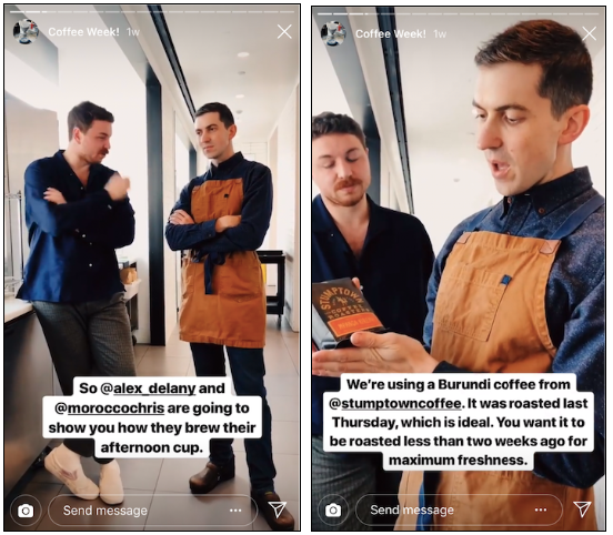
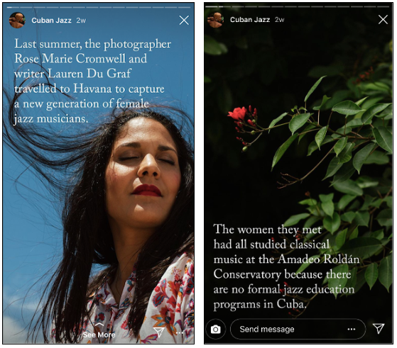
One exception to this rule? If your brand identity is more composed and formal, then your Stories should be too. For instance, the New Yorker’s Instagram Stories are aligned with the editorial look and feel of their other content.
2. …or maybe your Stories are too laid-back.
I know, we just told you to relax! But it’s sort of like when a friend tells you to “be yourself” at a job interview. They don’t mean that you should show up in sweatpants.
When in doubt, stay on brand. Having a clear visual identity for your business is essential, because it will help new fans get to know you, and long-time followers recognize your content instantly. Audiences will only spend a few precious seconds deciding whether to watch your Stories, so make it easy for them to figure out who you are.
Even if you want your Stories to look like you’re posting them in the moment, make sure to preview them first to check how they look. Are they blurry? Are they cropped weirdly? Does your text have typos? If so, reshoot!
While it always helps to have a professional designer or photographer creating your Stories, even small teams can produce stunning content. Anyone can learn to take and edit gorgeous photos using only a smartphone. Or, you could even use a set of graphic templates.
One last tip: always follow the design specs for Stories, which will ensure your videos and photos look sharp and clear.
3. Your CTA is unclear
Okay, you’ve reviewed your Stories and you’re confident that they’re hitting the right balance between polished and casual. But your audience still isn’t swiping up.
It could be another common problem: your call-to-action isn’t obvious enough.
Without a clear CTA, your audience is likely to move on without realizing you want them to take another action.
Instagram adds “See More” text to the bottom of Stories that include links, but that doesn’t give your viewers a lot of information. Swipe up to do what? Buy the pictured product, read a post about it, sign up to find out when it’s available?
When it comes to CTAs, there’s no benefit to subtlety. You should be as obvious as Andrew Lincoln holding giant cue cards up for Keira Knightley.
Providing additional context helps make your message clear in the few seconds you have with viewers.
You can also make your CTA bigger and more visible than the “See More” text while maintaining your Story’s aesthetic, like Apartment Therapy did here:

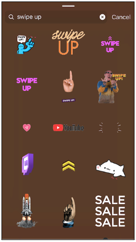
Or use one of the many GIFs or stickers on Instagram that were designed for exactly this purpose. Here are just a few of the options when you search GIFs for “swipe up” options.
4. Your landing page isn’t consistent
Your CTA is important, but it’s just the means to an end. Your landing page—or whatever’s waiting on the other side of that swipe—is where you’ll make or break your conversions.
And one of the biggest reasons audiences close your landing page without taking action is because your messaging or content is inconsistent. Message matching is key! Make sure whatever you’re offering on your Story is aligned with what audiences get on the landing page.
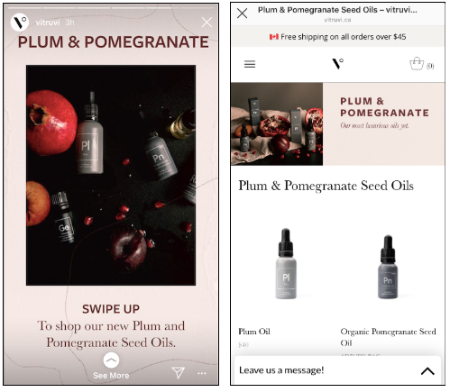
The look and feel of your landing page is equally important. It should mirror the tone and visuals of your Stories for a seamless experience that draws audiences in.
Essential oil brand Vitruvi is a good example of an aligned Instagram Story and landing page:
Here are more tips for creating a landing page that converts.
5. The important details are hard to find
You know how important quality is when it comes to Instagram Stories: if it looks bad, or it’s boring, audiences will skip it. But even great content can fail you if it’s not providing enough information to your viewers!
Even followers who like your Story might not be sure what the point is. A product reveal? A blog post? A longer video waiting for them on your website?
For example, mattress startup Endy shared some Valentine’s Day Stories about flowers. Here’s the first one:
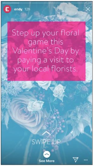
From this Story alone, it’s hard to guess what audiences can expect if they swipe. A list of reasons to visit a florist? Tips for choosing a bouquet? The next Stories in the sequence are much clearer:
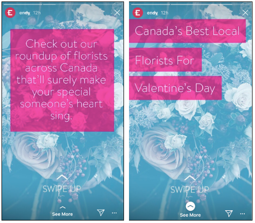
Follow their lead, and make sure that your Story sequence has a clear point for audiences.
And if you’re sharing an offer, you need to be even more specific and urgent. “SALE!” is compelling, but “ONE-DAY SALE ON NOW” is going to get more people swiping.
If your Story is a video, don’t rely too heavily on audio to get your key points across. While Instagram says that 70% of users watch videos with the sound on, that still means 30% of them turn it off. Include text with your offer and CTA, or risk viewers missing these details altogether!
6. There’s too much information
You want your Stories to pique interest and drive audiences to your landing page. That means being selective and sharing important information, not every single detail!
If your audience looks at the dashes along the top of the screen and sees that there are 20 Stories ahead of them, they might get overwhelmed and just skip them all.
You wouldn’t give a presentation in front of an audience without practicing it, or publish a blog post without editing, so apply the same philosophy to your Instagram Stories. Plan your Stories in advance to make sure each of them has a purpose (whether that’s information or entertainment) and adds value for your audience.
How much is too much? Some have made a solid case for a three-Story limit, but there’s no hard and fast rule.
If you’re sharing photo Stories that are easy to flick through, you can include more. But only your die-hard fans will watch a dozen 15-second videos in a row.
7. You don’t understand your audience
You may be nailing all these recommendations, and yet your Stories are still be falling flat. It might be that you’re making great content for the wrong audience: yourself, rather than your followers.
If your viewers aren’t swiping up on your Stories, chances are you’re sharing something they’re just not that interested in. So how do you find out what your followers want to see?
You probably don’t want to DM each one and ask. Fortunately, there are a ton of analytics that will tell you what kind of content resonates most with your followers. Instagram has some useful built-in statistics, but there are tons of other sources of data. Find out what analytics you should be tracking, and the tools you can use to track it.
A/B testing can also help you develop your Stories strategy, by allowing you to test variations on your promoted content. Over time, you’ll learn which CTAs and Story formats yield the best results.
Qualitative research is valuable too, so talk to your followers! Use Polls or Questions to gather feedback quickly on what they want to see from you, or what kinds of content they like best.
Always remember, your audience already likes your brand. They follow you for a reason! You just need to develop a solid understanding of who they are and what they like, and share Stories that speak to those interests.
Once you hit your stride, the conversions will follow!
Save time managing your Instagram presence using Hootsuite. From a single dashboard you can schedule and publish posts directly to Instagram, engage the audience, measure performance, and run all your other social media profiles. Try it free today.
The post 7 Reasons Your Instagram Stories Are Failing to Convert appeared first on Hootsuite Social Media Management.
Contributer : Hootsuite Social Media Management https://ift.tt/2FaGWLh
 Reviewed by mimisabreena
on
Thursday, March 14, 2019
Rating:


No comments:
Post a Comment