Twitter makes ‘likes’ easier to use in its twttr prototype app. (Nobody tell Jack.)
On the one hand, you’ve got Twitter CEO Jack Dorsey lamenting the “like” button’s existence, and threatening to just kill the thing off entirely for incentivizing the wrong kind of behavior. On the other hand, you have twttr — Twitter’s prototype app where the company is testing new concepts including, most recently, a way to make liking tweets even easier than before.
Confused about Twitter’s product direction? Apparently, so is the company.
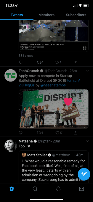
In the latest version of the twttr prototype, released on Thursday, users are now able to swipe right to left on any tweet in order to “like” it. Previously, this gesture only worked on tweets in conversation threads, where the engagement buttons had been hidden. With the change, however, the swipe works anywhere — including the Home timeline, the Notifications tab, your Profile page, or even within Twitter Search results. In other words, it becomes a more universal gesture.
This makes sense because once you got used to swiping right, it was confusing that the gesture didn’t work in some places, but did in others. Still, it’s odd to see the company doubling down on making “likes” easier to use — and even rolling out a feature that could increase user engagement with the “Like” button — given Jack Dorsey’s repeated comments about his distaste for “likes” and the conversations around the button’s removal.
Of course, twttr is not supposed to be Dorsey’s vision. Instead, it’s meant to be a new experiment in product development, where users and Twitter’s product teams work together, in the open, to develop, test, and then one day officially launch new features for Twitter.
For the time being, the app is largely focused on redesigning conversation threads. On Twitter today, these get long and unwieldy, and it’s not always clear who’s talking to who. On twttr, however, threads are nested with a thin line connecting the various posts.
The app is also rolling out other, smaller tweaks like labels on tweets within conversations that highlight the original “Author’s” replies, or if a post comes from someone you’re “following.”
And, of course, twttr introduced the “swipe to like” gesture.
While it’s one thing to want to collaborate more directly with the community, it seems strange that twttr is rolling out a feature designed to increase — not decrease — engagement with “likes” at this point in time.

Last August, for example, Dorsey said he wanted to redesign key elements of the social network, including the “like” button and the way Twitter displays follower counts.
“The most important thing that we can do is we look at the incentives that we’re building into our product,” Dorsey had said at the time. “Because they do express a point of view of what we want people to do — and I don’t think they are correct anymore.”
Soon after, at an industry event in October 2018, Dorsey again noted how the “like” button sends the wrong kind of message.
“Right now we have a big ‘like’ button with a heart on it, and we’re incentivizing people to want to drive that up,” said Dorsey. “We have a follower count that was bolded because it felt good twelve years ago, but that’s what people see us saying: that should go up. Is that the right thing?,” he wondered.
While these comments may have seemed like a little navel-gazing over Twitter’s past, a Telegraph report about the “like” button’s removal quickly caught fire. It claimed Dorsey had said the “like” button was going to go away entirely, which caused so much user backlash that Twitter comms had to respond. The company said the idea has been discussed, but it wasn’t something happening “soon.” (See above tweet).
Arguably, the “like” button is appreciated by Twitter’s user base, so it’s not surprising that a gesture that could increase its usage would become something that gets tried out in the community-led twttr prototype app. It’s worth noting, however, how remarkably different the development process is when it’s about what Twitter’s users want, not the CEO.
Hmmm.
Hey, twttr team? Maybe we can get that “edit” button now?
Contributer : Social – TechCrunch
 Reviewed by mimisabreena
on
Saturday, April 27, 2019
Rating:


No comments:
Post a Comment