Facebook tests a new Page design with a cleaner layout and no more ‘Like’ button
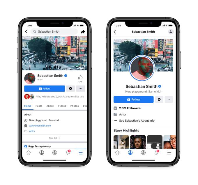
Facebook is testing a new design for Facebook Pages that will, among other things, remove the “Like” count, offer a cleaner and more readable layout, and make it easier for those who operate Pages to actually use and manage them. These features and others were initially tested with a small percentage of public figures on the mobile app, but are now being expanded to a broader group of Pages.
Currently, the public figures involved in the test include actors, authors, creators, and a small handful of media entities, like bands and books. If included in the test, the Pages will see an option to opt in to try out the new experience when they’re logged in on mobile.
Facebook says it’s now expanding the test now to include a small percentage of English-language business Pages, as well.

Image Credits: Facebook (Old vs New Pages)
The updated design and feature set is meant to make using Pages less complex, something the company understands can be an issue. It also acknowledges the need to simplify the use of Pages now, in particular, with so many people continuing to practice social distancing and choosing to instead connect with their communities online.
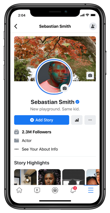
The new Page layout is meant to make it easier for visitors to a Page see key information, like the Page’s bio and posts. Notably, the design does away with the Page Likes and the Like button. Instead, the Page will only display a Follow button and follower count.
This change better reflects the Page’s true reach. Many people have “Liked” various Pages over the years, but then unfollowed them from their News Feed as they outgrew their interest. (Or they unfollowed them because they were only liking the Page as a favor, after being sent a request, for example.) The Follows count, meanwhile, indicates how many people are actually receiving the Page’s update in their News Feed.

Image Credits: Facebook
Having both options has lead to a more complicated process where users first “like” a Page, which creates an automatic follow. But the person can then back out of that follow by changing their settings at any time. Page owners find this to be confusing and unhelpful because they want to engage with followers who are actually interested in the Page and its contents.
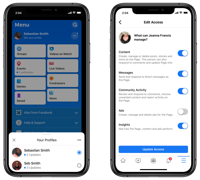
In addition, Page owners will be able to better connect with followers by browsing their News Feed, and then quickly switch between their personal Facebook profile and the public-facing Page (or Pages) they manage when they want to comment or react to posts they come across.
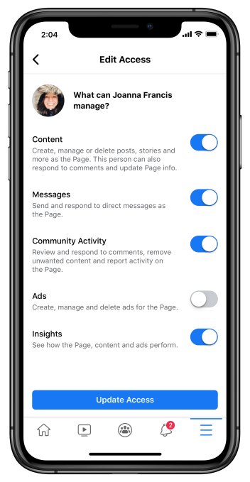
On the Page management side, they’ll be able to more clearly assign and manage admin access permissions based on specific tasks. This will be handled by an updated “Edit Access” screen, where owners can toggle on and off specific management tasks, like who can create Page content, send direct messages as the Page. create ads, respond to comments, and more.

Image Credits:
The update additionally aims to make it simpler to navigate to the Page Insights section, which is where Page owners and managers track analytics related to the Page’s performance.
Now, Page owners will be able to get to these insights from the Page itself or even directly from a post. Within the Insights section, they’ll gain access to a handful newly added insights, as well, including top performing posts and a new metric that shows the Page’s audience overlap with its connected Instagram account.
They’ll receive fewer notifications from their Pages, too, as Facebook will now group together relevant and related data, like mentions and post reactions, when sending updates.

Image Credits: Facebook
The test is running now in the Facebook mobile app but it’s not limited only to those who are seeing the simplified app design (pictured here with the colorful blue background and boxes.)
Facebook isn’t sharing when the update will roll out more broadly as this is still considered a test for the time being.
Contributer : Social – TechCrunch
 Reviewed by mimisabreena
on
Thursday, July 23, 2020
Rating:


No comments:
Post a Comment