Top 4 Website Builders for 2020
Want to jump straight to the answer? The best website builder for most people is Wix.
You want a website. But you’re not a coder, an engineer, or a designer. You just want your website to look good, work, and be easy to set up.
Good news: even if you’re not good with computers, a website builder gets you a professional-looking website in minutes.
There was a time when you could tell the difference between the custom site from a professional web designer and one from a site builder. The playing field has been leveled. You can now get a world-class website, build it yourself quickly, and no one will ever know. It looks just like a $100,000 site from some fancy marketing agency.
These days, I don’t even bother getting a designer involved. I’d rather use a site builder. The designs are that good.
To find the best, I reviewed 31 website builders, testing them on their ease of use, quality of the product, customer support, and pricing. I then narrowed them all down to my top 4 picks for the best website builders. Here they are.
The 4 Best Website Builders
If you’re looking for the easiest way to create a site, a website builder like Wix will certainly get you there. These are subscription services with drag-and-drop interfaces and we’ll explain the pros and cons of each of them in detail.
But you should also consider building your own website with WordPress. There’s no subscription fee and your site will be basically limitless. It’s not an all-in-one service, but it isn’t hard to sign up for the other pieces you’ll need (a domain name, hosting, and a theme). In this guide, I’ll walk you through this method too.
Read on for in-depth reviews of my top picks for 2020 and step-by-step guides to setting them up quickly and cost-effectively.
Website Builder Reviews
#1 – Wix
Automates the tough choices
Paid plans start at $11 per month
Free trial period: 14 days
Traffic and conversion analytics
Try Wix for free
It’s easy to choose Wix as one of the best website builders. Wix’s artificial intelligence asks you a few questions and literally builds your custom website before your eyes. This is a tool that can read your vision, even if you don’t know yet how you’d articulate that vision. Building a site with Wix’s AI felt a little like getting my mind read. Wix has been at the forefront of this revolution, combining AI and website building.
Wix does have a free tier, but I don’t recommend it. It has some of the most in-your-face “this was not paid for” company branding I’ve seen — an instant trust breaker. Wix free sites also have cumbersome domain structures: yourusername.wix.com/sitename (so we’d be QuickSproutEditorial.wix.com/QuickSprout.)
Connecting your actual domain allows you to attach a Google Analytics profile and add email accounts if you’d like ($5 per account per month, or about half that with an annual plan).
Unfortunately, the pricing isn’t very upfront. Wix wants you to connect your domain before you see the email pricing, for example. I found answers to pricing questions in the support center, not the user flow.
To start creating a Wix website, just click “create site.” You’ll be asked a question: What kind of website do you want to create? From there, the AI will help you build your website. (You can opt-out and go it alone at this point, too, but we appreciated the AI’s help.)
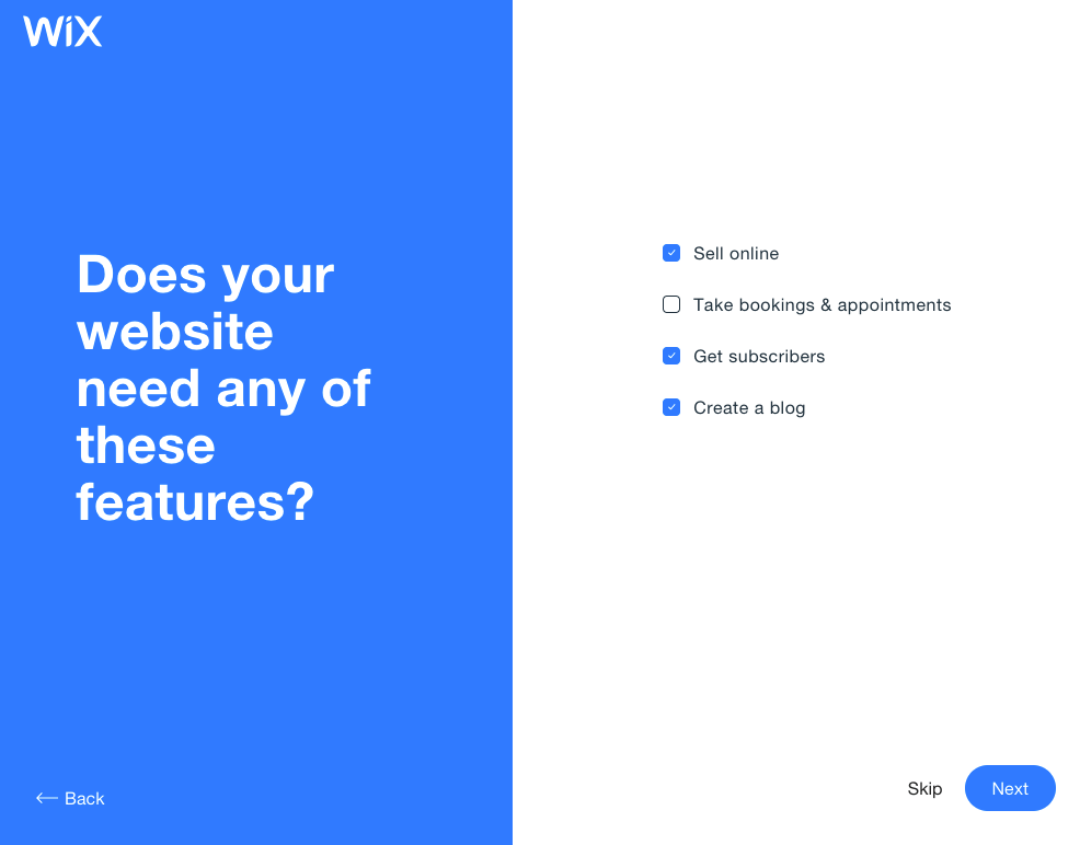
One of the first screens you’ll see when you build a website with Wix.
When I tested Wix, I loved how easy it was to find a template that matched our vision. The AI stayed with me as I edited the page, helping me pick the next thing to edit and showing me how to do it.
The Wix AI matched my new site to my business’ existing online presence, used my logo to create a color palette for my site, pulled right from Instagram, and gave me a template pre-populated with that logo and our street address. Connecting images from existing social media accounts made it easy to pull in all the assets we already owned.
A fun thing to try is to pick a business you already know and see how close Wix’s AI comes to replicating it. I used a local yoga studio as an example and Wix did closely match the studio’s existing site. Even better, I bet they paid a web designer a bit of coin for their design, and I did mine for free with an AI assistant.
>As AI progresses, it will be harder and harder to know which site was built via AI and which was built via a designer. You can think of it like passing a “design turing test”, i.e. in the future humans will not be able to differential between the two. Then, it’ll have to get innovative. Instead of mimicking what it is learning from what’s created, it will get better and more experimental. It’s easy to see how soon most websites that are created use AI in some way.
—Wix VP & GM of Consumer Experience Nitzan Achsaf told TechRadar
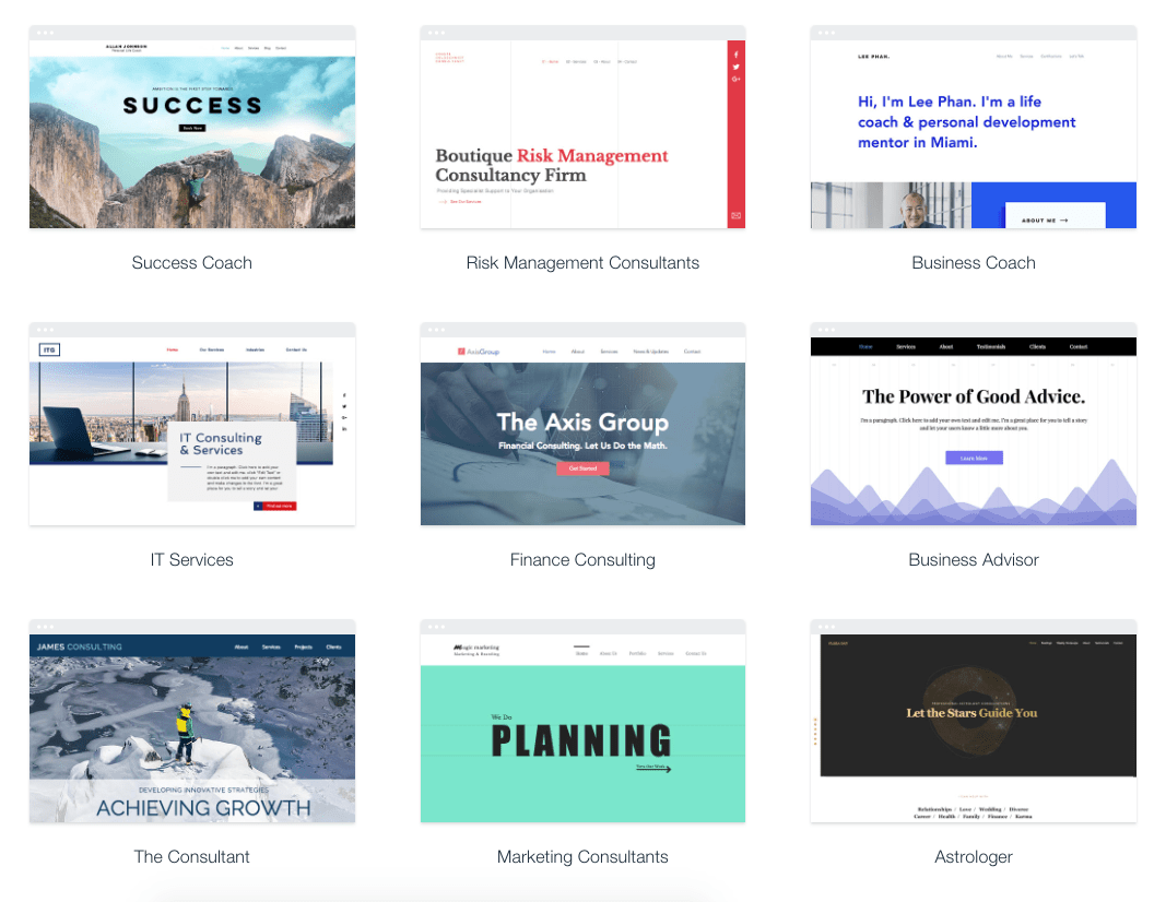
There’s a lot of variety between the Wix themes, and the personality of each theme matches its name well. The Business Advisor had a spot-on graphic of an analytics dashboard, while Astrologer features an astral hero image.
Some of Wix’s business-centric themes.
Editing your desktop site with Wix does require some patience. To change the text on a text box, you’ll need to hover precisely in the right spot. I did some deep breathing and was able to find enough inner zen to make all the changes I wanted. The mobile editor has the helpful feel I wish the rest of the editor maintained. It’s super easy to click through the options for how your menu, quick actions, and scroll options work on your mobile page. What you change in the mobile editor doesn’t affect anything that happens on desktop.
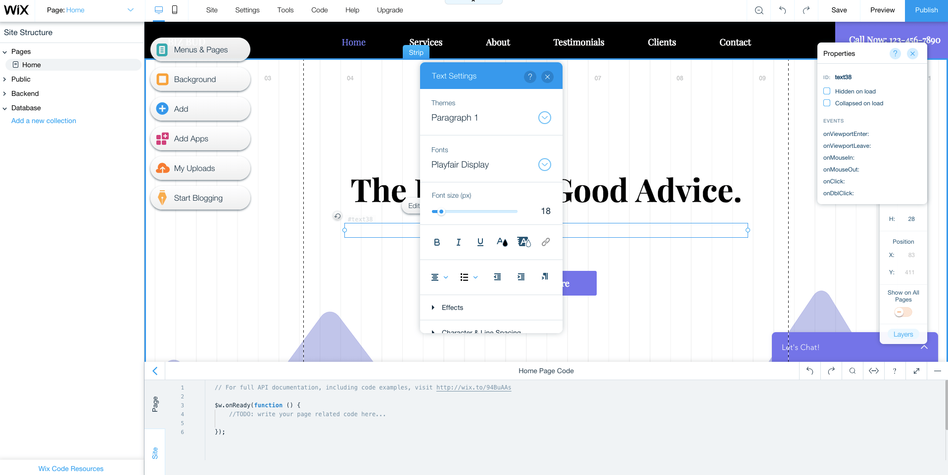
Wix’s editor requires patience — and some clicking around.
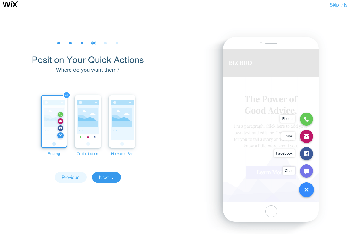
I prefer the easier-to-use mobile editor.
Take note: all of Wix’s plans are automatically set to auto-renew. Sticker shock is real, especially if you signed up with an introductory promo pricing (at the time of publishing, premium plans were a full 50% off, for example).
There are many frustrated customers on TrustPilot who’re unhappy with this. It is possible to turn off your auto-renew, but you’ll need to do it more than 14 days before your plan’s anniversary — and if you do it during your 14-day free trial, your trial will be canceled immediately.
As for which paid plan to pick, you have 7 options: 4 “regular” and 3 “ecommerce.” The difference really boils down to whether you’ll be accepting payments on your site or not. If you’re not sure about how much bandwidth you need, you can always start with a smaller subscription: if you go over the limit, you’ll get a notice from Wix (with no penalty) and can use that as your signal to upgrade.
#2 – WordPress
Best for content management
Free open-source software forever
You’ll need to buy a domain name and web hosting
Download WordPress
I love WordPress. (We run Quick Sprout on WordPress.) And I’d recommend anyone starting a website really consider starting it with WordPress, especially if you’re running a content site. Why’s that?
WordPress runs a third of the internet and it has the best content management system — all available for free. Some huge names you’ll recognize run their sites on WordPress.

If you run WordPress you’ll be in fine company, including Vogue, Lucky Peach, and Beyonce’s own website.
Because WordPress is so popular there’s a huge community of developers and designers creating themes and plugins for you to use.
Unlike other website builders, WordPress isn’t a one-stop shop. You’ll also need:
- A domain name – This is your website’s address. Ours is QuickSprout.com — you’ll need to buy yours. We recommend going to Domain.com to buy your domain (get 25% off with coupon code QUICKSPROUT) or you can check out our list of other recommended domain registrars.
- Hosting – This is where your website’s files will be stored, which allows a user to access your site. I recommend starting with a shared plan (the lowest tier) with either SiteGround, of if you don’t mind paying a premium, to go with WP Engine, which is optimized for WordPress. You can read more in our review of the Best Web Hosting Service. This will cost you about $8 a month, but there’s usually promotional pricing for half-off the first contract.
- A theme – A WordPress theme controls the look of your website and how all of the information in it works, so a theme is one part design and one part feature set. Every WordPress site comes with a basic theme, and there are thousands of free and paid themes you can select from in the WordPress themes directory. I like to use the $30 themes at Themeforest. If you go with WP Engine, your plan includes 35 or more themes already, which does a bit to defray the steeper price point.
Once you’ve gotten your domain name and your web host, you’ll be able to install WordPress within a few clicks and get your login credentials. They don’t call it WordPress.org’s “famous 5-minute installation” for nothing.
Log in and you’ll see that your site is pre-loaded with a starter theme. Using as different one? Simply install it. From here, you’re set to adjust your site’s settings, menus, and page structure, and start writing blog posts. WordPress is hands down the winner when it comes to running a content-driven site.
If you need help at any point, there are tons (literally tons) of guides on the internet. I recommend starting with WordPress’s support page, which will answer questions like Where to start, Writing posts, and Using themes.
Check out our full guide on how to create a website with WordPress!
#3 – Squarespace
Stellar templates
Plans start at $12 per month
Free trial period: 14 days
Try Squarespace for free
“Build something beautiful” is right. There’s no doubt that Squarespace wins the design and beauty contest here. The user interface has a bit of a learning curve and there’s not much of a Squarespace community to help you out, but the page you’ll end up publishing will be phenomenally good-looking.
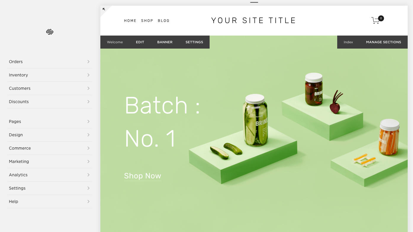
Squarespace’s templates are all modern and beautiful.
Building a website with Squarespace can feel a little like building IKEA furniture: in the showroom it’s all so beautiful and simple, but somehow it feels a little more complicated to put together than promised. It can be hard to understand where exactly you are in the Squarespace editor. I kept getting notifications that I was editing demo content, or that I’d see the social logos once we connected our social media, or that we could unlock this or that feature with a paid subscription, but Squarespace didn’t go the extra step to make it easy to make that required move. It was a lot of fumbling through a beautiful interface, not exactly sure what changes were real, or where to head next. I also had some issues saving changes — an error message popped up and we had to move on, without our changes.
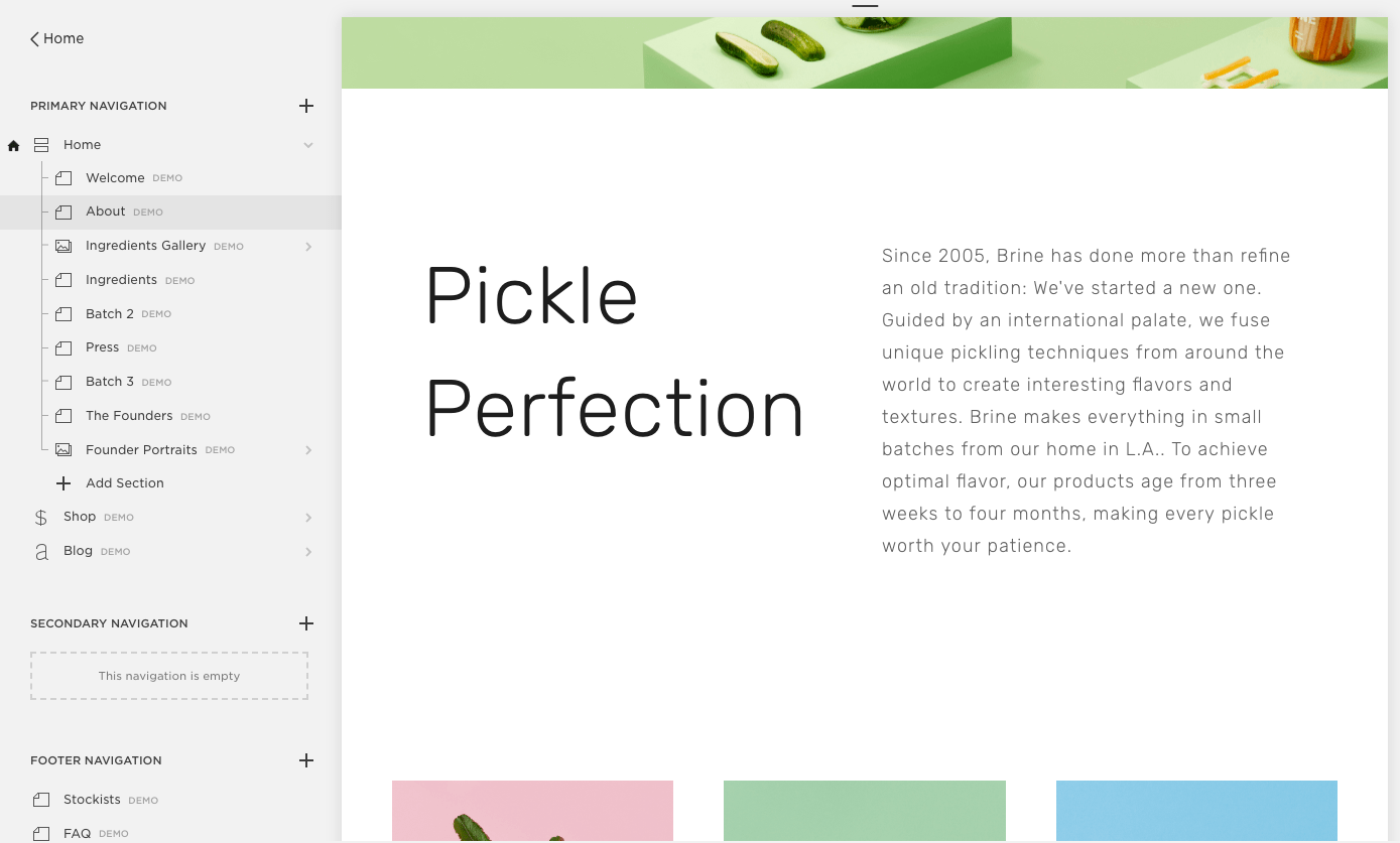
Editing a site in Squarespace has a bit of a learning curve.
Unlike IKEA, Squarespace is pricier than other website builders. That being said, I love the way sites built with Squarespace look, and think it’s one of the simplest ways to create a beautiful, contemporary site.
#4 – Ucraft
Free one-page sites
Paid plans start at $10 per month
Free trial period: 14 days
Try Ucraft for free
If you need something super simple, you may be happy with the free Landing Page option from Ucraft: you can create a single, mobile-ready page and connect your domain for free. The free version doesn’t get rid of the Ucraft branding but it’s minimal and non-invasive. The template has all the features I’ve identified in my anatomy of a high-converting landing page.
You can drop the branding and sell up to 50 products by upgrading to a $10 per month Pro Website plan, and sell up to 1,000 products on the $21 per month Pro Website plan. (Ucraft recently dropped its $6 per month Basic plan, and lowered the price of the Pro Website Plan from $14 to $10 per month.) If you have more items to sell, upgrade again, but note that once you upgrade, you can’t drop back down to a less expensive plan.
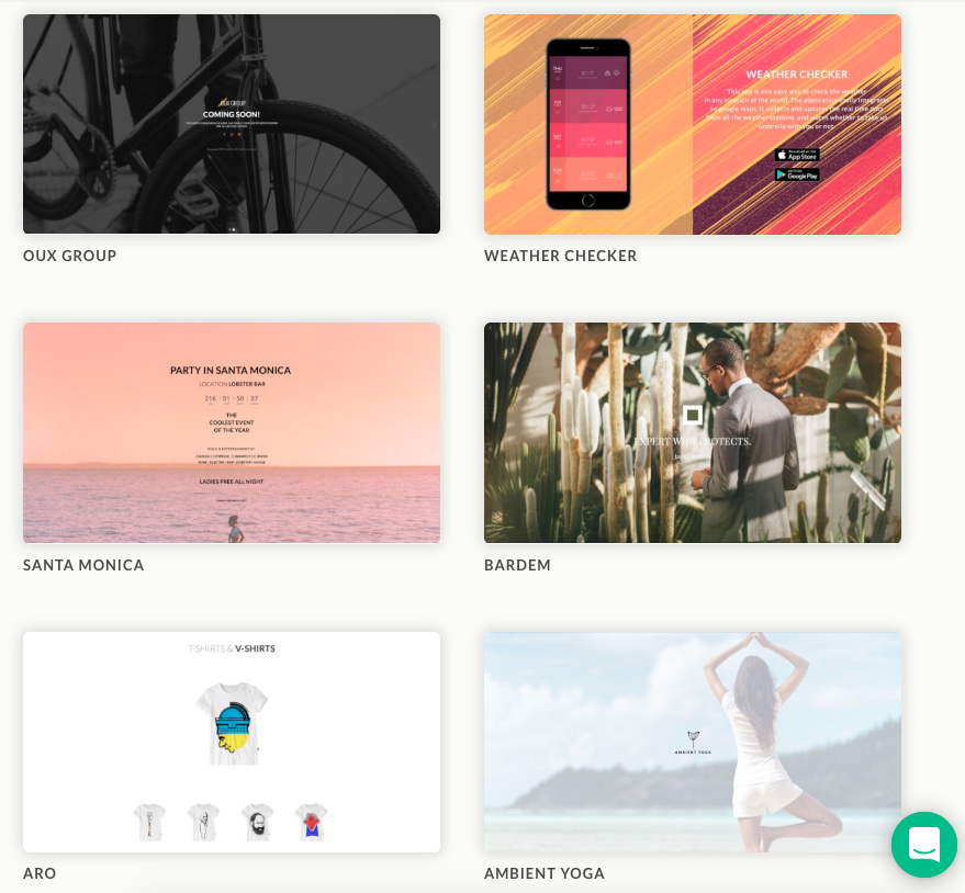
Ucraft’s themes are elegant and streamlined. It’s one-page free sites are designed to be a long scroll with anchored sections.

Build a Ucraft site using drag-and-drop blocks and elements.
Methodology and criteria for my website builder reviews
Ease of use. There should be no technical proficiency required and no need for a designer or other outside help. We asked ourselves, How easy it is to get started? And, how long does it take to build a nice looking site?
A professional high-quality final product. A professional, well-designed website that reflects your business. We asked, What do the templates look like? How customizable are those templates? Can I add an ecommerce option to sell things on my site? Can I add a menu? A form? A map? Reservations?
Customer support. We wanted to know that it’d be there if you needed it, but we also expect everything to be intuitive enough that you don’t feel like you can’t go it alone.
Pricing. Pretty simple, but we didn’t just ask how much does it cost? We also asked, Which tier should a person start on and when will they need to upgrade? If it’s free, what’s the trade-off? Does it come with a free domain? Does it come with email addresses? Any other extras to be on the lookout for?
Recap: The best website builders for 2020
I like WordPress for its ability to run just about any site you can think up. It’s also the best content platform out there. If you have a content site, I recommend building it with WordPress — with a template, it’s not drag-and-drop but it’s already pre-built.
In terms of all-in-one true website builders, I love Squarespace and Wix.
Need a little less? I was surprised by one-page standout Ucraft.
COntributer : Quick Sprout https://ift.tt/2PY83QK
 Reviewed by mimisabreena
on
Wednesday, July 08, 2020
Rating:




No comments:
Post a Comment