The MacBook Air is overdue for its own colorful redesign
Tim Cook's next Mission Impossible quest should be to insert the M1 chip in a redesigned MacBook Air or MacBook Pro that's actually interesting to look at.
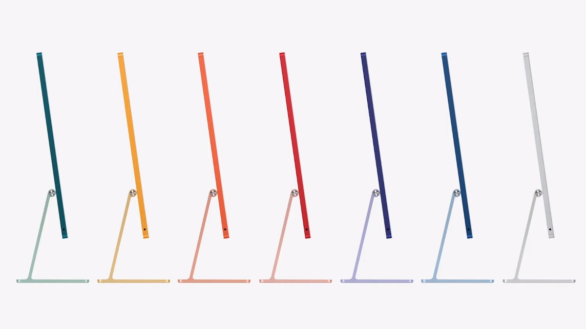
During today's Spring Loaded event, Apple unveiled the new iMac (M1, 2021), which made a big impression on us for its thin build and multiple color options. It's a necessary breath of fresh air for iMacs to go with their new processor.
While MacBooks were a no-show, I'd love to see a similar flashy redesign of Apple's laptops, either at WWDC 2021 in June or later this year. They're long overdue for a change.

MacBooks are in a design rut
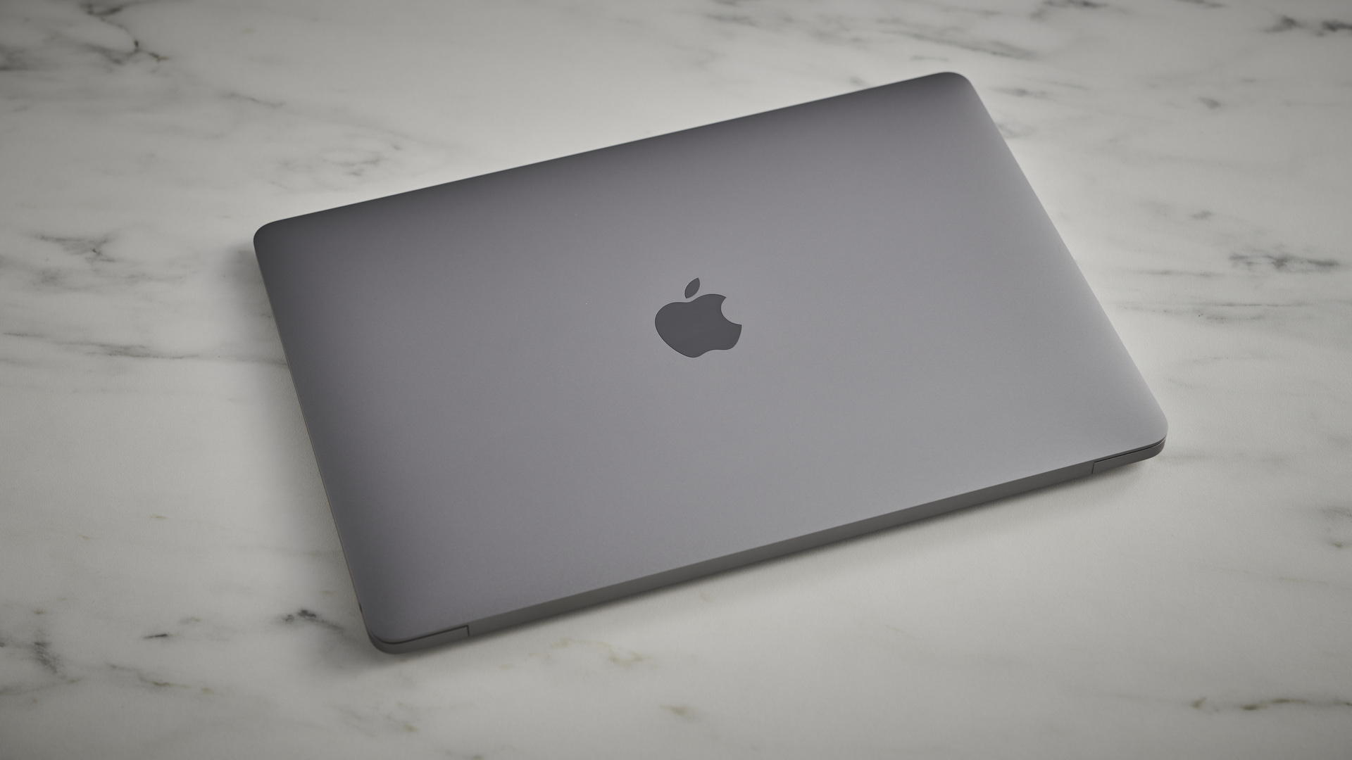
Last year's M1 MacBook Air and MacBook Pro both had a game-changing performance boost that blew us away. Unfortunately, the laptops themselves looked almost unchanged from past Intel models, underselling the upgrade for potential buyers.
Not only have their designs remained stagnant, the Air and Pro are so similar to one another that you have to pick them up or check the number of USB-C ports to tell them apart.
To give Apple some credit, the next MacBook Air reportedly will get a design overhaul with thinner bezels and a lighter frame. And Apple analyst Ming-Chi Kuo said Apple will release a 14-inch MacBook Pro this year with thinner bezels and some 'minor design changes.'
The M1 MacBook Air and MacBook Pro are so similar to each other that you have to pick them up to tell them apart.
Thinning the MacBooks' bezels is a necessary change. Compared to other top-tier laptops like the Dell XPS 13 and HP Spectre x360, the MacBook Air has way too much wasted space while other manufacturers have embraced super-thin display edges.
That being said, incremental design tweaks aren't enough, at least for me. Apple's only standout design innovations of the past few years are the Touch Bar – which arrived in 2016 and may be killed off for future laptops – and the infamous butterfly keyboard, which Apple abandoned.
I own a 2017 MacBook Pro with a keyboard that started to double-type, before the keys all started to randomly jam or even fall out if I wasn't careful. I took advantage of Apple's free replacement program, only for my new keys (which I'm typing on now) to feel decidedly refurbished. I don't know how much longer it'll last.
I've owned several MacBooks at this point, but if Apple wants me to buy another one, it won't continue to release iterative design changes and expect that to win people back. It needs to act like it has something to prove.

What I want to see
Apple rediscovered its sense of fun with the 2021 iMac, and I want it to do the same with its MacBooks. It can keep its 'business' design for the Pros, but it's time to make the Air more visually appealing.
That starts with smaller bezels. An Air with an edge-to-edge display would close the gap between its design and the best Ultrabooks of the past few years. It would also help it lose some weight: it's been stuck at 2.8 lb (1.29 kg) for years, but it could sport a 13-inch display with a smaller body this way.
More importantly: new color options besides gray will help the M1 MacBook Air stand out as something fresh and exciting for a new generation of students, or nostalgic for old Apple fans who remember their old fruit-colored computers.
There are different routes Apple could take. It could hide its speakers and make the keyboard edge-to-edge as well. Instead of doubling down on the Touch Bar with a touch panel, as some rumors have claimed, it could add an optional touchscreen – even if that makes it a competitor to the iPad Pro 2021.
I won't claim to be a designer, and Apple will always want to avoid using the same designs as the rest of the industry. But today's positive reaction to the new iMac will hopefully remind Apple's designers that people appreciate vivid colors that let them feel like individuals.
- One Techradar writer believes the new iMac is badly designed
Contributer : Techradar - All the latest technology news https://ift.tt/3gpN70W

 Reviewed by mimisabreena
on
Wednesday, April 21, 2021
Rating:


No comments:
Post a Comment