We asked an expert to redesign Wikipedia - here's what they came up with
As part of a new series, TechRadar Pro has asked designers from freelance platform Fiverr to give the branding of a selection of well-known companies a makeover.
The idea isn't to return to the drawing board completely, only to imagine what famous branding might look like with a few tweaks here and there.
Last time round, a design expert reworked the Twitter logo and UI. This time, UK-based designer Kevinsdesign gave Wikipedia the same treatement, and also talked us through his decision-making process. Here's what he came up with:
- Check out our list of the best drawing software right now
- Here's our rundown of the best graphic design software out there
- We've built a list of the best Photoshop alternatives around
Kevinsdesign's rationale
Overall goal
"To reinvision the digital product of Wikipedia focusing on a way to enhance the user experience for a particular user group or flow."
Research
"This project was largely based on my personal insights and thoughts on best practice, however I was keen to do a small micro research project - this took the form of 4 timeline interviews. These interviews encouraged the user to talk about past experiences with Wikipedia, their goals and frictions points."
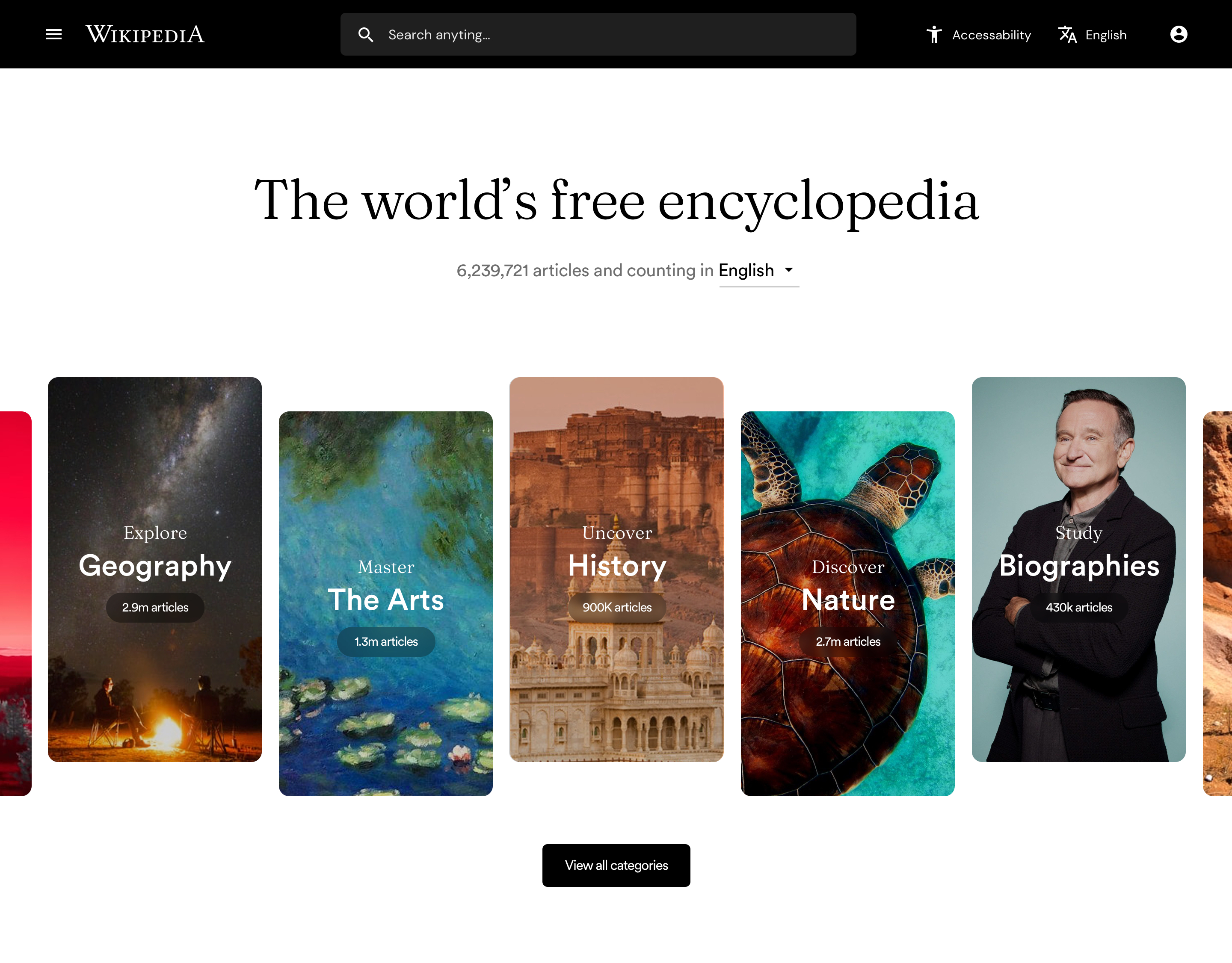
Homepage
"I’ll be honest the homepage of Wikipedia is a page I have never visited until now, not a single person brought it up in the interviews, so to be perfectly honest I saw this as a nice opportunity to make some UI porn. I took what was there and visually reinvisioned it, I wanted to create a design that gave a feel or knowledge and respectability but also fun and modern."
"In terms of function I did add in a few new things like language selection being brought to the forefront and a more prominent search bar."
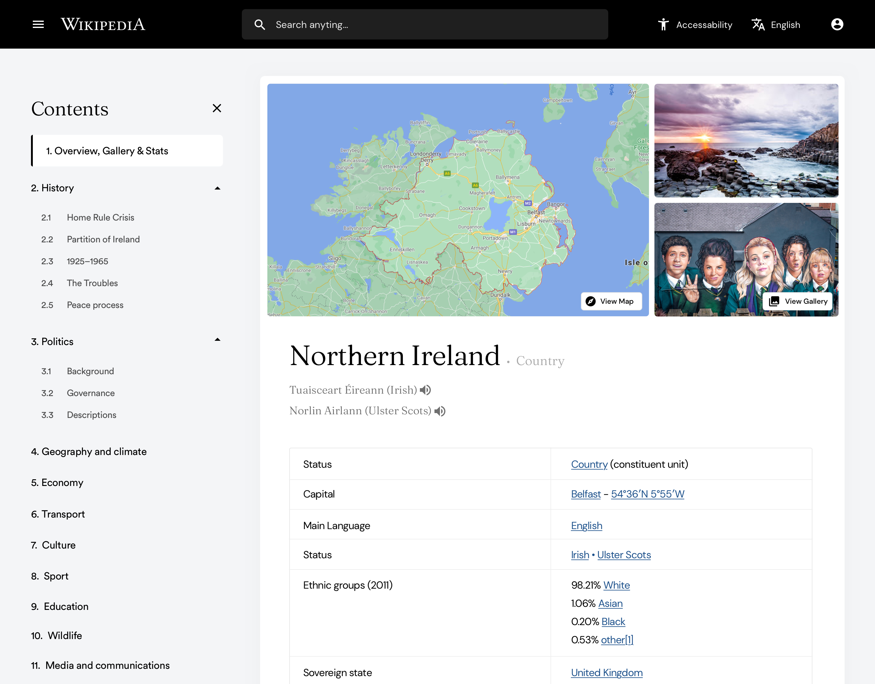
Article page
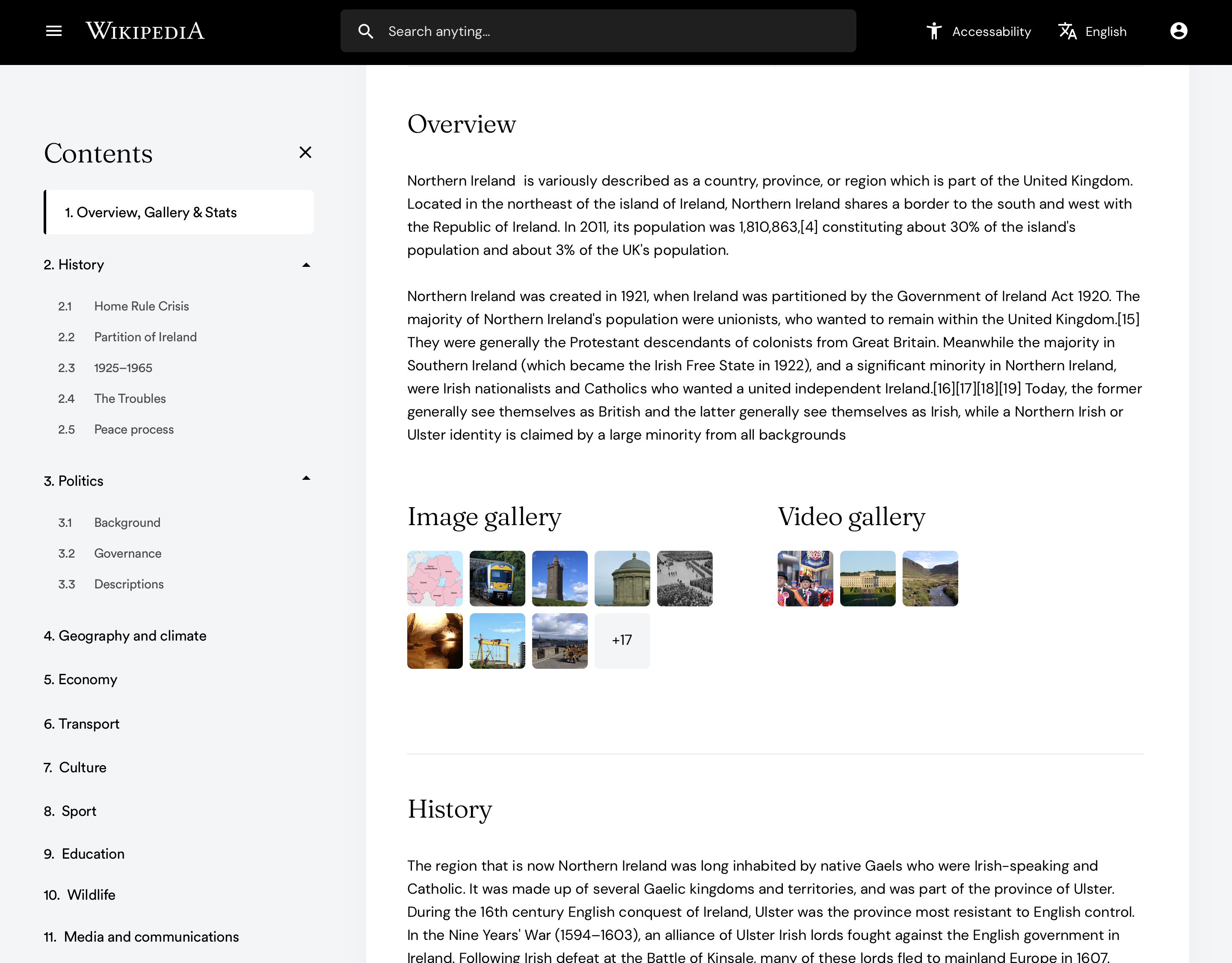
"Aside from just a general restyle of the article page and just making it look a little cooler, a few ideas came out of the research:
- A dynamic page contents that would allow users to jump from area to area with ease as well as seeing which area they are in at all times
- Access to all related media in a central location as well as being in the relevant sections
- The table to the right expanded out
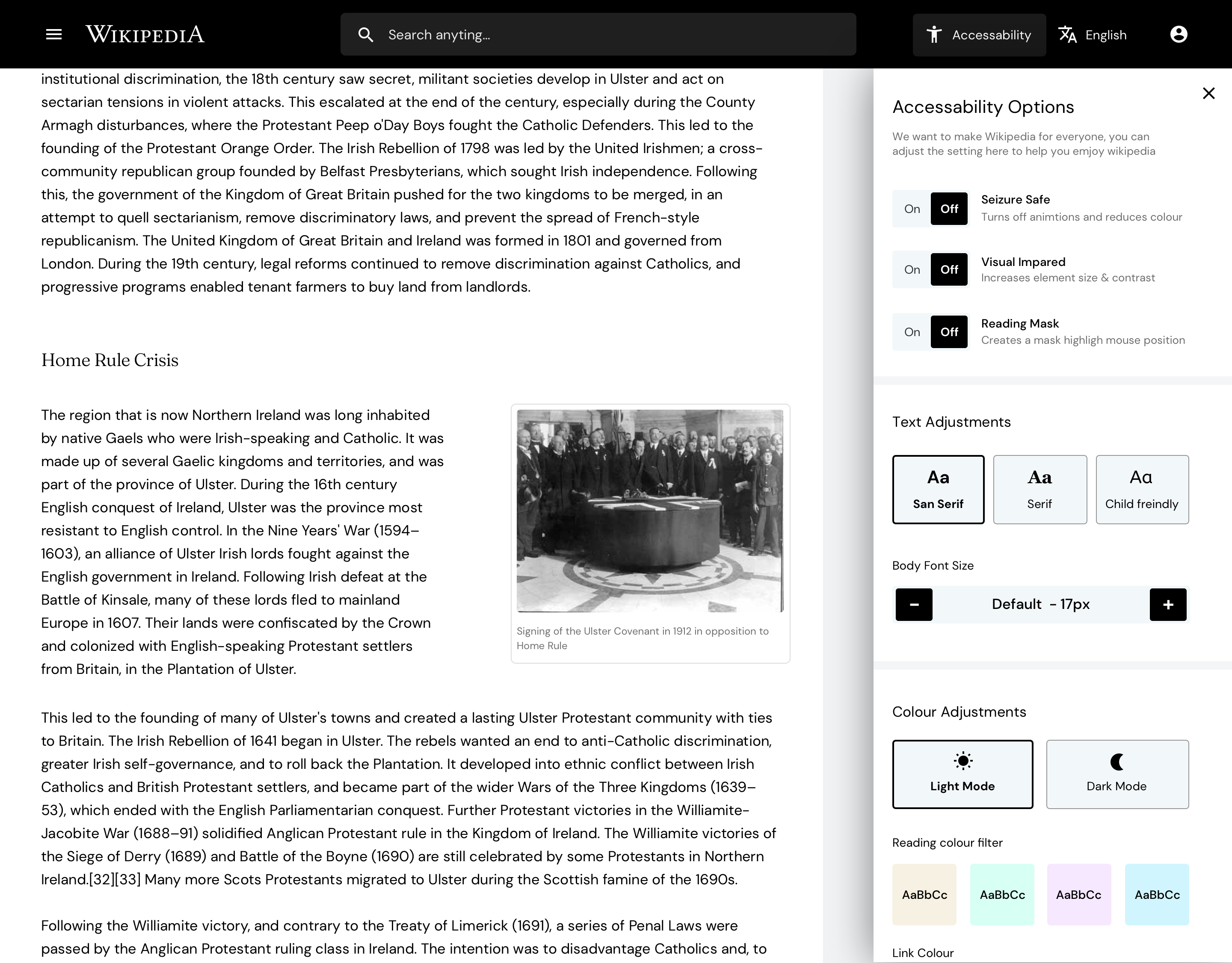
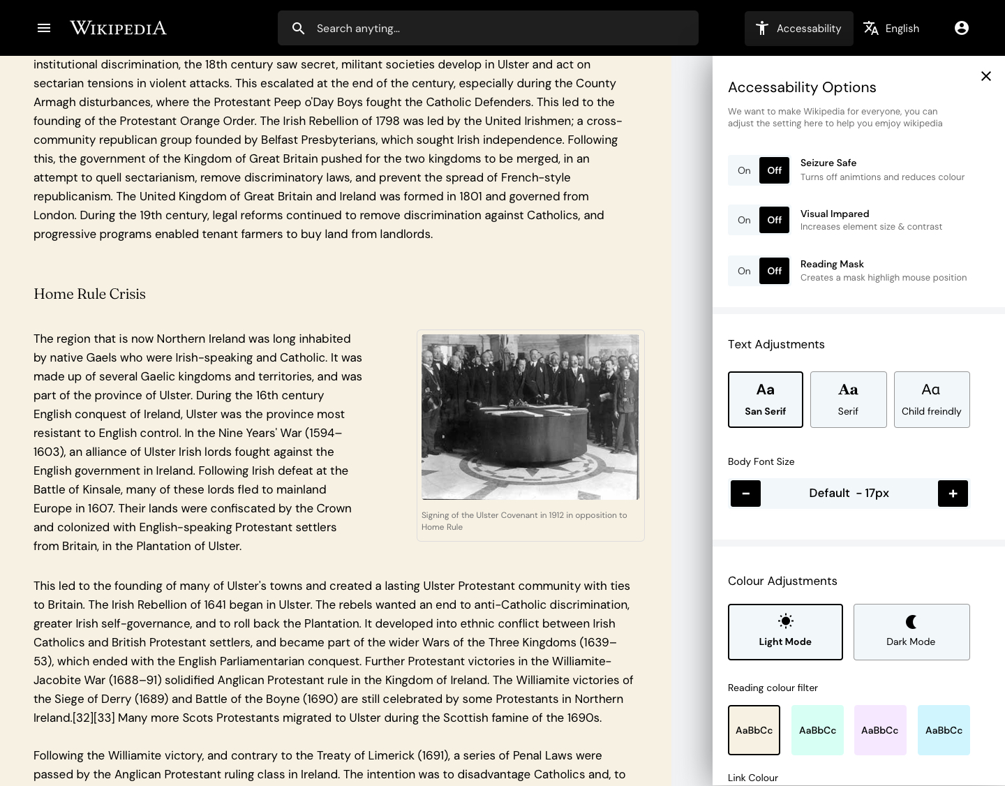
Accessibility
"This is where I spent the most time. Wikipedia is accessed by billions worldwide with the common goal of consuming written articles, however reading isnt a given for everyone, between 5-10% of the population are dyslexic (myself included), even more have visual impairments and so on. Things like colour contrast, font size, and even black text on white backgrounds can make content very hard to consume."
"I asked the question could I bake in accessibility options to the new design that would break down these barriers and make Wikipedia more accessible to people. The new accessibility option in the menu allows user to customize the setting to their needs, be it making the font size bigger, making the content seizure safe, changing the font to child friendly and even adding a color overlay to the article which for many dyslexics massively helps them read."
- Here's our list of the best laptops for graphic design
Contributer : Techradar - All the latest technology news https://ift.tt/3xJa9q0

 Reviewed by mimisabreena
on
Monday, May 03, 2021
Rating:


No comments:
Post a Comment