16 Creative Ways To Use Visuals In Your Landing Pages
Visuals are the emotional foundation of your landing pages.
They have the power to make your visitors walk away feeling happy, informed, motivated or reassured.
And most importantly – they have the power to boost your conversions.
But how exactly can you incorporate visuals into your landing pages?
Unsurprisingly, there are lots of ways to use visuals – as images, videos and even GIFs.
In this post, I’ll show you 16 creative ways to use visual elements in your landing pages. I’ll also show you how to make the most of each visual element so you can squeeze better conversion rates out of your pages.
Let’s dive in:
Chapter 1 – As images
This is how you’ll usually use visuals on your landing pages – as images.
Images have the dual benefits of capturing attention and amplifying your message, while also being easy to use and fast to load. And page load times are a big deal for user experience!
Throw in the fact that images are readily available, easy to edit and cost next to nothing to produce (when compared to video), and you can see why they are the mainstay of landing pages.
So what kind of images can you use on your landing pages?
Here are some ideas to get you started:
Use images of people
There are three things you must know about using images of people on your landing pages:
- We are hardwired to notice faces. A face is almost always the first thing we see in any image.
- Our eyes naturally follow what others are looking at. This is called ‘gaze following’ or ‘joint attention.’
- We empathize with others based on what we see, especially in the form of images.
This behavior makes pictures of people a particularly powerful tool to create empathy, hold attention and direct it to an important element on our landing page.
For example, an eye tracking study of a landing page with a baby showed that when the baby was looking straight, the viewer all but ignored the text on the page. Instead, the baby’s face counted for all the attention.
When the image was shifted so that the baby was facing the text, visitors first looked at the baby (i.e. the face got their attention). Then they followed the gaze of the baby’s eyes to look at the text.
This is a great example of our tendency to notice faces and follow their gaze.
Now, let’s look at some specific ways you can use pictures of people on your landing pages:
1. Help visitors identify with your product
Showing visitors that your customers are ‘just like them’ can bridge the empathy gap. This means that it’s easier for them to identify with your products and visualize themselves using it.
The result? Higher conversion rates.
One way to do this is to show either existing customers or an idealized version of the customer (based on your personas) on your landing pages.
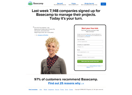
For example, this landing page from Basecamp shows a quote from an actual customer along with her picture:
And here’s an example from Voya, showing a model representing an ideal target customer:
Whenever possible, use an actual customer rather than an ideal target customer – it feels far more authentic (or at least, it does to me). And if in doubt, use split testing to see what works best.
2. Portray an emotion you want visitors to feel
How do you show that using your products make people happy?
Simple: use an image that portrays your target emotion.
This is a stable of modern advertising. You see happy people in car commercials because that’s what car companies want you to feel about their cars.
It’s similar to the ‘before’ footage in TV infomercials. They’re filled with unhappy, frustrated people because that’s the emotion the company wants to amplify.
So, when using pictures of people, try to show an emotion you want your customers to feel.
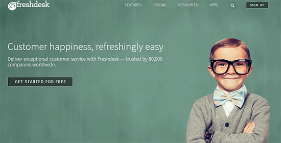
In this example from Freshdesk, you see a smiling, happy child. The image is unique enough to capture our attention (especially the child’s huge glasses). And the smile aligns with the ‘happiness’ emotion Freshdesk wants to convey:
Here’s a more complex example of this ‘happy’ image-type, courtesy of HomeAway:
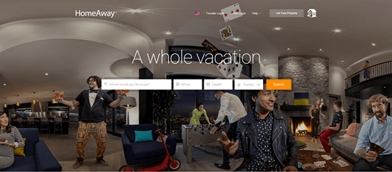
You see a wide range of actions in the image, but the people are all uniformly happy – the emotion HomeAway wants you to feel.
3. Use images to capture attention
Certain types of pictures immediately capture our attention, especially if they are bold, dramatic or appeal to desires.
This example from Lyft uses an image of a female model:
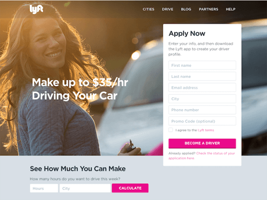
Why? Because research shows that attractive faces capture our attention.
It’s important to know that this approach can backfire as well. If the CTA isn’t compelling enough, a visitor might not notice it and focus attention exclusively on the model.
For example, in this eye-tracking study, viewers barely glanced at the product itself:
If you’re going to use this approach, make sure that your CTA and offer is strong enough.
You can also use gaze following by making the model look towards your CTA.
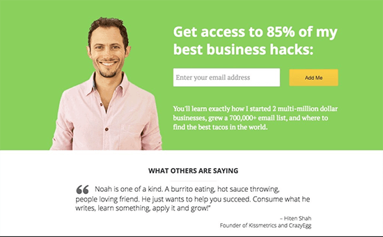
4. Use pictures of the business founder
Using pictures of the business founder does two things:
- It makes the brand more ‘human’ and relatable
- It associates the brand with an individual and so transfers the personality of the individual onto the brand
The most famous example of the ‘founder as an image’ is, of course, KFC. The Colonel’s image is everywhere in every KFC.
On a smaller scale, you’ll see bloggers and authors often use their own pictures on their landing pages.
Here’s Noah Kagan’s OKDork:
And here’s Elna Cain’s freelance writing site:
Use images of the product
Before they buy a product, your customers naturally want to know what it looks like and how it works.
This is why product images are so popular on landing pages. They showcase the product (even if it’s a digital one) and help buyers get a feel for how it works.
Let’s look at some ways you can use product images on your landing pages:
1. Show the product in use
This is the most common way to use product images on landing pages – showing what the product looks like and how it is used.
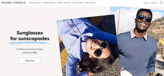
You can either use a stand-alone image of the product or show people using/wearing it. You’ll want to choose the last option if you want people to visualize the product (such as closing or accessories).
For example, Warby Parker shows models using its products:
Here’s another example from Tailor4Less:
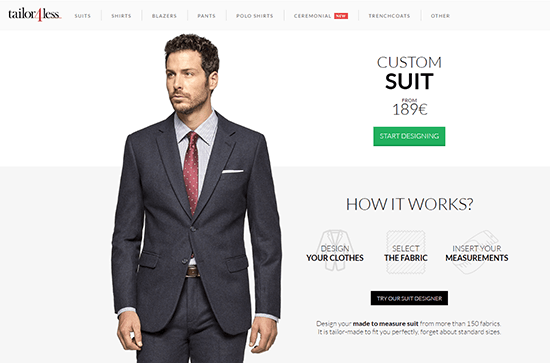
In the examples above, the product doesn’t have a unique enough design to hold its own. This is why a model is needed to help you visualize it.
If your product is unique or has a new take on a problem, you would want to show people how it works on your landing page.
For example, the original Square landing page showed how the product worked because at that time, accepting cards on a phone was a rather revolutionary idea.
2. Show the product by itself
If the product doesn’t require a model or has an exceptional design that you want to showcase, you can have a landing page like this one from Nike:
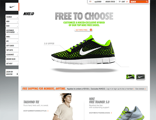
The product-centric design works here since it helps showcase the product’s unique features.
And of course, we can’t talk about product-centric landing pages without mentioning Apple:
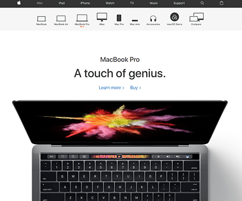
In both of these cases, the landing page highlights the product’s design and features. This wouldn’t work for a generic design but it works for companies like Apple and Nike.
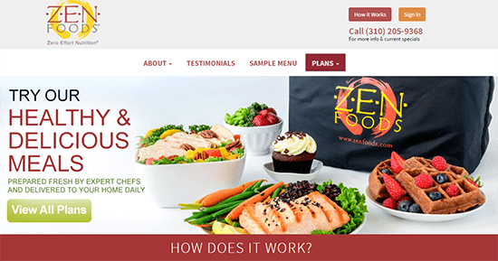
The food industry follows this trend as well, though it usually features an ‘idealized’ version of the product. This McDonald’s landing page doesn’t show what their burgers actually look like; it shows a Photoshopped interpretation of the burgers:
Another example is this image from Zenfoods which shows an enhanced version of the food:
But what if your product is nothing exceptional in terms of its design or value proposition.
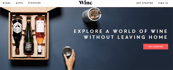
A great option in these circumstances is to focus on the packaging or show the product in context.
For example, this landing page from Winc shows the product in its complete packaging. The packaging part of the company’s USP, not the wine. And this landing page highlights that.
Similarly, the Trunk Club landing page showcases the ‘trunk’ and not the individual clothes:
3. Visualize a digital product
If you’re selling digital products, there are three main ways to use images:
- Visualize it as a physical product, such as an eBook Photoshopped to look like a physical book.
- Visualize its contents. This works particularly well for software products where you can show the UI.
- Visualize the product in context, i.e. show where and how the product is used.
For example, this landing page from Unbounce shows an eBook as a physical book:
This is a common trend with eBook landing pages since it helps to visualize the product. It also helps give the impression of higher value.
Software products usually show the product’s interface, mostly on a specific device (laptop/iPad/phone).
Here’s an example from Salesgenie:

Another alternative is to show the product actually being used by a person. This places the product in context and helps customers understand it better.
Here’s an example:

Use abstract imagery
In this context, ‘abstract’ imagery means any image that does not have a clear relation to the product.
Think of ‘hero images’ you see on Unsplash.com. These images work because they are beautiful to luck at and capture attention.
Here are a few ways you can use abstract imagery:
1. Use images of landscapes
An image of a landscape or other unrelated imagery doesn’t do anything for your product. And it doesn’t amplify the emotion you want to create.
It does, however, create an interesting backdrop for your copy. It might not capture attention the same way as a picture of a smiling model, but it does create appropriate ‘busyness’ on any page.
When done right, it can also be paired with the copy on the page to help readers visualize it.
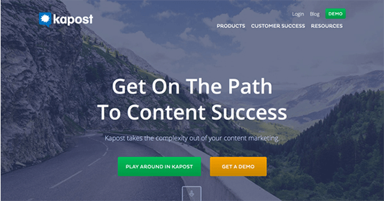
For example, Kapost’s landing page shows a road. This aligns with the copy on the page – the ‘path’ to content success.
2. Use an abstract or plain background
An abstract or plain background helps your text stand out while complementing the design of your page. Since backgrounds like these are small in terms of file size, they load very quickly. This can be useful for mobile visitors and those with slow connections.
Here’s an example from AwesomeTalk:
The background is a solid color which helps place the spotlight on the copy.
Here’s another example from Mitro:
Chapter 2 – As videos
If given a choice, a lot of people would prefer to watch a blog post in video form rather than read it.
Here’s why:
Videos reduce the level of effort visitors need to put in to understand your message. This leads to a greater understanding of your offer.
For marketers, the benefits of videos are obvious. They help you demonstrate your products better. They also help you use better storytelling techniques (such as animation) to tell your story.
But, there’s a downside. Videos suffer from two major flaws:
- They cut out users with low network speeds, especially mobile users.
- They cut out users who might not be able to use headphones/speakers.
Despite these flaws, videos usually improve landing page conversion rates, sometimes by as much as 80% according to one study.
It’s good practice to include an alternative to video or to show the video only if the user requests it by clicking a button. This will ensure that you don’t lose any visitors.
Below, I’ll show you some ways to use videos on your landing pages:
1. Show the product in action
This is the most common way to use video on landing pages – to show what the product looks like and how it works.
You’ll want to use this especially for innovative products.
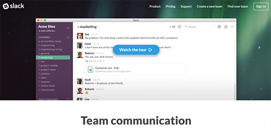
For example, Slack uses video to give users a tour of the product. Since Slack’s take on workplace communication is so different, the tour video gives new users everything they want to know about the product:
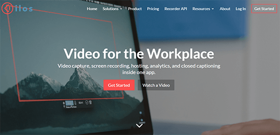
Here’s another example from IIos showing how its product works:
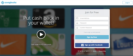
Most users don’t want to sit through a 10-minute video. Reassure them by showing the length of the video. For example, Swagbucks, tells users that its video is exactly ’43 seconds’. This is a great way to reduce their resistance.
2. Use video as your landing page background
A growing trend in landing page design is to use videos as the page background.
This adds a deeper level of emotive and visual complexity to the design. One downside is that it can hurt page load times, so it’s good practice to have a static alternative for slower connections.
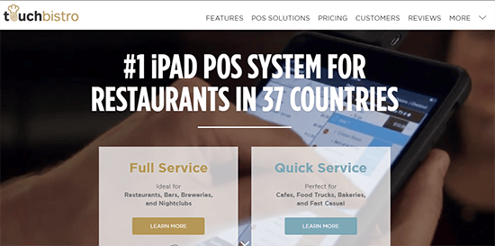
One way to use video backgrounds is to show a product in context. For example, Touch Bistro, shows its POS product being used in a restaurant. This helps customers understand how the product works.
Another approach is to use a background that doesn’t showcase the product or its users but adds visual complexity to the page.
A good example is Workshop’s landing page.
They use an abstract background that adds a dramatic flair to the page while focusing attention on the copy:

3. Use video as a selling tool
You’ll find examples of this approach on sales pages. Usually, it will involve a narrator (seen or unseen) making a pitch with the aid of video. Essentially, this is a long-form sales page in video format.
For example, Thrive Themes uses video on most of its product landing pages. These videos help demonstrate how the product works and pitch its core value proposition.
4. Use video testimonials
Testimonials show that the product or service provides real value to others and may lead to similar results for you. They’re a great form of social proof.
Video testimonials outperform both text and audio testimonials. While it’s easy to create a false text testimonial, videos are harder to fake, which leads to higher trust.
If you’re going to use video testimonials, make sure your speaker touches on the following points:
- Challenges they faced (and their unsuccessful attempts to resolve them)
- How they found your product / how easy it was to use
- How your product helped to resolve their challenge
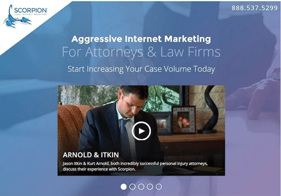
For example, Scorpion Internet Marketing, shows an actual client discussing their experience working with the company. In a competitive field (internet marketing) with low trustworthiness, this video testimonial adds authenticity to their messaging.
Chapter 3 – As GIFs
GIFs are nothing new.
They were created in the late 1980s and quickly embraced by the internet community. However, their use as a marketing strategy has only recently begun to gain traction (thanks, Buzzfeed).
These small animations offer a ‘middle-ground’ between images and videos.
They are cheap to create and often more engaging than still images. Besides engagement, these small animations let you target an exact emotion within your visitors.
Here are some easy ways to use GIFs on your landing pages:
1. Use GIFs to demonstrate the product and its core benefit
In some cases, you might be able to use a GIF to showcase your product and its core benefits.
This is usually the case with digital products.
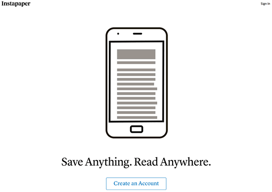
For example, the Instapaper landing page shows the product’s core feature – the ability to ‘read anywhere’ – with an animated GIF.
A GIF works better than video in this situation because it’s easier to animate. And, since the GIF has only limited colors, its file size is also smaller (remember, page load times matter).
2. Show the product in action
With this approach, the GIF works like an autoplay video. Instead of getting people to hit ‘play’ on a video, you can use a GIF to show your product in action.
Since a GIF needs to be a relatively small file size, you will have to limit which features you show off. Consider showing only the most important features instead of a complete demo (where a video would work best).
For example, Visual Website Optimizer uses a GIF to show how its ‘visual’ optimizer works:
3. Add visual interest to a page
Another way to use GIFs is to add visual complexity to an otherwise basic page. The GIF usually replaces a static element on the page and makes it more visually interesting.
For example, this landing page from Bench could have just used a static image (which they do offer to some users based on their location or device), but the GIF makes the page far more interesting.
Putting it all together
In order to drive conversions, a landing page needs to be visually engaging and dynamic.
Adding GIFs, images and videos to your landing page can increase its emotional impact, highlight your copy or CTA and add visual complexity.
Use the examples above to inspire the design of your next landing page – what will you create?
Further reading:
- The Blogger’s Guide To Landing Page Optimization
- 5 Powerful WordPress Landing Page Plugins And Tools
- The Definitive Guide To Growing Your Email List
- 32 Ways To Drive More Traffic To Your Blog
The post 16 Creative Ways To Use Visuals In Your Landing Pages appeared first on Blogging Wizard.
Contributer : Blogging Wizard http://ift.tt/2wCXoBv




No comments:
Post a Comment