5 Examples of Visual Storytelling in Web Design
There is no denying that people are visual by nature. They love simplicity and familiarity. So it should come as no surprise that people will form an impression of your website within seconds of landing on it.
As a result, websites today are in high competition with one another, no matter the niche.
Storytelling through web design, one of the most compelling ways to grab a site visitor’s attention without overwhelming them, has recently emerged as one of the biggest design trends to hit the market.
It is not easy to master the art of storytelling using web design. It takes a keen eye, an understanding of your target audience, and a well thought-out storyline that will resonate with visitors. However, when done right, people will remember your brand, your website and your beautiful story.
In this article, we are going to share with you some of the best examples of storytelling in web design.
Analysing London 2012
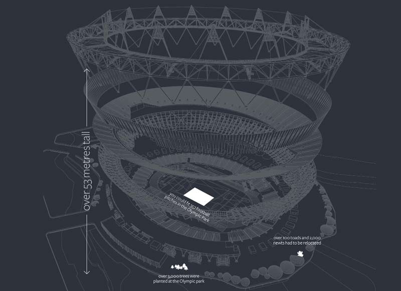
With the 2018 Winter Olympic Games underway, it seems fitting to showcase this beautiful celebration of the 2012 London Games. Using smooth parallax scrolling, which makes following the timeline easy, fascinating facts to give the story continuity, and clear, simple imagery to complement the story, GoSquared Analytics does an incredible job of bringing the site visitor into this piece of history.
Patagonia
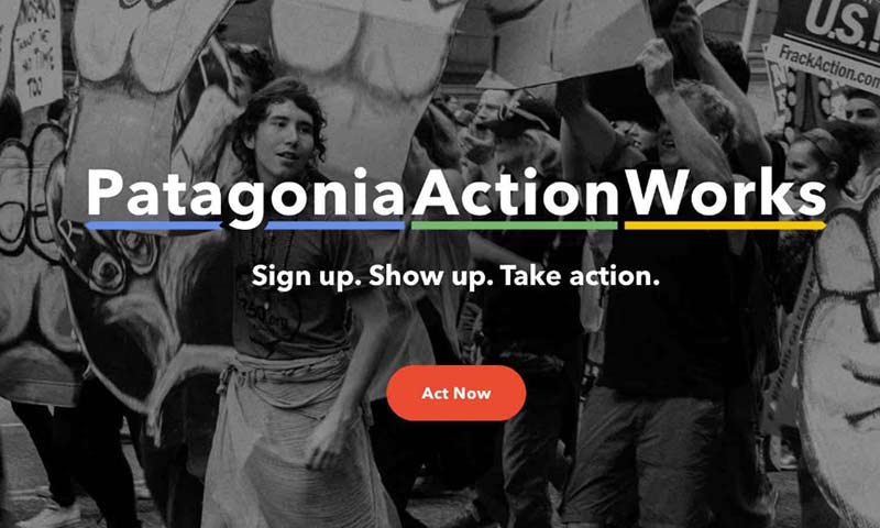
Patagonia’s marketing efforts are geared towards a very specific audience, and they do this well with their visual appeal. Their imagery focuses on everyday people, rather than high end fashion models, which makes their products more relatable.
Not to mention the visual story they tell on their site supports their core values and dedication to finding solutions to the current environmental crisis. It’s powerful enough to convince anyone to get involved.
Internet Live Stats
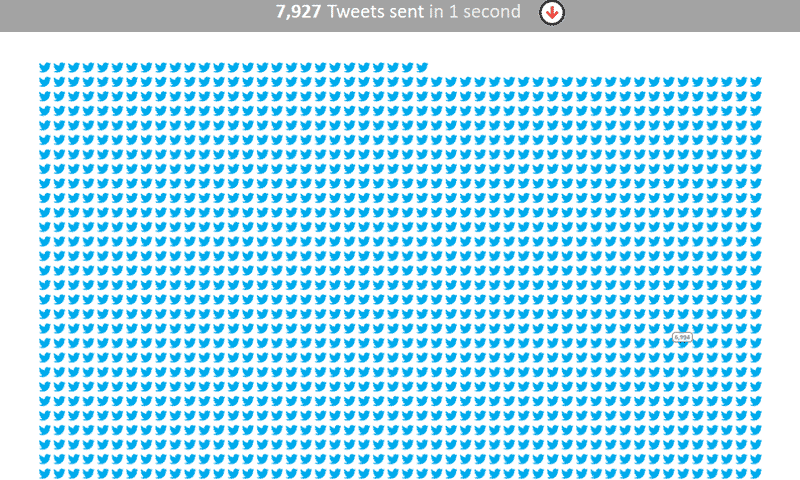
Internet Live Stats takes a unique approach to storytelling on their site. Using startling statistics, such as the fact that 7,927 Tweets go out every second, paired with just as startling imagery to complement their statistics, this is undeniably more effective than a simple sentence stating the facts.
And, to make matters even more interesting, there is a timer on the page adding up how many Tweets have been Tweeted since opening the page x seconds ago. Talk about putting things into perspective.
Twoodie
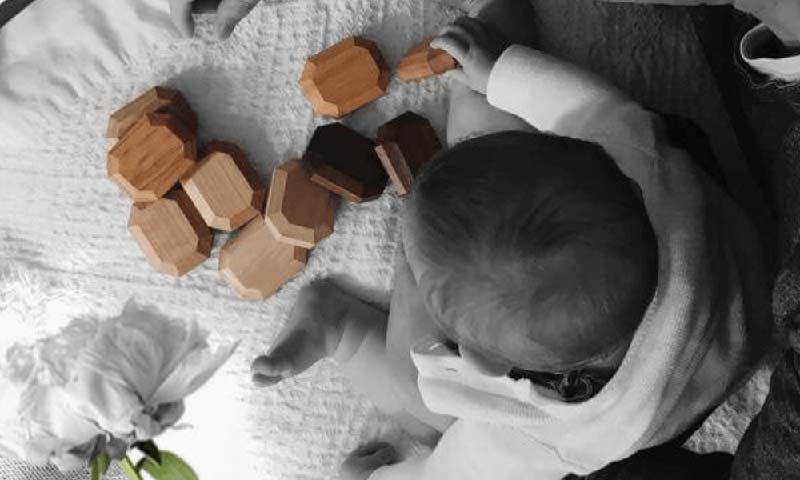
Twoodie draws on the heartstrings of parents from all over, while focusing on the fact that they, as a company, put families first and want health to take precedence. They show that imagination, creativity and minimalism lay at the heart of their brand.
And when it comes to imagery, Twoodie takes an effective approach. Using beautiful black and white photos of children playing with their toys (that are showcased in color) gives the reader a sense of nostalgia and warmth – which not many toy shops can say they do for their customers. In addition, this non-traditional approach of highlighting toys in such calming colors only adds to their brand message and solidifies their promise to simplify your life.
The Wild Unknown
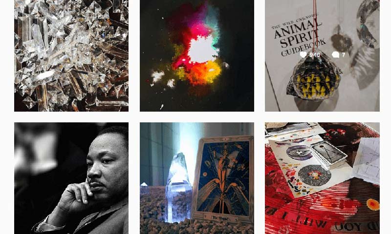
When it comes to storytelling in web design, brand promotion is not limited to websites. In fact, visual platforms such as Pinterest and Instagram can have powerful effects on people’s desire to take action and buy or subscribe based on the images they see in their social media feed.
The Wild Unknown has a visually stunning Instagram feed that not only promotes their products, but relates images to the current time, how people feel, and what may drive people to want to do better things with their lives. This is much more effective than simply saying “Buy me because I’m great.” Instead, they make the visitor feel great – and that is enough to encourage them to take action.
:) Hit link to watching video...! http://ift.tt/2EX9c4P
Contributer : 1stWebDesigner
 Reviewed by mimisabreena
on
Wednesday, February 21, 2018
Rating:


No comments:
Post a Comment