Design Tips & Examples of Device Mockups In Website Headers
Mobile device mockups are perfect for demoing new apps. These mockups let designers edit the device screen to add UIs that blend perfectly and fit naturally into the mockup photo.
Tons of mobile app websites also use these device mockups to style the page header. It’s a growing design trend I’ve seen a lot recently, and in this post I’ll explore this trend, sharing examples and tips that any designer can follow.
Straight Device View
By far the simplest technique to use is the front device view. This can use any type of device mockup where the design faces the viewer head-on.
Many designers use vector shapes to replicate the phone design rather than a realistic device mockup. This usually comes as a transparent graphic so you can blend it into any layout with ease.
Take for example the Mimo app header. It uses a dark iPhone vector graphic featuring a Mimo screenshot to help sell the product.
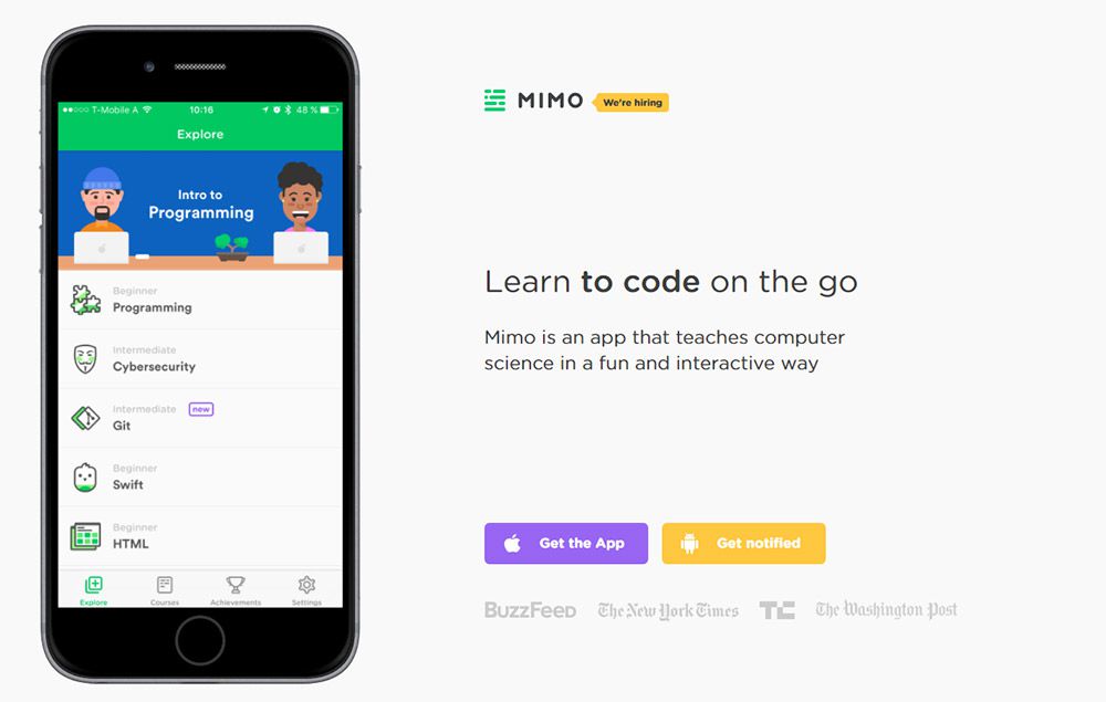
Most of these features are easy to setup and don’t require much editing in Photoshop. And since the devices appear flat on the page you can really showcase everything the app has to offer.
Most landing pages either use this flat style or the perspective style, but rarely both together. It all depends what type of design you’re going for.
But you could also use slideshows to get a mix of both. The Spendee homepage is the perfect example.
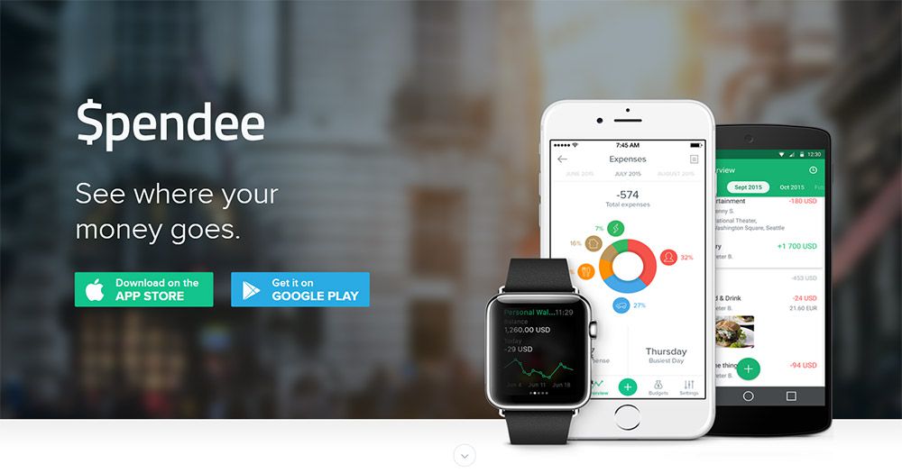
Their very first slide shows off the app in both Android & iOS devices. This stays fixed right at the top of the page so it’s a quick intro to the application.
But as you scroll down you’ll notice this page uses the dot navigation style and different sections of the page have perspective mockups too.
If the flat mockups work best for you then stick with ‘em. Tons of freebies out there in Google if you spend some time searching.
Strong Perspective Views
Another popular style is the skewed perspective device mockup. This technique uses photorealistic designs to create accurate devices with editable screens.
Most come in PSD format and they use smart objects for the screen. So when you edit the smart object you copy/paste your app UI flat into the window, then save it locally. Once you close the smart object you’ll see the screen properly aligned on the device to create the illusion of perspective.
Typically these mockups also come with transparent backgrounds so you can blend them into any layout. Filters has a terrific example of a device mockup spanning multiple sections on the page.
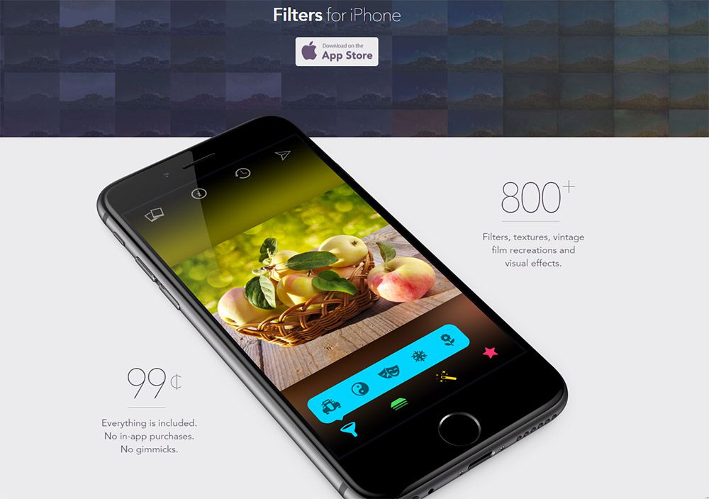
If you look closely at the device you can see the photorealistic layer FX are likely created in Photoshop. It’s definitely not a real device photo, yet it’s designed well enough to blend nicely into the homepage.
The app screenshot also follows this same perspective. This app UI is automatically manipulated in Photoshop to get the perfect angle every time.
On the Nuansa homepage you’ll find a cool slideshow effect that cycles through many different screenshots.
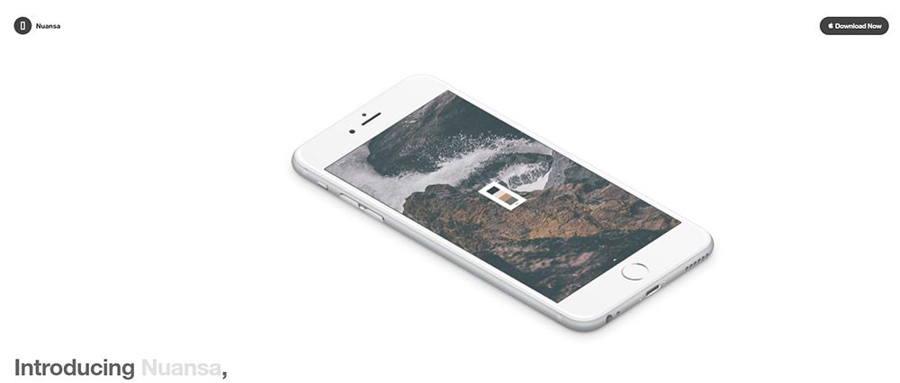
This uses different pics of the same device mockup holding different screens of the interface. It gives visitors a chance to see what the application can do without downloading it or watching a video.
Perspective app mockups are very common and you can find resources for everything from smartphones to tablets. You can also find many varying perspective shots aligned both vertical and horizontal.
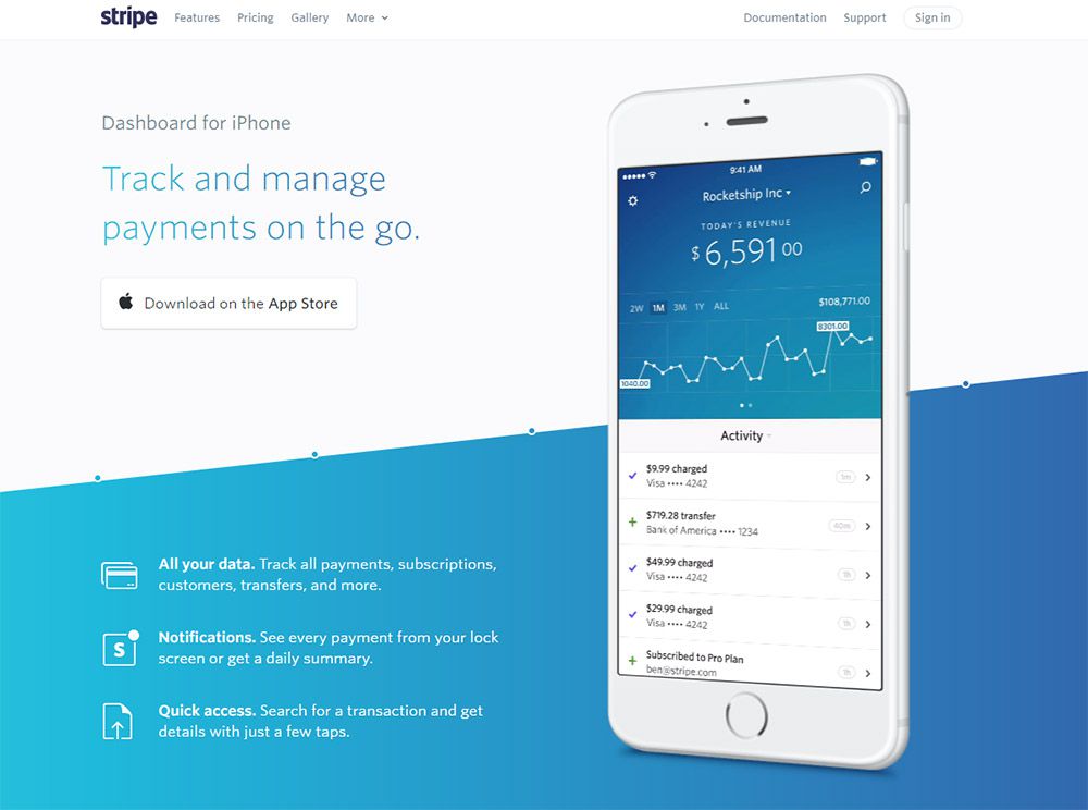
Consider this style if you want a more realistic presentation. These mockups usually come as transparent PSDs so you have full reign to edit and publish them to perfectly match your layout.
You can even follow the Stripe lander and use mp4/video content instead of a static image. This adds even more realism to the mockup without you recording a full video of someone actually using the application.
Device Hero Images
The single hottest trend in web design headers is the full-page hero image. This usually spans the entire header using a large photo to convey a message about the site and its content.
You can find tons of hero image mockups online and many of them include device PSDs. These are real-life photos of devices lying on desks or in the hands of users.
But you can edit the device screen to insert your app’s UI, so this creates a realistic photo as if someone was using the app on their phone. This lets you create promo material without ever submitting the app into an app store.
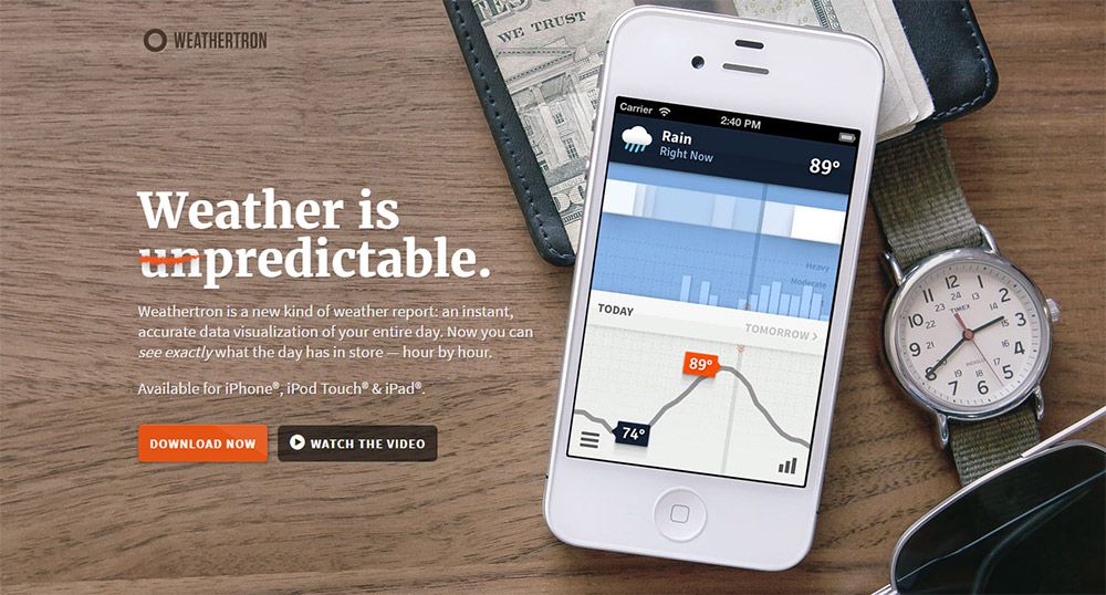
On the Weathertron homepage you’ll find a big juicy hero image plastered behind the main logo and navigation links.
This could be a real photograph of the application on an iPhone. But if you look closely at the graphic you can see the UI is a bit more polished than the rest of the photo. This is usually a sign that the photograph is real, but the iPhone’s screen was replaced with a smart object.
You’ll see something similar towards the bottom of the page on an iPad screen.
I like these larger photo mockups because they present the app as much more realistic. Visitors see the app on a real iPhone and it feels like a much more tangible interface.
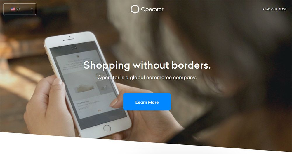
Operator is another example with a BG photo of a woman using the app on her iPhone. This again might be a real photo or a device mockup, but either way the effect is the same.
Use these larger photograph mockups when you want to sell your app in use. There are plenty of photo mockups out there and they’re just as easy to use as all the other device PSDs.
Designing With Device Mockups
There are tons of resources out there to use in your work and you’ll find dozens of styles to pick from.
Whether you’re looking for flat designs or photorealistic perspective mockups, or even live photo device shots, they’re all online with plenty of items to pick from. And these should be enough to get you started on the right path.
iPhone Clay PSD Mockups
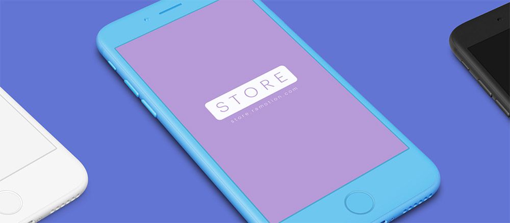
The team at Ramotion recently published iPhone Clay PSD mockups which let you fully customize the color of each device.
This is part of their massive device library for iOS & Android smartphones. But these clay mockups are perfect for landing pages because they offer more control over colors and styles to play better with your color scheme.
Each device is built in Photoshop using vector shapes so they’re easy to resize. And they use smart objects for the screen so you can drop your app UI and quickly export a picture-perfect graphic for your landing page.
Sketch Device Mockups
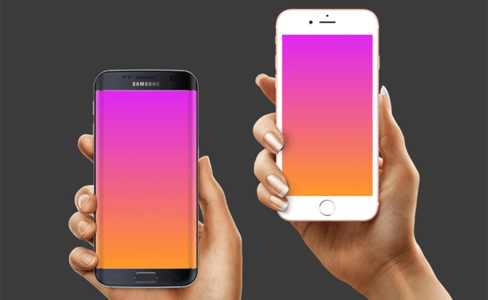
Some designers prefer Sketch over Photoshop so it’s no surprise that there’s also full Sketch device mockups ready for use.
Unfortunately these all come from different designers and there is no central source for Sketch device mockups. But you can find a ton of freebies on the Sketch App Sources website which curates the best resources from all over the web.
If you’re a Sketch fanatic then definitely consider grabbing one of these packs.
Dribbble Devices
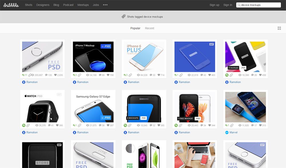
Last but certainly not least is the talent of Dribbble. This invite-only design community is packed with freebies that’ll leave you grinning from ear to ear.
Most of the top designs are from Ramotion’s perspective device packs. But if you dig deeper into the search results you can find some cool resources including flat iPhone/Android devices and actual photo mockups with people using/holding devices.
You might spend 30-60 minutes searching Google just to find the perfect mockup for your site. But Dribbble offers a smorgasbord of resources with preview thumbnails that make searching through mockups a breeze.
Wrapping Up
I mostly covered device mockups on mobile app landing pages but you can use these devices for blog posts, portfolio slideshows, and even graphic design pieces for print work.
Device mockups are here to stay and it’s a trend that’s growing in popularity. These device shots even work for responsive websites if you’re showing off a new homepage design. Get creative with these mockups and see what else you can come up with!
:) Hit link to watching video...! http://ift.tt/2rs45CV
Contributer : 1stWebDesigner
 Reviewed by mimisabreena
on
Wednesday, February 21, 2018
Rating:


No comments:
Post a Comment