Exploring Loading Screens in Mobile App Design
A loading screen should be visually interesting, carry through brand elements, and provide ample feedback to the user on the loading progress.
Below, we are going to look at some excellent loading screen examples in mobile apps, and analyse what makes each of them so effective.
8tracks
8tracks’ loading screen is clean, concise, and to-the-point. It briefly shows the company tagline before displaying a clever implementation of their logo design to feedback to the user that the app is in a loading state, through continuous movement.
This is important since static loading screens can often confuse users into thinking the app has frozen on startup.
Mahisadd
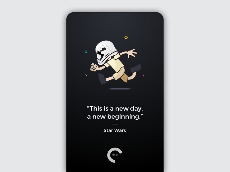
This loading screen has everything. From a visual standpoint it ticks all the boxes, providing a simple and interesting illustration for the user to enjoy while they await the loading of the app.
It combines the illustration with a quote from Star Wars and overall provides a perfect amount of content for the user to enjoy while waiting. The circular load progress icon gives simple feedback as to the progress of the load, without having the user concentrate primarily on this aspect.
Jjjjustin
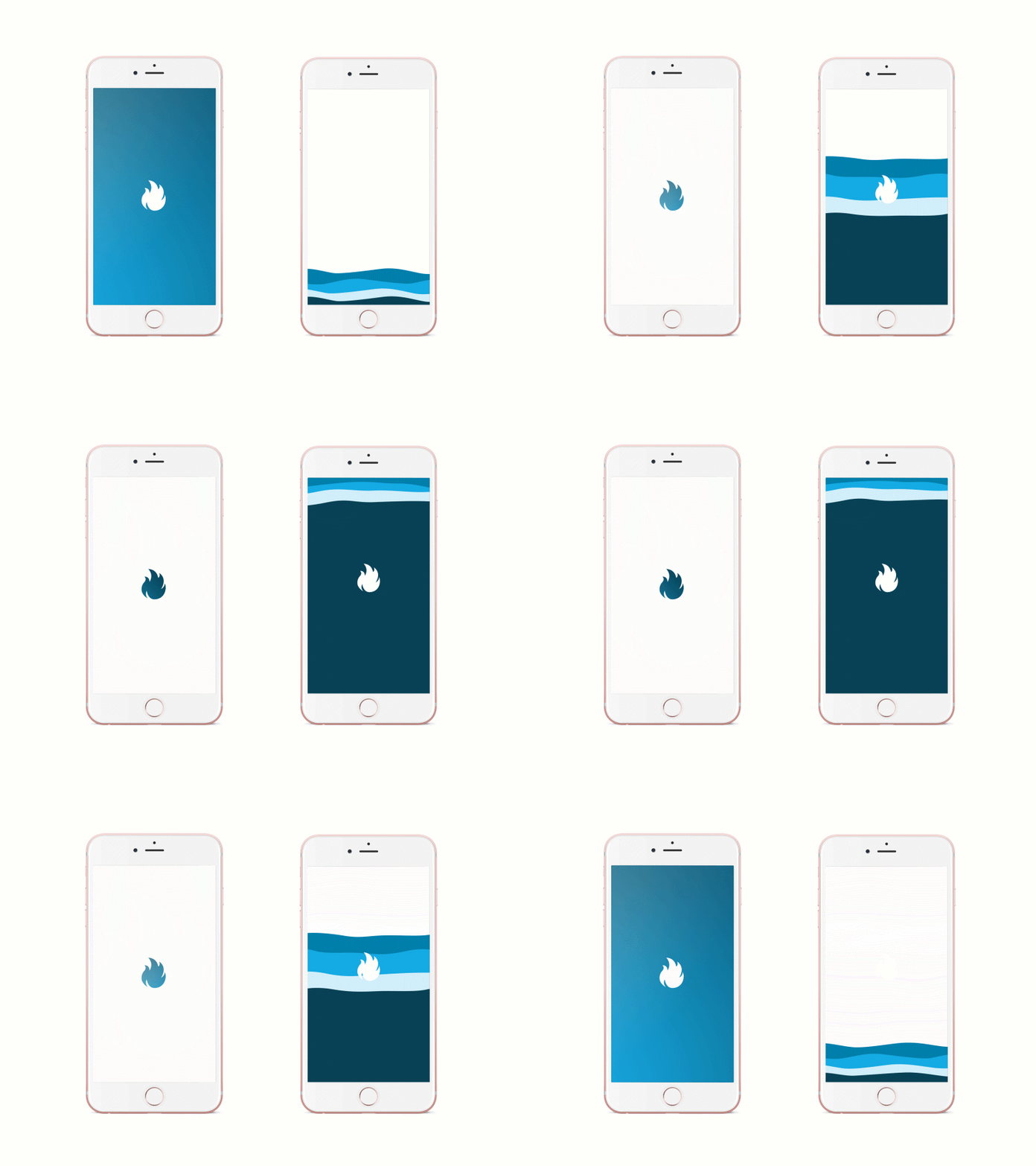
One of the cleverest implementations of a loading screen I have come across is the below example by Jjjjustin.
The left example is more subtle in its execution, proving a simple pulsating effect before expanding and animating into the app. The right example is even more clever in that it carries through the branding and colors, but uses a satisfying tidal effect to convey the load progress to the user.
The animation is perfectly designed, not to be too over-the-top, but to provide enough visual interest as the user awaits the load completion.
Yandex
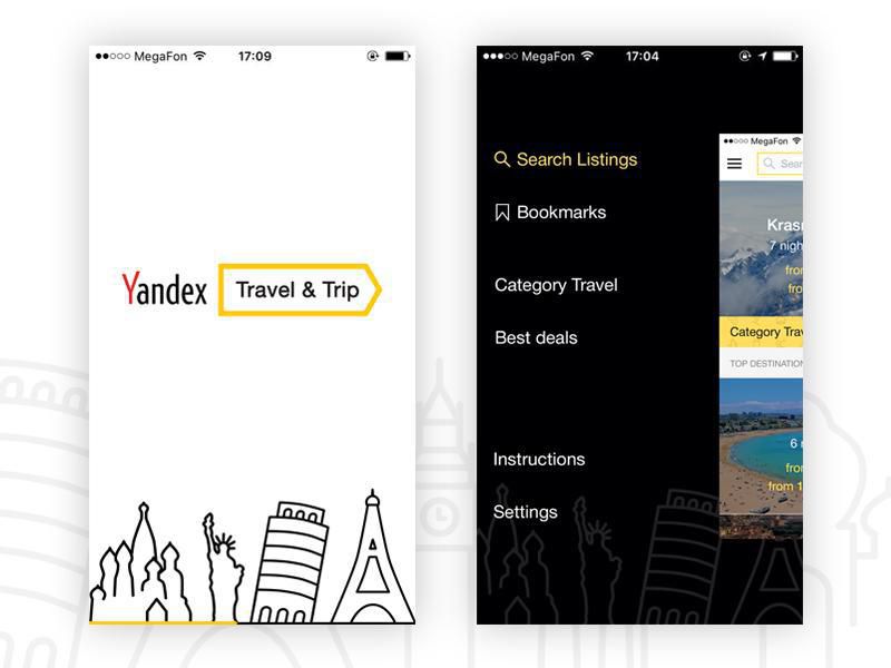
Yandex’s loading screen is beautiful in its simplicity. The branding is conveyed through use of color, logo, and iconography. It connects seamlessly with the app design and does not try to do too much.
The icons are recognisable, subtle, and not overly empowering. The simple yellow load bar at the bottom shows load progress while not making it the primary focus of the screen.
The light design provides excellent contrast with the main app design, and visually separates it as a loading screen.
YouMap
YouMap is my personal favorite loading screen. The modification of the logo design to double-up as a loading icon is extremely clever and keeps the loading screen simple and effective.
The minimal map background pattern provides extra visual interest and conveys the app’s use as a mapping tool. The gradient background is impactful and contrasts well with the loading logo design. The transition from loading completion to the main app content has been thought through right down to the finest detail, including the ellipsis, which satisfyingly combines and expands to reveal the map in its entirety.
Which are your favorite examples of mobile app loading screens? Share them below in the comments!
:) Hit link to watching video...! http://ift.tt/2oPIkIo
Contributer : 1stWebDesigner
 Reviewed by mimisabreena
on
Friday, February 16, 2018
Rating:






No comments:
Post a Comment