Top Examples of Modern Typopgraphy
Trying to decide what makes for the best typography isn’t even worth talking about. I mean, the typography discussion is similar to talking about the greatest baseball players. You can argue all you like, but some of them are better in certain situations and they all have their own individual strengths. Typography is quite the same, where you might think about using a modern font style on a technology website or logo but not dare to do something like that on a retro clothing store website.
However, trends certainly make some typography options stand out. The design industry leans toward those trends because they often end up being more effective in the business world. For instance, flat, minimalistic designs have been shown to improve conversions and load websites faster. There’s a reason we see so many of these designs today.
So, are modern typography designs better? Not necessarily, but they are certainly going to help when you’re working on a client design and you want to make it look current, relevant and on-trend.
If you’re looking for more modern, industry relevant typography, take a look below to find some inspiration.
Modeka
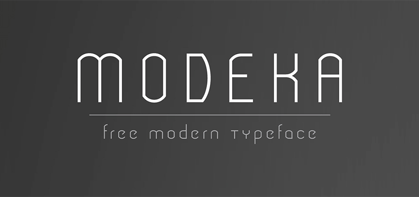
Modeka is a font by Gatis Vilaks, and it is both elegant and lightweight. The corners are slightly rounded for a more modern approach, yet you still get a visible rigidness to it – making it perfect for overlaying on top of images.
Komoda
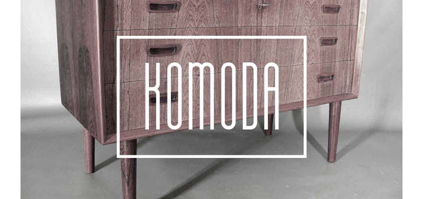
The Komoda font is one of our favorites in modern typography, mainly because of its slim design and perfect structure for everyday titles and headlines. The rectangle around the font helps drag the eye to the wording as well.
Minimalust
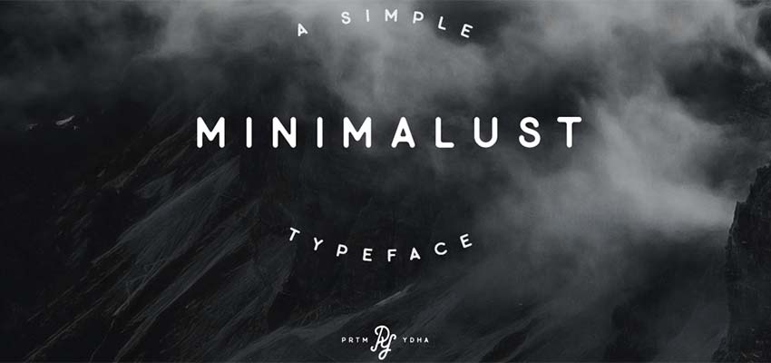
You’ll start to notice that many of the best modernist typography options have that rounded edge while still looking strong and robust. Minimalust is no different, creating a clean and simple solution for headlines and logos, while also providing a workable solution for more vintage designs.
Ministry
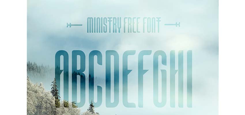
Ministry is a sans serif typography option, offering a condensed title with smooth curves and elegant strength. The spacing between the words makes for plenty of whitespace, and you get a sense of modernism and mysticism combined with this one.
Stoked
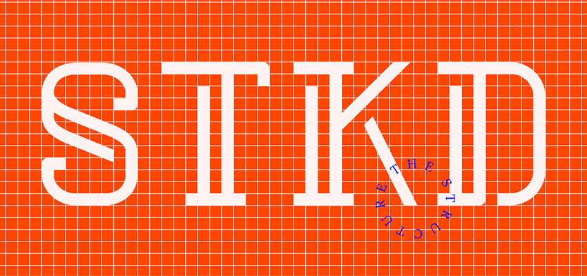
Stoked offers that youthful serif typeface that works for so many types of designs these days. Each letter has some sort of tail to it, strengthening the font and offering a playful, yet new age look.
Matey
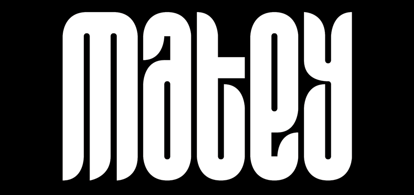
Matey is a font by Andreas Leonidou. We enjoy it as a modern font but it also has a taste of retro 80s and 90s. You get quite a bit of versatility with the font, while also receiving that bold, thick typography for headlines.
Maddac
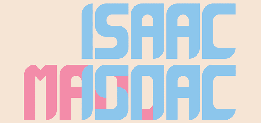
Maddac does a wonderful job of merging color and simplicity, and you can always change around the colors to make it look more professional. The clean and highly-legible typography has impressive rounded edges, but you’ll see that many of the edges are actually quite rigid. As you may notice, many of these modern fonts are useful for headlines, but you can even incorporate them into logos and other designs.
Distrito
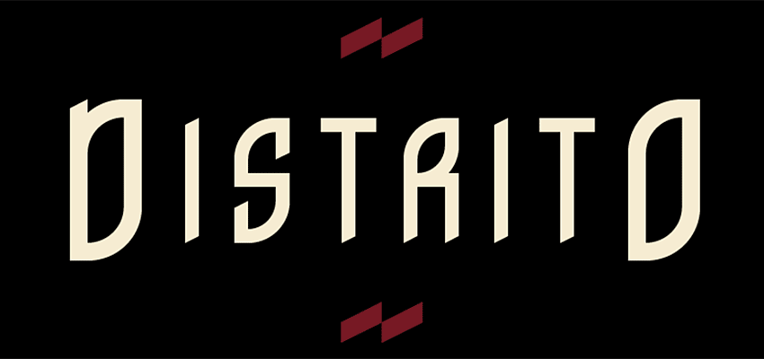
Distrito is said to have been inspired by Columbia, and it offers a sense of coolness while also bringing up different angles for high-impact marketing. When looking at the font it’s quite clear that it can be used for both retro and modern designs.
Glober
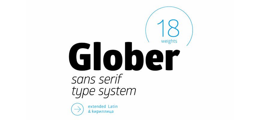
The Glober font has professionalism written all over it. It creates this type of message by combining classic fonts and elegant, lightweight modernism. The sans serif type provides some wonderful lowercase and uppercase juxtaposition, with soft geometric creations and stronger weights for the uppercase typography.
Go Out and Find Some More Modern Typography!
The good thing about typography is that it’s littered all over the internet. Hopefully these examples give you some inspiration when creating your own designs. You can even grab a few of them for free. Other than that, use Pinterest, Google, FontFabric and Behance to explore the world of modern typography even further.
:) Hit link to watching video...! https://ift.tt/2HEmQbY
Contributer : 1stWebDesigner
 Reviewed by mimisabreena
on
Monday, April 16, 2018
Rating:


No comments:
Post a Comment