Twitter lets advertisers ‘take over’ the Explore tab
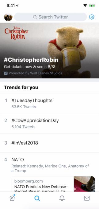
Twitter is ready to squeeze a lot more money out of its trending topics. After minimizing its mediocre Moments feature and burying it inside the renamed Explore tab, Twitter is now starting to test Promoted Trend Spotlight ads. These put a big visual banner equipped with a GIF or image background atop Explore for the first two times you visit that day before settling back into the Trends list, with the first batch coming from Disney in the U.S.
 These powerful new ad units demote organic content in Explore, which could make it less useful for getting a grip on what’s up in the world at a glance. But they could earn Twitter strong revenue by being much more eye-catching than the traditional Timeline ads that people often skip past. That could further fuel Twitter’s turnaround after it soundly beat revenue estimates in Q1 with $665 million. Its share price of about $44 is near its 52-week high, and almost 3X its low for the year.
“We are continuing to explore new ways to enhance our takeover offerings and give brands more high-impact opportunities to drive conversation and brand awareness on our platform,” a Twitter spokesperson told TechCrunch.
The Promoted Trend Spotlight ads are bought as an add-on to the existing Promoted Trends ads that are inserted amongst the list of Twitter’s most popular topics. When tapped, they open a feed of tweets with that headline with one of the advertiser’s related tweets at the top. Back in February, AdAge reported whispers of a new visual redesign for Promoted Trends. You can view a demo of the experience below.
Anthy Price, Disney’s executive vice president for Media, provided TechCrunch with a statement, saying “The Promoted Trend Spotlight on Twitter allowed us to prominently highlight Winnie the Pooh & celebrate the launch of ticket sales for Christopher Robin while four of the characters took over major Disney handles on the platform to engage with fans.”
Historically, Twitter’s biggest problem was that people skimmed past ads. The old unfiltered Timeline trained users to pick and choose what they read, looking past anything that didn’t seem relevant, including paid marketing. But with the shift to an algorithmic Timeline and bigger focus on video, Twitter has slowly retrained users to expect relevant content in every slot. Explore’s design, with imagery at the top followed by a text list of Trends, pulls attention to where these new Spotlight ads sit. With better monetization, Twitter will now have to concentrate on building better ways to get users to open Explore instead of just their feed, notifications and DMs.
Contributer : Social – TechCrunch
 Reviewed by mimisabreena
on
Thursday, July 12, 2018
Rating:


No comments:
Post a Comment