Building Digital Credibility for Better UX
The design of your website does more than offer a way for people to find you on the web – it builds the credibility of your brand. Your website’s UX creates brand associations to gain traction with your customers.
In today’s technological society, it takes more than a pretty website to turn the heads of consumers – though a pretty website helps. Your site must contain credible content, have reliable navigation, and feature structured layouts to have a competitive edge and stay relevant in your industry.
The UX Designer Toolbox
Unlimited Downloads: 500,000+ Wireframe & UX Templates, UI Kits & Design Assets
Know What Consumers Are Looking For
When determining if your site is credible to your consumers, you must have an understanding of your target audience.
Deliver products and experiences that meet their needs to be seen as trustworthy. Define your target audience, then design a website interface that meets their needs.
Create a Great First Impression
In a world filled with instant gratification, we make quick judgments about people, products, and experiences. Current research suggests users form their first impressions of your website in just .05 seconds!
This is where your visual appeal is most important. The other factors come into play after you have captured their initial attention.
The design of your website and the first look your users receive upon arrival tells the story of your business. You must catch your users’ attention in a way that feels personal to establish credibility. Your consumers need to have faith in the story you are telling and the products you are offering.
To give them that faith, spend some time thinking about the details – color, navigation, and font size all make a difference for user experience.
Color schemes have a huge effect on the perceived value and credibility of your business, so spend some time considering the colors of your site. Your favorite colors may look cool to you, but if they come off as unprofessional, they could cost you business. Conversely, if colors seem too old school and your target audience is millennials, you may be seen as out of the loop.
Your navigation bar – regardless of your target audience – should be clear and easy to navigate. If your users are older, ensure that there can be no confusion when navigating the site. Keep your font type and size in mind, too. Curly fonts can lack gravitas, and fonts that are too small are frustrating.
Offer Credible Content
One of the most important ways to be credible to your readers is by providing them with reliable and meaningful content. Consumers who are visiting your website want to read about your products and how they have helped or served people in their community, but they don’t want to feel like they are stuck on a used car lot, so don’t be overly salesy.
Include content that relates to your business but doesn’t feel overly promotional. Offer something of value on your site – consumers are giving you time, give them something in return. It’s a win for you in more ways than one – you’re seen as a thought-leader in your industry, and the higher engagement time on the website means better rankings.

Article by Ruslan Siiz
Up-to-date content shows consumers you are maintaining your website and the information on it. If a user can tell your site has not been updated in months, they won’t stay long. Presenting new information to your users shows you are committed to giving them the latest information regarding your business. It builds trust that you will deliver for them in the future.
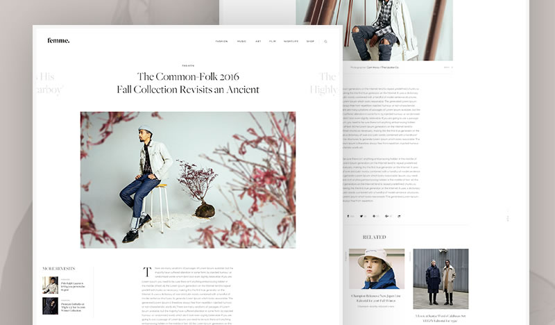
Your credible content doesn’t stop at what is written on your site. Photos need to be relevant to your business and set the tone for what you stand for. Appealing photos say a lot about the quality of your business and can make your users feel confident about your brand.
Going out of your way to find images to match your brand and values builds trust. Choosing stock images is easy and doesn’t require much thought – that thoughtlessness shows.
Improve Navigation and Usability
Confusing or malfunctioning navigation is one of the most frustrating things you can encounter on a website. And, at this point in the tech race, users don’t have to put up with it. If your navigation is confusing, you can bet there’s a competitor whose site navigation is clear. Making users work to navigate your site is just asking them to leave.
One way to make your site look professional is to make its usability seamless. When it isn’t, it suggests other aspects of your business might be flawed or created lazily. When users have an easy experience navigating your website, they have a better overall image of you as a professional in your industry.

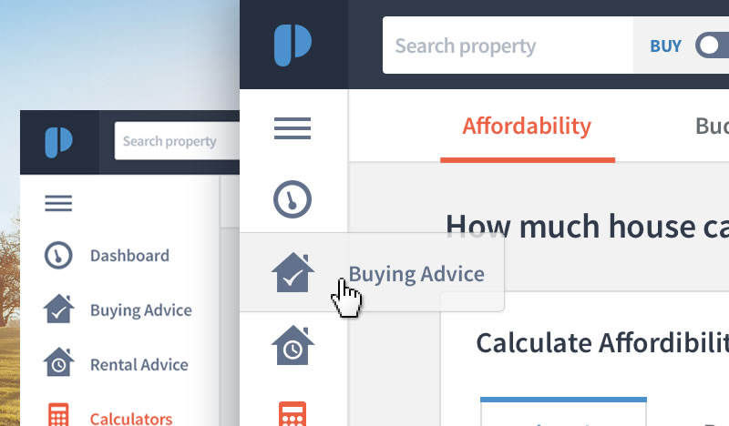
Navigation Ideas by Oykun Yilmaz
Provide Answers through Effective Layouts
The layout of your website can do even more than just provide effective navigation; it gives users a guide for finding the answers and information they need. Consistency matters from page to page – it should feel like an extension of the identity you’ve created with your brand.

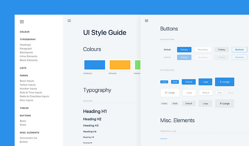
F&W UI Kit by Scott Wakefield
Backgrounds, color choices, navigation tools, and your content’s voice should all have a common feel. Keeping this information consistent can build a positive UX, encouraging users to trust and return to your business.
You may want to tuck away certain aspects of your site, but don’t try to tidy the site up so much that users can’t find what they came to the site to see. Don’t make users click too many times to find important information.
Like a newspaper, the top left corner is the most prominent area – use that precious real estate wisely. National Geographic does a great job with their layout design – consider how clear the info is and how nothing crucial is hidden.
Maintain Information and Links
One of the fastest ways to lose credibility is by having outdated information on your website or links that don’t work. Want to diminish your chances of being a valuable resource? Offer what looks like value with a broken link. Not only will it drive away users, your reputation takes a hit – along with your rankings.
Wrong information tells your users you don’t care enough to keep the information on your website up-to-date, which may make them believe your brand will not provide them with a good experience.
Design Work Is Never Done
With the never-ending development of technology and responsive website elements, you must always stay on top of your design. If your website begins to seem old or isn’t providing enough to your consumers, they will lose trust in your company.
Creating design elements and building your brand to be credible and trustworthy takes more than good intentions and caffeine. Website building and design is business building – create a brand identity using your site, and it will increase your reputation and help you with you every aspect of your business.
:) Hit link to watching video...! https://ift.tt/2u8SXwE
Contributer : 1stWebDesigner
 Reviewed by mimisabreena
on
Tuesday, August 28, 2018
Rating:


No comments:
Post a Comment