Bringing Accessibility to Your Web Design Process
The internet, by its nature, is a place people of all walks of life can visit. The physical barriers that people with disabilities face are lessened online. Sadly, many people encounter a new barrier on the web: content not designed for accessibility.
As a web designer or developer, you have the ability to fix these issues, increasing your audience and even improving search rankings. Often these problems have a simple fix and little effect on your design – if you’re willing to be creative.
Your Web Designer Toolbox
Unlimited Downloads: 500,000+ Web Templates, Icon Sets, Themes & Design Assets
How Create an Accessible Website
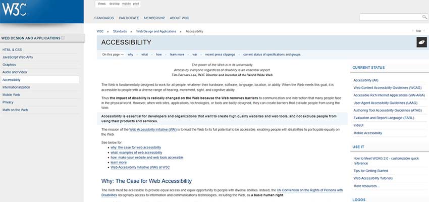
The guidelines to accessibility are extensive, but here are a few key suggestions. For whatever reason, it may be infeasible to include all the guidelines in your site design, and that’s okay.
The goal isn’t to break the core functionality or design of your website, but to avoid unnecessary exclusion. Include as many optimizations as is sensible for the site you’re designing.

Optimize for Visual Impairments
Your biggest task by far lies in improving visual design. Having a site with unfriendly colors or contrast can lead to confusion or headaches for people with impairments.
- Use high contrast; text should be dark or light enough to be read easily. Light gray text on white may be trendy, but it’s all but invisible to people with low vision.
- Consider including a large text mode, or a menu where font, size, and style can be modified.
- Avoid using flashing and blinking, repetitive patterns, and other epilepsy triggers — especially without consent. These aren’t just annoying, but downright dangerous.
Screen reader friendliness should be a priority. There are more screen reader best practices, but here are a few things to keep in mind:
- Certain UI types, such as drop-downs with buttons hidden within them, are incompatible.
- Always use the
langattribute to specify language. - Organize content with headings.
- Define ARIA landmarks for easy navigation.
- Provide non-visual alternatives, such as using the image
alttag, when necessary.

Don’t Convey Information Through Only Sight, Sound, or Color
It shouldn’t need to be stated that putting purple text on a blue background is a terrible idea, not just for colorblind users, but there are other problems you may not realize.
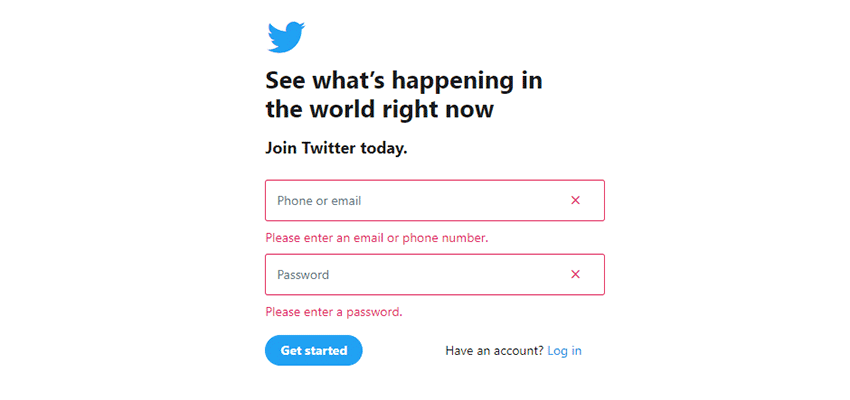
- Always include an indicator other than color. The person stuck on a form won’t appreciate the “minimalistic” red highlight around the error box, with no other visual indication.
- Similarly, avoid requiring sound or images alone to navigate.
- Include audio transcripts or captions for videos.
- Use the image
alttag, and include text versions of non-text content.

Make Your Website Easy to Navigate and Understand
The web has taken a turn towards simplicity, which is great for those who require an easy-to-navigate website. However, there are still many common mistakes that prevent accessibility. It often comes down to keeping a clear and consistent design.
- Use predictable navigation elements. If you have links in a top bar on one page and the sidebar on another, you’re only causing confusion.
- Require as little maneuvering as possible to get around, such as by using a sticky navigation bar.
- Make interactive elements stand out.
- Label and define click targets (boxes, links, forms). Don’t make them small and hard to press.
- Your website should be navigable by keyboard alone. Never disable focus indicators without an alternative.
- Write in clear, understandable text, or provide a simpler version.
- Offer a layout mode that strips superfluous CSS.
- Have helpful error messages that explain what went wrong and how to fix it.
- Create a responsive site, or design a mobile version.

Making the Web Accessible
These are just a few suggestions on how to make your website usable by everyone. If possible, ask people with disabilities to test your site, or use a tool to simulate color blindness, screen readers, and so on.
With 15% of people in the world having some disability, it’s time to create a web that meets everyone’s needs. And in the end, if many websites adopt these standards we’ll create a better, more inclusive internet together.
:) Hit link to watching video...! https://ift.tt/2HxtJL0
Contributer : 1stWebDesigner
 Reviewed by mimisabreena
on
Monday, September 03, 2018
Rating:


No comments:
Post a Comment