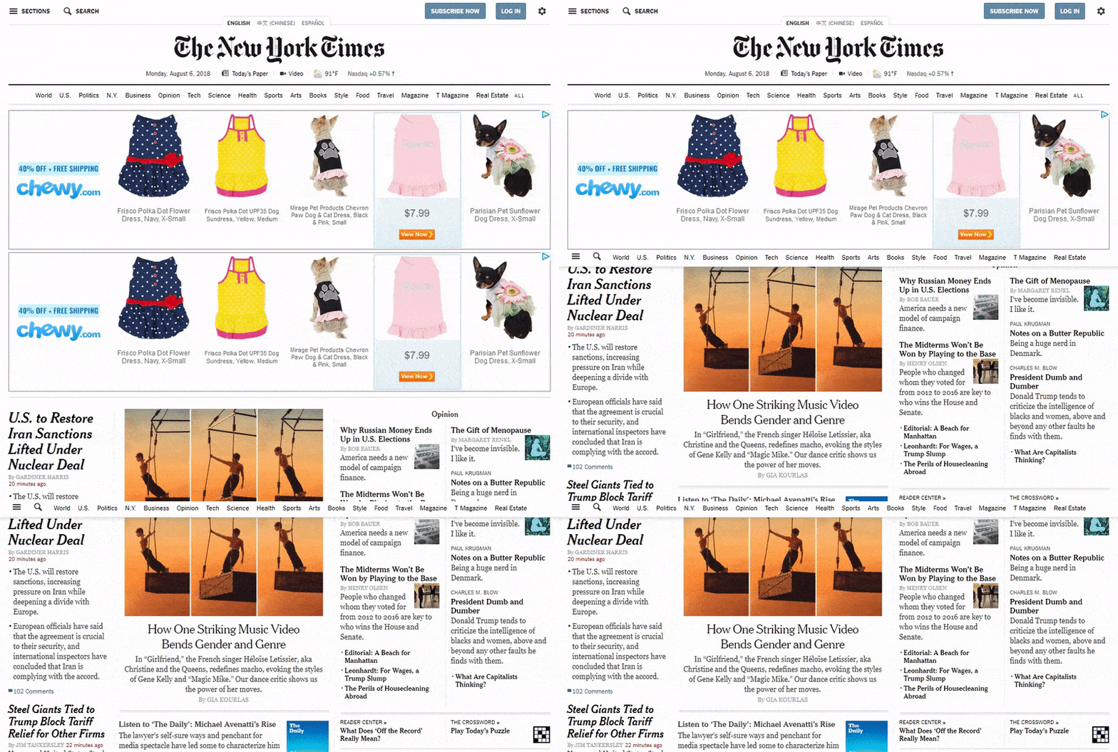
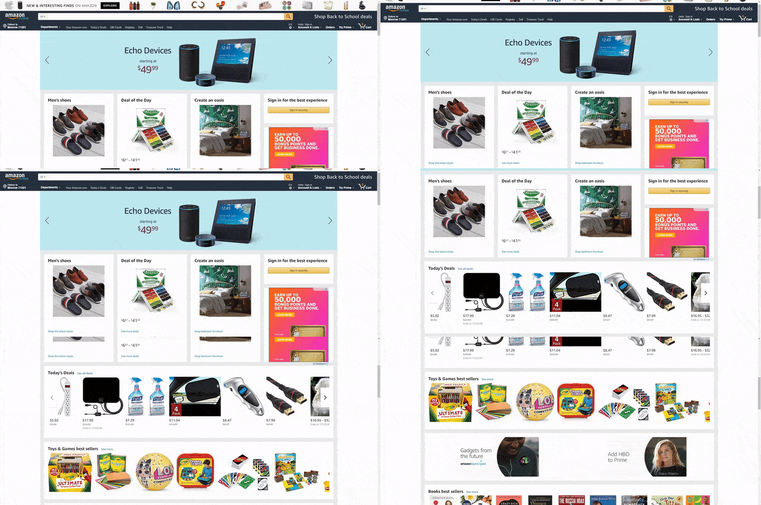
Sticky vs Fixed Navigation: A Comparison
In the world of website design, user experience is everything. And the menu bar at the top (or side) of your website is the starting point where many users will look for pages or certain items like booking forms or an “about me” section. But what about how your navigation bar reacts to the user scrolling down the page?
There are two types of navigation, sticky and fixed. It used to be that all websites had some sort of fixed navigation, where the user would scroll down on the page and the fixed menu would go upwards with the rest of the content. In short, the menu was glued to the top of the page and would disappear before anything else.
On the other hand, sticky navigation is a newer kind of menu, where the user continues to see the menu bar even when they move toward the bottom of the page. The menu buttons usually hover above the webpage content, potentially blocking out some of the text or images. However, since the menu bar is often quite narrow, it usually doesn’t matter that much.
Which One Should You Go With?
Considering that both fixed and sticky navigation options are still quite popular, it makes sense that you see a little bit of both all over the internet.
But what are the main differences when it comes to advantages and disadvantages?
Let’s take a look.

Sticky Navigation
Pros
- Your user constantly has the menu bar in their view. This has been shown to help people move around sites quicker, since they’re able to locate what they’re looking for without having to scroll all of the way up to the top.
- The sticky navigation reminds users that there are other options besides whatever content they are currently looking at. They may have forgotten, or not realized, that a contact page was available in the menu bar. The sticky menu provides a bit of a reminder.
- The sticky menu often doesn’t occupy the space of other elements. So it’s not forcing anything to move around or make the website glitchy.
- You can typically keep the logo in view on the sticky menu, setting your brand image in front of people at all times.
Cons
- The sticky menu can be distracting for visitors who don’t want to be constantly reminded about the darn menu. After all, most internet users know where to find the menu, and aren’t always looking for it.
- These sticky menus are trickier for developers to implement in designs. Therefore, you might find that some of these menus are jumpy or push other elements to the side. Overall, the sticky menu is a moving element that’s a bit more complicated than a fixed option.

Fixed Navigation
Pros
- A navigation bar that doesn’t move means that you’re not always distracting your readers with a menu they might not need.
- You don’t run any risk of cluttering your content or making a jumpy site experience while the user scrolls down your website.
Cons
- There’s a much better chance of your readers getting confused or lost. Website visitors are trying to move around quickly, so it might be enough to convince them to leave.
- You may see fewer views on your other pages, since the customers aren’t being repeatedly reminded of what else in on the website.
Sticky Navigation? Yea or Nay?
Today, it makes sense to go with the sticky navigation. For one, it’s kind of like popup email forms. You might annoy a few random customers, but the benefits far outweigh the downsides. The whole goal is to improve your user experience and convince people to stick around for longer periods of time. That’s exactly what a sticky menu does.
:) Hit link to watching video...! https://ift.tt/2PrDL46
Contributer : 1stWebDesigner
 Reviewed by mimisabreena
on
Monday, September 03, 2018
Rating:


No comments:
Post a Comment