Free Social Media Icons (The Ones You’re Actually Allowed to Use)
No website is complete without social media icons. And nowadays everything from email signatures and business cards to posters and video spots benefit from a little “iconography.”
But before slapping icons on every asset your company owns, there are a few things to consider—including legalese. Despite the ubiquity of icons in all shapes, colors and sizes online, social media icons are registered trademarks. They are protected by copyright and enforceable brand guidelines.
We’ve assembled download links for all the major social network icons, as well as best practice guidelines that will keep your icon use on the level. And we’ll help you steer clear of design blunders with tips on how to tailor icon use for each medium.
Bonus: Get the step-by-step social media strategy guide with pro tips on how to grow your social media presence.
Where to source social media icons
Download the full suite of icons.
Key brand guidelines:
- Only use the icon in Facebook blue or reversed white and blue. Revert to black and white if facing color limitations. Blue, grey, white and black versions are available for download.
- The Facebook icon should always appear in a rounded square-shaped container.
- Make sure the icon is reproduced in a legible size. It should be at equal size to all other icons.
- Do not animate or represent the logo in the form of physical objects.
- Download icons according to your medium. Facebook variations of its icon spec’d for online, print, and TV and film.
Icons for online use (.png)


Download the full suite of icons.
Key brand guidelines:
- Only use the icon in Twitter blue or white. When limitations with print coloring apply, Twitter will allow the logo to be displayed in black.
- Twitter prefers its icon to be represented free of container, but offers square, rounded square, and circular containers if they better suit your needs.
- If using the logo over an image, always use the white version.
- Do not animate the logo, and do not embellish or accessorize it with word bubbles, or other creatures.
- Clear space around the logo should be at least 150% of the width of the icon.
- Icons should have a minimum width of 32 pixels.
Icons for online use (.png)



Download the full suite of icons.
Key brand guidelines:
- Only the icons found in the Assets section of Instagram’s brand resources site may be used to represent Instagram. These icons are available in color and black and white.
- Instagram icons should be represented without container. Square, circle, rounded-square, and other container shapes are not available.
- Don’t incorporate the icon with your company name, trademark, or other language or symbol.
- When using the icon for broadcast, radio, out-of-home advertising or print larger than 8.5 x 11 inches, you need to request permission and include a mock-up of how you your intended use.
- Instagram content shouldn’t comprise more than 50% of your design, or more than 50% of the total duration of your content.
Icons for online use (.png)

Download the full suite of icons.
Key brand guidelines:
- LinkedIn prefers its blue and white icon to be displayed on a white background. The icon should always be displayed in color online. When not possible, use the reverse white and blue or black and white icon.
- Use the solid white icon on dark-colored backgrounds or photos, and the solid black icon light-colored backgrounds or photos, or in one-color print applications. Make sure the “in” is transparent.
- The LinkedIn icon should never be a circle, a square, a triangle, trapezoid, or any shape other than a rounded square.
- LinkedIn icons are typically used at two sizes online: 24 pixels and 36 pixels. The minimum size is 21 pixels online, or 0.25 inches (6.35mm) in print. Icons sized for print or larger use should reference the 36-unit grid found here.
- Icon bounds should be approximately 50% of the size of the container. The minimum clear space requirement specifies that padding the size of two LinkedIn “i’s” be used around the icon.
- Use in television, film, or other video productions requires a request for permission.
- If using call-to-actions such as “Follow us,” “Join our group,” or “View my LinkedIn Profile,” in conjunction with the icon, use a different font and color—preferably black.
Icons for online use (.png)


Key brand guidelines:
- Pinterest’s “P” icon should always be displayed in Pinterest Red, in print or on screen and unaltered in any way.
- To use Pinterest in video, television or film, companies need to submit a written request to their partner manager at Pinterest.
- Always include a call-to-action after showing the Pinterest icon. Make sure the icon size is proportionate to the call-to-action text.
- Acceptable call-to-action phrases include: Popular on Pinterest, Find us on Pinterest, Follow us on Pinterest, Visit us, Find more ideas on Pinterest, Get inspired on Pinterest. Do not use the phrases Trending on Pinterest or Trending Pins.
- Always display or hyperlink your Pinterest URL when using the icon.
Icons for online use (.png)


YouTube
Download the full suite of icons.
Key brand guidelines:
- The YouTube icon is available in YouTube red, monochromatic near-black, and white monochrome.
- If a background does not work with the YouTube red icon, or color can’t be used for technical reasons, go monochrome. The almost-black icon should be used for light multi-colored images. The white icon should be used on dark multi-colored images with a transparent play-button triangle.
- YouTube icons should be a minimum of 24 dp in height online and 0.125 inches (3.1mm) in print.
- The clear space requirement for the YouTube icon should be half of the icon’s width.
- The YouTube icon can only be used when it links to a YouTube channel.
Icons for online use (.png)
![]()
![]()
Snapchat
Download the full suite of icons.
Key brand guidelines:
- Only show the Snapchat icon in black, white and yellow.
- Don’t surround the logo with other characters or creatures.
- The minimum size if the Ghost icon is 18 pixels online and .25 inches in print.
- The icon is available without container in black in white, or with a yellow rounded square.
- Clear space around the logo should be at least 150% of the width of the logo. In other words, padding should be the same size as half of the Ghost.
Icons for online use (.png)


Download the full suite of icons.
Key brand guidelines:
- Only show the WhatsApp icon in green, white (on green backgrounds), and black and white (in materials that are primarily black and white).
- Make sure to spell WhatsApp as a single word with proper capitalization
- Only use the green square icon when referencing the iOS app.
Icons for online use (.png)



What are social media icons and why should you use them?
Add social media icons to your website, business cards, and other digital and physical marketing materials to grow your social media following and connect with customers on different channels.
Not to be confused with share buttons or wordmarks, social media icons are shorthand symbols that link to your company profile on different networks (or, in the case of print materials, simply let people know that your business is on those networks).
Most often, social media icons use the first-letter or symbol logo of the social media company. Think Facebook F, Twitter bird, or Instagram camera.
Some logos are available in “containers.” Containers are shapes enclosing the letter or symbol. Very often the icons are coloured with the company’s official hues, but they are sometimes also available in monochrome.
Thanks to their widespread use by businesses, most customers expect companies to have icon links on their websites and are savvy enough to know where to look for them. Neat and uniform in style, icons are a tidy alternative to annoying “follow me” pop-ups.
How to use social media icons in your marketing materials (legally)
Whether online or offline, social media icons can provide a link to your company’s social channels. Here are a few tips and tricks for using them effectively on different mediums.
Websites
Often brands will place social media icons in the header and/or footer of their website. But they can also be placed on a floating left or right sidebar for greater prominence.
As a general rule, icons placed above the fold have a better chance of being seen.

Emails and newsletters
Having social media icons in your email signature or newsletters offers additional ways to connect with recipients. If networking is important and your company permits, you can also add a public profile LinkedIn badge.
Follow these steps to add icons to your email signature:
Outlook signature
1. In Outlook, from the Home tab, select New Email.
2. On the Message tab, in the Include group, select Signature, then Signatures.
3. From the E-mail Signature tab, in the Edit signature box, select the signature you want to edit.
4. In the Edit signature text box, add a new line beneath the current signature.
5. Choose Picture, then go to the folder where you downloaded icons, and select the icon you’d like to include.
6. Highlight the image and select Insert then Hyperlink.
7. In the Address box, enter the web address for your corresponding company profile.
8. Select OK to finish modifying the new signature.
9. On the Message tab, in the Include group, choose Signature, and then choose your newly modified signature.
Gmail signature
1. Open Gmail.
2. Click the settings glyph in the top right corner.
3. In the Signatures section click the Insert Image symbol to add your downloaded icon.
4. Highlight the image and click the Link symbol.
5. Add the web address for your company profile.
6. Scroll to the bottom and select Save Changes.
Newsletters
Most publishers place social media icons in the newsletter footer, because often the goal of newsletters is to promote website products, services, or content. .
Gmail can sometimes clip long messages, so if gaining social followers is one of your newsletter goals, put the icons in the header or above the fold and consider using a call-to-action. Alternately, if the goal of your newsletter is to promote content, you may want to consider including share icons, and placing follow icons in the footer.
Bonus: Get the step-by-step social media strategy guide with pro tips on how to grow your social media presence.
Get the free guide right now!
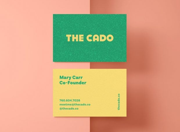
Social media icons are space savers in print collateral such as brochures, print ads, or business cards. But don’t forget that you can’t hyperlink on paper.
A good workaround for offline icons is to use just the domain name and the direct link to your company’s page. Or, skip the domain name altogether.
Option 1: (F) facebook.com/Hootsuite
(T) twitter.com/Hootsuite
Option 2: (F) Hootsuite
(T) @Hootsuite
Option 3: (F) (T) @Hootsuite
On business cards, if you don’t plan to include a URL or handle , then you may not want to include the icon—especially if the handle is not obvious. But if your company has a high profile and is easy to find on social media, standalone iconscan be an elegant way to signal your brand’s presence on social media in print ads and brochures.

TV and video
Like print, if you’re using video on a medium that doesn’t allow viewers to click on an icon, then you should include the URL. On YouTube, you can include clickable icons using the annotations feature. Most often “follow” call-to-actions come at the end of a brand video. Make sure to allot enough time for viewers to read the URL.
Many social media brands require permission requests and sometimes mock-ups before allowing companies to use their icons.
Best practices for using social media icons
Thanks to widespread use of reshaped and revised icons and third-party sites like Iconmonstr or Iconfinder, many brands and social media managers don’t realize that use of altered icons is strictly forbidden.
Here are some common guidelines you should be familiar with before adding social media icons to your marketing materials.
Download from the source
When in search of social media icons, try getting them from the social network websites first. We’ve also assembled the download links for the most popular social media icons below.
No alterations
All social media logos and icons are trademarked. That means rotating, outlining, recolouring, animating, or edits of any kind are not permitted.
Size uniformly
Display all social media icons at equal size, height, and resolution if possible. Don’t display social media icons larger than your own logo or wordmark. And don’t display any of the network icons larger than another network icon (e.g., making the Facebook icon larger than the Instagram icon).
Space evenly
Make sure icons are spaced in a way that meets the “clear space” requirements of each social media company.
Choose three to five
Very often icons are used as call-to-actions, and if you use too many, you risk overwhelming visitors with decision fatigue. Not to mention the clutter that too many icons create on business cards or assets with limited space. Determine the top three to five channels that are most important for your brand and audience. A full list can be included in the contact section of a website or in the website footer.
Order by priority
If LinkedIn is a more strategic network for your brand than Instagram, for example, make sure LinkedIn appears first in your icon list.
Use the latest version
Social media companies require that brands using their icons ensure they keep them up to date. But also, using old logos will stick out and could signal that your company is “behind the times.”
Don’t use the wordmark
Most social media companies explicitly state that you should never use the wordmark in place of the icon. Wordmarks are typically for corporate use only, and represent the company, as opposed to your company’s presence on the network.
Make your brand the focus
Featuring icons too prominently could wrongly imply sponsorship, partnership, or endorsement, and potentially land your company in legal trouble. Plus, your brand should be the focus of your marketing materials anyway.
Link to your company profile
This may seem obvious, but don’t link to a product page, personal profile, or the generic homepage of the site. It’s commonly understood, expected, and in some cases required, that these icons link to your company profile page on the specified network.
Request permission
As a general rule, if you plan to use the icons in a way not specified in the brand guidelines, it’s best to double check. Some brands may forbid use of icons on manufactured products, such as T-shirts or other memorabilia. In other cases, you may be required to send a mock-up of intended use.
Now that you know how to legally advertise your brand’s presence on all the major social networks, easily manage all your social channels from one dashboard using Hootsuite. Schedule and publish posts, reply to followers, track your performance, and more. Try it free today.
The post Free Social Media Icons (The Ones You’re Actually Allowed to Use) appeared first on Hootsuite Social Media Management.
Contributer : Hootsuite Social Media Management https://ift.tt/2xEKtNO
 Reviewed by mimisabreena
on
Friday, September 28, 2018
Rating:





No comments:
Post a Comment