


After 4 Years, We Rebranded Our Email Newsletter. Here’s Why.
You said we should stand out more. We took that pretty seriously.
When we asked readers what they thought of our newsletter, one said, “OK, but just ordinary.” And another said, “The simplicity is great. But your branding needs to be stronger.” Great emails stand out. They stop readers in their tracks. They’re valuable and beautiful. And they have strong branding. That’s why we’ve rebranded our email with bright colors, a new name, and a new logo. Introducing FWD: Thinking — our updated and improved newsletter.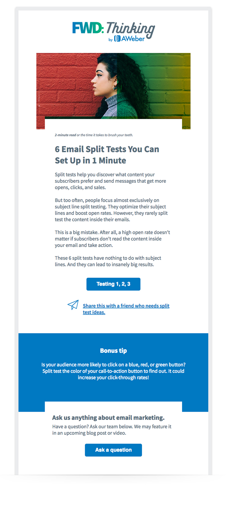 After running a split test of this updated newsletter against our standard newsletter, we saw positive results. We got great email engagement and happy feedback from subscribers. One subscriber even messaged us to say, “Love this new layout!” But this newsletter isn’t simply rebranded. Using your feedback, we’ve revamped the content, too.
You asked for quick, easy-to-digest advice. We added it.
As we were reading through the survey results, themes quickly appeared. Time was the most common one. You said you don't have a lot of it, so you need information you can digest in minutes. “Give me quick wins,” one reader said. Another said, “I’d like more content with small, easy steps.” That’s why we added a quick tip section to our newsletter. This section highlights inspirational quotes, actionable advice, and pro tips. You can read it in seconds and apply it quickly.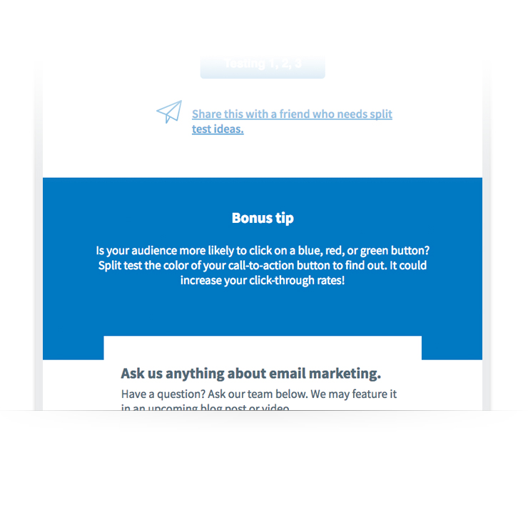 Related: The 4 Survey Emails That’ll Give You Answers to Your Most Pressing Questions
You’re busy. Now, you can instantly find out how much time it'll take to read a post.
Many subscribers told us that they're not sure if they have the time to read an article when they receive our email. So they archive the message to read later. Then, they never get to it. That's why we added read times to our posts within the email. Now, you know what your time commitment is before reading and can plan accordingly.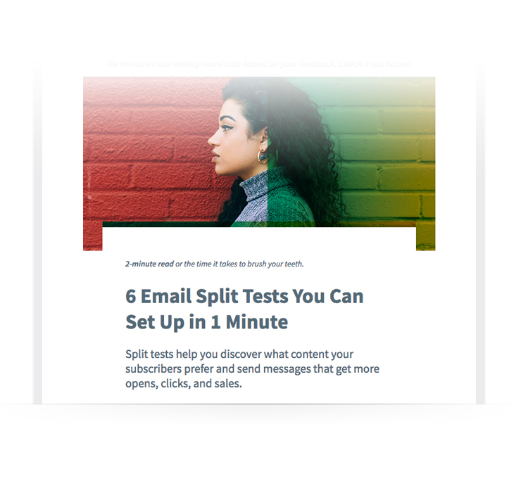 Related: How to Craft Irresistible Newsletter Content
You said our newsletter was overwhelming. We made it easier to focus on what’s important.
You can’t have too much value in an email, right? That’s what we thought. So we pack each of our newsletters with tons of valuable content. But some of our readers said this was actually overwhelming. “I think maybe fewer items per newsletter would make me more likely to read it. It's kind of overwhelming when there are so many articles to read,” said one subscriber. This feedback was a challenge for us. Although some readers were overwhelmed, others appreciated how much content we included in each email. Instead of cutting content from the email, we decided to make it easier for readers to focus on what’s new. In our newsletter, we originally had 3 sections with educational content. The design of each section was identical.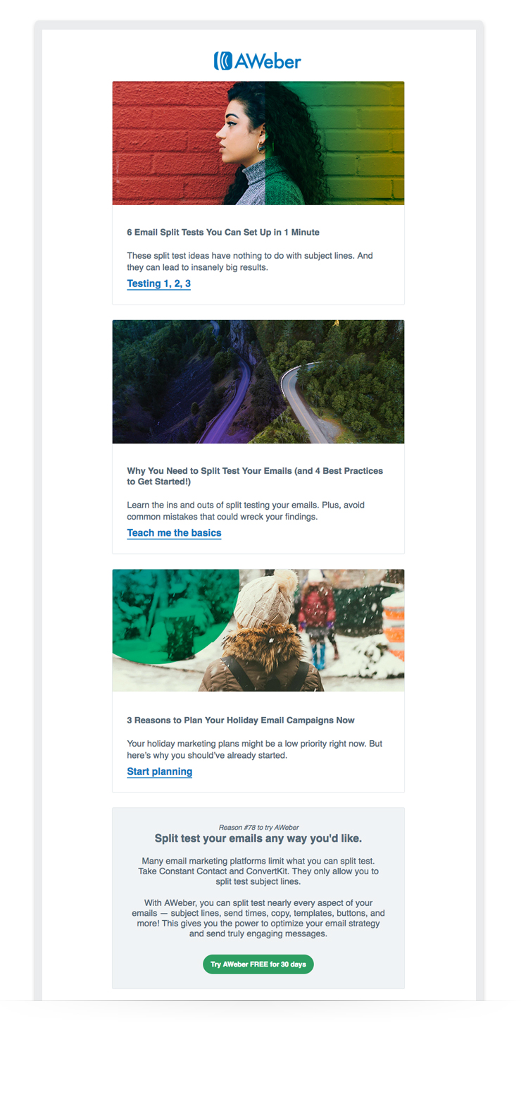 While this format was simple and easy to digest, it could also overwhelm time-strapped subscribers by giving them too many choices. In our updated newsletter, we’ve made it simple for readers to tell which post is the most important — with design hierarchy. Instead of 3 identically-weighted content sections, we now have 1 featured post and 2 supporting posts.
 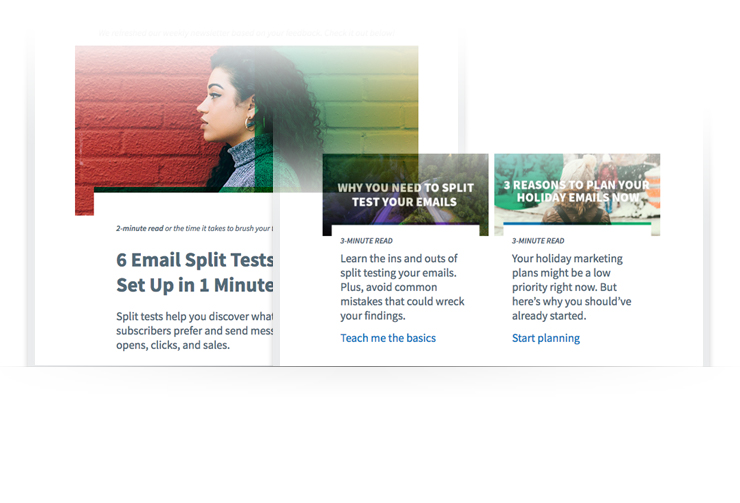 We placed more emphasis on the featured post by using a larger image, describing the post in more detail, and centering it. We decreased focus for the 2 supporting posts by making them smaller and decreasing the explainer text. This use of hierarchy makes it easy for busy readers to pick the one post they should read. And for those who want to read every post, we still have the same amount of value in each email. Related: The Top Email Design Trends You Must Know
You have questions. Now you can ask them directly from our newsletter.
This reader comment had a big impact on our redesign: “I don't know how to start, and I don't know how to make the time to do [email marketing]. I work long hours, and I get back home very tired.” We wanted to help. After brainstorming how we could better serve this reader, we came up with an idea: What if we asked our readers to submit questions directly from our weekly newsletter? Our team of email experts could answer these questions by creating a detailed blog post or video. So we added a new question submission section to our newsletter. Now, readers can submit their questions. And we can write content to answer those questions in the near future.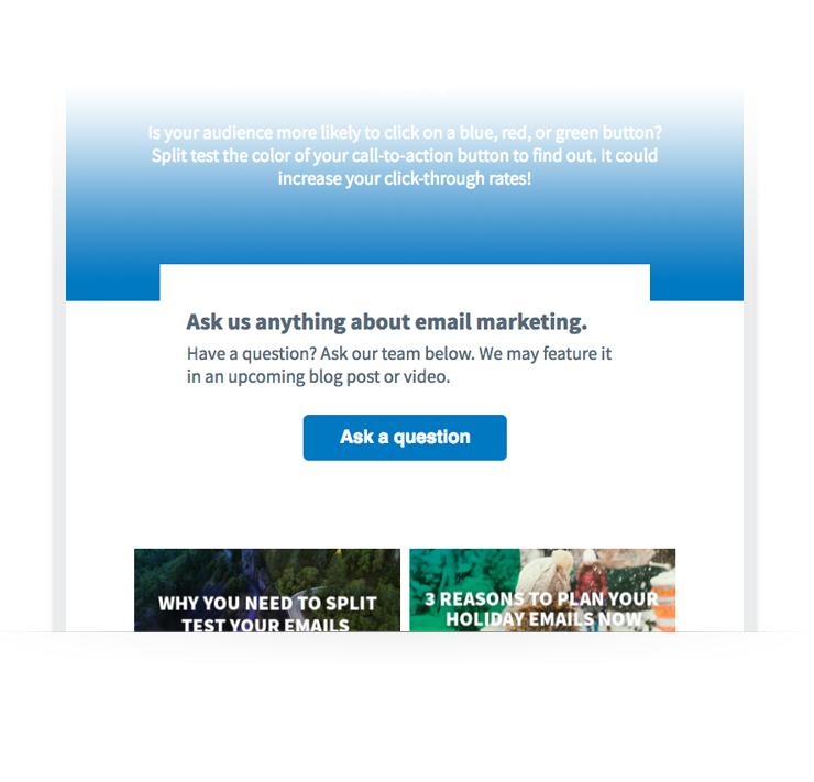 Related: The Simple Question You Should ALWAYS Include in Your Emails
What do you think?
We’re excited to see how you like the improvements. Have questions or feedback? Tell us in the comments section below.The post After 4 Years, We Rebranded Our Email Newsletter. Here’s Why. appeared first on Email Marketing Tips.
Contributer : Email Marketing Tips
After 4 Years, We Rebranded Our Email Newsletter. Here’s Why.
![After 4 Years, We Rebranded Our Email Newsletter. Here’s Why.]() Reviewed by mimisabreena
on
Thursday, October 04, 2018
Rating:
Reviewed by mimisabreena
on
Thursday, October 04, 2018
Rating:


No comments:
Post a Comment