10 Beautifully Designed Web Design Agency Sites
Web design agencies are tasked with the tough assignment of producing a site design that communicates their skill levels through various visuals and elements. They are often judged as much on their website design as they are on their portfolio of work. It’s a critical aspect of generating work and conveying a high level of design skill.
As such, agency sites are often meticulously designed with even the very smallest of details being paid considerable attention to. This, in turn, means that the sites present some of the most forward-thinking and exciting designs in the web design industry.
In this article, we are going to round up ten of the most beautifully designed and polished web design agency sites around today.
Your Web Designer Toolbox
Unlimited Downloads: 500,000+ Web Templates, Icon Sets, Themes & Design Assets
R&D
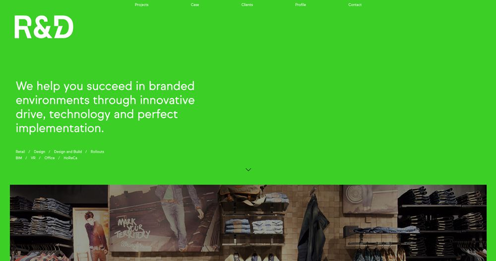
R&D’s agency website combines a spacious layout with a unique and vibrant green background. This contributes to the visual impact and makes for a memorable website design.
Mast
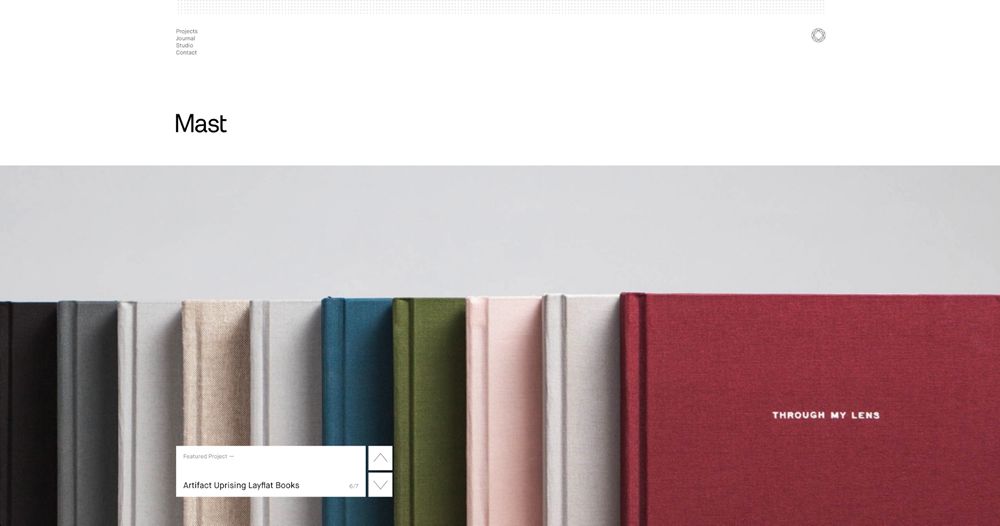
Mast’s website is very minimal but uses beautifully composed imagery and overlapping navigation elements.
A Day Out
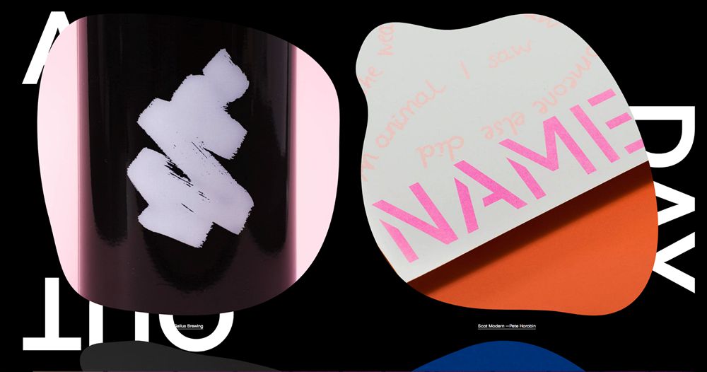
This agency website by A Day Out is incredibly unique and impactful. It uses large cutouts with plenty of imagery and large capitalized typographic elements.
Lg2
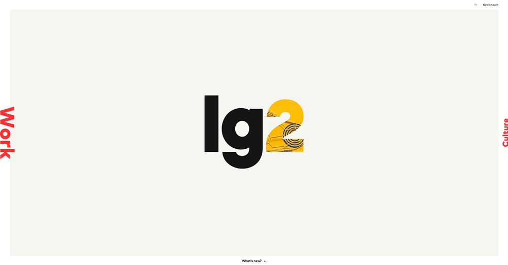
Lg2’s website implements an unusual navigation layout which spans the border of the central content area. The animated visuals within the ‘2’ are an eye-catching addition.
Mathematic
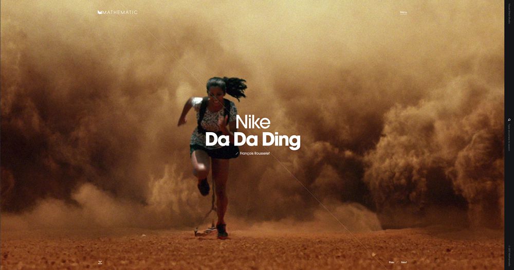
Mathematic’s website is highly-focused on visuals. The slider spans the entirety of the hero section, creating an immersive experience perfect for showcasing their work.
Phoenix
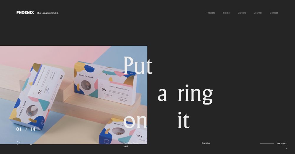
This website from Phoenix offers one of the most unique layout directions of all. The typography is seemingly sporadic but provides great effect as it overlaps the rotating imagery.
2LG
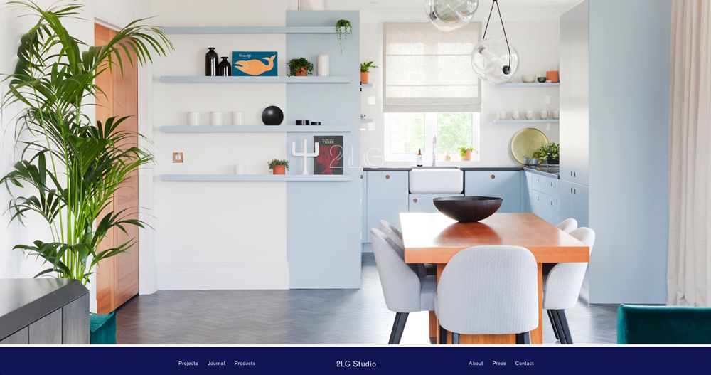
2LG’s agency website uses an immersive loading graphic which consists of their logo overlaying a colorful image. The site then transitions seamlessly into a refined homepage with minimal graphics and typography.
Designgoat
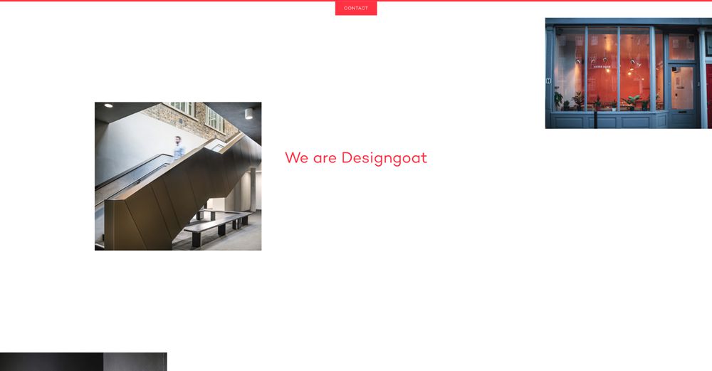
This agency site design from Designgoat is similarly sporadic in the way it has approached its laying out of imagery. The result has a brutalist-style feel to it and offers a beautifully unique look when combined with the red highlights and text.
Gin Lane
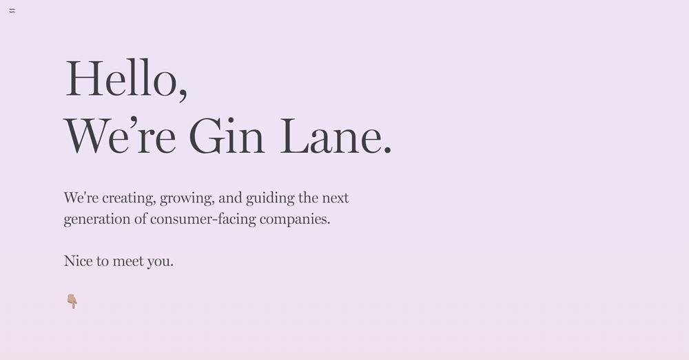
Gin Lane’s simple website uses beautiful serif type against a muted gradient background. The hero leads perfectly into the rest of the homepage design.
P22
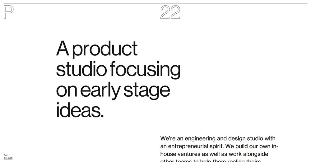
P22 has approached its agency web design with a combination of minimalism and brutalism. The bordered logo text is attractive and counters the filled typography used in the remainder of the monochrome design.
:) Hit link to watching video...! https://ift.tt/2zVFZVc
Contributer : 1stWebDesigner
 Reviewed by mimisabreena
on
Sunday, November 04, 2018
Rating:


No comments:
Post a Comment