Keeping Your Website Design Consistent
The last word you may want a user to associate with your website is “predictable.” This term has a negative connotation in the business world and makes you think of a brand that is boring, unexciting, and identical to its competitors.
Yet to a degree, users expect and rely on the predictability of a website. At its most basic level, a website should be predictable – it should function like all other websites, at least to the point where your user does not struggle to make sense of the interface. Otherwise, your think-outside-the-box strategy might throw users off.
Your Web Designer Toolbox
Unlimited Downloads: 500,000+ Web Templates, Icon Sets, Themes & Design Assets
Think of your website like a car. While consumers react positively to creative, innovative ideas that boost the user experience, for example, touch screen infotainment systems and massage chairs, they may not be keen on a brand that tries to completely revolutionize the way vehicles operate, such as one that places the steering wheel in the backseat.
Features along such lines can seem less user-friendly and more gimmicky, designed simply for the “wow factor” – a move on the brand’s part that users would likely not respond to well. Your website must prioritize usability and the user experience above all else to maintain its popularity – and your brand’s credibility.
The solution is to balance predictability with intrigue. Maintain certain elements your users cannot go without, such as menu options and content. Your users must be able to navigate your website with ease or else they will click away. Yet predictable does not have to mean boring.
For instance, some websites are beginning to integrate virtual and augmented realities into the UI. Designers can get away with this progressive idea by making it simple for users with VR-supported browsers, and doing it for the users’ benefit – by letting users view products up close in VR from their homes before making a purchasing decision, for example.
Maintain Internal Consistency
Achieving predictability and creativity is possible by maintaining internal consistency on your website. Marry a logical flow with your interface that may allow slight variations to keep your users intrigued. Add your own flare and innovations, but keep your primary functional elements consistent and comprehensible.
It is intuitive for users to click on a link or a highlighted section of a page, and you can assume they will access your homepage. From there, the user instinctively knows that clicking on other menu options will lead to the content they desire. The user’s intuition is what makes fast website use possible. Do not underestimate it. Creating a website that takes effort to navigate will end badly for your brand.

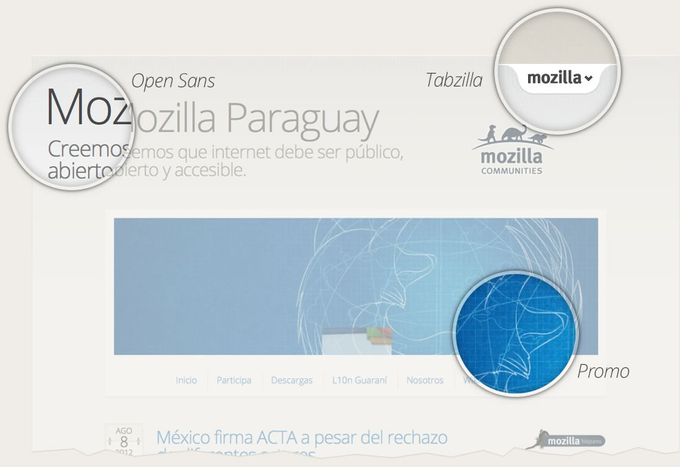
The consistency of Mozilla design.
Achieve internal consistency with accepted UI design patterns. These are standard design elements your user expects to encounter on your website. Patterns can include navigation options, a search feature, a place to input user data, and links to social media accounts.
UI design patterns can be standard or persuasive. Persuasive UI design engages users and encourages them to take certain actions, such as subscribing to a mailing list or taking the next step in the sales process. Both types of UI design have accepted standards and guidelines that make them work in the company’s favor.
Simplify Your Site
One of the easiest and most rewarding ways to master UI consistency is to keep your website’s design simple. Again – simple does not have to mean plain or boring. It means a clean, easy-to-use website that your users can navigate in seconds. Go with a simple visual design to optimize consistency and get brownie points with Google. That’s right – Google rewards sites with simple designs, because these are the sites users deemed “most beautiful” in a 2012 study.

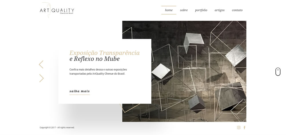
The beautifully simple ArtQuality.com.br layout.
In the five years since this study, this conclusion has held up. Users still prefer simple websites to those that are visually complex. Existing accepted standards for website layouts limit what you can do at this stage of the design process, but this is a good thing – you can only change the standard layout so much before you cross the line into visual complexity. Instead of trying to reinvent the wheel, impress your users with how you use your simple layout.
For example, look at the stunning visuals on FeedMusic.com. It appears you are in a beautiful, swirling miasma of space dust on the homepage. Every page you scroll through (Feed also uses a unique navigational system) showcases another eye-catching, high-definition visual. Using graphics in new and exciting ways can bring a simple layout to the next level, while still maintaining the UI people have come to depend upon. It is possible to stay consistent and make waves in your industry with creative, original UI design.

The FeedMusic.com homepage.
Keep Content Cohesive
One of the most crucial elements to keep consistent is your content. Your brand must maintain a constant tone, voice, and quality across every page. Any mistakes or oversights in this regard can lead to users assuming your site has spammy content or that the brand doesn’t care about its users – both bad news for your business.
Your content should reflect the overall mood of your site and complement your design. It should also match what your users are looking for when they come across your company. Your content should not only exude consistency in the words you write (or the videos you post), but in how often you post new articles. On your website’s blog and social media accounts, consistency in content will pay off handsomely in site traffic and potential conversions.
Create Uniformity among Site Elements
The goal with your website should be to reduce user learning while piquing their interest. This can sound like a conundrum until you realize that when you keep the major UI design elements uniform, you have the freedom to play with the rest of your site. Consistency in the bones of your website gives you wiggle room with the rest of the body. Here are site elements to keep consistent across the board:
- Typography size
- Whitespace
- Color palette
- Brand logo and visuals
- Size of site elements
- High-resolution imagery
- Button colors
- Navigation menu
- Headers, footers, and sidebars
- Clickable elements
This is an idea of what elements your users want to remain consistent from page to page to facilitate easy navigation. Use common sense here – changing the location of your sidebar from page to page would only confuse users and probably lead them to click away.

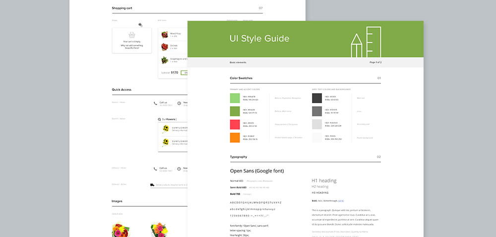
UI Style guide by Alex Gilev.
Keep in mind that your users will not be as familiar with your site as you are. Look at your design elements from an outsider’s perspective – do your elements make sense and work together as part of a larger picture or are they scattered and confusing?
The Takeaway
At the end of the day, consistency always wins the UX and UI game. No matter how beautiful the imagery, how excellent the content, or innovative the theme, users will not stay on a site that is too complex or confusing.
Avoid this by keeping your site seamless and easily digestible. You are free to experiment but within the boundaries of what the current web user deems acceptable. Broaden your horizons, but only if it will bring something of value to your target audience.
Remember – your users should be at the heart of every website design decision you make. With this in mind, design consistency and efficiency should become second nature.
:) Hit link to watching video...! https://ift.tt/2rRizvi
Contributer : 1stWebDesigner
 Reviewed by mimisabreena
on
Sunday, November 04, 2018
Rating:


No comments:
Post a Comment