Tools and Guides for Web Design Accessibility
Fifteen years ago, web accessibility wasn’t a thought in many designers’ minds. Online standards did exist as far back as 1996. But they were followed much less often than they are now, leaving many struggling just to use the internet.
Over the past ten years, the web has made huge strides in making sites accessible. But it’s up to you, the designers and developers, to optimize your own websites. Not sure where to begin? These tools and guides for web accessibility will help you design a better web.
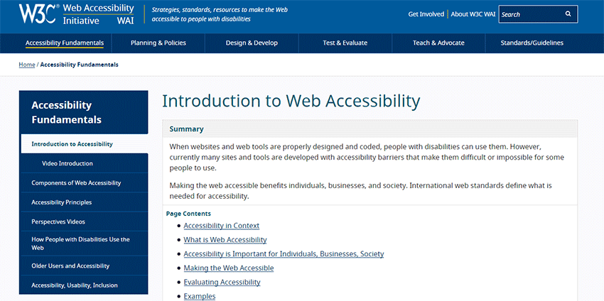
Introduction to Web Accessibility
What is web accessibility, why should you implement it, and – most importantly – how can you do so? This invaluable resource introduces you to the basics of accessibility and can help you get started in optimizing your site.
The A11Y Project
Accessibility isn’t an easy topic to broach. With dozens of standards and hours of reading material, some people just don’t bother. The Accessibility Project aims to make the topic much more approachable, with easy-to-read articles, bite-sized tips, and plenty of helpful guides.
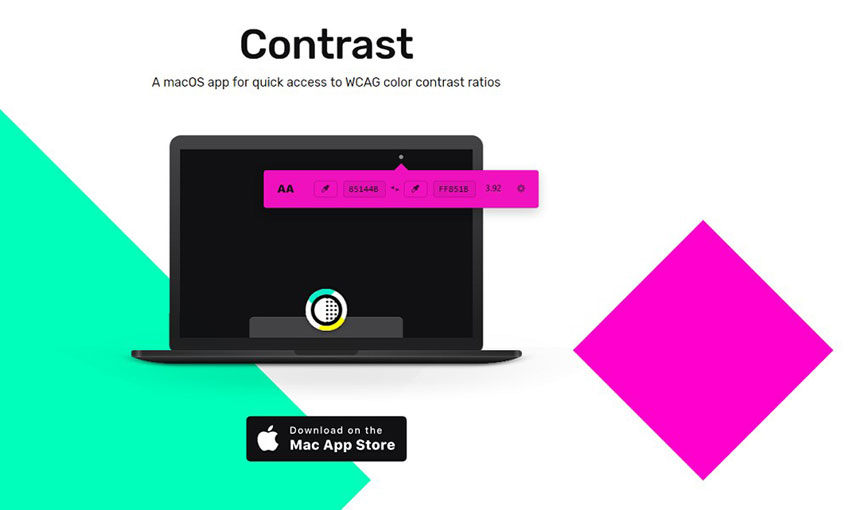
Contrast
High contrast colors are very important for those with visual impairments. There are tools to check your site’s color contrast, but that disrupts your design flow. This macOS app scores colors instantly. No more guessing or spending minutes inputting hex codes.
Stark
What if there was a tool that let you design with accessibility in mind from the beginning? Stark is an Adobe XD and Sketch plugin that does just that. Check contrast, run colorblind simulations, and get quick color suggestions. Now you can create a site that’s beautiful and accessible even during the mockup phase.
tota11y
Tota11y is an extremely useful tool that activates from your browser bookmarks and notifies you of accessibility violations on a page. It’s open source and comes with many plugins that all detect a range of issues. Activate it on your site and see if you pass!
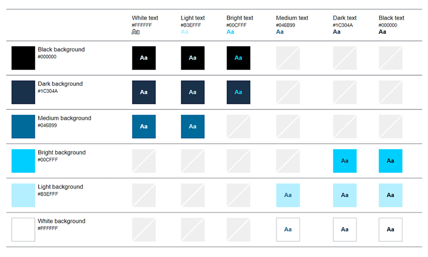
Accessible Color Matrix
Picking a palette? This tool shows you how your palette will work in action, and notes when it doesn’t meet the contrast requirements. Now no one will struggle to read text on your site.
WAVE Web Accessibility Tool
WAVE is a webpage checker that runs a page through a variety of standards, reporting back errors, alerts, and correctly implemented features in an interactive panel. While it’s no replacement for human testing, it can help set you on the right design path.
Web Accessibility Checker
This accessibility checker reports issues on a page in a simple list segmented by known, likely, and possible problems. This one also comes with extra features, like the ability to upload or paste an HTML file. You can also check against different standards!
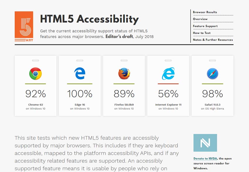
HTML5 Accessibility
Wondering what accessibility features are supported by major browsers? This nifty resource details info about individual elements and how they test for support by browsers.
18F Accessibility Guide
This is a fantastic collection of resources, guides, and articles about web accessibility. If you need even more reading material, start here! It’s also a great source of testing tools for businesses.
AccessLint
GitHub user? This accessibility checker automatically detects and points out violations, simple as that. It also re-reviews code changes to let you know if you’ve really fixed the issue. For open source projects it’s totally free, but you’ll need a monthly subscription if you run a private project.
Lighthouse
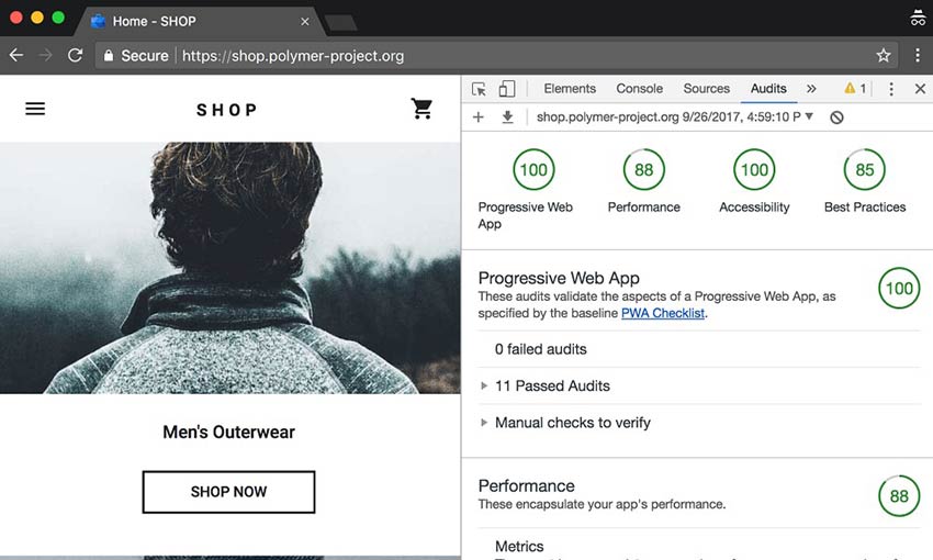
Lighthouse is an advanced tool available right from Google Chrome’s developer tools. Along with performance issues it also checks for accessibility errors. You can run it from Chrome, the command line, or as a Node module.
Making the Web More Accessible
Nearly 1 in 5 people in the US have a disability. 3.2 million Americans are visually impaired, while 8.2 million have vision problems, and that number is only growing. You should do your best to follow accessibility standards, so that everyone can browse your site without having to contend with garbled screen reader output, difficulty reading, and headaches.
Something as simple as adding alt text to images and increasing contrast can make a huge difference to your disabled users, but there’s always more you can do. Don’t make accessibility an afterthought.
:) Hit link to watching video...! http://bit.ly/2KW1V9p
Contributer : 1stWebDesigner
 Reviewed by mimisabreena
on
Thursday, April 25, 2019
Rating:


No comments:
Post a Comment