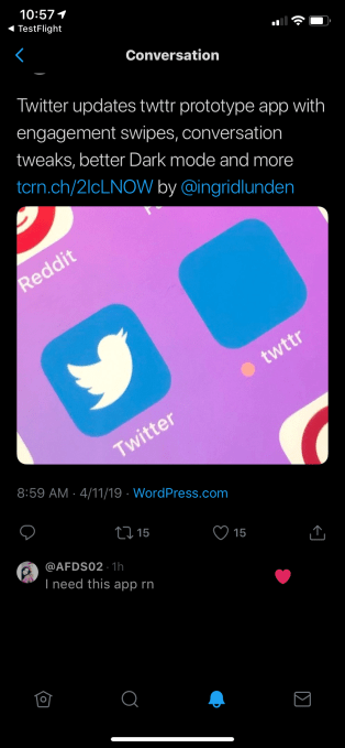
Twitter updates twttr prototype app with engagement swipes, conversation tweaks, better Dark mode and more
Twitter’s new prototyping app twttr, which it created to test and get feedback on new features — and new approaches to old features — has been out in the wild for a month. Now, with Twitter taking in the first wave of responses from users, twttr is getting an update. The move highlights how Twitter continues to chip away at ongoing criticism that it is too confusing for most people to use, which has impacted overall growth for the social media platform.
The latest version of twttr — which is now used by several thousand people, says Twitter — is a decent step ahead in that mission.
Updates include: the introduction of a swiping gesture, specifically in conversations to like a Tweet; new labels in threads indicating who is the original poster and who you follow and improved visibility with dark mode. Ironically — even as Twitter has shifted to putting experimental features into twttr — the latter app is also getting an import of new features from the main Twitter app, which has been getting updates that had yet to be rolled out to the prototype app.
These include new versions of the Twitter camera, darker mode and profile previews that keep you in your timeline.

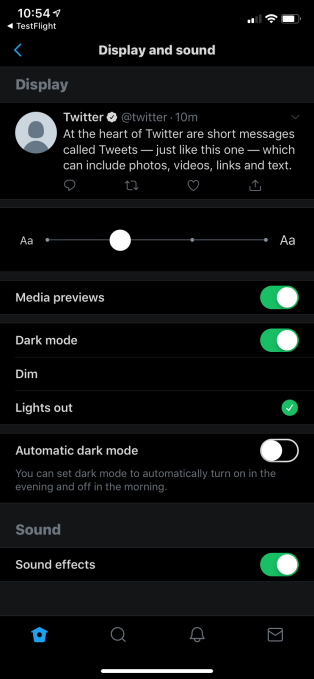
Above: twttr gets the new “Lights Out” mode, already in the current Twitter app
Overall, those who are using twttr say they prefer it to the official Twitter app, says Sara Haider, Twitter’s director of product management. That likely means certain features are sticking enough in the prototype app that they will be making their way into the permanent Twitter experience. But what form that will ultimately take is still in play.
One of the big areas that is still seeing some changes are engagement buttons — that is, the options to “like” a Tweet with a heart, to reply to it, or to retweet. These are a cornerstone of how Twitter is used, but they are also potentially distracting and add to the noise in an often chaotic experience, since timelines and potentially conversations are more or less constantly on the move.
In the new build of twttr, engagements do not appear by default in conversation threads, as before. But now, you can swipe to the left on a Tweet in order to like it. However, replying or retweeting still requires a tap.

Above: When you swipe on a tweet, a heart appears over the tweet to indicate you’re liking it. It’s Twitter’s own take on the IG double tap.
This is not exactly new: it’s an iteration of what we saw in the first major build of twttr. There, the engagement buttons were also hidden away completely in conversations, and they only appeared when you tapped on a Tweet to begin engagement.
But it seems that design decision got very mixed reviews, said Haider, who said that while it was easier to focus without the distraction of metrics, it also made it harder to like tweets since that required an extra tap.
My guess is that it also resulted in less engagement, even among the power users who signed up test twttr in the first place — which is likely not the end result that Twitter (or its advertisers, or others who measure and rely on engagement metrics) would want.
Replacing that tap with a swipe brings twttr in line with one of the most popular gestures in app user interfaces today, since the small touchscreens of smartphones are natural surfaces this gesture to make quick responses. My guess is that we will see yet more changes in how gestures are used in Twitter overall, since in the main Twitter app, a swipe to the left currently brings up the Camera, while a swipe to the right gets you to your Profile page.
Haider also said that early feedback, from those using twttr in English and Japanese, included a clear endorsement of the new threaded layout for conversations. This made them “easier to follow” and let readers see more replies.
The old layout had also collapsed side-conversations that branch out from the main Tweet, giving you the option either of expanding them to see more replies by way of a “Show more” button, or continuing to scroll to see more replies to the main Tweet without confusing the two.
Above: The old twttr app included too many “Show more” buttons
But some had complained that in an especially noisy conversation, the “show more” buttons appeared too much, serving the exact opposite of their intention: they ended up distracting from the flow of conversation. And if you were using the “dark mode” that was running in twttr, it was hard to follow the shading on replies (something we also highlighted in our initial review of the new app).
These issues are now getting addressed with more nuanced shading on replies that appears more clearly in dark mode, and it also seems that Twitter will be playing with the number of “Show more” buttons in threads – which have now been relabeled as “Show Replies.”

Above: the new build of twttr includes more compact replies, lines between conversations, and “Show replies” buttons, which are justified along with the conversion; previously, the “Show more” buttons had been centered.
Another interesting addition brings to light something that Twitter had already been experimenting with in its original app: the appearance of labels for the original tweeter and those that indicate who you follow, to better organize what you might want to see or know as the reader. (Twitter more recently switched its “original tweeter” labels to read “Author.”)
The original twttr app rolled out without these labels. Now that’s changing.
In the new twttr build, “Author” is now included – but instead of a big, gray label, it’s just small, red text.
This still doesn’t look quite right as the text appears underneath the Twitter user’s name. It makes more sense to have labels appear off to the side of a name, instead of interrupting the conversation – as on Reddit, for example.

Above: the red “Author” label in the new twttr build
Similarly, the new twttr app also has “Following” labels to indicate which people in conversation threads are people you follow on Twitter. These labels, however, are in blue.

Above: blue “Following” labels and red “Author” labels identify tweeters you need to know
Parity between Twitter and twttr is something of a theme here, since Twitter has also made some other changes to bring features in the latter up to date with newer changes in the main app.
As noted above, that includes adding in updated, Snapchat-like camera features; and more nuanced Dark Mode that includes a darker, battery-saving black and other customizations. You are now also able to see profile previews in twttr without navigating away from the flow of conversation (something Twitter has been testing in the main iOS app).

Above: profile previews in the new twttr app
All in all, the picture that this paints for Twitter (and twttr) is that the app and wider platform still remain very much in flux. The company says that it will be “many months” before anything goes from test to full launch, which is not a bad thing when you’re on a mission not just to grow usage, but to keep people around for longer.
We’re still waiting (but not holding our breath) to see how and if twttr gets used for other kinds of changes that transcend user interface — such as as changing the mechanics around how to report abuse and manage your overall content experience on the app.
As more people flock to Twitter to get their opinions heard, and Twitter continues to sign up third parties to bring in a wider range of media into the app, transforming not just the application of its mechanics, but the whole reason you may be using Twitter in the first place, there is a lot of work to do in both.
This article was updated after original publication. An earlier version implied swiping offered access to other engagements, it’s for likes only. Sara Haider is Twitter’s director of product management, not head of product; we regret the error.
Contributer : Social – TechCrunch
 Reviewed by mimisabreena
on
Friday, April 12, 2019
Rating:


No comments:
Post a Comment