Instagram’s IGTV copies TikTok’s AI, Snapchat’s design
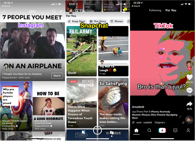
Instagram conquered Stories, but it’s losing the battle for the next video formats. TikTok is blowing up with an algorithmically suggested vertical one-at-a-time feed featuring videos of users remixing each other’s clips. Snapchat Discover’s 2 x infinity grid has grown into a canvas for multi-media magazines, themed video collections and premium mobile TV shows.
Instagram’s IGTV…feels like a flop in comparison. Launched a year ago, it’s full of crudely cropped and imported viral trash from around the web. The long-form video hub that lives inside both a homescreen button in Instagram as well as a standalone app has failed to host lengthier must-see original vertical content. Sensor Tower estimates that the IGTV app has just 4.2 million installs worldwide, with just 7,700 new ones per day — implying less than half a percent of Instagram’s billion-plus users have downloaded it. IGTV doesn’t rank on the overall charts and hangs low at No. 191 on the US – Photo & Video app charts, according to App Annie.

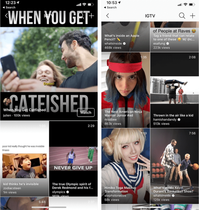
Now Instagram has quietly overhauled the design of IGTV’s space inside its main app to crib what’s working from its two top competitors. The new design showed up in last week’s announcements for Instagram Explore’s new Shopping and IGTV discovery experiences. At the time, Instagram’s product lead on Explore Will Ruben told us that with the redesign, “the idea is this is more immersive and helps you to see the breadth of videos in IGTV rather than the horizontal scrolling interface that used to exist,” but the company declined to answer follow-up questions about it.
 IGTV has ditched its category-based navigation system’s tabs like “For You”, “Following”, “Popular”, and “Continue Watching” for just one central feed of algorithmically suggested videos — much like TikTok. This affords a more lean-back, ‘just show me something fun’ experience that relies on Instagram’s AI to analyze your behavior and recommend content instead of putting the burden of choice on the viewer.
IGTV has also ditched its awkward horizontal scrolling design that always kept a clip playing in the top half of the screen. Now you’ll scroll vertically through a 2 x infinity grid of recommended clips in what looks just like a Snapchat Discover feed. Once you get past a first video that auto-plays up top, you’ll find a full-screen grid of things to watch. You’ll only see the horizontal scroller in the standalone IGTV app, or if you tap into an IGTV video, and then tap the Browse button for finding a next clip while the last one plays up top.
Instagram seems to be trying to straddle the designs of its two competitors. The problem is that TikTok’s one-at-a-time feed works great for punchy, short videos that get right to the point. If you’re bored after five seconds you swipe to the next. IGTV’s focus on long-form means its videos might start too slowly to grab your attention if they were auto-played full-screen in the feed rather than being chosen by a viewer. But Snapchat makes the most of the two previews per row design IGTV has adopted because professional publishers take the time to make compelling cover thumbnail images promoting their content. IGTV’s focus on independent creators means fewer have labored to make great cover images, so viewers have to rely on a screenshot and caption.

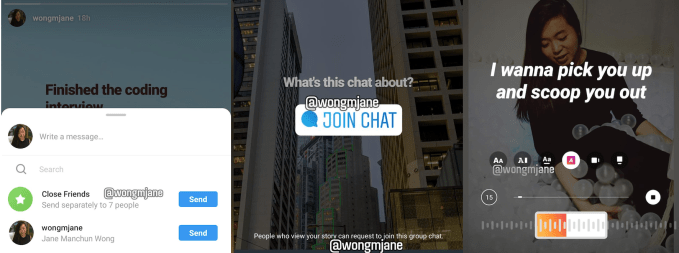
Instagram is prototyping a number of other features to boost engagement across its app, as discovered by reverse-engineering specialist and frequent TechCrunch tipster Jane Manchun Wong. Those include options to blast a direct message to all your Close Friends at once but in individual message threads, see a divider between notifications and likes you have or haven’t seen, or post a Chat sticker to Stories that lets friends join a group message thread about that content. And to better compete with TikTok, it may let you add lyrics stickers to Stories that appear word-by-word in sync with Instagram’s licensed music soundtrack feature, and share Music Stories to Facebook. What we haven’t seen is any cropping tool for IGTV that would help users reformat landscape videos. The vertical-only restriction keeps lots of great content stuck outside IGTV, or letterboxed with black, color-matched backgrounds, or meme-style captions with the video as just a tiny slice in the middle.

When I spoke with Instagram co-founder and ex-CEO Kevin Systrom last year a few months after IGTV’s launch, he told me, “It’s a new format. It’s different. We have to wait for people to adopt it and that takes time . . . Everything that is great starts small.”
But to grow large, IGTV needs to demonstrate how long-form portrait mode video can give us a deeper look at the nuances of the influencers and topics we care about. The company has rightfully prioritized other drives like safety and well-being with features that hide bullies and deter overuse. But my advice from August still stands despite all the ground Instagram has lost in the meantime. “Concentrate on teaching creators how to find what works on the format and incentivizing them with cash and traffic. Develop some must-see IGTV and stoke a viral blockbuster. Prove the gravity of extended, personality-driven vertical video.” Until the content is right, it won’t matter how IGTV surfaces it.
Contributer : Social – TechCrunch
 Reviewed by mimisabreena
on
Tuesday, May 21, 2019
Rating:


No comments:
Post a Comment